Bold PC Gaming Blog Editorial Landing Page
Rigpress is a bold editorial landing page built for PC gaming blogs. It combines a broadsheet-inspired typographic hero, an origin-story scroll structure, and a focused click-through layout. The Ink and Paper color system and zine aesthetic give it immediate personality. One primary call to action drives readers straight into your latest content.
by Rocket studio
Quick summary
Rigpress is a single-page editorial landing page designed for PC gaming blogs. It uses enormous serif headlines, a newsprint-and-ink color palette, and a scroll-driven origin story to convert first-time visitors into loyal readers. The layout earns trust through methodology transparency and editorial voice before it ever asks for a click.
Who this template is for
This template is built for independent hardware writers and PC gaming enthusiasts who want their blog to look as serious as their opinion is. It suits creators who have real test data, genuine opinions, and a readership that respects honesty over hype.
- Overclockers, mid-budget builders, and hardware-obsessed writers launching an editorial blog
- Returning PC gamers who want to create content for others navigating a confusing hardware landscape
- Independent gaming media creators who need a credible, distinctive first impression
What problem this template solves
Most blog landing pages borrow from generic startup playbooks. They look fine but feel hollow. For a PC gaming editorial blog, that mismatch kills trust before a single word is read.
- Generic layouts lack editorial personality, so hardware enthusiasts dismiss them immediately
- Visitors with no context about the blog have no reason to click through to actual content
- There is no clear path from first impression to first article without a deliberate conversion structure
What you get with this template
You get a complete single-page editorial landing page with five distinct content sections and a footer. Every section is purpose-built to deepen trust and move the reader toward your content.
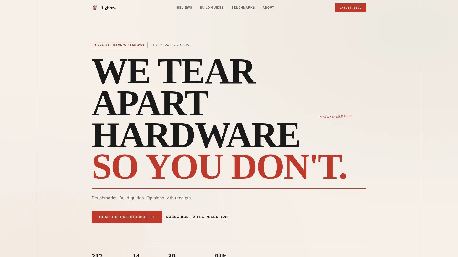
- A broadsheet-style hero with a manifesto headline, red rule, and two calls to action
- Four scroll sections covering the problem, methodology, sample articles, and benchmark highlights
- A bottom subscribe strip with an inline email field and a pencil-sketch envelope icon
Feature list
This template is built around specific editorial and conversion decisions drawn from print media tradition and enthusiast web culture.
Giant Broadsheet Hero Typography
The hero fills the entire viewport with enormous Fraunces serif type set in manuscript black on newsprint cream. No image, no gradient. A thin red rule sits beneath the headline. A single graphite-gray subhead anchors the visual before the first call to action appears.
Origin Story Scroll Structure
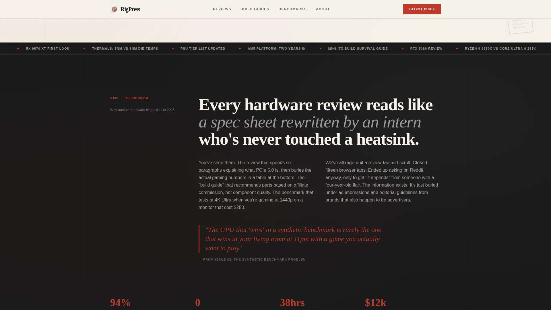
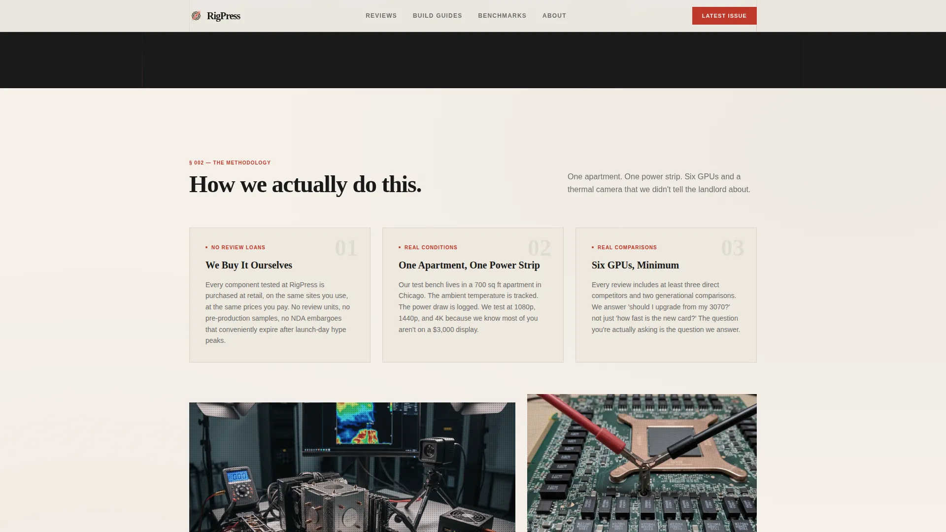
The page unravels in four stages: the problem, the moment of founding, the proof, and the editorial voice. Each section deepens reader trust by showing the humans and the methodology behind the content rather than just listing topics.
Red-Button Primary Call to Action
A bold marginalia-red button labeled "Read the Latest Issue" appears directly beneath the hero and repeats after the proof section. It is the only friction-free path forward, with no form between the visitor and the content.
Magazine Column Sample Articles Layout
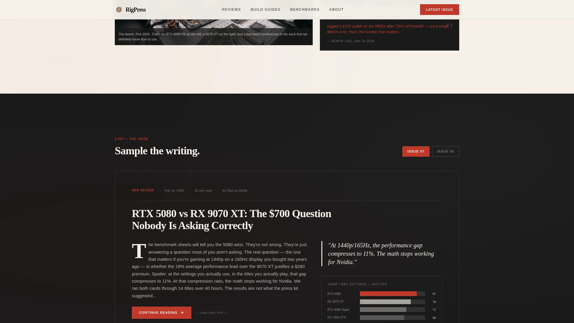
One full section renders sample article excerpts in true multi-column magazine layout, complete with drop caps and pull quotes highlighted in red. Excerpts end mid-thought to pull the reader forward like a torn page.
Halftone Bento Benchmark Grid
The latest benchmarks section uses an asymmetric bento-grid card layout with halftone grain treatment on illustrations. Spotlight hover effects and scroll-triggered reveal animations give the grid an interactive editorial feel.
Inline Subscribe Strip
At the bottom of the page, a single inline email field sits beside a pencil-sketch envelope icon. It is styled like a subscription card falling out of a magazine, offering a weekly email digest without interrupting the reading flow.
Page sections overview
| Section | Purpose |
|---|---|
| Hero Headline | Manifesto typography, red rule, dual calls to action |
| The Problem | Dark recto section establishing editorial credibility |
| Methodology Proof Cards | Cream verso, three-column halftone proof cards |
| Sample Article Columns | Magazine columns with drop caps and pull quotes |
| Benchmark Bento Grid | Asymmetric halftone cards with subscribe strip |
| Footer | Linear single-row navigation and identity |
Design & branding system
The visual identity is built on an Ink and Paper system. Every color choice references the physical experience of reading a well-worn hardware magazine, not a screen-native design trend.
- Four-color palette: manuscript black (#1A1A1A), newsprint cream (#F5F0E8), marginalia red (#C0392B), and pencil-graphite gray (#6B6B6B)
- Backgrounds alternate between cream and black in a recto-verso page rhythm to simulate turning printed pages
- Red appears sparingly on pull quotes, hover states, the primary button, and the thin rule beneath the headline
Mobile & speed optimization
The template is built desktop-first to match the hardware enthusiast audience, but it delivers full mobile responsiveness throughout every section.
- Scroll-triggered reveals, stagger animations, and an infinite ticker are handled through Client Components to keep interactive JavaScript isolated
- Static content sections use Server Components, keeping the base render lean and the page structure clean
- The spotlight card hover effect and beam drop animations are scoped to interactive elements only, so non-interactive sections stay lightweight
How this template helps you convert
The page is structured as a single deliberate path from curiosity to click, with no dead ends and no unnecessary friction.
- The hero earns attention immediately through typographic spectacle and a clear manifesto headline, so visitors understand the blog's purpose in under five seconds
- The origin story scroll builds credibility section by section, using methodology detail and authentic excerpt samples before the second call to action appears
- The subscribe strip at the bottom captures longer-term interest with a single email field, offering a second conversion path without competing with the primary click-through goal
Other information about this template
Rigpress is part of the Rigpress template family built specifically for PC gaming editorial and enthusiast hardware media. A few additional details worth knowing:
- Typography uses Fraunces for display headings and DM Sans for body text and interface elements
- Animations include spotlight card effects, scroll-triggered reveals, stagger animations, and an infinite content ticker
- The footer follows a linear single-row pattern for clean, minimal navigation
- The template is localized for English (United States) with dates formatted in MM/YYYY style
- No currency fields, checkout components, or external service connections are included in this template
Theme
Ink & Paper
Creative direction
Origin Story
Color system
Ink & Paper
Style
Editorial/Magazine
Direction
Click-Through
Page Sections
Giant Broadsheet Hero Typography
Origin Story Scroll Structure
Bold Red Primary Call to Action
Magazine Column Article Layout
Halftone Bento Benchmark Grid
Inline Subscribe Strip
Related questions
Is this template suitable for a new PC gaming blog with no existing content?
Can I change the color palette to match a different brand identity?
Does the template include a working email subscribe form?
What typography does this template use?
Is this a single-page layout or does it include multiple pages?



