Product Management Newsletter Landing Page Template
Roadmap is a hub-and-spoke landing page template built for product management daily digest newsletters. It combines an editorial Atelier Studio design with a Cinematic Dark color system, a full-bleed workspace header, anchor navigation, and a lead-generation flow that earns subscriptions by showing real digest excerpts before asking for an email address.
by Rocket studio
Quick summary
Roadmap is a single-page editorial template designed for a product management daily digest. It uses a hub-and-spoke anchor navigation structure to guide senior product managers through five content spokes. The Cinematic Dark palette and typewriter headline set a calm, deliberate tone from the first scroll.
Who this template is for
This template suits content creators and editorial teams running a curated product management newsletter. It fits anyone who wants to convert readers into email subscribers through genuine content value rather than vague promises.
- Senior independent contributor product managers and heads of product at growth-stage startups
- Newly promoted product leads who need a polished, trust-building landing page for their digest
- Newsletter founders in the product management daily digest space seeking a desktop-first editorial layout
What problem this template solves
Product managers are buried in Slack threads, launch announcements, and framework debates with no single calm entry point. A newsletter landing page needs to earn trust before it asks for an email address. Most templates lead with promises; this one leads with proof.
- Readers cannot quickly judge digest quality without seeing real content samples
- Generic newsletter templates lack the editorial weight that senior product audiences expect
- Anchor navigation is often missing, making long single-page digests feel disorganized
What you get with this template
You get a fully structured, single-page layout that guides visitors from a dramatic header through five editorially distinct content spokes, then closes with a clear subscription call to action. Every section is purposefully sequenced to build credibility before conversion.
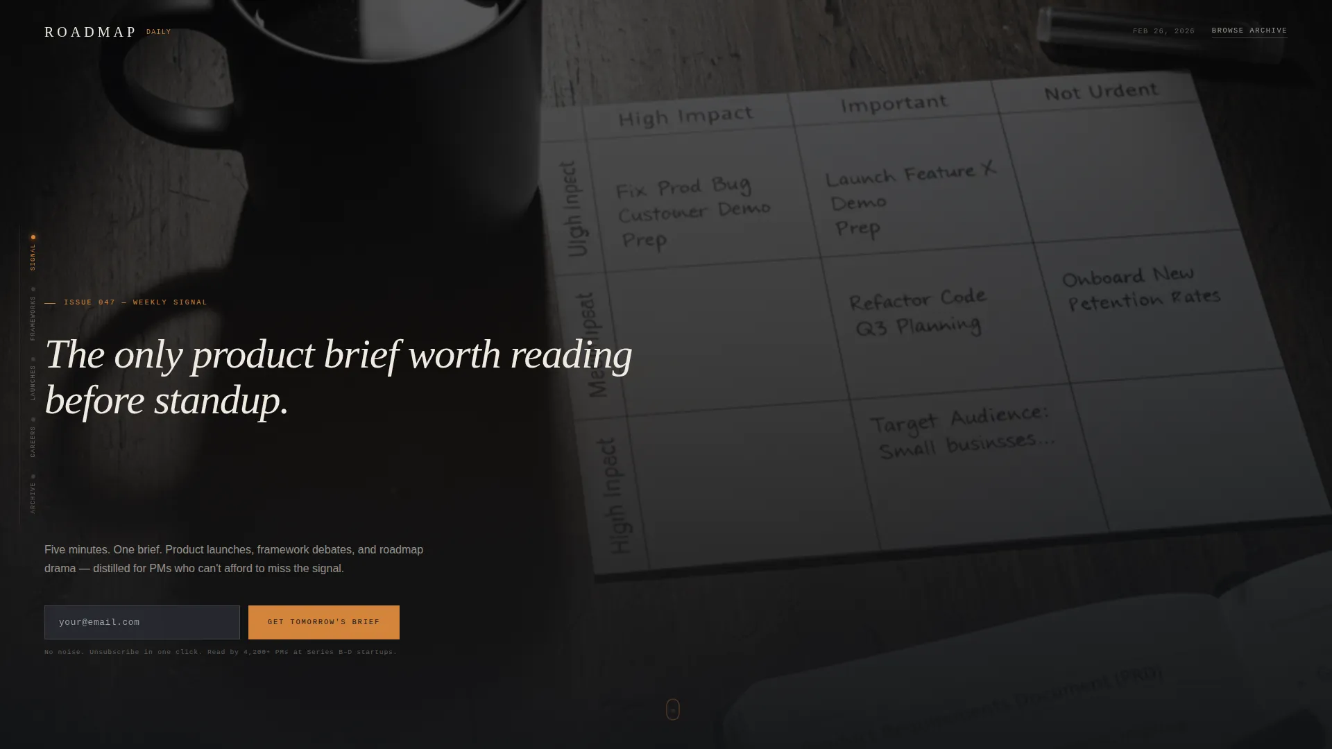
- A full-bleed workspace photo header with a typewriter-effect headline and a delayed email capture field
- Five anchor-navigated spokes: Signal, Frameworks, Launches, Careers, and Archive, each styled as a magazine department
- Three inline digest excerpt blocks showing real content so visitors read value before they subscribe
Feature list
This template is built around five tightly designed features that work together to create an editorial experience rather than a standard newsletter signup page.
Typewriter Headline with Delayed Email Field
The hero headline types itself in a monospaced serif font. A three-second delay then surfaces the email capture field, giving visitors a moment to absorb the positioning before the conversion prompt appears.
Hub-and-Spoke Anchor Navigation
Five named spokes pin to a left-rail navigation bar. Each spoke links directly to its section. The nav highlights the active spoke in burnt amber as the visitor scrolls, keeping orientation clear on a long-form page.
Sticky Email Subscription Bar
After the visitor passes the second spoke, a sticky bar resurfaces the primary call to action. This gives late-converting readers a persistent, low-friction path to subscribe without interrupting their reading flow.
Archive Gate Modal
The Browse the Archive path opens a lightweight modal registration wall. It asks for email address and role title only, keeping the friction minimal while collecting useful audience segmentation data.
Inline Digest Excerpt Blocks
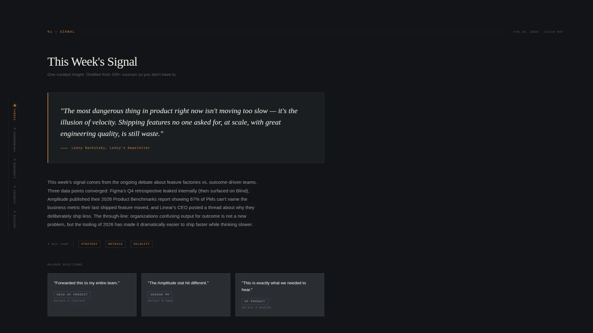
Three real content samples are placed inline within the page. Visitors read actual digest content before they are asked to give up their email address, which is the core trust mechanism of the lead-generation design.
Scroll-Linked Section Reveals
Each spoke section uses scroll-linked reveal animations. Transitions between sections are designed to feel like turning thick cotton-stock pages, using deliberate pauses and generous whitespace rather than fast-moving imagery.
Page sections overview
| Section | Purpose |
|---|---|
| Full-Bleed Hero | Establishes editorial tone; delivers headline and delayed email field |
| Signal Spoke | Presents one curated weekly insight as a pull quote on dark canvas |
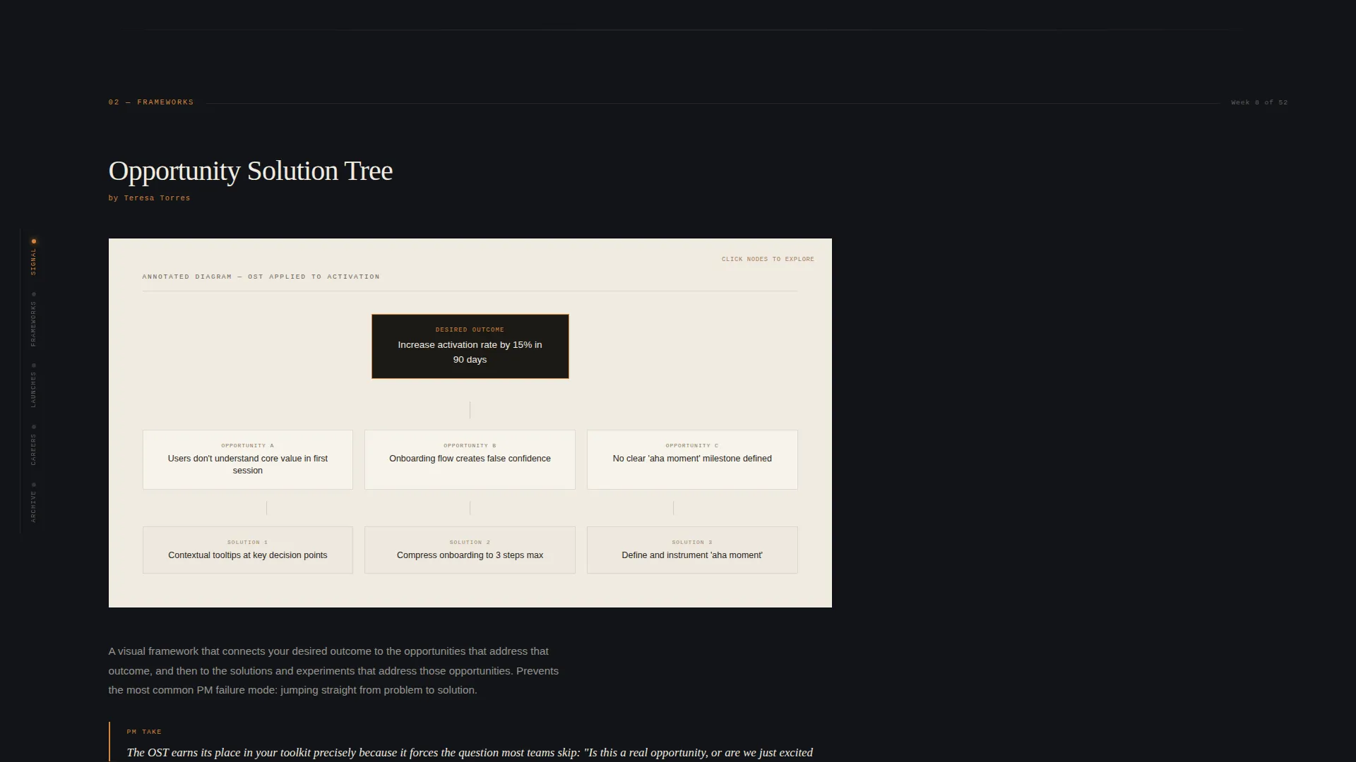
| Frameworks Spoke | Features one annotated methodology card on a parchment background |
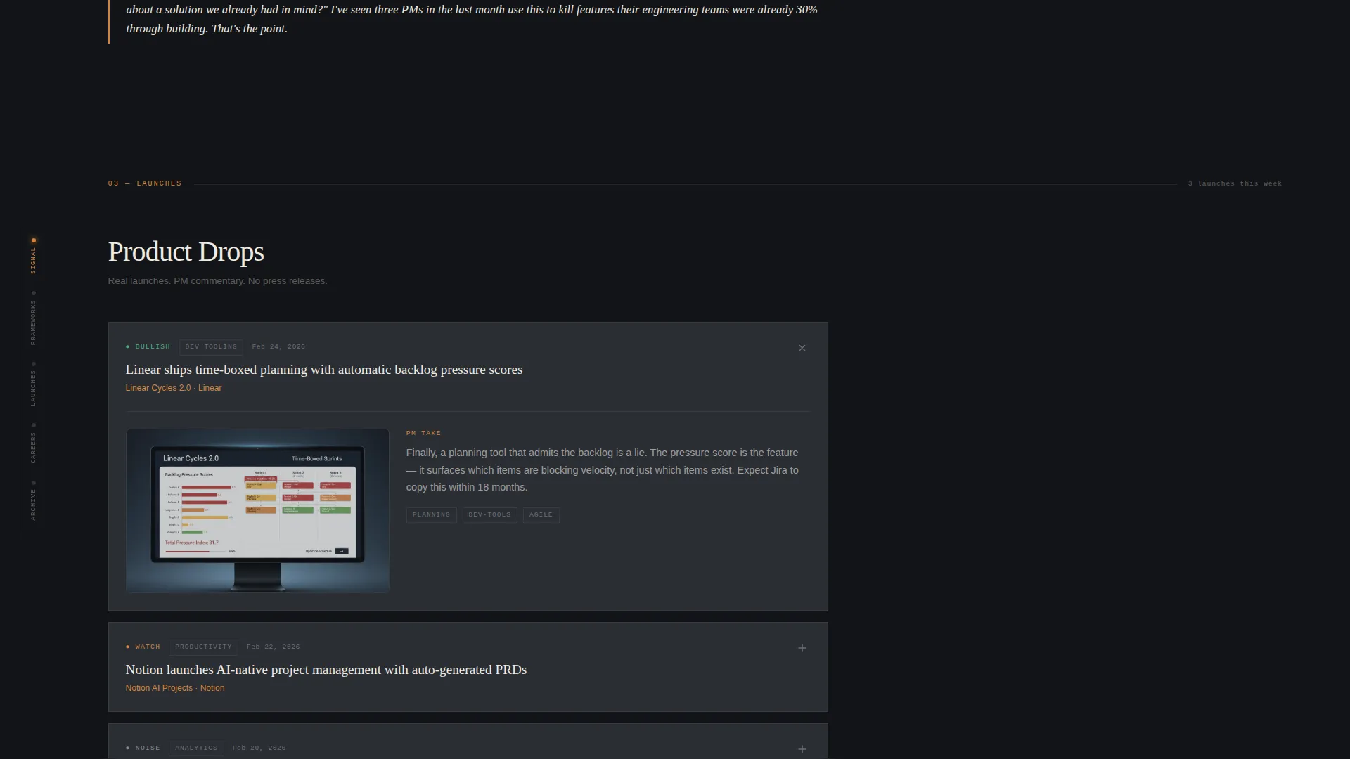
| Launches Spoke | Displays a grid of real product drops with screenshots and PM commentary |
| Careers Spoke | Lists role opportunities and reinforces community positioning |
| Archive Spoke | Provides gated access to back issues via modal registration |
| Sticky Email Bar | Resurfaces the primary subscription call to action after the second spoke |
| Footer | Horizontal flow pattern closing the page with navigation and brand links |
Design & branding system
The visual identity follows an Atelier Studio theme with a Cinematic Dark color system. The palette feels like a private screening room: warm, considered, and intentionally quiet. Typography does the heavy lifting across every section.
- Color palette: deep charcoal canvas (#121417), warm graphite (#2A2D34), parchment cream (#F0EBE1) for body text and cards, and burnt amber (#D4853B) reserved for accent elements, call-to-action buttons, and pull quotes
- Typography stack: Fraunces serif for display headings, Manrope for body text, and DM Mono for the typewriter monospaced effect
- The header photo is desaturated to feel editorial rather than stock, showing a dark walnut desk with index cards in a prioritization matrix, a ceramic mug, and a Muji pen resting across a half-written document
Mobile & speed optimization
The template is desktop-first, reflecting the reality that senior product managers typically open their morning brief at a desk before standup. Full mobile support is included so the page remains readable on any device.
- Server Components handle static content sections for faster initial load; Client Components are used for animations and interactive elements
- The anchor navigation collapses gracefully on smaller viewports so spoke links remain accessible without crowding the layout
- Animation intensity scales with device context so scroll-linked reveals and sticky elements do not create layout issues on mobile
How this template helps you convert
Every design decision in this template is in service of one goal: turning a first-time visitor into an email subscriber. The conversion architecture is layered and respectful of reader attention.
- The delayed email field in the hero gives visitors three seconds to read the headline and feel the editorial tone before the subscription prompt appears, reducing early abandonment.
- Inline digest excerpts place real content in front of readers before any gate, so the decision to subscribe is based on genuine product experience rather than marketing copy.
- The sticky email bar and archive gate modal provide two additional conversion touchpoints without disrupting the reading flow that earns the click.
Other information about this template
This template is built for the product management newsletter and daily digest space. It is particularly well-suited for editorial products targeting growth-stage startup teams who value clarity, curation, and concise signal over volume.
- Template style: Hub and Spoke with anchor navigation, single-page layout
- Creative direction: Industry Report editorial structure with magazine-department spoke design
- Header concept: Full-Bleed Photo with an overhead editorial workspace photograph
- Lead generation direction: email-only primary field plus a gated archive secondary path
- Animation level: high, including typewriter effect, scroll-linked section reveals, sticky navigation, and delayed call-to-action appearance
- Localization: English language, USD currency, United States date format
- Category alignment: Blog and Editorial, Product Management Newsletter subcategory
Theme
Atelier Studio
Creative direction
Industry Report
Color system
Cinematic Dark
Style
Hub & Spoke (Anchor Nav)
Direction
Lead Generation
Page Sections
Typewriter Headline with Delayed Email Capture
Hub-and-spoke Anchor Navigation
Sticky Subscription Bar
Gated Archive Modal
Inline Digest Excerpt Blocks
Scroll-linked Section Reveals
Related questions
Who is this landing page template designed for?
How does the template capture email subscribers?
Can visitors see real digest content before subscribing?
What sections does the anchor navigation include?
Is this template optimized for desktop readers?



