Veterinary Industry Report Landing Page Template
Rounds is a hub-and-spoke landing page built for a weekly veterinary business intelligence dispatch. It combines an editorial broadsheet aesthetic with sticky anchor navigation, data-forward spoke sections, and two conversion paths: a primary click-through to a gated quarterly report and a secondary newsletter subscription link. Purpose-built for practice owners, consultants, and industry analysts.
by Rocket studio
Quick summary
Rounds is a single-page editorial landing page for a weekly veterinary industry report. It opens with a half-page photograph and broadsheet headline, then drops into a sticky five-spoke navigation covering consolidation trends, deal flow, workforce economics, regulatory signals, and editorial synthesis. Every section leads with a large data callout and closes with a pull quote, guiding engaged readers toward a gated quarterly report.
Who this template is for
This template serves professionals who track the business side of veterinary medicine at a serious level. The layout respects their time by front-loading real data and keeping the reading experience dense but never cluttered.
- Veterinary practice owners evaluating acquisition signals and market positioning
- Private equity consultants benchmarking EBITDA multiples for veterinary portfolio clients
- Industry analysts monitoring consolidation strategies and regional deal flow in animal health
What problem this template solves
Most editorial landing pages feel like bloated blog homepages. They bury the data, repeat the pitch, and offer no clear path forward. Rounds solves a different problem: how do you earn a click from a skeptical, time-pressed professional who already reads three industry newsletters?
- Readers arrive with high skepticism and need real numbers before they trust the next click
- Spoke-style navigation lets a veterinary consultant jump straight to deal flow data without scrolling through sections they already know
- The page must convert without a form, relying entirely on editorial credibility and front-loaded intelligence
What you get with this template
You get a complete, ready-to-adapt landing page structured around five named report sections. The layout handles both macro-level narrative and granular data presentation without switching visual modes. Everything from the sticky navigation to the footer subscription link is pre-built and placement-tested.
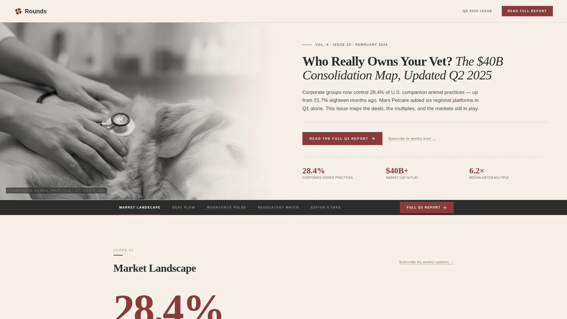
- A half-page hero with a broadsheet headline, newspaper-style dateline, and desaturated editorial photograph slot
- Five spoke sections, each opening with an oversized data callout and closing with a full-width sandstone pull quote
- Two conversion touchpoints: a primary call-to-action band after the third spoke and a secondary subscription text link in the footer and beside each spoke heading
Feature list
This section describes the core built-in capabilities of the Rounds landing page template.
Half-Page Editorial Hero
The hero splits into two equal halves. The left side holds a desaturated, high-grain photograph with shallow depth of field. The right side carries a large serif headline, a one-sentence deck, and a newspaper-style dateline. The composition sets the broadsheet tone immediately.
Sticky Anchor Navigation Bar
A five-item anchor navigation bar pins below the hero as the reader scrolls. It labels the five spoke sections: Market Landscape, Deal Flow, Workforce Pulse, Regulatory Watch, and Editor's Take. The active section receives an oxblood highlight so readers always know where they are.
Data Callout Blocks
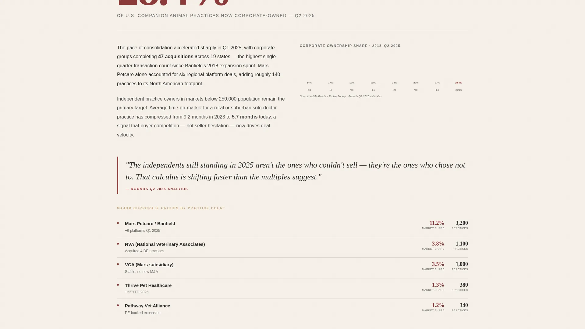
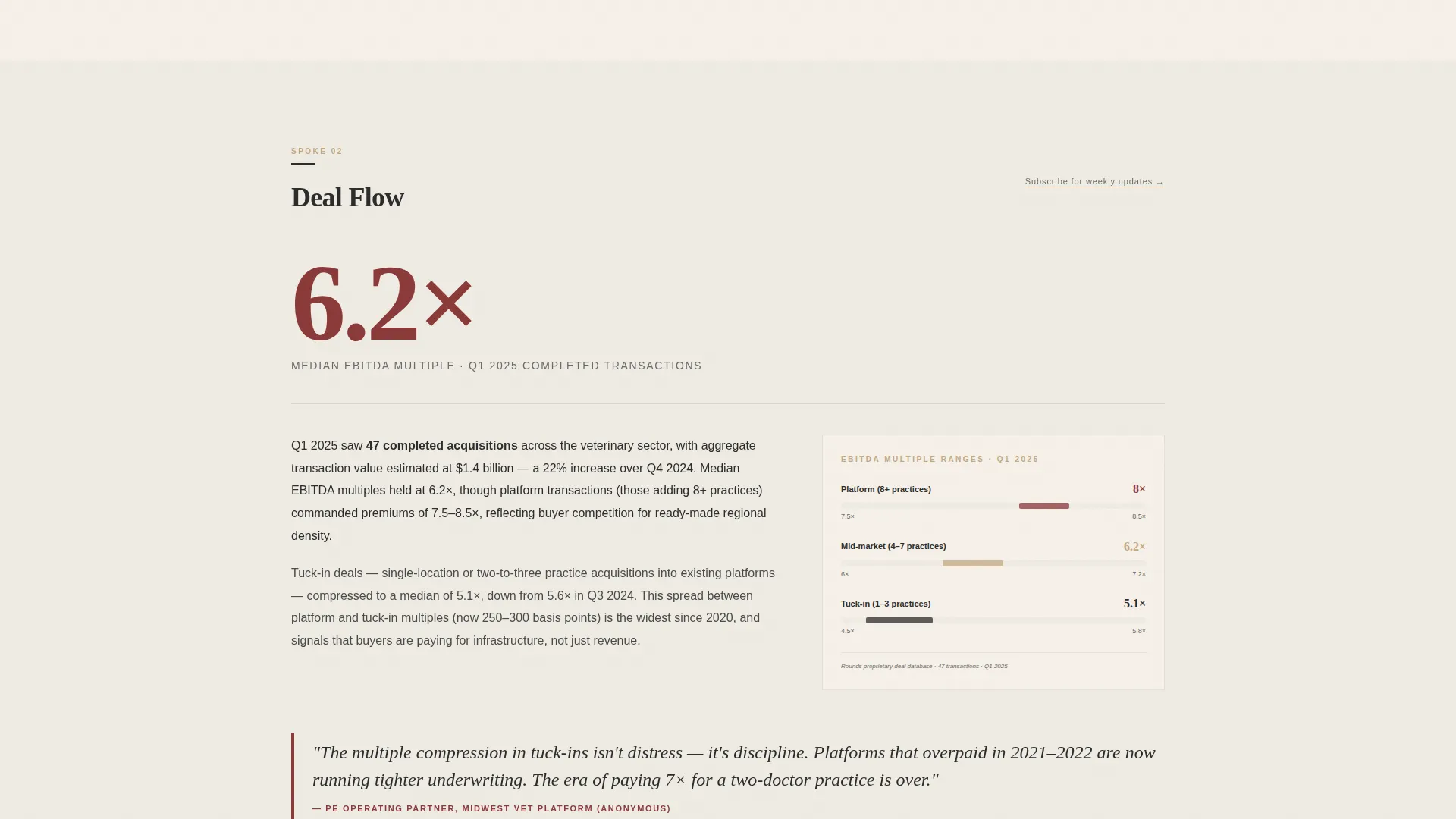
Each spoke section opens with a single oversized figure rendered in oxblood. This could be a percentage, a dollar figure, or a headcount. The number anchors the analysis that follows and signals immediately that the content is quantitative, not speculative.
Full-Width Pull Quote Bands
After each dense data paragraph, a full-width sandstone-toned pull quote band provides visual breathing room. The contrast between tight analytical text and spacious pull quotes creates the scroll rhythm the template is designed around.
Dual Conversion Touchpoints
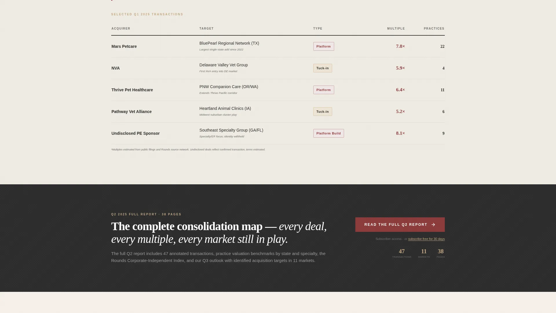
The primary call-to-action, "Read the Full Q2 Report," appears inside the sticky navigation and again as a full-width band after the third spoke section. A secondary "Subscribe to the Weekly Brief" text link sits in the footer and beside each spoke heading. No form is required on this page.
Inline Annotated Charts
Charts in this template are flat, two-color, and annotated directly on the visual rather than below it in a caption. This keeps the reader's eye inside the data and avoids the disconnected feeling that traditional captioned charts create in analytical editorial layouts.
Page sections overview
| Section | Purpose |
|---|---|
| Half-Page Hero | Sets editorial tone with photograph and broadsheet headline |
| Sticky Anchor Nav | Pins five spoke labels and primary call-to-action to viewport |
| Market Landscape | Opens with macro consolidation data callout and analysis |
| Deal Flow | Presents transaction data, EBITDA multiples, and named deal context |
| Workforce Pulse | Covers staffing economics and compensation data |
| Call-to-Action Band | Full-width conversion prompt placed after the third spoke |
| Regulatory Watch | Surfaces reimbursement shifts and policy signals |
| Editor's Take | Synthesizes the report and closes with final conversion prompt |
| Footer | Minimal horizontal flow with secondary subscription text link |
Design & branding system
The visual identity follows an Ink and Paper editorial theme built on a Warm Stone color system. Every color decision references printed matter: the warmth of parchment, the weight of charcoal ink, the earthiness of sandstone, and the authority of oxblood. Typography pairs Fraunces serif for headlines with DM Sans for body text and labels.
- Background alternates between parchment cream (#F5F0E8) and linen white (#EEEBE3); body text sits in editorial charcoal (#2C2C2C) with generous line height
- Sandstone tan (#C4A882) is used for pull-quote bands and supporting accents, while oxblood (#8B3A3A) is reserved for anchor navigation highlights, data callout figures, and pull-quote borders
- Fraunces handles all display headlines and section openers; DM Sans handles navigation labels, body copy, and data annotations
Mobile & speed optimization
The template is desktop-first by design. Practice owners and consultants are expected to read at a desk, so the layout prioritizes wide-viewport richness. The template still adapts for smaller screens without breaking the editorial hierarchy.
- Server Components handle all static content blocks, keeping JavaScript minimal and load behavior predictable
- Scroll-reveal animations and sticky navigation behavior are implemented with medium animation weight, keeping motion purposeful rather than decorative
- The sticky anchor navigation reflows cleanly on narrower viewports so spoke links remain accessible on tablets
How this template helps you convert
The conversion strategy is built around editorial trust, not persuasion mechanics. The page earns the click by demonstrating the value of the full report before asking for it.
- Front-loaded data in each spoke section proves the report contains real, actionable intelligence, so the "Read the Full Q2 Report" click feels like a logical next step rather than a gamble.
- The full-width call-to-action band appears after the third spoke, precisely when reader engagement peaks, and the sticky navigation keeps the primary call-to-action visible at every scroll depth.
- The secondary subscription path, placed beside each spoke heading and in the footer, catches organically arriving readers who want future issues without committing to the gated report immediately.
Other information about this template
This template is purpose-built for the veterinary industry report niche and is not a general-purpose blog layout. A few additional details worth knowing before you adapt it:
- The page references a hub-and-spoke architecture: the landing page is the hub and each spoke section is a self-contained analytical unit with its own data callout, analysis block, and pull quote
- The gated report destination (PDF download or subscriber login) is external to this template; the template handles only the click-through path, not the gated asset delivery
- The footer uses a horizontal flow pattern with minimal elements, keeping visual weight at the bottom low and directing attention back to the call-to-action band above it
- This template suits any B2B industry newsletter or intelligence report vertical where the editorial brand, not a product feature list, is the primary conversion driver
- The Ink and Paper theme and Warm Stone palette were selected specifically to signal authority and unhurried depth, qualities that matter to the veterinary practice owner and consultant audience this template targets
Theme
Ink & Paper
Creative direction
Industry Report
Color system
Warm Stone
Style
Hub & Spoke (Anchor Nav)
Direction
Click-Through
Page Sections
Half-page Broadsheet Hero
Sticky Five-spoke Anchor Nav
Oversized Data Callout Blocks
Full-width Pull Quote Bands
Dual Conversion Touchpoints
Inline Annotated Flat Charts
Related questions
Does this template include the gated report or PDF download?
Can I rename the five spoke navigation sections?
Is there a lead capture form on this landing page?
Can this template support an industry report outside veterinary medicine?
What conversion paths does this landing page support?



