Veterinary Thought Leadership Editorial Landing Page
Rounds is a veterinary thought leadership landing page built for editorial publishing. It curates practicing clinicians through a descending gallery of contributor spotlights, pairing portrait photography, pull quotes, and editorial introductions. A persistent email subscription path and open archive invite readers to subscribe through quality alone. The design draws from Japanese Zen aesthetics with ink-weight typography and generous negative space.
by Rocket studio
Quick summary
Rounds is a single-page editorial landing page for a veterinary thought leadership blog. It presents a curated gallery of contributing clinicians, each introduced through portrait photography, a pull quote, and a short editorial biography. The page earns subscriber trust by opening the full archive freely and letting the writing prove its value before asking for an email address.
Who this template is for
This template suits anyone building a serious veterinary editorial platform. It is designed specifically for the kind of clinical voices that rarely get a proper publishing home.
- Practicing veterinarians who want to publish case dissections and protocol thinking for peer audiences
- Veterinary educators and researchers looking to reach associate vets and nurses who are hungry for mentorship-quality reading
- Editorial teams managing a veterinary blog or media outlet that prioritizes depth over volume
What problem this template solves
Most veterinary content online is either too clinical to read comfortably or too simplified to be useful. Associate vets a few years into practice often find themselves between textbooks and lived experience, with no clear community to learn from. This template creates a publishing home that respects that gap.
- It replaces the generic blog grid with a curated, contributor-led reading experience that signals quality immediately
- It removes the friction of gated content and pop-ups, letting the writing itself do the converting
- It gives each contributor real editorial presence, so readers follow minds rather than just clicking individual articles
What you get with this template
You get a complete, single-page editorial landing page built for a veterinary thought leadership blog. Every section is ready to populate with real contributor content and real clinical writing.
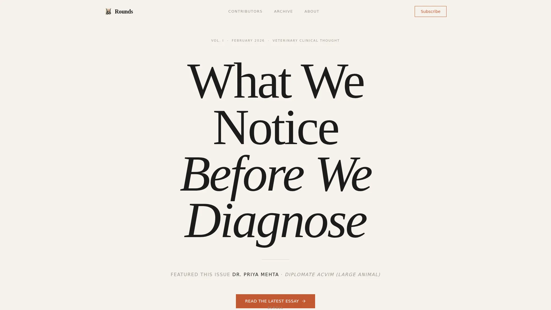
- A monumental hero section with a giant centered serif headline and a single-line contributor credential subhead
- A descending gallery of contributor spotlight sections, each with a portrait photograph, pull quote, and two-sentence editorial introduction
- A minimal email subscription section using the prompt "Get one essay, every Thursday" alongside an open full-archive link
Feature list
This template is organized around a small number of high-impact layout decisions. Each feature below reflects a deliberate editorial choice present in the source brief.
Giant Centered Hero Headline
The hero section uses an enormous editorial serif typeface set in sumi ink against a washi paper white background. The headline sits in monumental isolation, like a title page in a hand-bound volume, and a single-line subhead in dry stone gray names the featured author and their credential. Nothing else competes for attention.
Descending Contributor Spotlight Gallery
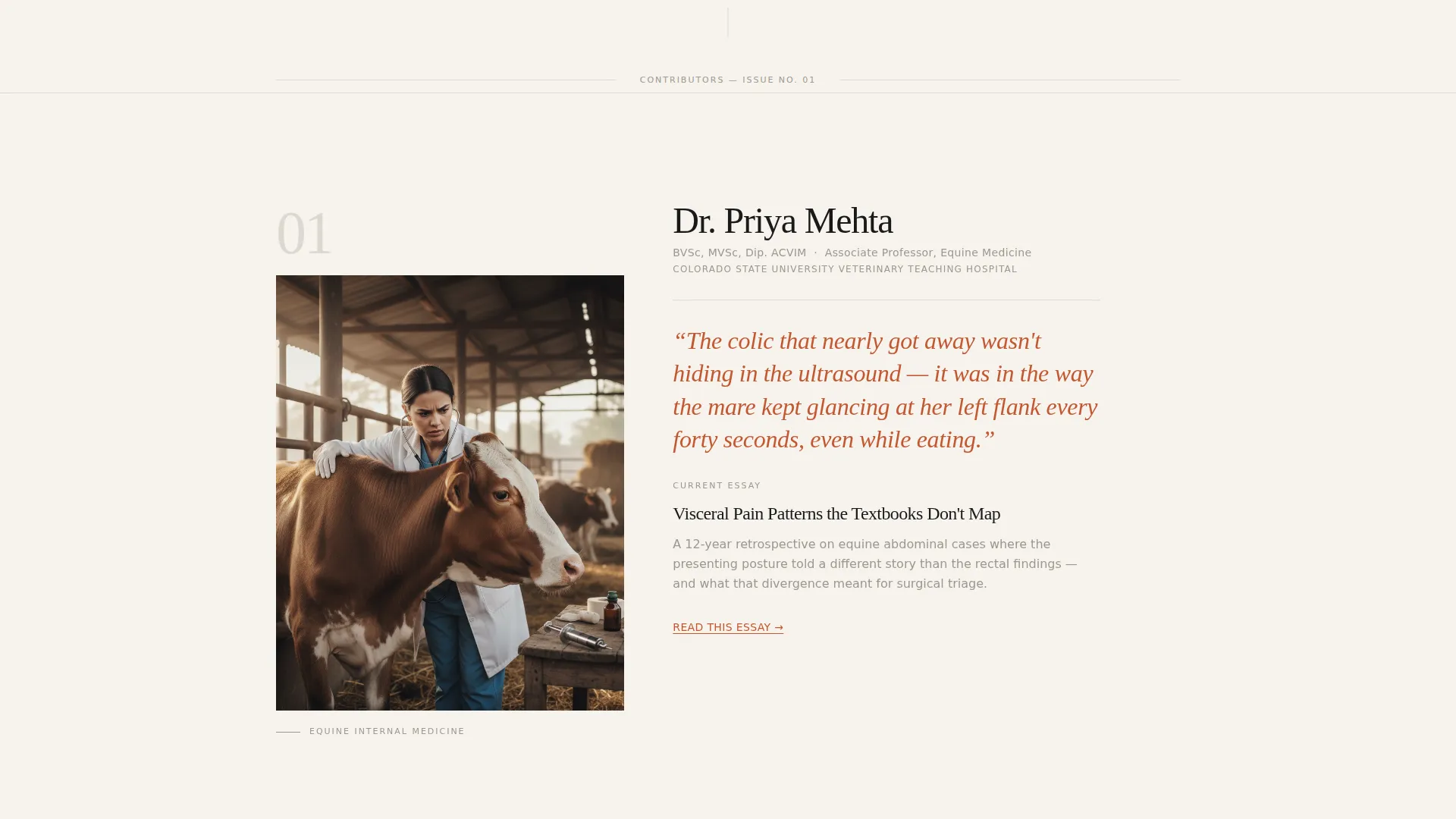
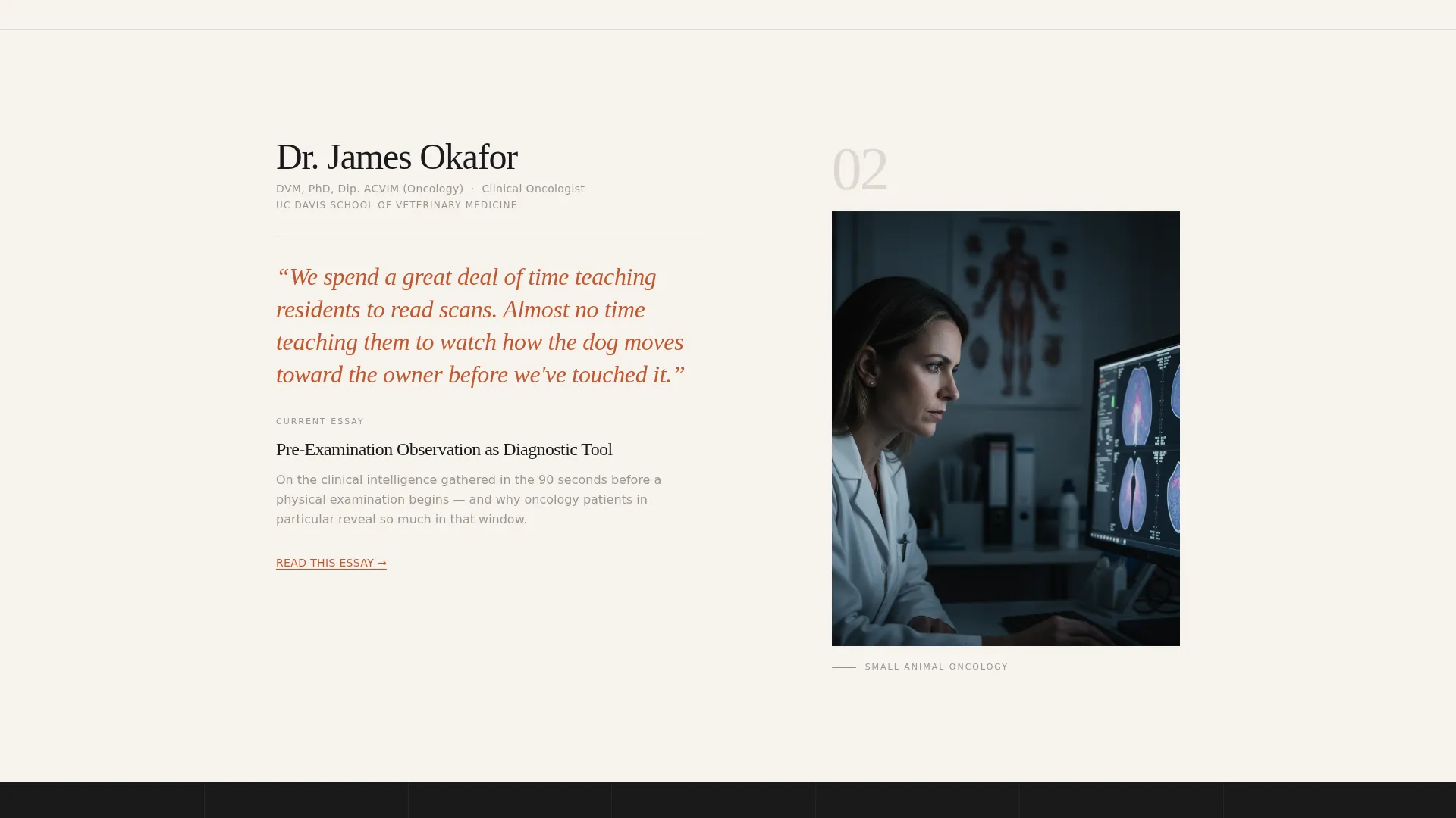
The page's primary structure is a vertical gallery of contributor profiles. Each spotlight opens with an environment portrait photograph of a veterinarian, followed by a pull quote from their latest essay and a two-sentence editorial introduction. The typographic rhythm stays constant while the voice, setting, and species change with each contributor.
Persistent "Read the Latest Essay" Call to Action
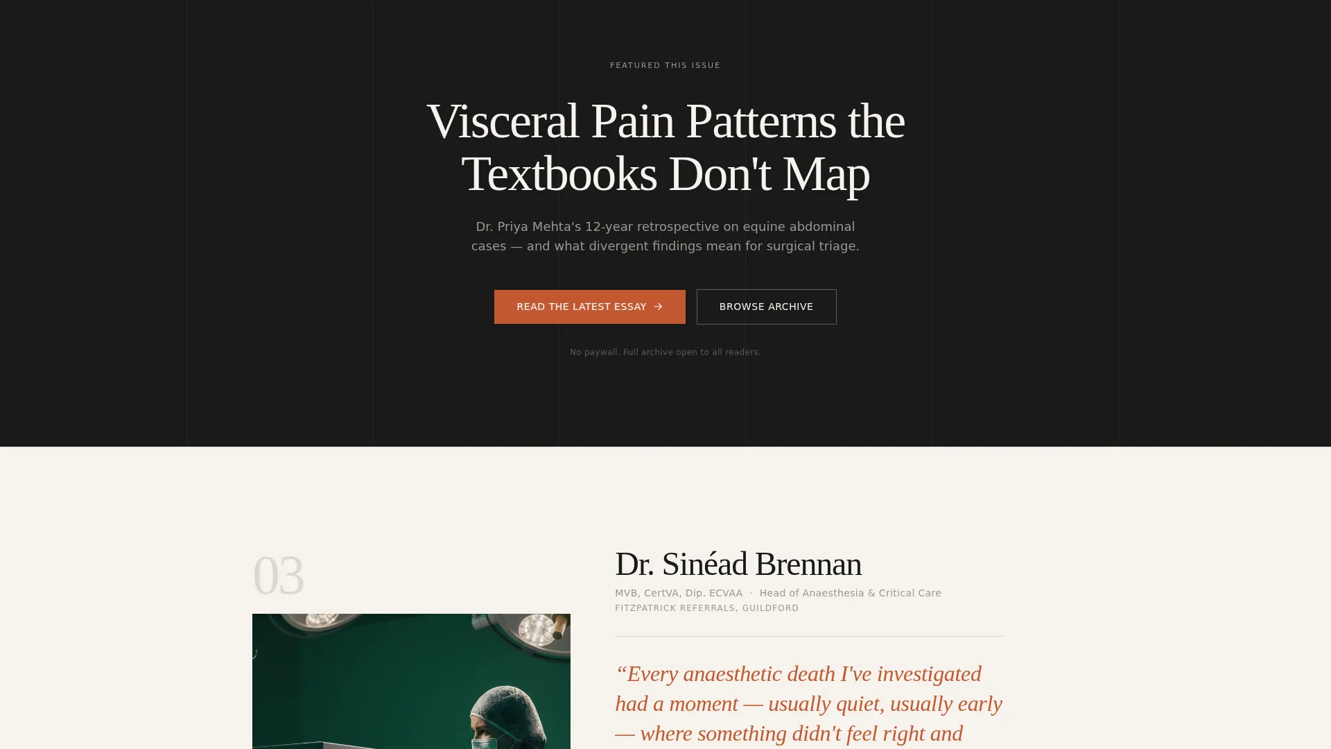
The primary call to action appears after the first contributor spotlight and repeats after every third contributor. It uses the persimmon accent color to draw the eye without competing with the editorial tone of the surrounding content.
Minimal Email Subscription Section
A clean, low-pressure subscription section sits near the footer. It presents a single email field and the prompt "Get one essay, every Thursday." The subscribe button uses the persimmon accent. There are no pop-ups and no content gates.
Scroll-Triggered Animation System
The template includes medium-intensity scroll-triggered fade and blur reveals for content sections. Portrait images use subtle parallax scrolling, and contributor sections have hover image reveal states. These animations are driven by the Intersection Observer application programming interface (API) and native CSS scroll behavior.
Open Archive Structure
The full content archive is openly accessible. No registration is required to read. The subscription offer earns the click by demonstrating quality first, which aligns with the editorial philosophy of the platform.
Page sections overview
| Section | Purpose |
|---|---|
| Hero Headline | Monumental centered headline with featured author subhead |
| Contributor Spotlight 1 | Equine surgeon portrait, pull quote, editorial intro |
| Contributor Spotlight 2 | Small animal internal medicine portrait and pull quote |
| Primary call to action Break | "Read the Latest Essay" persimmon call to action |
| Contributor Spotlight 3 | Veterinary researcher portrait and pull quote |
| Email Subscribe | "Get one essay, every Thursday" minimal field |
| Footer | Horizontal layout with archive and navigation links |
Design & branding system
The visual identity follows an Atelier Studio direction interpreted through a Japanese Zen color system. Every design decision prioritizes negative space and typographic weight over decorative elements.
- Color palette: washi paper white (#F7F3ED) as the background, sumi ink (#1A1A1A) for primary type, dry stone gray (#9B978F) for supporting text, and persimmon (#C35831) reserved exclusively for links, pull quotes, and the primary call to action
- Typography: Fraunces is used for all editorial serif display type; DM Sans handles body copy and interface elements
- Negative space and ink-weight type carry the visual load, giving the page the feeling of a calligraphy brush resting on unglazed ceramic
Mobile & speed optimization
The template is built desktop-first with an elegant mobile adaptation. The editorial reading experience is preserved across screen sizes without sacrificing the spatial quality of the layout.
- Portrait gallery sections reflow cleanly for smaller screens while maintaining the typographic hierarchy
- Server Components handle static content delivery, and CSS scroll-behavior native is used for scroll-linked animations without heavy JavaScript dependencies
How this template helps you convert
The conversion strategy in this template is built on demonstrated quality rather than persuasion pressure. Readers are moved toward subscribing and reading because the page earns their trust before asking for anything.
- The open archive removes the hesitation that gated content creates. Readers can explore freely, which builds genuine confidence in the platform before the subscription ask appears.
- The repeating "Read the Latest Essay" call to action appears at natural scroll intervals, so it reaches readers at the moment their interest is highest, without feeling intrusive.
- The minimal email subscription section closes the page with a low-friction offer. One essay per week, no gates, no pop-ups. The persimmon button color creates a clear visual anchor without breaking the editorial calm of the surrounding design.
Other information about this template
This template is categorized under Blog and Editorial, with a specific niche alignment to veterinary thought leadership publishing. It is well suited for teams building a veterinary blog and media presence that needs to attract both practitioner contributors and a returning reader base.
- The template style is Editorial and Magazine, appropriate for content platforms where depth of voice matters as much as frequency of publication
- The Atelier Studio theme and Japanese Zen color system give the page a distinctive visual identity that stands apart from typical veterinary practice websites
- The Creator Spotlight creative direction means the page curates minds, not articles. Each contributor section is designed to make a reader want to explore everything that person has written
- The page uses a Content and Resource landing page direction, meaning the goal is to move visitors into the reading experience and then into a low-pressure subscription relationship
Theme
Atelier Studio
Creative direction
Creator Spotlight
Color system
Japanese Zen
Style
Editorial/Magazine
Direction
Content/Resource
Page Sections
Giant Centered Editorial Hero
Descending Contributor Gallery
Repeating Primary Call to Action
Minimal Email Subscribe Section
Scroll-triggered Animation System
Related questions
Who is the target reader for a page built on this template?
Is the content archive gated or locked behind a subscription?
How many contributor spotlights does the template include?
Can this template work for a single author instead of multiple contributors?
What makes the call to action placement effective in this layout?



