Editorial Healthcare Podcast Landing Page Template
Rounds is a horizontal-scroll editorial landing page built for a healthcare podcast and media studio. It presents upcoming episodes as magazine spreads, drawing in attending physicians, nurse practitioners, and health policy readers through immersive narrative teasers. Visitors swipe through the collection and arrive at a clean waitlist form, converting editorial curiosity into genuine signups before the show launches.
by Rocket studio
Quick summary
Rounds is a single-page, horizontal-scroll landing page template designed for a medical podcast and media studio. It blends the weight of a print editorial journal with a modern waitlist conversion flow. Visitors move through episode teasers like pages of a curated collection, arriving at a stark signup panel only after they've built real appetite for the content.
Who this template is for
This template is built for healthcare media creators who take their audience seriously. It suits independent podcast studios, clinical content teams, and editorial producers targeting an audience of busy clinicians and researchers.
- Podcast producers launching a medical or clinical audio series
- Healthcare editorial teams building pre-launch anticipation for a new show
- Health policy communicators who need a credible, narrative-first landing page
What problem this template solves
Most podcast landing pages look like generic app stores. For an audience of attending physicians and nurse practitioners, that visual shorthand signals low effort and earns immediate distrust. This template solves the credibility gap before it opens.
- Generic podcast pages fail to signal depth, authority, or editorial intent
- Waitlist forms presented too early collect low-quality signups from low-intent visitors
- Healthcare audiences demand specificity and earned trust before they hand over an email address
What you get with this template
You get a fully structured, single-page horizontal-scroll layout that guides visitors through episode content before asking for anything. Every section is purposeful and built around the brief.
- A cinematic full-viewport hero with oversized editorial serif type and a parchment and rust color treatment
- Five horizontal episode panels styled as magazine spreads, each with episode number, pull-quote, narrative teaser, and editorial photograph
- A final waitlist panel with an email field, specialty dropdown, and an early-transcript toggle
Feature list
Horizontal Scroll Episode Track
Five lateral panels create a magazine-spread browsing experience. Each panel presents a single upcoming episode with a large rust episode number, an italic serif pull-quote, a charcoal body teaser, and a full-bleed editorial photograph. Visitors swipe through the collection in sequence, building narrative investment with every panel.
Teal Reading-Progress Indicator
A thin teal progress bar runs along the top of the horizontal scroll track. It stretches with each swipe, mimicking the reading-progress indicator familiar from long-form editorial sites. The bar uses the muted surgical teal reserved exclusively for interactive and hover states, reinforcing the template's visual hierarchy.
Cinematic Type-Over-Image Hero
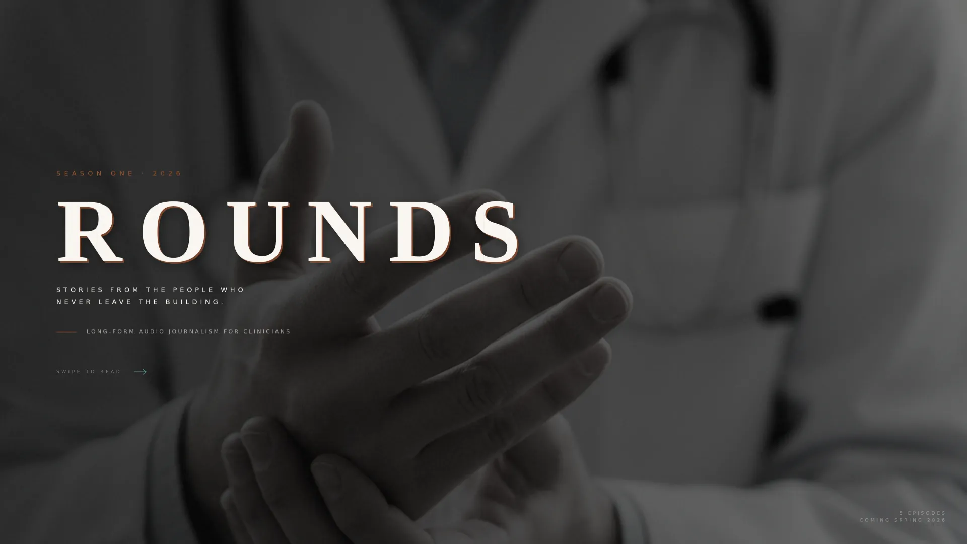
The header fills the full viewport with a desaturated, high-grain photograph. The title sits in an oversized, wide-tracked editorial serif, set in parchment white with a faint rust drop-shadow. A small-caps subtitle sits beneath it. The composition feels letterpress-embossed rather than digitally layered.
Waitlist Conversion Panel
The final horizontal panel breaks from the magazine aesthetic to focus entirely on capture. It uses a stark charcoal background with a single email field, a specialty dropdown covering Internal Medicine, Nursing, Policy, Student, and Other, and a toggle asking whether the visitor wants early transcripts. The contrast makes the form feel like a deliberate editorial decision, not an afterthought.
Word-Reveal and Image Grain Animations
Animated word-reveals introduce copy as panels come into view. A persistent grain overlay sits across editorial photographs, reinforcing the vintage-print aesthetic. Hover states shift images from grayscale to color, rewarding engagement without distracting from reading.
Desktop-First Responsive Layout
The template is built with a desktop-first horizontal scroll experience in mind, reflecting a physician commute context where tablet and laptop use is primary. The horizontal scroll degrades gracefully to a vertical stack on smaller screens, preserving all content without layout breakage.
Page sections overview
| Section | Purpose |
|---|---|
| Full-Viewport Hero | Establishes editorial identity and brand tone |
| Horizontal Scroll Track | Delivers five episode magazine-spread panels |
| Episode Teaser Panels | Builds narrative hunger before the conversion ask |
| Waitlist Signup Panel | Captures email, specialty, and transcript preference |
| Minimal Footer | Displays social icons and copyright, no clutter |
Design & branding system
The visual identity follows an Editorial Magazine theme. Every color and typeface choice references the feel of a vintage medical textbook left open at dawn, warm and authoritative without feeling clinical or sterile.
- Color system: parchment (#F5F0E8) dominates all backgrounds, rust (#A0522D) marks headlines and pull-quotes, charcoal (#3B3B3B) carries body text, and muted surgical teal (#5F8F8B) appears only on hover states and the progress indicator
- Typography: Cormorant Garamond is used for headlines and pull-quotes; DM Sans handles body copy and interface labels
Mobile & speed optimization
The template is designed with a desktop-first philosophy, matching the primary use context of tablet and laptop commute listening. On smaller screens, the layout adapts without losing structural integrity.
- Horizontal scroll degrades to a vertical panel stack on mobile viewports
- Client Components handle scroll track and form interactivity; the page shell uses a Server Component structure for efficient initial load
How this template helps you convert
The conversion strategy is built into the editorial format itself. Scarcity and hunger are created structurally before any form ever appears.
- Visitors read through episode teasers in sequence, each one escalating in emotional weight, so by the final panel they have genuine motivation to sign up rather than passive curiosity.
- The specialty dropdown and transcript toggle in the waitlist form signal that the studio treats subscribers as professionals, reinforcing the editorial credibility built across the scroll.
Other information about this template
This template sits within the Blog and Editorial category, specifically aligned with the Healthcare Podcast and Media niche. It is suited to creators building a pre-launch presence in the clinical and health policy content space.
- Template style: Horizontal Scroll with JS wheel hijacking and IntersectionObserver-driven reveals
- Creative direction: Curated Collection, presenting episode content as a browsable editorial archive
- Landing page direction: Waitlist and coming-soon conversion, not an active storefront or episode directory
- Header concept: Type Over Image, with a physician's hands photograph as the cinematic anchor
- Animation level is high, including teal progress bar, word-reveal transitions, grain overlay, and hover grayscale-to-color effects


Theme
Editorial Magazine
Creative direction
Curated Collection
Color system
Parchment & Rust
Style
Horizontal Scroll
Direction
Waitlist/Coming Soon
Page Sections
Horizontal Scroll Episode Track
Teal Reading-progress Bar
Cinematic Type-over-image Hero
Waitlist Conversion Panel
Word-reveal and Grain Animations
Desktop-first Responsive Layout
Related questions
Is this template designed for an active podcast or a pre-launch waitlist?
Can I update the episode panels to match my actual show lineup?
What audience is this landing page designed for?
Does the waitlist form include a specialty dropdown?
What happens to the layout on mobile devices?



