Veterinary News Blog Landing Page Template
Rounds is a single-column editorial landing page built for veterinary news platforms. It opens with a broadsheet masthead, stacks clinical headlines above the fold, and flows through story cards, a long-read feature with embedded data, and a credentialed editorial board. Two email gates capture subscriber leads with minimal friction.
by Rocket studio
Quick summary
Rounds is a lead-generation landing page designed for a veterinary clinical newsroom. It combines a broadsheet newspaper aesthetic with a focused subscription funnel. Board-certified specialist bylines and peer-reviewed story framing build immediate credibility. The page guides readers from headline scanning to email sign-up without ever feeling like a marketing pitch.
Who this template is for
This template is built for veterinary media publishers, editorial teams, and clinical content platforms that need to convert professional readers into email subscribers. It suits organizations that produce peer-reviewed case studies, regulatory intelligence, and specialty clinical content for working veterinary professionals.
- Associate veterinarians in mixed-practice clinics looking for continuing education insights between appointments
- Veterinary nurses building clinical protocol references and practice owners tracking regulatory policy changes
- Editorial teams launching a veterinary news blog or professional subscription publication
What problem this template solves
Veterinary professionals distrust generic content platforms. They need a publication that feels authoritative enough to cite and specific enough to act on. A standard blog layout does not communicate that credibility quickly. Rounds solves this by opening like a trusted broadsheet, not a marketing funnel.
- Readers arrive skeptical and leave before a generic sign-up form ever appears
- Clinical content lacks visible authority signals like editorial boards and specialist bylines
- Subscription asks come too early, before the reader has seen genuine editorial value
What you get with this template
This template delivers a complete single-column landing page structured as a living editorial publication. Every section earns reader trust before asking for contact details. The layout paces disclosure of value the way a well-edited magazine controls reading rhythm.
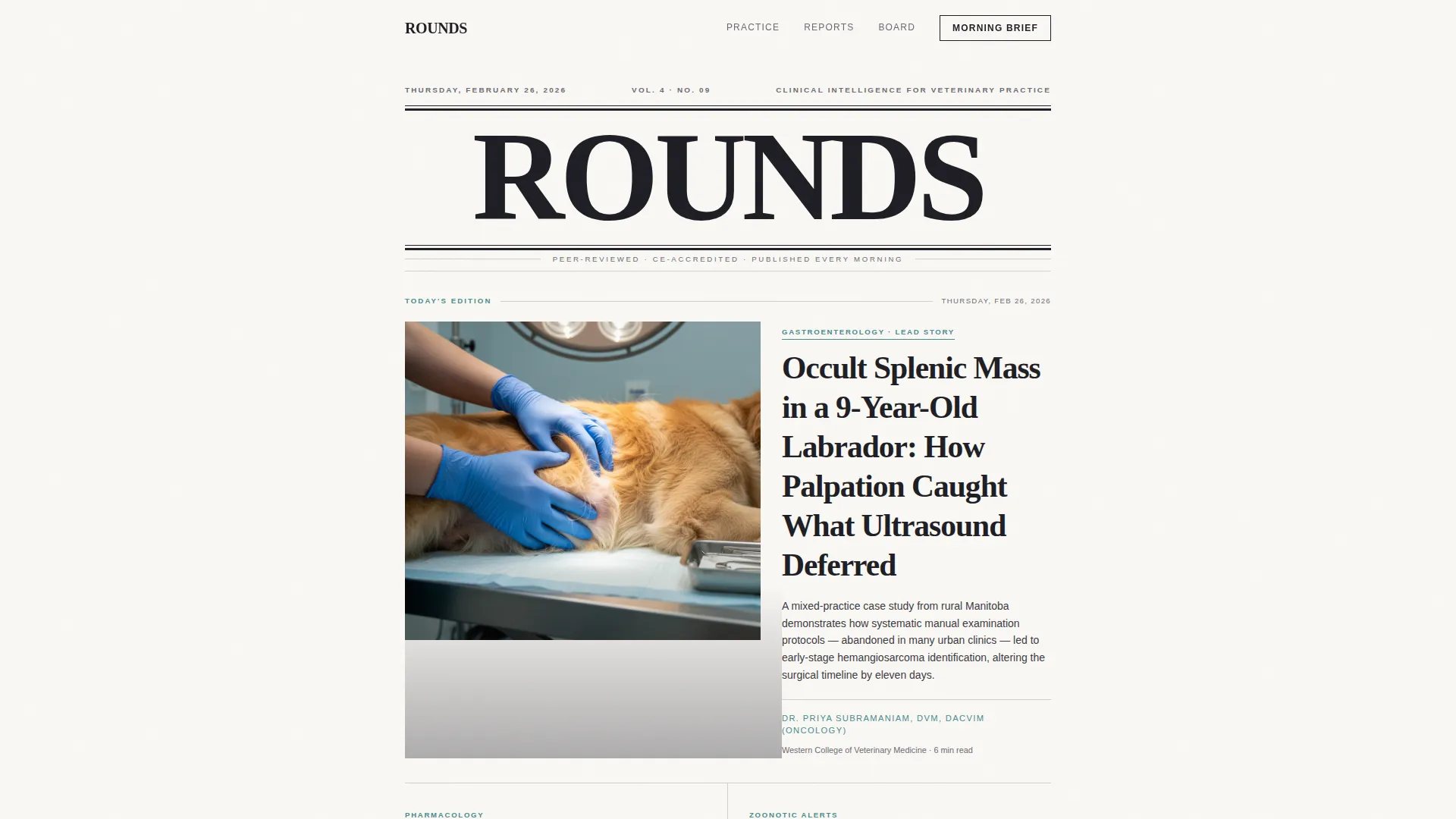
- A full broadsheet masthead section with a lead story, clinical photograph placement, and two secondary headlines in descending typographic hierarchy
- Three editorial story cards with category tags, an inline subscription tear-out strip, a long-read feature with drop cap and pull quote, and a credentialed editorial board section
- Two email capture forms with a role-selection dropdown, styled as print-inspired subscription elements
Feature list
This template is built around a set of deliberate editorial and conversion features drawn from the source brief.
Broadsheet Masthead Header
The header presents the publication name in a bold condensed serif at broadsheet scale. A thin rule sits beneath it, followed by an edition and volume dateline. This single block immediately signals an authoritative publication rather than a promotional page.
Above-the-Fold Story Stack
Three headlines are arranged in descending typographic hierarchy below the masthead. The lead story features a large clinical photograph placement. Two secondary stories sit alongside with thumbnail image areas and one-sentence decks, creating the visual logic of a newspaper front page.
Editorial Story Cards with Category Tags
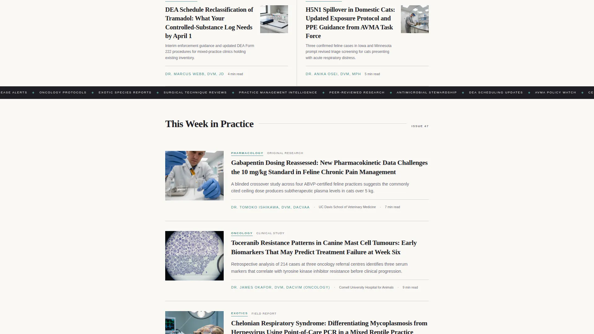
The "This Week in Practice" section presents three story cards tagged by specialty area: Pharmacology, Oncology, and Exotics. Each card establishes the editorial breadth of the publication and builds reader confidence before any subscription ask appears.
Long-Read Feature with Data Visualization
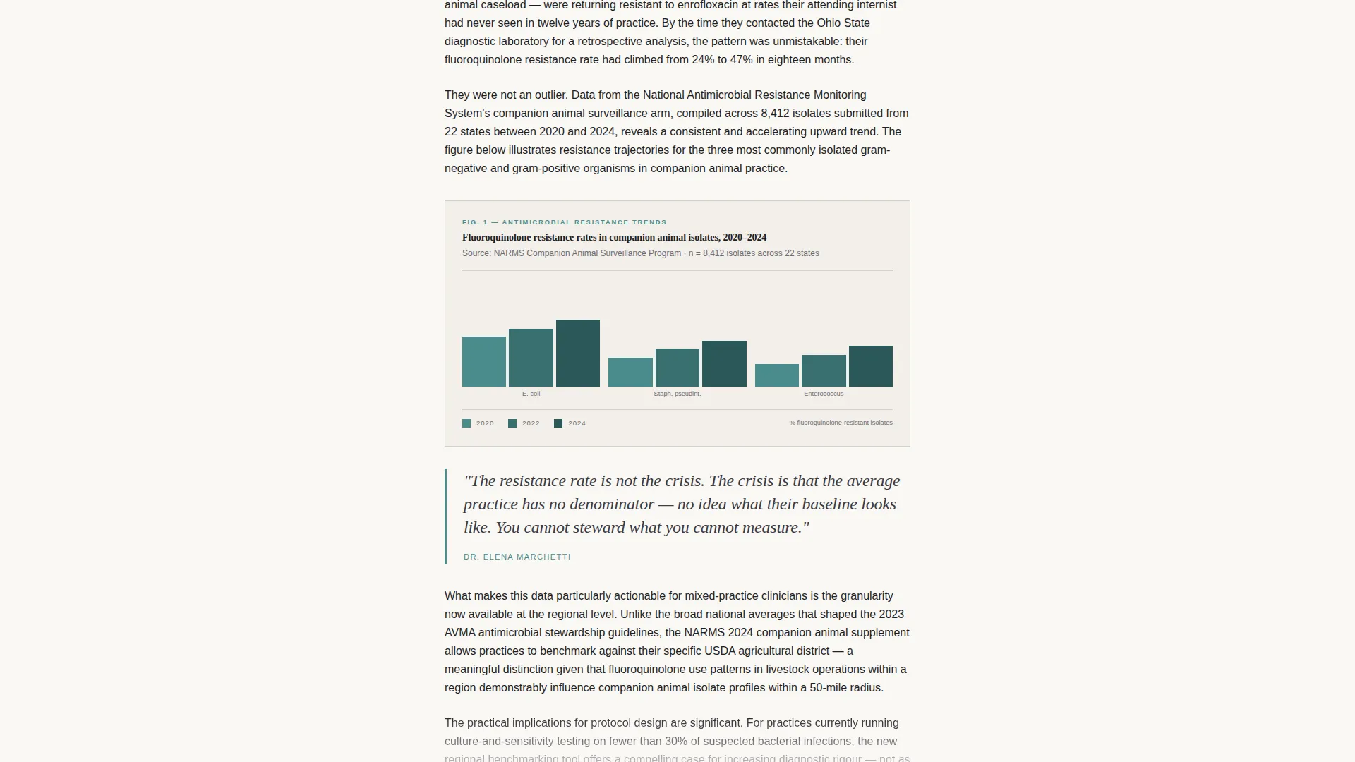
A single long-read excerpt uses drop cap typesetting and a pull quote to demonstrate the depth of content subscribers unlock. An embedded chart on antimicrobial resistance trends sits within the feature, showing data-driven editorial rigor.
Inline Subscription Tear-Out Strip
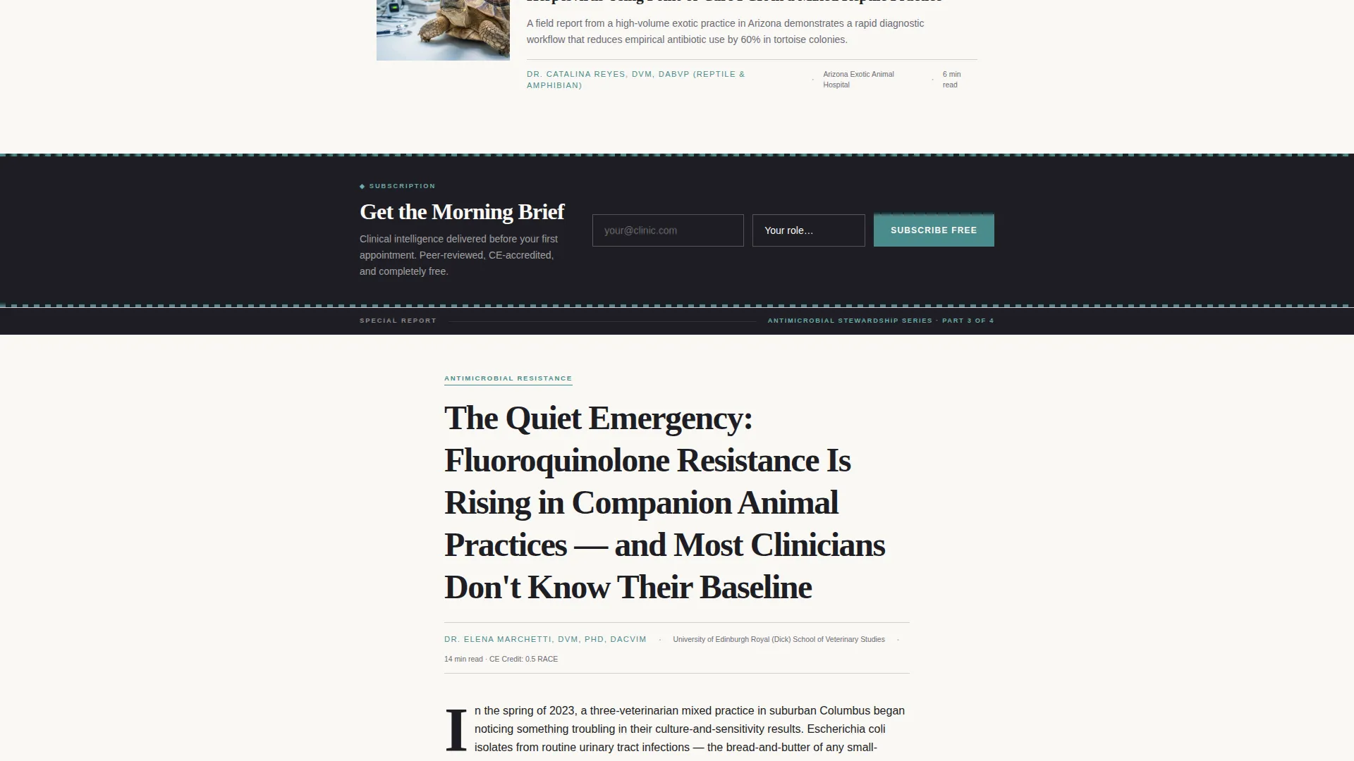
The primary call to action, "Get the Morning Brief," is styled as a print magazine subscription tear-out. It collects an email address and a single role-selection dropdown. This placement appears after the second story card, when reader trust is already established.
Credentialed Editorial Board Section
Circular portrait placements with credentials and specialty labels introduce the editorial board. This section provides institutional authority and signals that the content is shaped by named, board-certified specialists.
Page sections overview
| Section | Purpose |
|---|---|
| Masthead Hero Header | Establish publication identity and edition context |
| Above-the-Fold Stories | Stack lead story and two secondary headlines |
| This Week in Practice | Present three specialty story cards |
| Inline Subscription Strip | Capture email with role dropdown after story cards |
| Long-Read Feature | Deliver data-driven excerpt with drop cap and pull quote |
| Email Gate Call to Action | Offer full report access behind the same email form |
| Editorial Board | Display credentialed specialists for authority |
| Footer | Single-row linear footer with publication details |
Design & branding system
The visual identity follows an editorial magazine theme built on the Cloud Canvas color system. The palette is warm and authoritative, designed to feel like a respected journal left open on a clinical workstation. Typography pairs a display serif for headlines with a clean sans-serif for body text and interface elements.
- Colors: soft newsprint ivory (#FAF8F5) for backgrounds, column-rule gray (#D2CFC9) for dividers, deep editorial charcoal (#1E1E24) for body text, and muted clinical teal (#4A8C8C) reserved for bylines, pull-quote borders, and hover states
- Typography: Fraunces serves as the display serif for all headlines and masthead elements; DM Sans handles body copy and interface labels for clean readability at clinical scanning speeds
- Visual details include airy white space between sections and dense, elegant typesetting within them, mimicking the pacing rhythm of a professionally edited print magazine
Mobile & speed optimization
The template is designed desktop-first to serve readers on clinic workstations. Full mobile support is included so the same editorial experience carries across devices. Scroll-driven animations and interactive components are handled selectively to keep the page responsive.
- Scroll reveal animations, a shrinking navigation bar, staggered story card entrances, and a marquee element are built in at medium animation intensity
- Static editorial content uses server components to keep initial load lean; scroll animations and interactive form elements use client components
- Story card hover states and form interactions are designed to feel immediate and polished without heavy scripting overhead
How this template helps you convert
Rounds earns subscriber trust before asking for contact details. The conversion architecture follows a deliberate editorial sequence that mirrors how readers naturally engage with a high-quality publication.
- The masthead and above-the-fold story stack give the reader genuine editorial value immediately, so the page feels like a real publication rather than a lead capture form dressed as content.
- The inline subscription tear-out appears only after two story cards have been read, when the reader has already invested time and recognized the content quality, making the "Get the Morning Brief" ask feel natural.
- The email gate on the long-read feature offers the full antimicrobial resistance report as a continuation of a conversation already started, not as a barrier to entry.
Other information about this template
This template sits within the Blog and Editorial category, specifically the Veterinary Blog and Media subcategory. It is purpose-built for the veterinary news blog niche and carries a strong intersection match for teams building subscription-driven clinical media.
- The template uses a single-column flow layout optimized for focused, distraction-free reading on desktop and mobile
- The design intersection aligns the Industry Report creative direction with a Newspaper and Publication header concept and a Lead Generation funnel structure
- US regulatory context is woven into the editorial framing, with content placeholder signals referencing DEA scheduling and AVMA policy coverage
- The footer follows a linear single-row pattern to keep the close of the page clean and publication-appropriate
Theme
Editorial Magazine
Creative direction
Industry Report
Color system
Cloud Canvas
Style
Single Column Flow
Direction
Lead Generation
Page Sections
Broadsheet Masthead with Dateline
Above-the-fold Story Stack
Specialty Story Cards with Tags
Long-read Feature with Data Chart
Print-styled Subscription Tear-out
Credentialed Editorial Board Display
Related questions
Can I customize the story card category tags?
How does the email gate work for the long-read feature?
Is the editorial board section easy to update?
Does the masthead support a real dateline and volume number?
Who is this template best suited for?



