Review & Comparison Site Blog Website Template
Savor is an editorial restaurant landing page template built for food publications that take their writing as seriously as their subjects. It uses a horizontal scroll layout structured as chapters, a warm parchment-and-charcoal visual system, and a click-through architecture that delivers origin stories while holding back the verdict to earn the reader's next tap.
by Rocket studio
Quick summary
Savor is a single-page editorial template for restaurant and food review publications. It opens with pure serif typography, no photography, then unfolds laterally through horizontal scroll chapters. Each chapter traces a restaurant's origin story forward to its defining dish. The design feels like a linen-bound food memoir, unhurried and literate from the first panel to the last.
Who this template is for
This template suits editorial food publications that lead with voice and story rather than star ratings. It is designed for writers and editors who want their digital presence to feel as considered as their prose.
- Food critics and independent reviewers publishing long-form restaurant criticism
- Editorial teams running digital food journals, dining digests, or neighborhood food guides
- Content-led subscription publications looking to convert casual readers into weekly subscribers
What problem this template solves
Most restaurant review pages look like listing directories. They prioritize thumbnails and scores over narrative. Savor solves the gap between editorial ambition and digital presentation.
- Standard templates flatten food writing into grids that strip away voice and pacing
- Readers with serious dining intent need a layout that matches the depth of the content
- Publications that rely on subscriber growth need a click-through structure that rewards curiosity without giving everything away upfront
What you get with this template
You get a fully structured horizontal scroll landing page designed around editorial storytelling. Every section serves a specific role in moving the reader from curiosity to click.
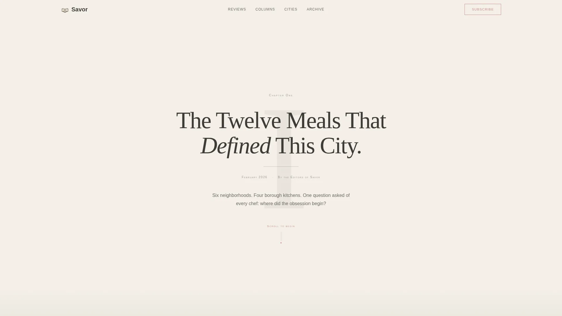
- A chapter-opening hero section built from typography alone, no photography, pure editorial restraint
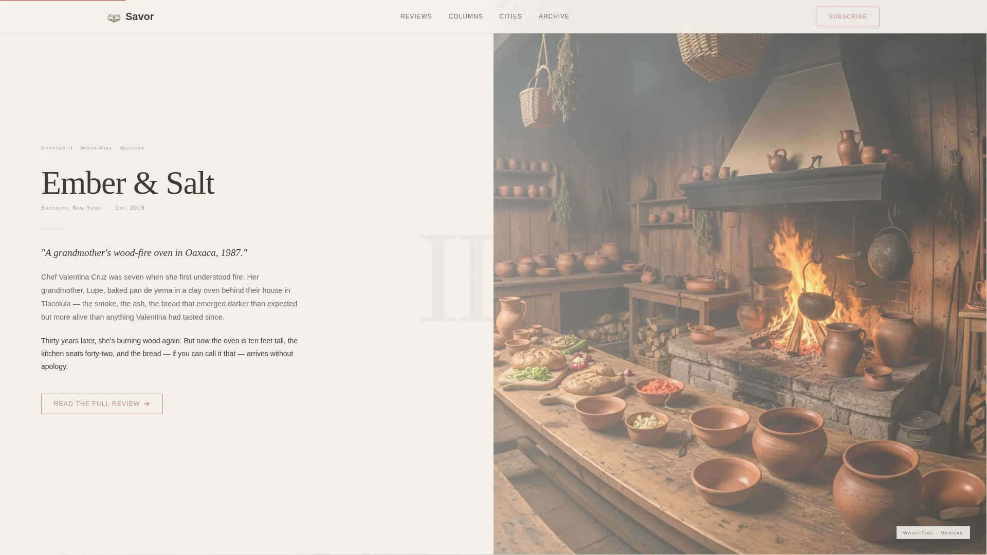
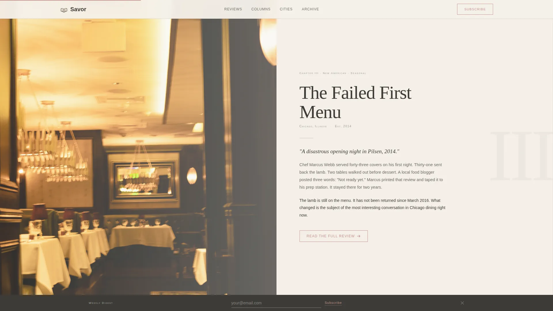
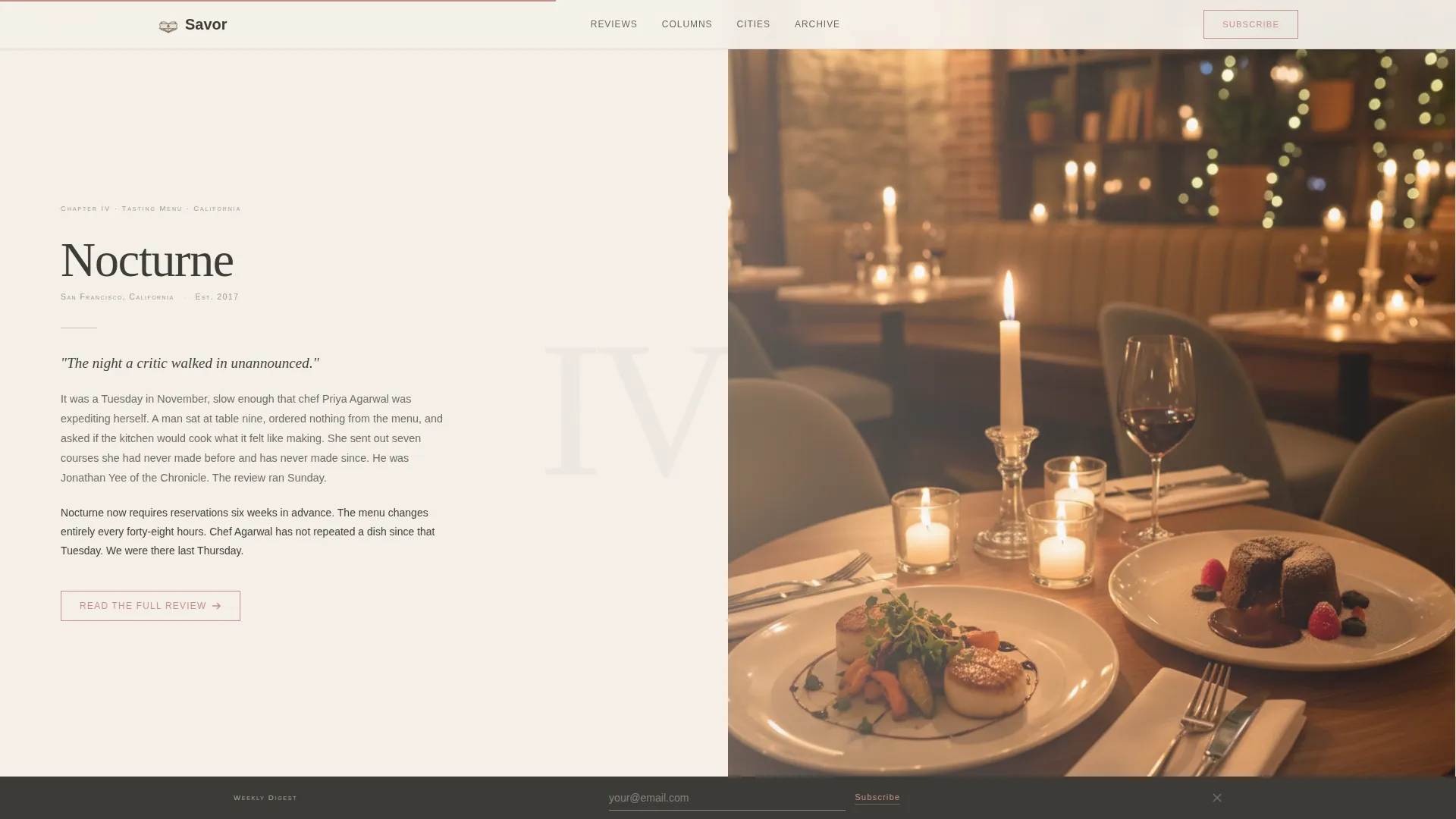
- Four horizontal scroll chapter panels tracing individual restaurant origin stories, each ending with a call-to-action button
- A persistent bottom subscription bar with an email field for weekly digest sign-ups
Feature list
This template ships as a complete editorial landing page with each section purposefully designed. Every visual and structural decision comes from the source brief.
Chapter-Opening Hero Section
The hero presents a tall serif numeral "I" centered on a warm parchment background. Below it sits a single display-type editorial headline, a thin charcoal rule, and a dateline with byline in small caps. There is no photography. The restraint is intentional and functions as the hook.
Horizontal Scroll Chapter Layout
Four restaurant origin story panels scroll laterally, simulating the experience of turning pages in a physical book. Photographs grow larger and more vivid as each story reaches its climax, then retreat to quiet typography before the next chapter begins. CSS scroll-snap keeps transitions precise and smooth.
Pull Quote and Voice Section
A dedicated section showcases editorial pull quotes using the dried-rose accent color. This section establishes the publication's critical voice and adds credibility before the reader reaches the review grid.
Featured Reviews Bento Grid
An asymmetric photography grid presents featured restaurant reviews. Images shift in scale and prominence to reflect the editorial hierarchy of each story, moving from intimate detail to full vivid spread.
Persistent Subscribe Bar
A fixed bottom bar carries a secondary call to action throughout the scroll experience. It includes a single email input field and a prompt to subscribe to the weekly digest, visible at all times without interrupting the reading flow.
GSAP-Powered Animation System
The template uses GSAP stagger reveals, parallax movement, and cursor tracking across all chapter panels. IntersectionObserver triggers section reveals as the reader scrolls, keeping the pacing cinematic and deliberate.
Page sections overview
| Section | Purpose |
|---|---|
| Chapter Hero | Opens with pure serif typography, editorial headline, dateline, and byline |
| Horizontal Scroll Chapters | Four lateral origin story panels, each ending with a review call to action |
| Pull Quote Block | Displays editorial voice with dried-rose accent for credibility |
| Featured Reviews Bento | Asymmetric grid of restaurant photographs with editorial hierarchy |
| Subscribe Call to Action | Dedicated section with email field for weekly digest sign-ups |
| Persistent Bottom Bar | Fixed subscribe prompt visible throughout the entire scroll journey |
| Footer | Horizontal flow pattern carrying publication identity and navigation |
Design & branding system
The visual identity follows an Editorial Magazine theme using the Soft Mist color system. Every palette choice is deliberate and restrained, evoking a Sunday broadsheet on a marble café counter.
- Warm parchment (#F5F0E8) fills every panel background; muted charcoal (#3B3A36) carries all body text in a tall serif; pale sage (#C6CEBB) separates chapters like a pressed herb between pages
- Dried-rose (#C4908A) appears only in pull quotes and interactive cues such as the "Read the Full Review" button, reserving its warmth for moments that ask the reader to act
- Typography pairs Fraunces as the display serif for headlines and numerals with DM Sans for body text and interface elements, keeping editorial hierarchy clean and readable
Mobile & speed optimization
The horizontal scroll experience is designed desktop-first, with a graceful vertical fallback for mobile readers. Performance choices are built into the scrolling and reveal architecture.
- CSS scroll-snap governs horizontal chapter transitions, keeping movement precise without relying on heavy JavaScript overrides
- IntersectionObserver drives section reveals, so animations trigger only when content enters the viewport rather than on page load
- The mobile fallback converts horizontal chapter panels into a vertical reading flow, preserving the narrative structure for smaller screens
How this template helps you convert
The entire page architecture is designed around a single principle: give the reader the origin, withhold the verdict. This earned-click model drives both review traffic and subscription growth.
- Each horizontal chapter ends with a dried-rose "Read the Full Review" button, creating a natural pause that converts narrative curiosity into a deliberate click toward the full long-form piece
- The persistent bottom bar keeps the weekly digest subscription offer in view throughout the scroll, allowing readers to commit without interrupting the story they are already inside
- The pull quote section establishes critical voice and publication trust before the reader reaches any call to action, warming the conversion path with credibility rather than pressure
Other information about this template
Savor is built as a single landing page, not a multi-page site. It is intended as the editorial front door for a food publication, not a full content management system. A few additional details worth noting before you build with it.
- The template is structured for a desktop-first experience with a defined mobile fallback; it is not an equal split between devices
- Animation complexity is high by design; GSAP, parallax, and cursor tracking are included to match the cinematic pacing described in the brief
- The footer uses a horizontal flow pattern consistent with the lateral scrolling identity of the full page
- The template supports four restaurant chapter slots as built; expanding the number of chapters would require duplicating the chapter panel component
Theme
Editorial Magazine
Creative direction
Origin Story
Color system
Soft Mist
Style
Horizontal Scroll
Direction
Click-Through
Page Sections
Chapter-opening Hero Typography
Horizontal Scroll Chapter Panels
Dried-rose Pull Quote Block
Featured Reviews Bento Grid
Persistent Subscription Bottom Bar
GSAP Animation and Reveal System
Related questions
Is this template suitable for a single food critic or a full editorial team?
Does the horizontal scroll work on mobile devices?
Can I change the number of restaurant chapters?
How does this template help grow a subscriber list?
What animation technology does this template use?



