D2C Growth Consultancy Landing Page Template
Scale is a modular card-grid landing page built for direct-to-consumer growth consultancies. It uses a Tech Glass visual identity, an interactive comparison layout, and a Logo Bar header to position the consultancy against every alternative a founder might consider. The template captures qualified leads through a two-field revenue qualifier and an in-card email capture path.
by Rocket studio
Quick summary
Scale is a single-page, card-grid landing page template designed for a direct-to-consumer brand growth consultancy. It opens with a scrolling Logo Bar of past client brands, runs visitors through an interactive comparison explorer, and closes with a sticky-bar call to action. The whole flow earns trust before it asks for a single detail.
Who this template is for
This template is built for consultancy founders and operators who work with direct-to-consumer brands at the growth stage. If your clients are founders generating roughly $50K to $500K per month and feeling the plateau, this page speaks their language precisely.
- Direct-to-consumer growth consultants targeting founders at the $80K-per-month revenue ceiling
- Boutique and mid-market consultancies that need to justify their model against in-house hiring and larger agency alternatives
- Operators who want a high-converting landing page without a generic agency template look
What problem this template solves
Most consultancy landing pages describe what the firm does rather than showing why it beats every alternative. Founders at the growth stage are analytical. They need proof before they commit to a conversation.
- The template removes the "just trust us" problem by letting visitors interact with comparison data before any contact form appears
- It solves the positioning problem by structuring the entire page around a direct contrast with in-house teams and competing agency tiers
- It addresses the qualification gap by collecting revenue range and channel mix before a sales call ever happens
What you get with this template
You get a fully structured, single-page layout built around modular comparison cards, a credibility-first header, and two distinct conversion paths. Every section is purposeful and tied to a specific stage in the founder's decision process.
- A scrolling Logo Bar header with a knockout headline, two rows of interactive comparison card modules, and a sticky call-to-action bar
- A primary "See Your Growth Model" qualifier form with revenue bracket dropdown and channel mix checkboxes
- An in-card secondary capture path that collects an email address in exchange for a downloadable breakdown
Feature list
This section covers the core interactive and structural capabilities built into the Scale landing page template.
Scrolling Logo Bar Header
The header opens with a horizontal scroll of past client brand logos rendered in monochrome chrome on a gunmetal background. A single line of white type anchors the credibility statement beneath the moving logos. There is no hero image and no founder portrait. The logos do the talking.
Interactive Comparison Card Grid
Two rows of modular cards let visitors flip, expand, or toggle between options. The first row compares in-house hiring against the consultancy across cost, ramp time, channel breadth, and tool stack. The second row lets visitors switch between boutique, mid-market, and holding-company agency tiers with metrics that animate in real time.
Sticky Call-to-Action Bar
After a visitor scrolls past 60 percent of the page, a sticky bar surfaces the primary call to action. This keeps the conversion prompt visible without interrupting the interactive exploration happening in the card grid above.
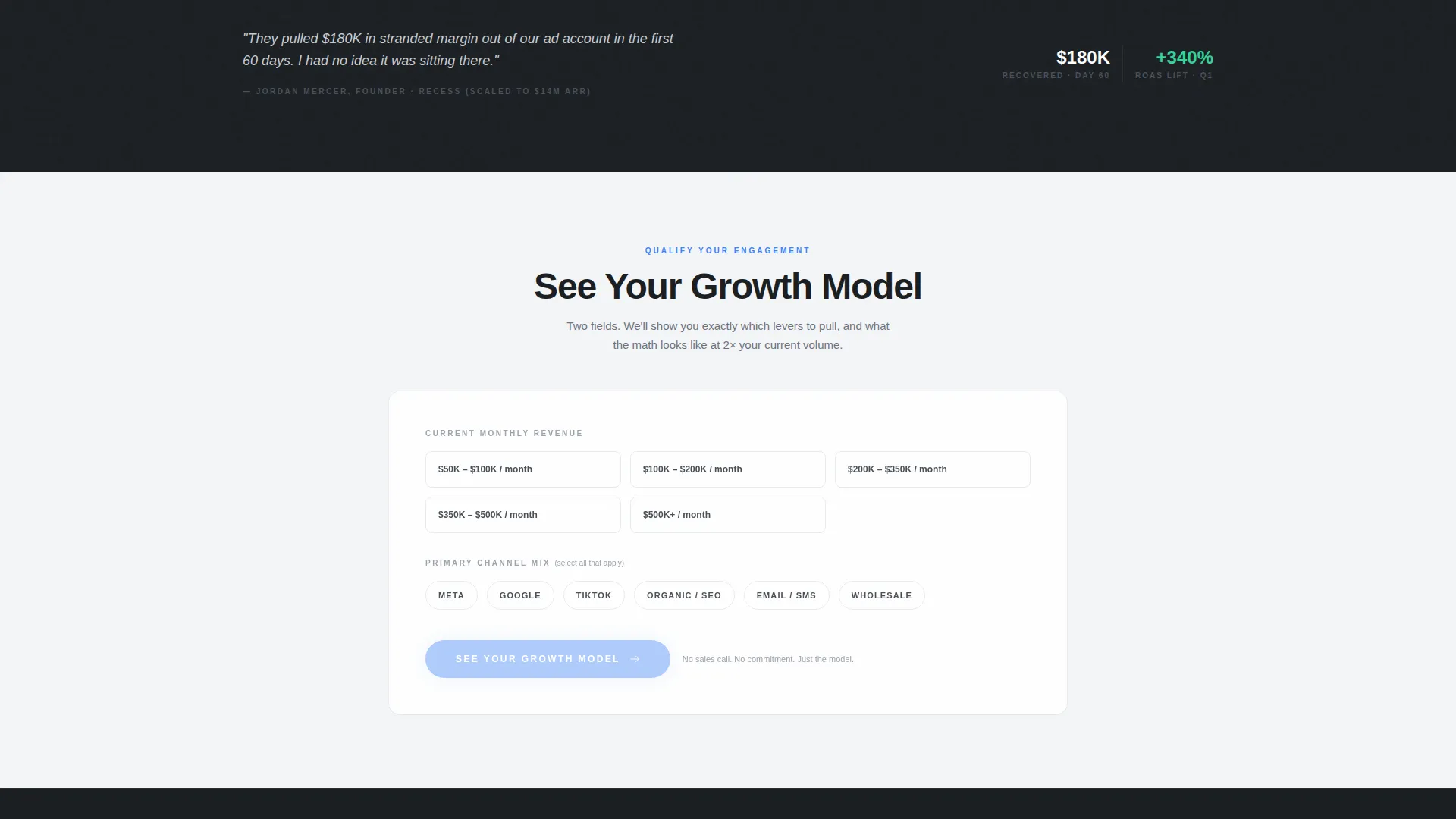
Two-Field Revenue Qualifier
Clicking the primary call to action opens a lightweight qualifier with two inputs. A dropdown lets founders select their current monthly revenue bracket from $50K to $500K and above. A checkbox group captures their primary channel mix across paid social, search, short-form video, organic, and wholesale.
In-Card Email Capture
Each comparison card contains a subtle secondary link inviting visitors to receive the full data breakdown as a downloadable file. This path captures only an email address, lowering the friction for founders who are not yet ready for a full conversation.
Glass-Morphism Card Design
Every card floats on a subtle frosted-glass layer with a one-pixel chrome border and a gunmetal or frosted-white background beneath. The visual depth reinforces the precision positioning without relying on photography or illustration.
Page sections overview
| Section | Purpose |
|---|---|
| Logo Bar Header | Opens with scrolling client logos and a credibility headline |
| In-House versus. Scale | First card row comparing hiring cost, ramp time, channels, and tools |
| Agency Tier Toggle | Second card row letting visitors animate metrics across agency tiers |
| Primary call to action Block | "See Your Growth Model" qualifier form at the base of the grid |
| Sticky call to action Bar | Persistent conversion prompt appearing after 60 percent scroll depth |
Design & branding system
The visual identity follows a Tech Glass theme built entirely on a Monochrome Steel palette. The result feels like the back panel of a precision-milled aluminum device: no warmth, no decoration, just material confidence.
- Four-color palette: deep gunmetal (#1B1F23) for primary backgrounds, polished chrome (#C9CDD1) for secondary text and borders, frosted panel white (#F4F5F7) for alternating card backgrounds, and signal blue (#3B82F6) reserved exclusively for interactive states and calls to action
- Two-weight typography only: hairline weight for labels and supporting text, bold weight for numbers and key data points
- Glass-morphism card styling with subtle blur layers and one-pixel chrome borders throughout the grid
Mobile & speed optimization
The card-grid layout is structured to reflow cleanly across screen sizes. Modular cards stack vertically on smaller viewports while preserving the full interactive toggle and flip behavior.
- Modular card components are designed to stack and resize without losing their comparison logic on mobile screens
- The sticky call-to-action bar adapts to smaller viewports, keeping the primary conversion prompt accessible throughout the scroll
- Alternating gunmetal and frosted-white backgrounds maintain visual separation between sections without relying on images or heavy graphical assets
How this template helps you convert
The conversion architecture is built on a simple principle: let the visitor prove the value gap to themselves before the page asks for anything in return.
- The interactive comparison grid lets founders run their own analysis across cost, time, and capability dimensions, building conviction before any contact form appears
- The two-field qualifier collects revenue bracket and channel mix upfront, so the first sales conversation is already pre-qualified and relevant
- The in-card email capture provides a low-friction secondary path for founders who want data first, turning a hesitant visitor into a warm lead without pressure
Other information about this template
The Scale landing page template sits within the Startup and Launch category, specifically aligned to the direct-to-consumer brand growth stage niche. It is a strong fit for consultancies that operate at the intersection of paid media, e-commerce operations, and growth strategy.
- Template style: Card Grid (Modular), suitable for comparison-heavy consultancy positioning pages
- The interactive explorer creative direction is well-suited to analytically minded founders who respond to data over narrative
- The Logo Bar header concept works best when the consultancy has a portfolio of recognizable brand clients to display
- The Comparison/Versus landing-page direction makes this template directly relevant to founders evaluating multiple growth paths at once


Theme
Tech Glass
Creative direction
Interactive Explorer
Color system
Monochrome Steel
Style
Card Grid (Modular)
Direction
Comparison/Versus
Page Sections
Scrolling Logo Bar with Credibility Line
Interactive Flip and Toggle Card Grid
Two-field Revenue Qualifier Form
Sticky Conversion Bar at 60 Percent Scroll
In-card Email Capture Path
Glass-morphism Monochrome Steel Styling
Related questions
Can I customize the comparison metrics inside the cards?
How does the in-card email capture work?
Is the sticky call-to-action bar always visible?
Who is this template best suited for?
Can the qualifier form capture different revenue brackets?


