Entertainment News Blog Landing Page Template
Scoop is a heritage-styled entertainment news landing page built around a masonry card grid, a cinematic short-form reel header, and a persona quiz that turns casual scrollers into newsletter subscribers. Warm parchment tones, scroll-linked animations, and an editorial rhythm that moves from dawn dispatches to late-night premiere coverage make every visit feel like a page you want to linger on.
by Rocket studio
Quick summary
Scoop is a single-page entertainment news landing page template with a vintage editorial feel. It opens with a grainy, golden-hour reel, flows through a masonry card grid with a morning-to-evening rhythm, and closes visitors into a persona quiz that earns their email address. The design feels warm, personal, and made for pop-culture obsessives.
Who this template is for
This template is built for editorial creators and media publishers who want substance without sacrificing style. It suits anyone running an entertainment-focused blog, culture column, or celebrity news outlet.
- Pop-culture bloggers and independent entertainment journalists launching a digital presence
- Editorial teams wanting a reader-first landing page with a built-in newsletter acquisition flow
- Content creators covering film, television, awards seasons, or celebrity culture for engaged audiences
What problem this template solves
Most entertainment blog templates feel either too tabloid-loud or too generic-minimal. Scoop fixes that gap. It gives you a designed editorial identity that feels human and considered, not scraped together.
- Bland grid layouts that do not guide the reader through a story or build emotional momentum
- Newsletter signup forms that feel transactional and earn low conversion because they ask before they give
- Visual identities that clash with editorial warmth, leaving a blog that reads well but feels forgettable
What you get with this template
You get a fully structured, single-page entertainment landing page with every section designed and ready to populate. The template covers every stage of the reader journey, from first impression to email capture.
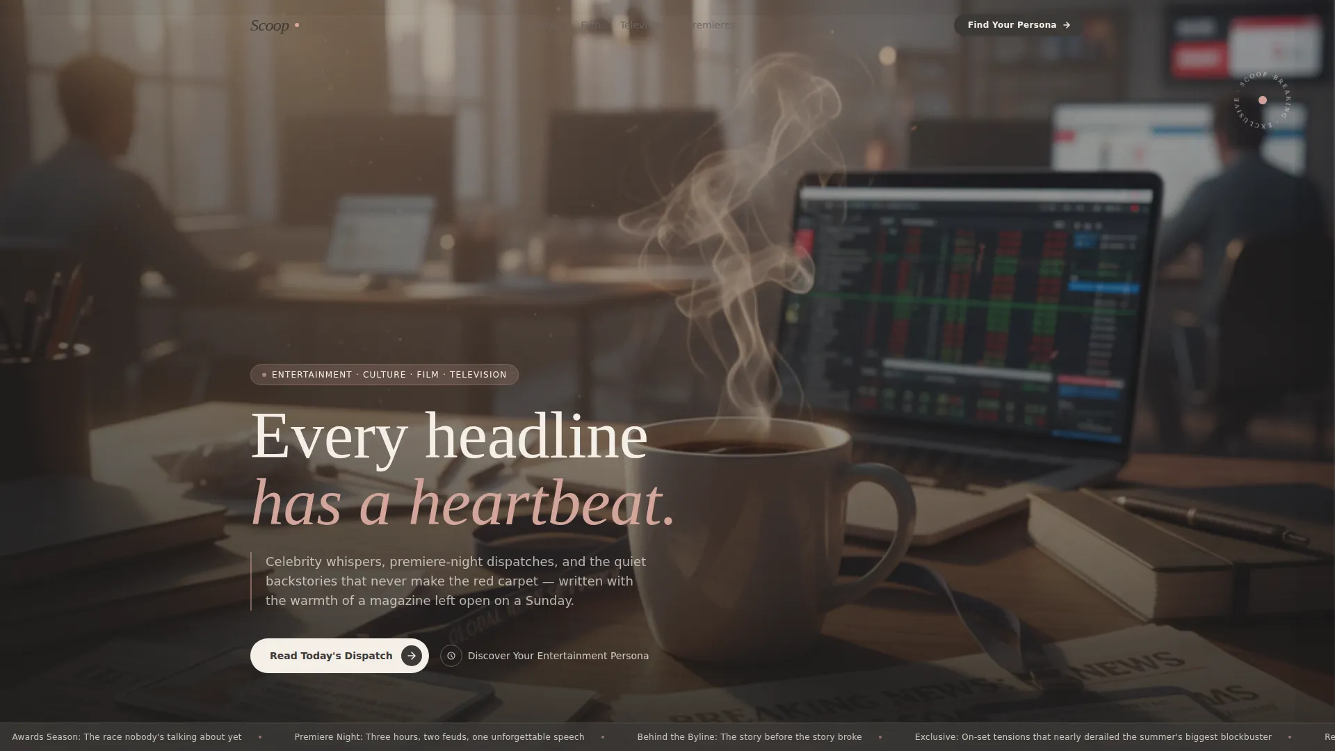
- A cinematic header with a short-form reel video background, a headline overlay, and a marquee ticker strip
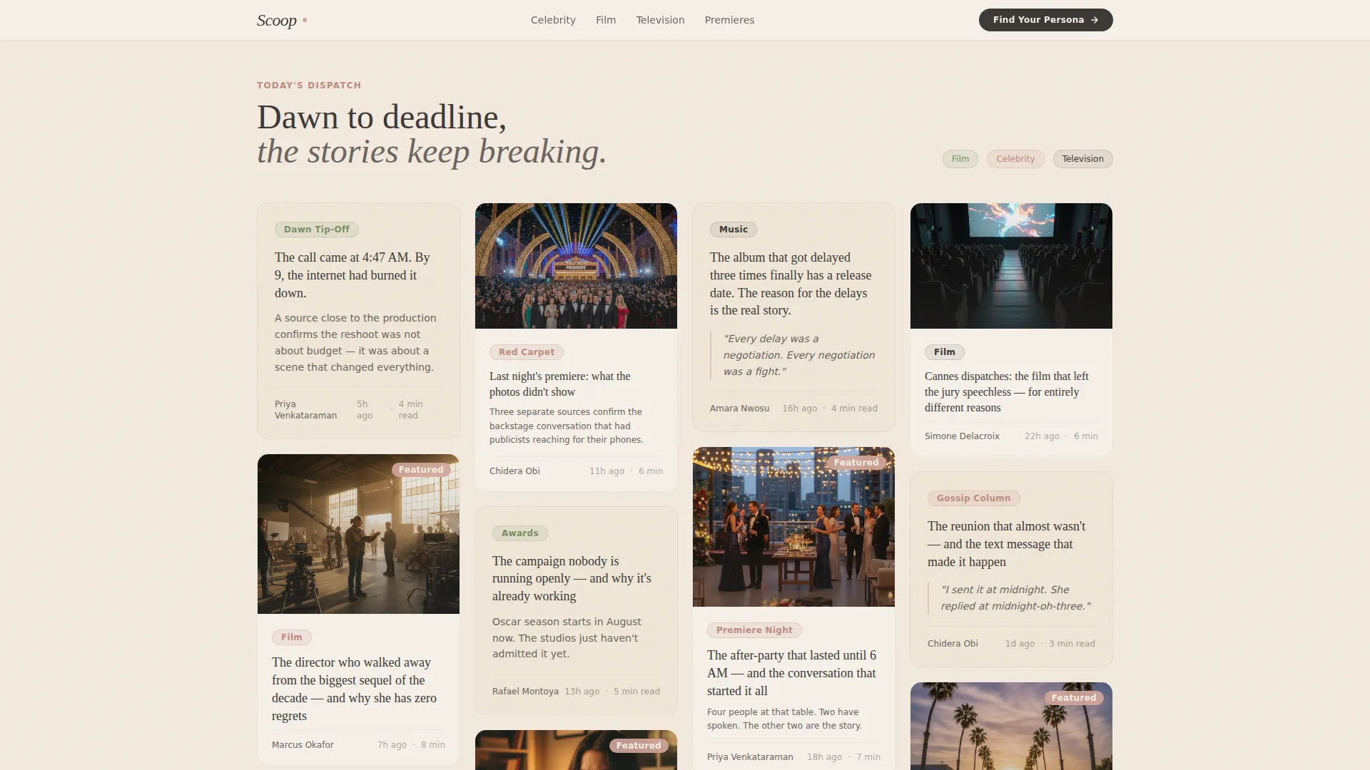
- A masonry Pinterest-style card grid that shifts visually from text-heavy morning dispatches to rich evening photo spreads
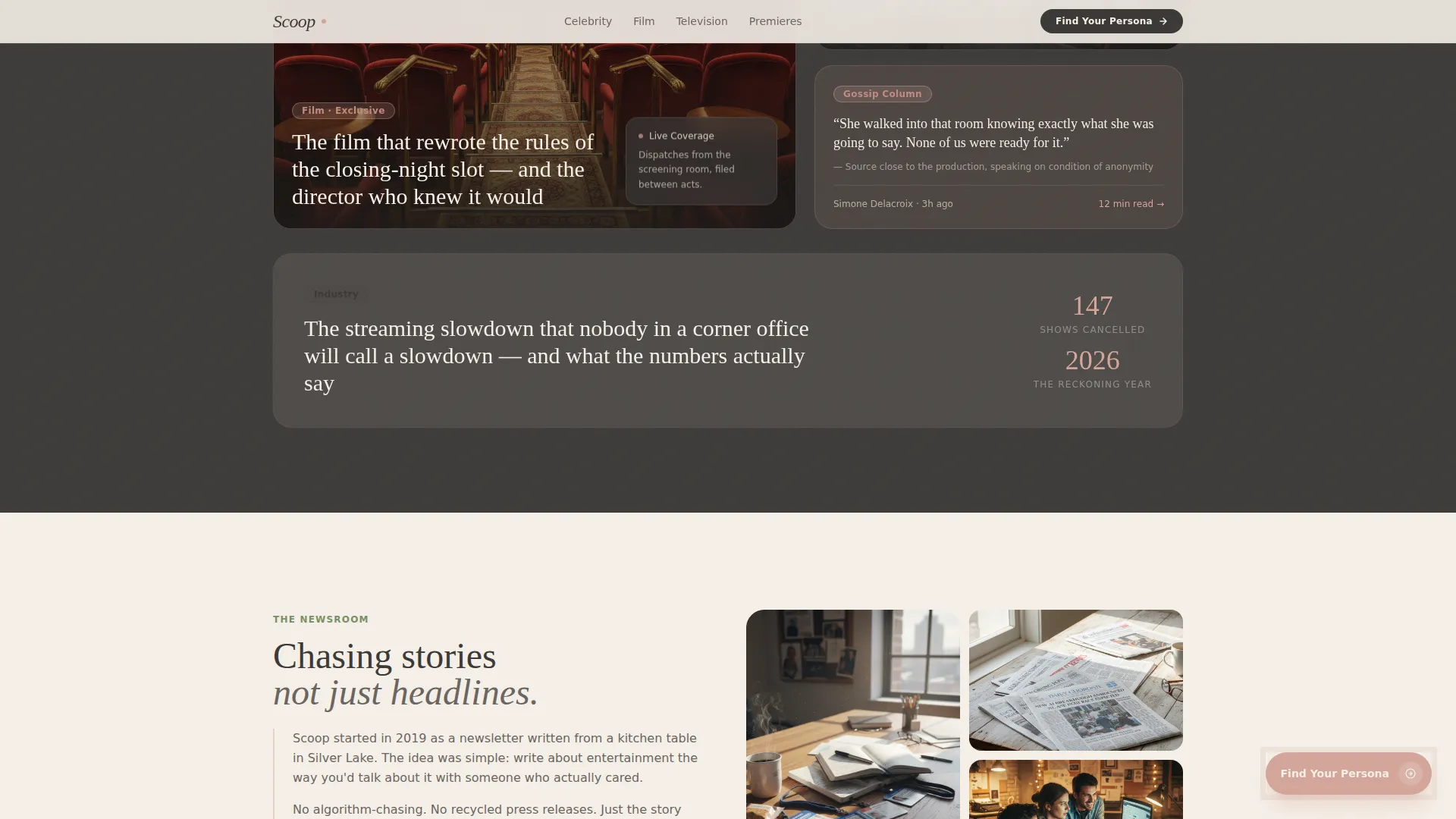
- A floating persona quiz call-to-action button, a five-question modal quiz with illustrated questions, four reader archetypes, and an email capture step framed as a curated weekly briefing
Feature list
This template delivers six purpose-built features grounded in the editorial brief.
Cinematic Short-Form Reel Header
The header plays a vertical-format video montage shot in a grainy, handheld, golden-hour style. It opens on a 5 AM alarm, moves through a writer's desk cluttered with press passes, and ends on a "publish" tap. A single headline fades in over the final frame: "Every headline has a heartbeat."
Masonry Pinterest-Style Card Grid
Cards are arranged in a staggered masonry layout that mimics a scrapbook or a well-loved pin board. Early cards are text-heavy morning dispatches. Later cards bloom into full photo spreads and embedded clips. The rhythm accelerates as the reader scrolls deeper, matching a real newsroom's pace toward deadline.
Scroll-Linked Background Shift
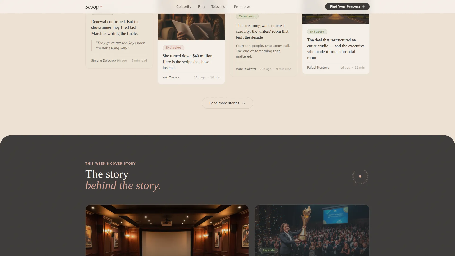
As visitors scroll down the page, the background tone transitions gradually from pale morning parchment to a deeper evening blush. This scroll-linked animation gives the page a living, time-of-day quality without requiring any user interaction.
Persona Quiz Modal with Email Capture
A floating button labeled "Discover Your Entertainment Persona" appears after the third scroll depth. It opens a modal with five illustrated questions. Results sort readers into one of four archetypes: The Critic, The Stan, The Insider, or The Nostalgist. Each archetype unlocks a curated reading list and newsletter frequency suggestion. Email capture closes the flow as "Get your weekly briefing."
Featured Editorial Spotlight Card
A dedicated large-format featured story card sits within the grid as an editorial anchor. It gives the most important story room to breathe and signals editorial curation to the reader.
Newsroom Voice and Social Proof Section
A dedicated section covers the editorial identity of the publication, supported by story count metrics and editorial credibility badges. This section builds trust before the quiz prompt arrives.
Page sections overview
| Section | Purpose |
|---|---|
| Hero Reel Header | Opens with cinematic reel video, headline overlay, and scrolling marquee ticker |
| Masonry Story Grid | Pinterest-style cards arranged in a morning-to-evening editorial rhythm |
| Featured Story Card | Large spotlight card highlighting one key editorial piece |
| Quiz Persona call to action | Floating button and modal quiz leading to archetype results and email capture |
| Newsroom Voice Section | Editorial identity statement, story count stats, and credibility badges |
| Page Footer | Horizontal flow footer pattern with navigation and publication details |
Design & branding system
The visual identity follows a Heritage and Story theme built on a Soft Mist color palette. Every color decision is warm, editorial, and deliberately soft, evoking a stack of vintage magazine covers found in a used bookshop.
- Colors: warm parchment (#F5F0E8) for backgrounds, faded ink charcoal (#3B3836) for body text, blush (#D4A59A) for highlights and hover states, and muted sage (#A3B18A) for category tags
- Typography: Fraunces serif for headlines to give editorial weight, paired with DM Sans for body copy to keep reading comfortable at speed
- Texture and animation: a grain overlay adds vintage warmth, masonry cards stagger on load, and a marquee strip runs across the hero section
Mobile & speed optimization
The template is built mobile-first, which directly serves its core audience: commuters reading between subway stops and office workers refreshing tabs on their phones during lunch.
- Images are lazy-loaded so the page does not hold up on slower mobile connections
- Scroll behavior uses native CSS, keeping the scroll-linked background transition smooth without heavy scripting
- The floating quiz button and modal are sized and positioned for thumb reach on smaller screens
How this template helps you convert
Scoop approaches conversion the way a good magazine earns loyalty: by giving readers something worth their time before asking for anything in return.
- The masonry grid and cinematic header create genuine editorial pull, so visitors stay long enough to feel invested in the content before the quiz prompt appears.
- The persona quiz delivers a personalized result with a curated reading list, making the email signup step feel like a reward rather than a form to fill out.
- The floating call-to-action button activates only after the third scroll depth, reaching readers who have already demonstrated interest rather than interrupting them on arrival.
Other information about this template
Scoop was designed as a complete starting point for entertainment news publishers who want a strong editorial identity from day one. A few practical details worth knowing before you build with it.
- The template is categorized under Blog and Editorial, subcategory Entertainment Blog and Media, with a niche focus on entertainment news
- The masonry layout uses a stagger animation on card entry, giving each story card its own moment as it enters the viewport
- The quiz modal includes five illustrated questions covering viewing habits, cinema decade preference, review reading order, awards show snacks, and headline-stopping type
- The footer uses a horizontal flow pattern suited to editorial publications with category navigation needs
- The Heritage and Story theme and Soft Mist color system work together to distinguish the page from high-gloss celebrity tabloid aesthetics
Theme
Heritage & Story
Creative direction
Day-in-the-Life
Color system
Soft Mist
Style
Masonry/Pinterest
Direction
Quiz/Assessment
Page Sections
Cinematic Short-form Reel Header
Masonry Pinterest-style Card Grid
Scroll-linked Background Transition
Persona Quiz Modal with Email Capture
Featured Editorial Spotlight Card
Newsroom Voice and Credibility Section
Related questions
What kind of content works best in the masonry card grid?
Can I use this template if my publication is newsletter-first?
How does the persona quiz work for readers?
Is this template built for solo bloggers or editorial teams?
What is the overall page structure of this template?



