Lifestyle Blog Reviews Website Template
Scribble is a single-page landing page template built for college and student life blogs. It pairs a cinematic full-bleed hero with a 60/40 asymmetric origin story grid, a scrolling reader testimonials marquee, and an interactive five-question archetype quiz that ends with a personalized reading list and email capture. The design uses a Luxe Minimal Ink and Paper palette to feel like an independent editorial magazine.
by Rocket studio
Quick summary
Scribble is a landing page template for college and student life blogs. It guides visitors through an honest origin story, earns emotional trust, then invites them into a five-question "Find Your College Chapter" quiz. The quiz sorts readers into archetypes and delivers a personalized reading list, with email capture framed as a gift at the results screen.
Who this template is for
This template is built for editorial bloggers who write about the real, unfiltered side of college life. If your content reads like a voice note from a friend who just figured things out, Scribble was designed with your audience in mind.
- College and student life blog creators who want a content-first landing page with emotional storytelling
- Lifestyle writers targeting freshmen, juniors, and transfer students navigating campus culture
- Independent editorial bloggers who want an email list built around a personalized reader experience
What problem this template solves
Most blog landing pages feel generic. They list categories, drop a subscribe button, and move on. That approach does not work for an audience that can smell inauthenticity from three scrolls away.
- No clear origin story to build trust before asking for an email address
- No way to match a first-time visitor to the content most relevant to where they are in college
- No personality in the conversion flow, so readers bounce before they ever subscribe
What you get with this template
You get a complete, section-led single-page layout that takes a visitor from first impression to email subscriber through earned trust rather than pressure. Every section has a clear job, and each one flows naturally into the next.
- A cinematic full-bleed hero, a 60/40 origin story grid with an artifact sidebar, a dual-row reader testimonials marquee, a five-question interactive quiz module, a personalized reading list call to action, and a minimal single-row footer
- A Luxe Minimal visual identity using DM Serif Display headlines and Plus Jakarta Sans body text across the Ink and Paper color system
- High-interactivity components including character-reveal animations, scroll-linked parallax, hover-pause marquee, and multi-step quiz transitions
Feature list
This template combines editorial storytelling design with a structured conversion flow built specifically for a college lifestyle blog audience.
Full-Bleed Cinematic Hero
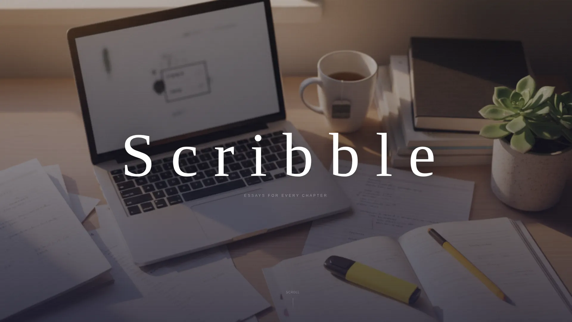
The hero section uses an overhead, shallow-depth-of-field dorm desk photograph with golden-hour window light. The blog name sits in large tracked-out serif type at dead center, white against the image, with no navigation or subtitle competing for attention.
Asymmetric 60/40 Origin Story Grid
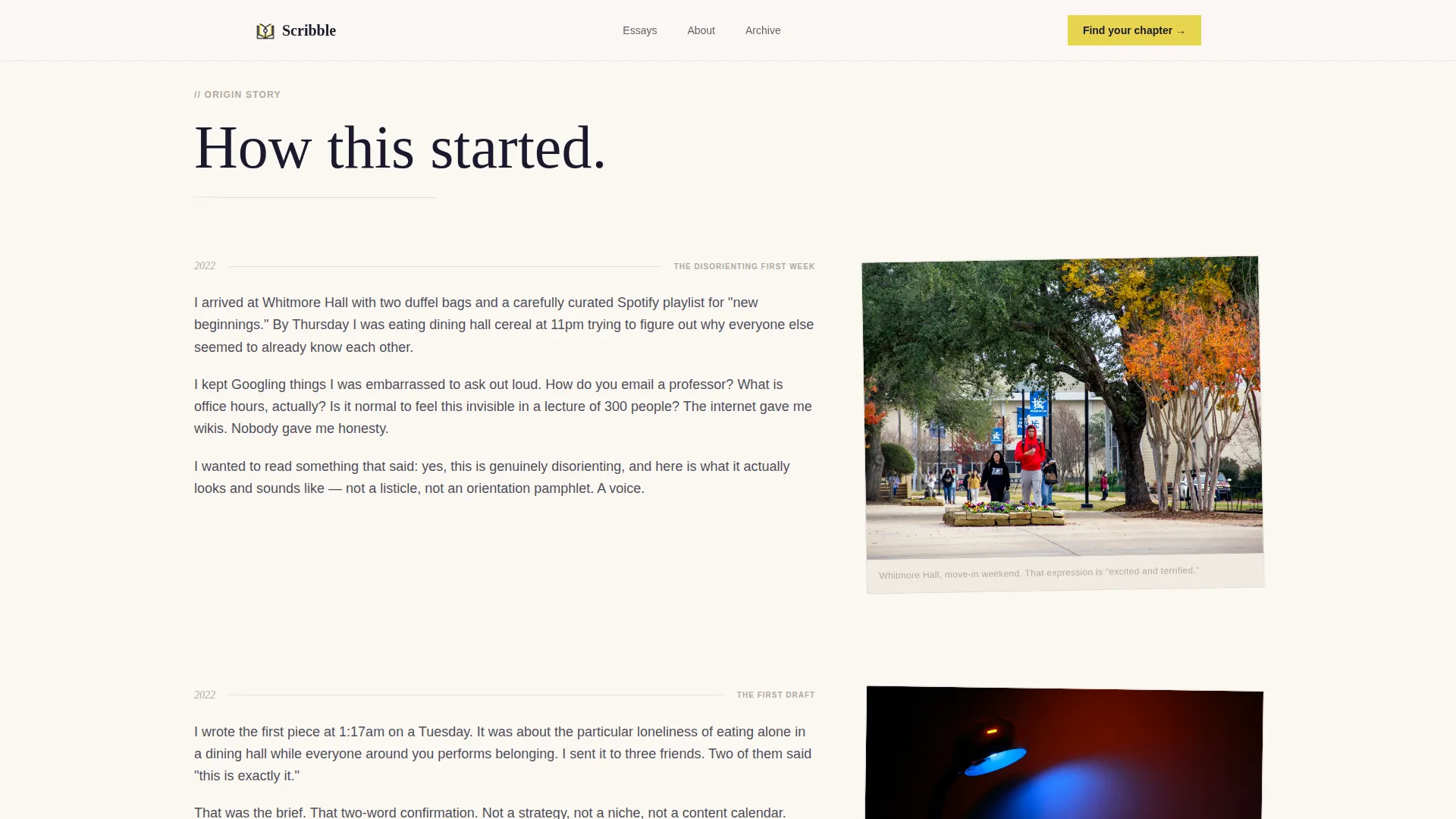
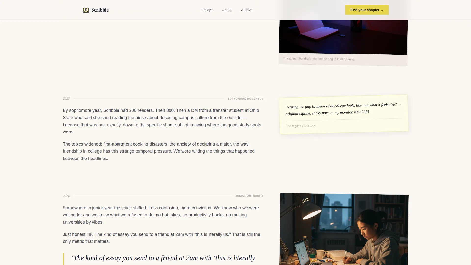
The wider column carries long-form serif narrative paragraphs that scroll through the blog's founding story. The narrower column mirrors each scroll segment with artifacts: a first-draft screenshot, a dorm photo, and a sticky note with the original tagline in handwriting.
Dual-Row Scrolling Testimonials Marquee
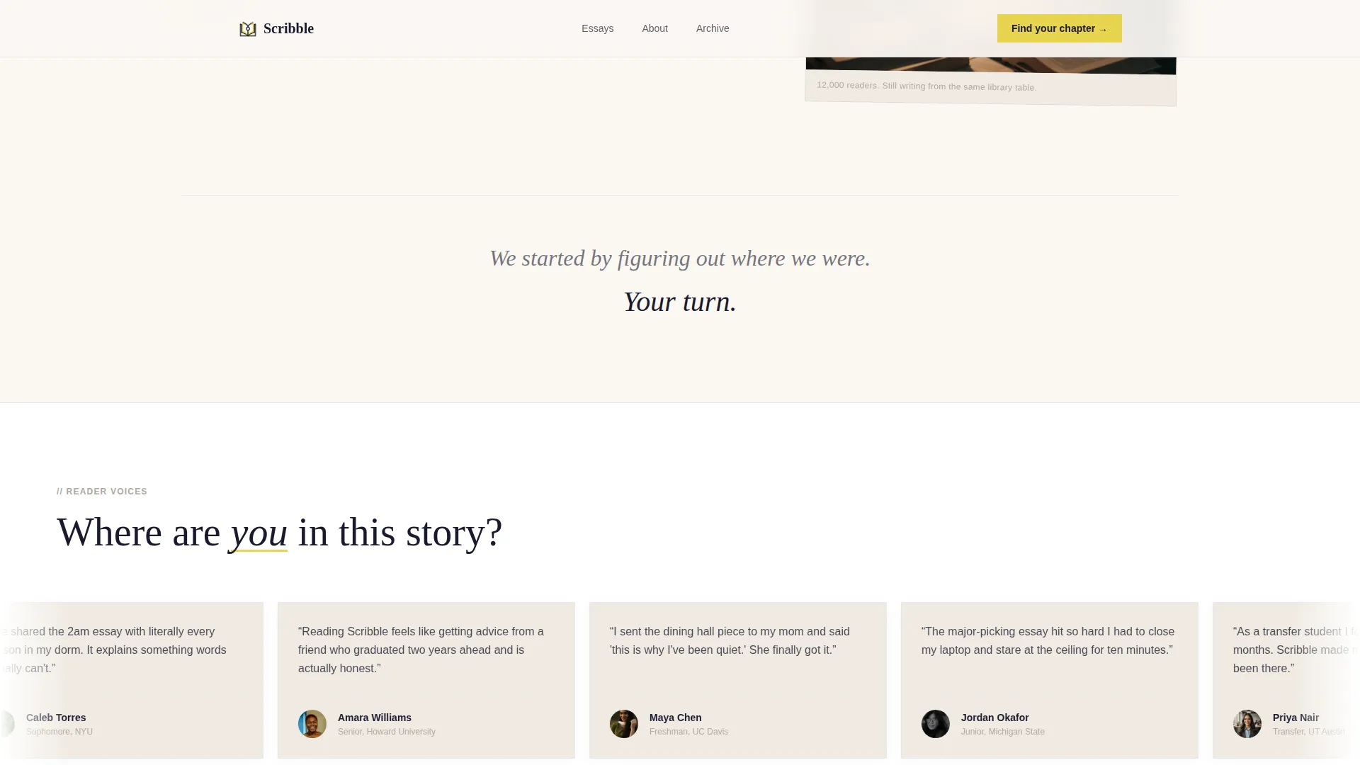
Real reader voices appear in a continuous two-row marquee that pauses on hover. This section replaces the founder's voice with the audience's, signaling social proof at the moment emotional buy-in peaks.
Five-Question Archetype Quiz Module
The "Find Your College Chapter" quiz sorts visitors into reader archetypes: The Overwhelmed Freshman, The Reinventing Junior, and The Almost-Adulting Senior. It surfaces first as a soft inline prompt, then expands into a full interactive multi-step module with illustrated transitions.
Personalized Reading List Email Capture
Email capture happens at the quiz results screen, framed as "Get your reading list sent to your inbox." This positions the hand-off as a curated gift rather than a subscription gate, reducing friction at the most motivated moment.
High-Interactivity Animation System
The template includes character-reveal text animations, scroll-linked parallax effects, marquee motion, and smooth quiz step transitions. These are handled by client-side components while static sections use server components for performance balance.
Page sections overview
| Section | Purpose |
|---|---|
| Full-Bleed Hero | Establish visual identity and blog name |
| Origin Story Grid | Build trust through founder narrative and artifacts |
| Reader Voices Marquee | Provide social proof with real testimonials |
| Quiz Module | Sort visitors into personalized reader archetypes |
| Reading List call to action | Capture emails via personalized content gift |
| Minimal Footer | Close the page with a clean single-row layout |
Design & branding system
The visual identity follows a Luxe Minimal direction that feels like a beautifully typeset independent magazine left on a café table. It is restrained enough to signal editorial taste and warm enough to stay approachable.
- Color system uses deep fountain-pen black (#1A1A2E), warm cotton stock (#FAF7F2), margin-note gray (#B0A8A0), and a single highlighter-yellow accent (#E8D44D) reserved for calls to action and pull quotes
- Typography pairs DM Serif Display for headlines with Plus Jakarta Sans for body copy, creating a clear hierarchy between narrative weight and readable prose
- The overall aesthetic references an independent print magazine: generous white space, confident type, and one streak of yellow like a line someone could not help underlining
Mobile & speed optimization
The template is built mobile-first because its core audience, college students, primarily browse on their phones. Layout decisions prioritize readability and tap-friendly interaction at small screen sizes before scaling up.
- The 60/40 asymmetric grid stacks vertically on mobile, keeping the narrative readable without horizontal overflow
- Server components handle static sections while client components manage quiz logic and animations, balancing interactivity with load considerations
- The multi-step quiz and marquee are designed to function smoothly on touch devices with swipe and tap interactions in mind
How this template helps you convert
The conversion strategy is intentional and sequenced. Emotional investment is built first; the ask comes only after the visitor feels seen.
- The origin story earns trust by telling the honest founding narrative before any subscription prompt appears, so the visitor arrives at the quiz already engaged rather than skeptical
- The soft inline quiz prompt ("We started by figuring out where we were. Your turn.") transitions naturally into the full interactive module, lowering resistance before the email ask
- Email capture at the results screen is framed as a personalized reading list delivery, making the subscriber hand-off feel like a helpful next step rather than a marketing gate
Other information about this template
This template is part of the Blog and Editorial category, sitting within the Lifestyle Blog subcategory and specifically targeting the College and Student Life Blog niche. It was built with a high intersection match score, meaning the design direction, conversion mechanic, and content tone are all tightly aligned to editorial blog use cases.
- Creative direction is Origin Story, meaning the scroll experience peels back the blog's reason for existing, moving from freshman confusion through sophomore momentum to junior authority
- The landing page direction is Quiz and Assessment, which is a proven engagement mechanic for content-first blogs that want to personalize the subscriber experience from the first visit
- The header concept is Full-Bleed Photo, which sets a cinematic, editorial tone immediately and avoids the cluttered multi-element headers common on generic blog templates
- The template style is Asymmetric Grid (60/40), which gives the layout a deliberate, editorial rhythm that sets it apart from symmetric or card-based blog layouts
- The color system is Ink and Paper, a palette designed specifically for written-word content that values warmth, legibility, and restraint over loud visual branding
Theme
Luxe Minimal
Creative direction
Origin Story
Color system
Ink & Paper
Style
Asymmetric Grid (60/40)
Direction
Quiz/Assessment
Page Sections
Full-bleed Cinematic Hero Section
60/40 Asymmetric Origin Story Grid
Dual-row Hover-pause Testimonials Marquee
Five-question Archetype Quiz Module
Personalized Reading List Email Capture
Character-reveal and Parallax Animation System
Related questions
Can I change the quiz archetypes and questions to match my own blog?
Does this template include the quiz logic and email delivery out of the box?
Is this template usable if I have no reader testimonials yet?
Can I swap in my own photo for the full-bleed hero?
What makes this different from a standard blog home page template?



