E-Commerce Blog & Media Blog Website Template
Byline is a film noir editorial landing page built for e-commerce intelligence brands. It opens with a full-viewport manifesto in oversized serif type, scrolls through conviction-driven belief statements, and funnels readers into a five-question "Find Your Blind Spot" diagnostic. The conversion goal is clear: newsletter signup, earned through editorial credibility rather than hard selling.
by Rocket studio
Quick summary
Byline is a sharp editorial landing page template designed for e-commerce news brands, newsletters, and intelligence publications. It combines a cinematic dark color system, manifesto-led storytelling, and a built-in quiz funnel to convert visitors into newsletter subscribers. Every section is built to establish conviction before asking for commitment.
Who this template is for
This template is built for founders, operators, and investors who live inside the commerce layer of the internet. It suits anyone launching a credible e-commerce media brand, an operator-led newsletter, or an editorial publication that wants to stand out from generic blog landing page examples. The landing page design speaks directly to people who read earnings reports, negotiate logistics contracts, and track unit economics for a living.
- Direct-to-consumer founders and e-commerce operators who want a publication that reflects their working reality
- Investors and analysts who need signal-dense content rather than surface-level trade news
- Editorial teams and solo writers building a new media brand in the e-commerce vertical
What problem this template solves
Most e-commerce publications look like generic product page directories or ad-stuffed media sites. They fail to establish trust or editorial authority before asking visitors to subscribe. Founders and operators are skeptical by default. They have seen too many landing page examples that promise insight and deliver noise.
- The template replaces passive browsing with a conviction-building scroll that earns trust before presenting the call to action
- The belief statement structure gives the publication a clear editorial identity, so potential customers immediately understand the point of view
- The "Find Your Blind Spot" quiz replaces a cold signup form with a personalized diagnostic, giving readers a reason to engage and a reason to subscribe
What you get with this template
This landing page template delivers a complete editorial e-commerce landing page structure. It is ready to launch as a standalone web page and is built to convert visitors into committed newsletter subscribers through layered storytelling and an interactive quiz funnel. No coding required to customize the core layout and content.
- A full-viewport hero manifesto section with oversized serif typography and a hot-press red rule accent
- Three scroll-linked belief statement sections, each unfolding into content pillar excerpts and contributor portraits
- A five-question interactive quiz modal with a personalized result state and a newsletter signup funnel built into the outcome screen
Feature list
This template includes several elements designed specifically for editorial credibility and subscriber conversion. The key features work together to keep visitors engaged from first impression through to signup.
Full-Viewport Manifesto Hero
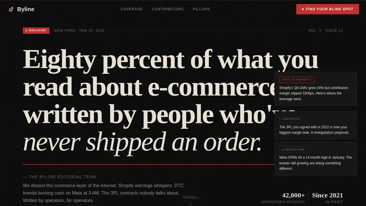
The hero section fills the browser window with a single provocative declaration set in large-format Fraunces serif type against deep editorial black. There is no image or illustration competing for attention. A thin hot-press red rule sits beneath the quote, and floating breaking-news badge elements add editorial energy without cluttering the layout. This first impression is designed to grab attention immediately and signal that this publication is different from anything the reader has seen before.
Scroll-Linked Belief Statement Sections
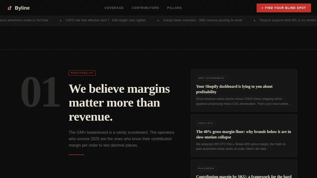
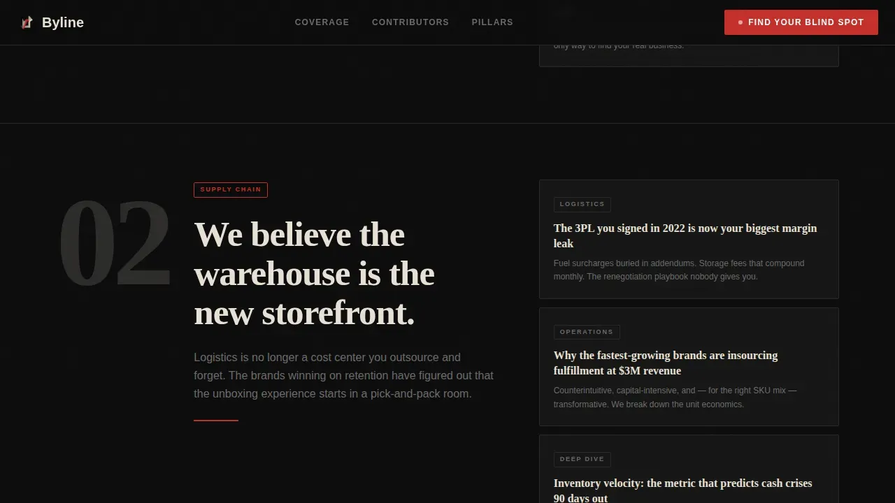
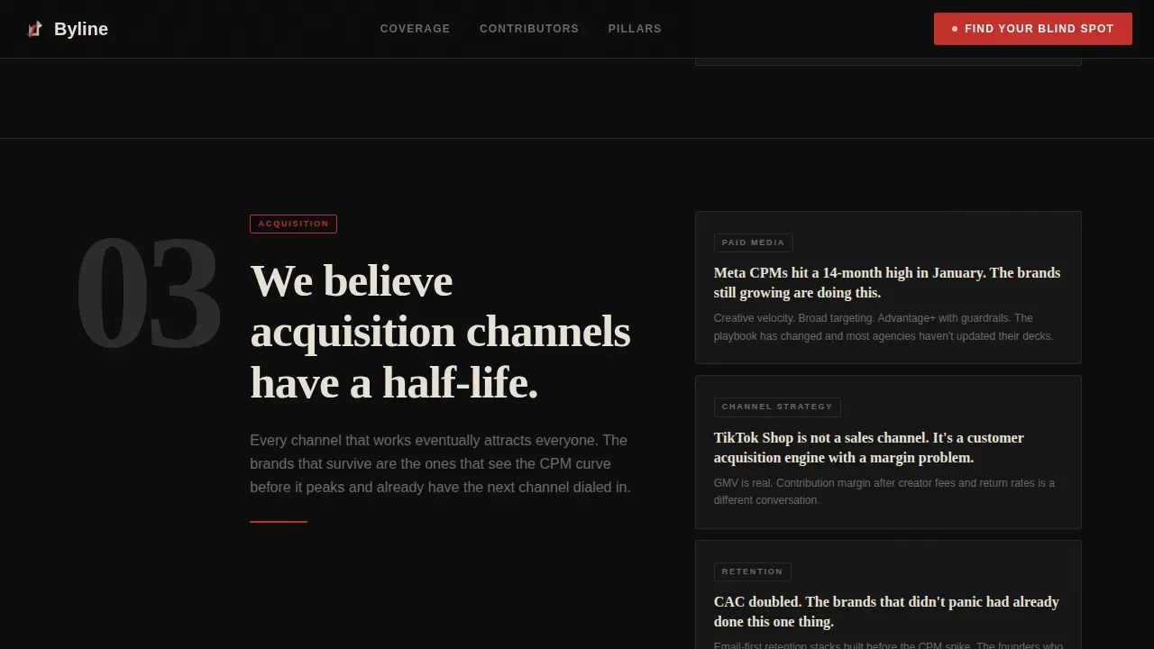
Three belief statement sections unfold as the reader scrolls. Each belief lands as a thesis statement, then opens into sample headlines, contributor portraits in high-contrast black and white, and excerpt cards styled like torn-out clippings. IntersectionObserver opacity transitions animate each reveal, keeping visitors engaged and building conviction progressively. This structure makes the brand story feel earned rather than stated.
Interactive "Find Your Blind Spot" Quiz Modal
A five-question diagnostic modal launches from a clear call to action button that appears after the third belief section and again at the footer. Questions are framed as real operational scenarios, not textbook trivia. The result screen delivers a personalized reading list and flows directly into the newsletter signup. This is the primary conversion goal of the entire landing page and the mechanism that turns curious visitors into loyal customers.
Editorial Contributor Section
The contributors section displays high-contrast black-and-white editorial portraits alongside author credentials and publication counts. Each contributor profile functions like a byline card, allowing readers to see the expertise behind the content. A byline is a line of text that identifies the author of an article and often their job title or affiliation, and this template treats every contributor display as exactly that. Bylines help readers decide if they should trust the information provided, making this section essential for social proof.
Excerpt Clipping Cards
Excerpt cards are styled to feel like torn-out newspaper clippings, complete with category badges and sharp editorial headlines. These cards sit within the belief statement sections and give the landing page concrete content proof. High-quality product photos and product images are not the focus here; instead, high quality images of editorial layouts and article typography carry the visual weight. The copy explains the editorial angle of each content pillar without over-selling.
Footer Quiz Anchor and Newsletter Funnel
The footer repeats the quiz call to action, ensuring a second opportunity to convert visitors who scrolled past the mid-page prompt. The footer follows a horizontal flow layout pattern and includes the newsletter signup entry point linked directly to the quiz result state. This placement follows best practice for landing page design: clear call to action placement both above the fold and anchored at the page base.
Page sections overview
| Section | Purpose |
|---|---|
| Hero Manifesto | Opens with a full-viewport provocative declaration in large serif type on pure black, establishing editorial identity instantly |
| Belief Statement One | Introduces the profitability content pillar with a thesis statement and excerpt clippings |
| Belief Statement Two | Introduces the logistics and supply chain coverage pillar with editorial conviction |
| Belief Statement Three | Introduces the third content pillar and triggers the first quiz call-to-action placement |
| Contributors Section | Displays editorial portraits and byline credentials to build social proof and reader trust |
| Sample Coverage Cards | Shows torn-clipping style headline cards with category badges as content examples |
| Quiz Call to Action | Launches the five-question "Find Your Blind Spot" diagnostic modal |
| Footer Newsletter Anchor | Repeats quiz call to action and newsletter signup in a horizontal flow footer layout |
Design & branding system
The visual identity is built on an Ink and Paper theme using a Cinematic Dark color system. The palette is restrained and intentional, designed to make every element feel like a deliberate editorial choice rather than a default style. A consistent color scheme runs from hero to footer, reinforcing brand identity at every scroll position.
- Deep editorial black (#0D0D0D) dominates the canvas; aged newsprint (#E8E0D5) warms the type columns; columnist gray (#6B6B6B) handles secondary text and dividers
- Hot-press red (#C4302B) appears sparingly as a pull-quote accent, alert badge color, and hover state, functioning like a breaking-news chyron that snaps the eye
- Typography pairs Fraunces serif for headlines with DM Sans for body text and interface elements, creating a clear hierarchy that keeps visitors engaged and allows ample white space to do its work
Mobile & speed optimization
The template is built desktop-first, reflecting the reality that its target audience reads at a desk. However, a fully responsive design ensures the layout holds up well across every screen size. The fully responsive structure means the editorial hierarchy and quiz modal adapt cleanly without losing the Cinematic Dark atmosphere that defines the brand.
- Responsive design scales the oversized serif headlines and belief statement sections to fit mobile devices without collapsing the visual hierarchy
- The quiz modal is optimized for touch interaction, so readers on mobile devices can complete the diagnostic and reach the newsletter signup with minimal friction
- Scroll-linked animations use IntersectionObserver transitions, keeping the experience smooth across different screen sizes and device types
How this template helps you convert
Editorial credibility and a clear conversion goal make this landing page different from generic e-commerce landing page templates. The page does not ask for a subscription immediately. It earns trust first, then presents the ask at the moment of highest conviction. This approach keeps visitors engaged and makes the newsletter signup feel like a natural next step rather than an interruption.
- The manifesto hero and belief statement scroll build editorial authority progressively, so by the time the quiz call to action appears, the reader already trusts the publication enough to engage. Benefit-driven copy explains what the reader gains, not just what the publication covers.
- The five-question quiz personalizes the conversion path. Instead of a generic contact form or cold email field, potential customers receive a tailored reading list that makes the first purchase of attention feel valuable. Social proof from contributor bylines and reader count badges reinforces credibility at the same moment.
- The repeated footer call to action catches readers who were not ready to act mid-page. This placement reflects a core principle of high converting landing page design: a clear call to action should appear both above the fold and at the end of the page to maximize conversion rates.
Other information about this template
This template is a strong reference point among editorial-style e-commerce landing page examples. It sits in a category that balances high-authority storytelling with conversion-focused landing page design, a balance that is essential for e-commerce blogs that want to attract visitors who become loyal customers. Several elements combine to make this one of the more distinctive product landing page designs available in the editorial media category.
- The landing page uses benefit-driven copy throughout, keeping every section focused on what the reader gains rather than listing product features for their own sake
- White space is used deliberately across the layout; ample white space around the belief statements and excerpt cards ensures the typography reads cleanly without visual clutter
- The color palette is fully locked to the Cinematic Dark system, making easy customization possible by simply swapping the newsprint tones, red accent, or heading typography to match a different editorial brand
- The template supports contact forms and email capture natively within the quiz result screen, allowing new brands to launch a subscriber list from day one without any coding required
- Bylines in e-commerce news blogs must be concise to avoid cluttering the visual hierarchy; each contributor byline card in this template is compact and placed consistently within the article card component, following the standard that bylines sit immediately below or above the content they introduce
- An effective byline includes a link to the author's bio page; the contributor section is structured to support this pattern, allowing readers to follow a link from each byline to a full author profile
- Well known publications use editorial credibility signals like contributor credentials, publication counts, and reader count badges; this template includes all three as part of its social proof system
- The quiz modal is the primary interactive element and acts as the main conversion driver, replacing static contact forms with a personalized diagnostic that gives visitors a reason to share their email address
- From a landing page design perspective, this template combines eye catching graphics in the form of high-contrast black-and-white editorial portraits with concise copy and a clear color scheme to keep visitors focused on a single conversion goal
- Pricing information, pricing options, and product photos are deliberately absent from this template; it is built exclusively for media, newsletter, and editorial brands, not for direct product sales
- The template is seo friendly by structure, with clear heading hierarchies, short paragraphs, and concise copy that makes content easy to scan in any browser window
- The byline sharp editorial ecommerce news blog landing page template is a purpose-built solution for operators and founders who want a publication that inspires confidence from the first line of copy
Theme
Ink & Paper
Creative direction
Manifesto
Color system
Cinematic Dark
Style
Editorial/Magazine
Direction
Quiz/Assessment
Page Sections
Full-viewport Manifesto Hero Section
Scroll-linked Belief Statement Reveals
Five-question Quiz Modal with Result State
Editorial Contributor Byline Section
Excerpt Clipping Cards with Category Badges
Horizontal Flow Footer with Repeated Call to Action
Related questions
Who is this landing page template designed for?
Do I need coding skills to customize this template?
How does the quiz funnel convert readers into subscribers?
Is the template fully responsive on mobile devices?
How does this template build social proof?



