Secure — Rapid Insurance Technology Landing Page Template
Underwrite is a bold brutalist landing page template built for insurtech pre-seed startups. It uses a scroll-reveal layout with a stats-first header, live code snippets, and a progressive feature matrix to communicate one thing fast: embedding insurance into any fintech product is now four lines of code. Designed for developer-led audiences at neobanks, lending platforms, and gig-economy apps.
by Rocket studio
Quick summary
Underwrite is a single-page scroll-reveal landing page template for an insurtech pre-seed startup. It opens with a pitch-black metrics wall, then progressively unlocks three capability sections: an embed workflow, a compliance engine, and a carrier network dashboard. The entire design is built around one technical claim, insurance integration in four lines of code.
Who this template is for
This template is built for a very specific kind of founder. If you are a small technical team selling developer infrastructure to fintechs, this layout was designed around your pitch.
- Developer leads at neobanks, lending platforms, and gig-economy apps who need to add insurance to their product
- Pre-seed insurtech founders who need to convert skeptical technical buyers without a sales team
- Startup teams replacing legacy carrier onboarding workflows with a modern API layer
What problem this template solves
Adding insurance to a fintech product sounds simple until it isn't. Legacy carrier onboarding takes months, state-by-state compliance creates legal landmines, and ACORD forms are a nightmare for any engineering team. This template gives you a landing page that acknowledges that pain directly and immediately shows the fix.
- No clear way to demonstrate a complex API product without a live demo environment
- Developer audiences distrust marketing-heavy pages and skip to proof before they read anything else
- Pre-seed startups lack the time or resources to build a custom high-conviction page from scratch
What you get with this template
You get a complete scroll-reveal landing page structured around progressive disclosure. Each section is designed to earn the next scroll, stacking technical proof until the visitor is ready to click.
- A stats wall header that renders key metrics in oversized monospaced type against a void black background
- Three locked reveal sections covering the embed workflow, compliance engine, and carrier network
- A persistent primary call-to-action button fixed to the bottom of the viewport after the first code-snippet reveal
Feature list
This template ships with a set of tightly scoped, prompt-backed components. Each one plays a specific role in the conversion flow.
Live Metrics Header
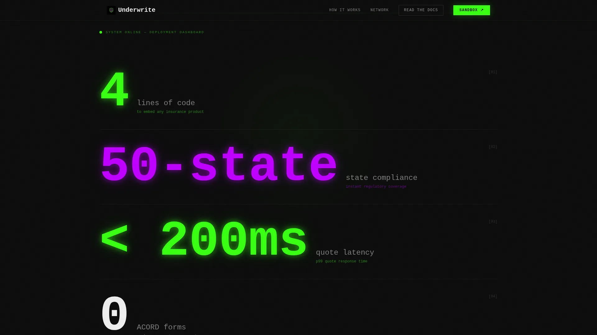
The page opens pitch black, then numbers render one by one like a deployment dashboard coming online. Metrics including "4 lines of code," "50-state compliance," "less than 200ms quote latency," and "0 ACORD forms" stamp themselves onto the screen in oversized monospaced type with a reactor-green glow.
Scroll-Locked Feature Matrix
Three capability sections are locked until the visitor scrolls to each one. This progressive reveal structure controls pacing and builds tension. Each unlock feels earned, not delivered all at once.
Embed Workflow Section
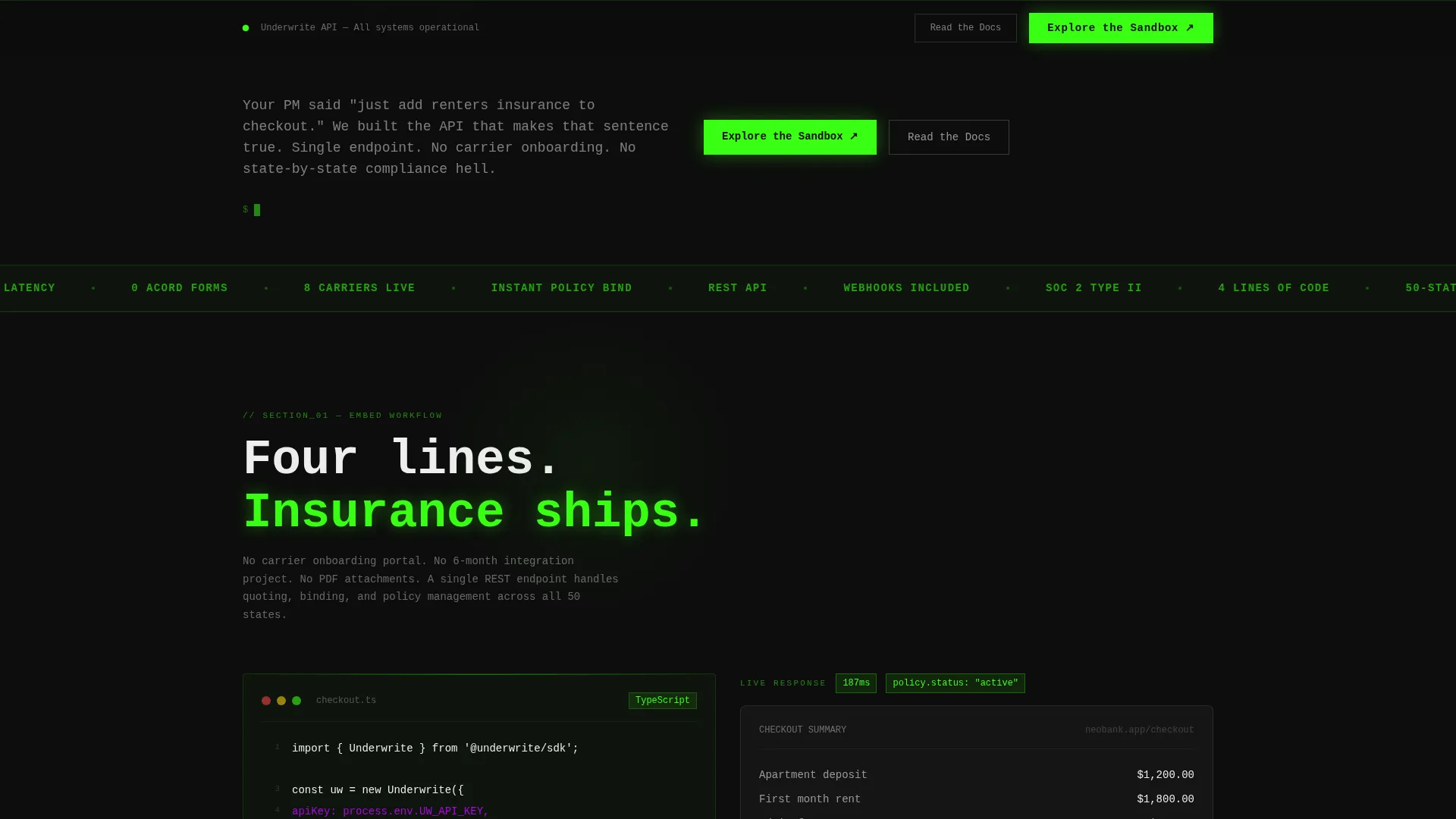
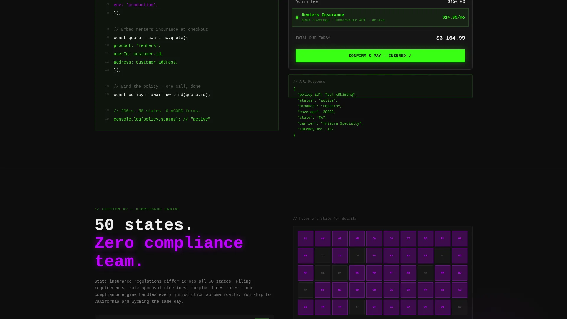
The first reveal shows a live code snippet on the left and a simulated checkout interface on the right. The checkout user interface demonstrates insurance being added in real time, making the integration feel immediate and tangible.
Compliance Engine Visualizer
The second reveal shows a map of the United States lighting up state by state in ultraviolet as coverage activates. This communicates 50-state compliance without a single line of legal copy.
Carrier Network Dashboard
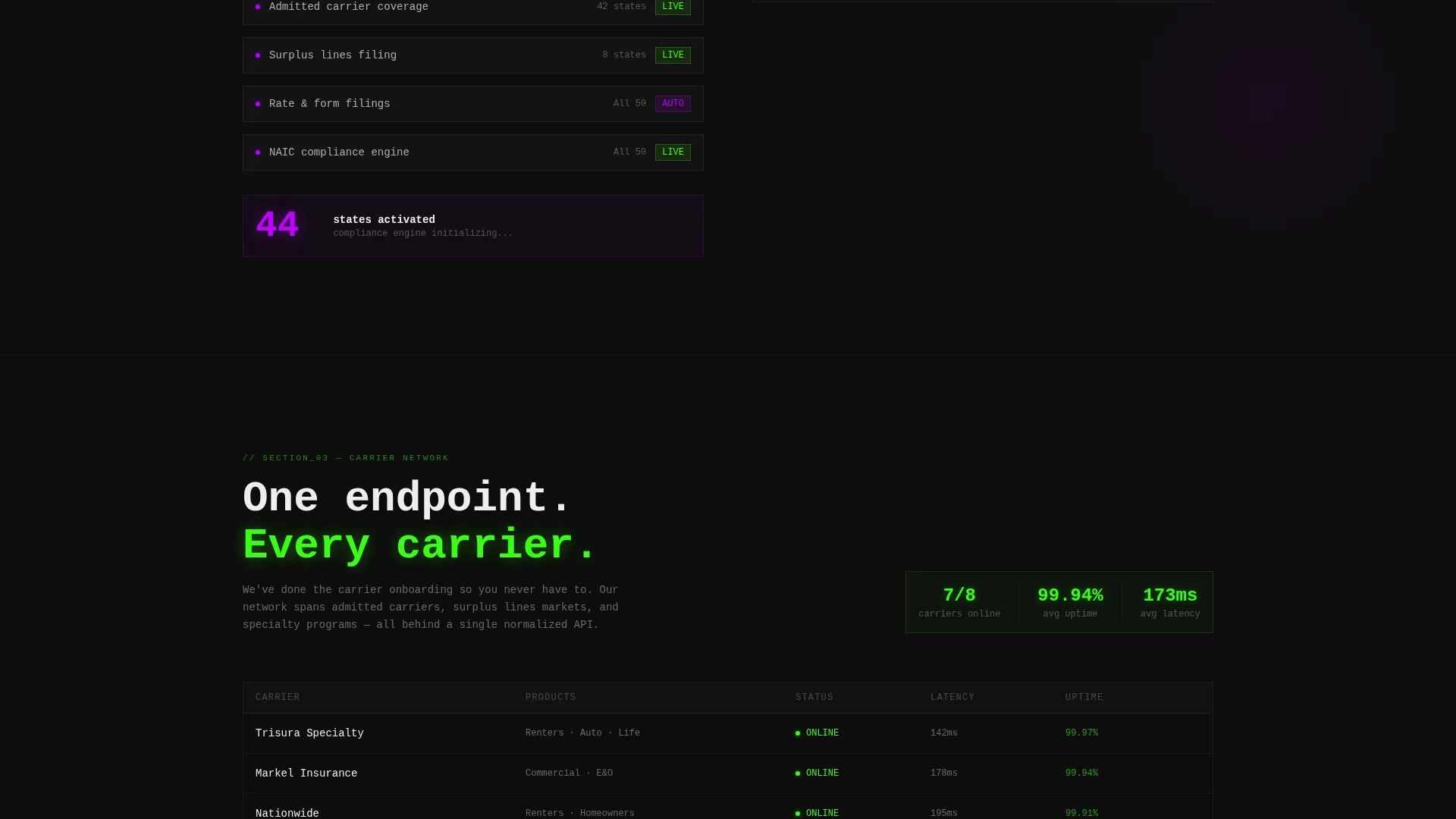
The third reveal presents carrier logos alongside connection status indicators styled like a system health dashboard. It reads like infrastructure monitoring, not a marketing slide.
Persistent Sandbox Call-to-Action
The primary call-to-action button labeled "Explore the Sandbox" first appears after the code-snippet reveal. It then stays fixed to the bottom of the viewport for the rest of the scroll. A secondary ghost-outlined button reads "Read the Docs." There are no form fields on the page.
Page sections overview
| Section | Purpose |
|---|---|
| Stats metrics header | Renders key technical metrics one by one to stop developer scrolling immediately |
| Embed workflow reveal | Shows a live code snippet beside a simulated checkout to prove integration simplicity |
| Compliance engine reveal | Animates a state-by-state coverage map to communicate regulatory breadth visually |
| Carrier network reveal | Displays carrier logos and status indicators styled as a live system dashboard |
| Persistent sandbox call to action | Keeps the primary action fixed in view throughout the scroll without requiring a form |
Design & branding system
The visual identity is built on a Bold Brutalist theme using an Acid Digital color system. Every color in the palette has a defined job. Nothing decorates without purpose.
- Void black (#0D0D0D) dominates the background, making every glowing element feel like it is radiating off the screen
- Reactor green (#39FF14) marks live data, primary accents, and the main call-to-action button
- Ultraviolet (#BF00FF) handles secondary highlights, hover states, and the compliance map activation
- Raw white (#EDEDED) is reserved for monospaced body type, keeping legibility sharp against dark backgrounds
Mobile & speed optimization
The template is designed around a scroll-reveal interaction model that works on both desktop and mobile viewports. The layout prioritizes a focused reading experience at every screen size.
- Oversized monospaced type in the header scales responsively so metrics remain readable on smaller screens
- The fixed viewport call-to-action button stays accessible at the bottom of the screen on mobile without obstructing content
- Section locks and progressive reveals are built to feel native on touch-scroll devices
How this template helps you convert
This template is engineered around one conversion goal: get a technical founder to click through to the sandbox or documentation before they have a reason to leave.
- The metrics header creates immediate conviction by showing proof before the visitor even reads a headline, making "wait, really?" the first reaction
- The progressive feature matrix builds credibility section by section, so by the time the call-to-action is fully visible, the product has already demonstrated itself through working code and visual proof
- The no-form-field approach removes all friction from the first click, letting the sandbox environment do the final selling once the visitor arrives
Other information about this template
This template sits at the intersection of the Startup and Launch category and the InsurTech Pre-Seed Startup niche. It is purpose-built for a very narrow use case, which is exactly what makes it effective.
- The template style is Scroll Reveal (Progressive), meaning content layers unlock as the visitor moves down the page
- The header concept is Stats and Metrics, which replaces a traditional hero image with raw numbers rendered in sequence
- The creative direction is a Feature Matrix, structuring the page around three escalating proof points rather than a feature grid
- The landing-page direction is Click-Through, optimized for a single exit action rather than lead capture
- The theme is Bold Brutalist, rejecting decorative user interface in favor of raw type, glowing accents, and maximum information density
- The color system is Acid Digital, combining void black, reactor green, ultraviolet, and raw white for a look that reads like a radiation monitor crossed with a code editor
Theme
Bold Brutalist
Creative direction
Feature Matrix
Color system
Acid Digital
Style
Scroll Reveal (Progressive)
Direction
Click-Through
Page Sections
Live Metrics Render Header
Scroll-locked Progressive Reveals
Embed Workflow Code Snippet
State-by-state Compliance Map
Carrier Network Status Dashboard
Persistent Viewport Call to Action Button
Related questions
Does this template include form fields or lead capture?
Who is the target audience for this landing page template?
Can I customize the metrics shown in the header?
What makes this different from a general startup landing page template?
Is this template suitable for a startup that has not yet launched publicly?



