Biotech Startup Professional Website Template
Sequence is a single-page biotech pitch deck advisory landing page built for pre-Series A founders who need hard data, not encouragement. It pairs a live comparison tab switcher with an interactive deck diagnostic tool, benchmarking your deck structure against 200+ closed rounds. Every section earns scroll before asking for anything.
by Rocket studio
Quick summary
Sequence is a high-intensity, single-page advisory landing page designed for biotech founders preparing a Series A raise. It opens with a live comparison grid, moves through a deck diagnostic tool, and escalates through pipeline benchmarks and investor attention heatmaps before delivering a clear conversion ask. The tool is the hero from the first pixel.
Who this template is for
This template is built for founders and operators deep in pre-Series A fundraise preparation. It speaks to people who want proof over polish and data over reassurance.
- Chief Scientific Officers (CSOs) spinning out of academic labs who need to validate their deck structure against funded peers
- Chief Executive Officers (CEOs) at pre-IND (Investigational New Drug) stage startups burning through seed runway before a Series A push
- Business Development (BD) leads at platform companies repositioning for a new therapeutic modality and retooling their narrative for investors
What problem this template solves
Most biotech founders walk into partner meetings guessing. They do not know whether their slide count, data density, or narrative sequence matches the decks that actually closed. That gap is expensive.
- Founders have no reliable benchmark for how their deck compares to funded rounds in the same pipeline stage
- There is no visible signal showing where investor attention drops, which slides carry weight, and which kill momentum
- Without a structured diagnostic, founders cannot identify what is missing before it costs them the term sheet
What you get with this template
You get a fully structured, desktop-first landing page designed to deliver benchmarking utility before asking for anything in return. Every section is built to deepen credibility through data.
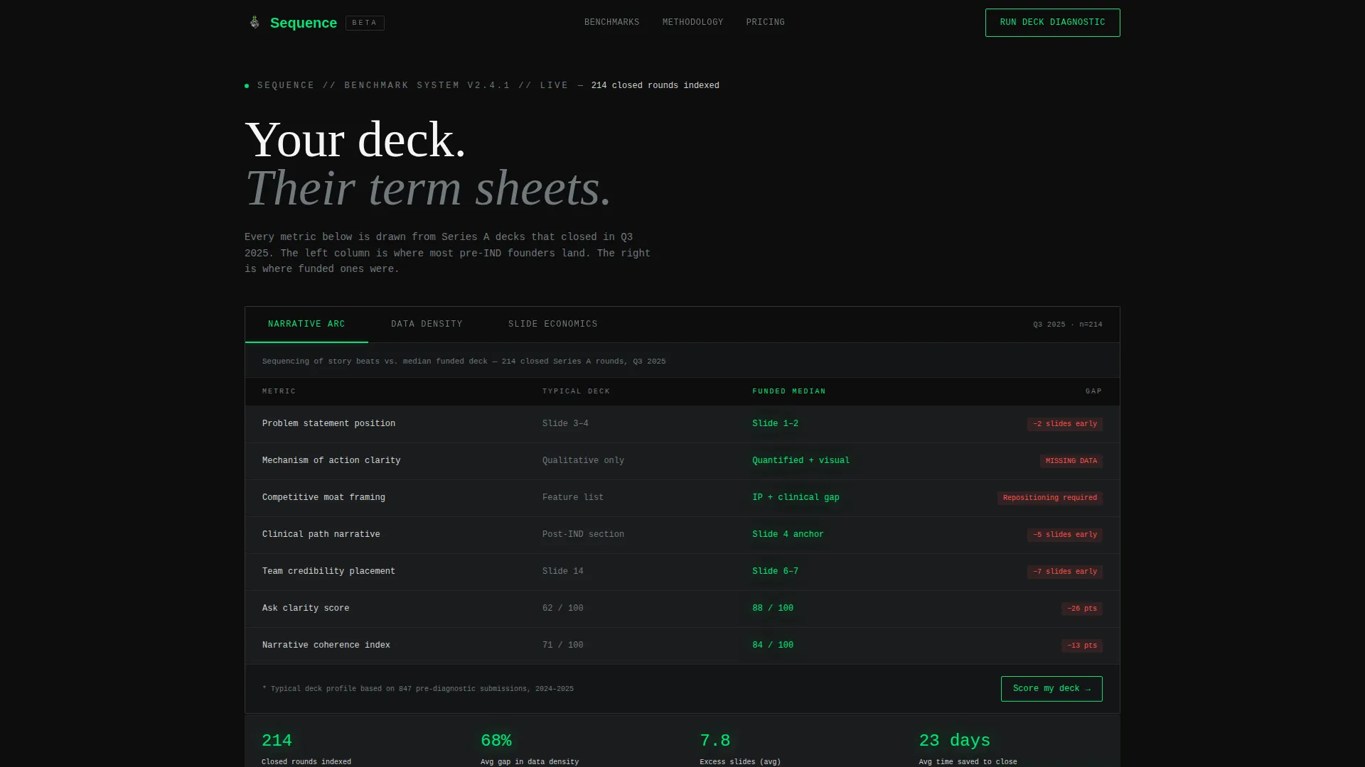
- A Feature Tab Switcher opening section with three live comparison tabs: Narrative Arc, Data Density, and Slide Economics
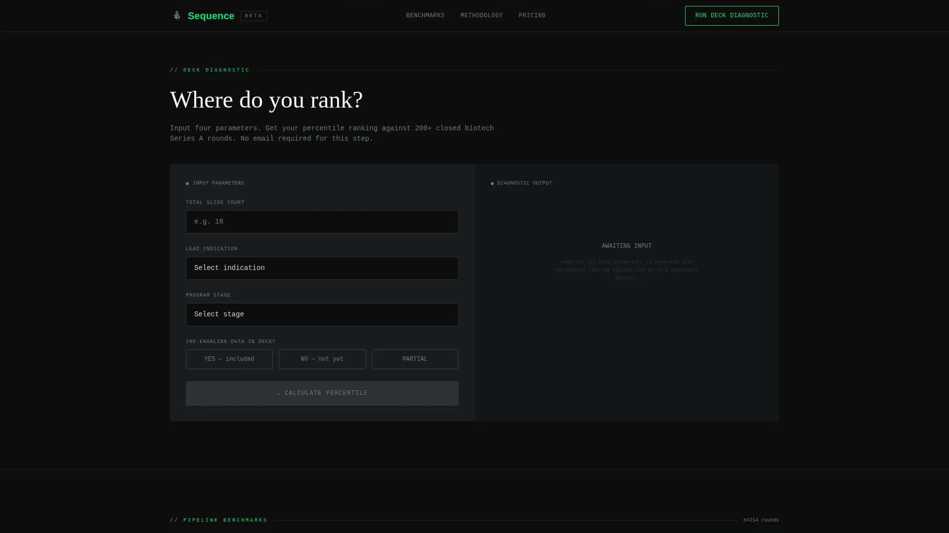
- An interactive Deck Diagnostic Tool that accepts slide count, stage, lead indication, and IND-enabling data status, then outputs a percentile ranking against 200+ closed biotech rounds
- A five-section page flow covering the comparison grid, pipeline stage benchmarks, investor attention heatmaps, an anonymized funded-versus-passed deck teardown, and a gated conversion form
Feature list
This template includes purposefully engineered components, each serving a distinct role in the founder's diagnostic journey.
Three-Tab Comparison Grid Header
Three tabs labeled Narrative Arc, Data Density, and Slide Economics sit across a matte-black panel at the top of the page. Each tab reveals a live comparison grid showing the visitor's typical deck structure against the median funded deck. Metrics are rendered in monospaced type. The active tab glows with the signal-green accent; inactive tabs hold steel-gray. No hero image loads before this tool.
Interactive Deck Diagnostic Tool
Below the tab switcher, founders enter their slide count, lead indication, development stage, and whether they carry IND-enabling data. The tool outputs a percentile ranking against a dataset of 200+ closed biotech rounds. The result is immediate and visible without requiring a form submission, but deeper analysis is gated behind the primary call to action.
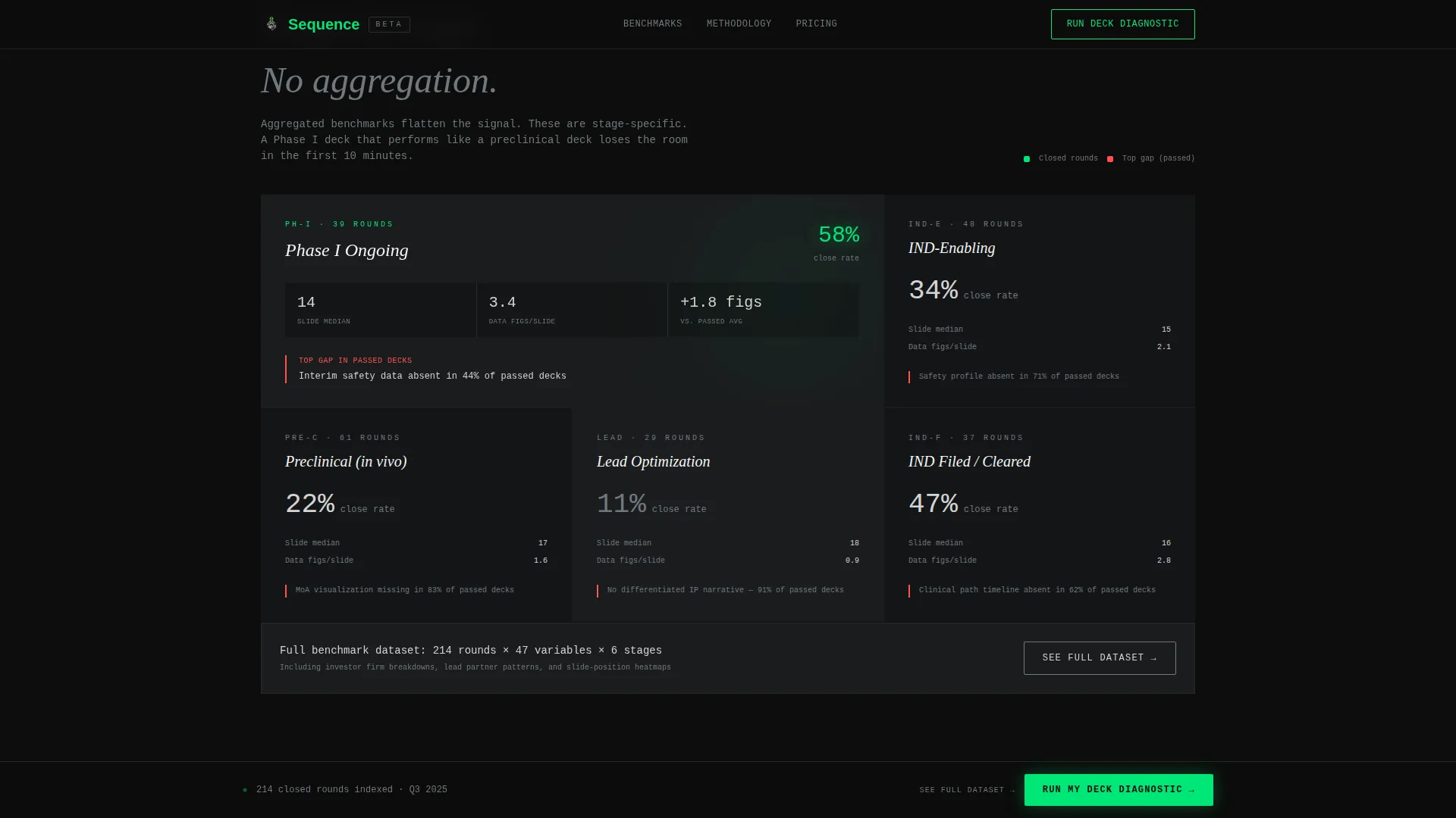
Pipeline Stage Benchmark Grid
A bento-style grid presents stage-by-stage metrics comparing funded and passed decks. Founders can see how decks at discovery, pre-IND, and Phase I differ in data figure frequency, narrative sequencing scores, and slides-to-term-sheet ratio. This section makes stage-specific gaps concrete rather than abstract.
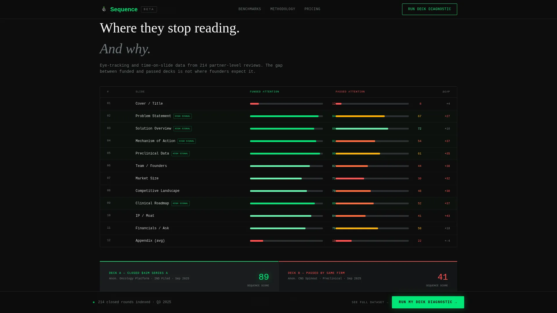
Investor Attention Heatmap Section
A slide position heatmap visualizes where investor attention concentrates across a standard biotech deck. An anonymized side-by-side teardown of one funded deck and one passed deck sits alongside it. The section turns subjective feedback into readable signal.
Dual-Path Conversion Section
The primary call to action reads "Run My Deck Diagnostic" and collects company name, lead program phase via dropdown, deck file upload in PDF or PPTX format, and email. A secondary path, "See the Full Benchmark Dataset," captures email-only leads who are not ready to share their deck yet. Both paths are visible in the same conversion section.
Developer-Minimal Footer
A single-row footer follows the GitHub Developer Minimal pattern: copyright information, navigation links, and social icons on one clean line. No decorative elements, no redundant sections.
Page sections overview
| Section | Purpose |
|---|---|
| Tab Switcher Header | Opens with live funded-versus-passed comparison grid across three analytic tabs |
| Deck Diagnostic Tool | Accepts founder inputs and outputs a percentile ranking against 200+ closed rounds |
| Pipeline Stage Benchmarks | Bento grid showing stage-by-stage funded and passed deck metrics |
| Investor Attention Heatmap | Slide position heatmap plus anonymized funded-versus-passed deck teardown |
| Conversion Form Section | Primary diagnostic form and secondary email-only benchmark dataset capture |
| Developer Minimal Footer | Single-row footer with copyright, links, and social icons |
Design & branding system
The visual identity follows a Data Command theme. Every design decision reinforces the feeling of a precision instrument interface, where contrast carries meaning and decoration has no place.
- Color system uses surgical black (#0D0D0D) for backgrounds, instrument-grade steel (#71797E) for inactive user interface elements, catheter-line light gray (#D4D4D4) for body text, and signal green (#00E676) reserved exclusively for outperformance indicators and primary calls to action
- Typography pairs JetBrains Mono for all monospaced data readouts, Fraunces as the serif typeface for section headers, and DM Sans for body copy
Mobile & speed optimization
The template is designed desktop-first to match its war room terminal aesthetic. Founders using this page are typically at a laptop late at night during fundraise preparation, and the layout prioritizes that context.
- Interactive components including the tab switcher and diagnostic calculator are built as client-side components, while static content sections use server-side rendering to keep load behavior clean
- Animation is high-intensity by design: tab switching transitions, scroll reveals, count-up number animations, animated chart SVGs, and staggered grid reveals are all part of the intended experience
How this template helps you convert
The page converts by proving its value before asking for anything. The progression from free data to gated insight is deliberate and architecturally enforced.
- The tab switcher and diagnostic tool give away enough real benchmarking data that founders can see their deck's position without submitting anything, making the gap between where they are and where funded decks sit undeniable
- The "Run My Deck Diagnostic" call to action appears first inside the tool output as a gated deeper-analysis unlock, then repeats as a fixed bottom bar after the second scroll section, keeping the primary conversion path visible without interrupting the data experience
Other information about this template
This template is part of the Startup and Launch category, specifically targeting the Biotech Startup subcategory and the Biotech Pitch Deck Page niche. A few additional details worth noting:
- The page is localized for English-language audiences using USD and United States date format conventions
- Animation complexity is high and intentional: tab switching, scroll reveals, count-up numbers, animated chart SVGs, and staggered grid reveals are all specified in the design brief
- The intersection of a Calculator and Tool First creative direction with a Comparison and Versus landing-page direction is a deliberate strategic choice that earns trust through utility before requesting data
- The template style is Comparison Table, meaning the core interaction is always a funded-versus-passed contrast rather than a feature showcase
- The header concept is a Feature Tab Switcher, which is an uncommon but high-engagement pattern for analytical advisory products
Theme
Data Command
Creative direction
Calculator/Tool First
Color system
Monochrome Steel
Style
Comparison Table
Direction
Comparison/Versus
Page Sections
Three-tab Live Comparison Grid
Interactive Deck Diagnostic Tool
Pipeline Stage Benchmark Grid
Investor Attention Heatmap
Dual-path Conversion Section
Data Command Visual System
Related questions
What kind of founder is this landing page built for?
What does the Deck Diagnostic Tool actually do?
What are the two conversion paths on this page?
Is this template easy to customize for a different visual identity?
What layout pattern does the footer follow?



