Defensive Driving Landing Page Template
Shield is a split-screen defensive driving landing page template built for training programs that turn raw drivers into alert ones. It pairs a cinematic Tech Glass visual identity with a side-by-side Comparison Journey layout, pushing every visitor toward an enrollment click through escalating real-world scenarios and ruby-accented urgency cues.
by Rocket studio
Quick summary
Shield is a single-page, click-through landing page template for defensive driving programs. It uses a 50/50 split-screen layout to place untrained and trained driving scenarios side by side. Every scroll deepens the stakes. The page closes with a full-width enrollment push, earning the click before a form is ever needed.
Who this template is for
Shield is built for driving schools, fleet safety teams, and corporate training providers who need to convert cautious visitors into enrolled students. It speaks to people who already feel the risk but have not yet committed to a solution.
- Parents of newly licensed teenagers who want peace of mind on Friday nights
- Fleet managers tracking rising insurance premiums from preventable fender-benders
- Corporate safety officers who need Department of Transportation compliance training without pulling drivers off the road for a full week
What problem this template solves
Most defensive driving pages list course features and expect visitors to connect the dots. Shield flips that approach. It puts the cost of NOT training on screen first, making the gap between untrained instinct and trained reflex feel immediate and personal.
- Visitors leave before enrolling because the page never makes the risk feel real
- Generic layouts treat safety training like any other product, losing the emotional case for action
- Split-screen comparison designs take too long to build from scratch, especially with animated counters and floating call-to-action elements
What you get with this template
Shield delivers a fully structured, desktop-first landing page with a mobile fallback stacking layout. Every section is pre-built and purpose-driven, from the animated hero to the final enrollment push.
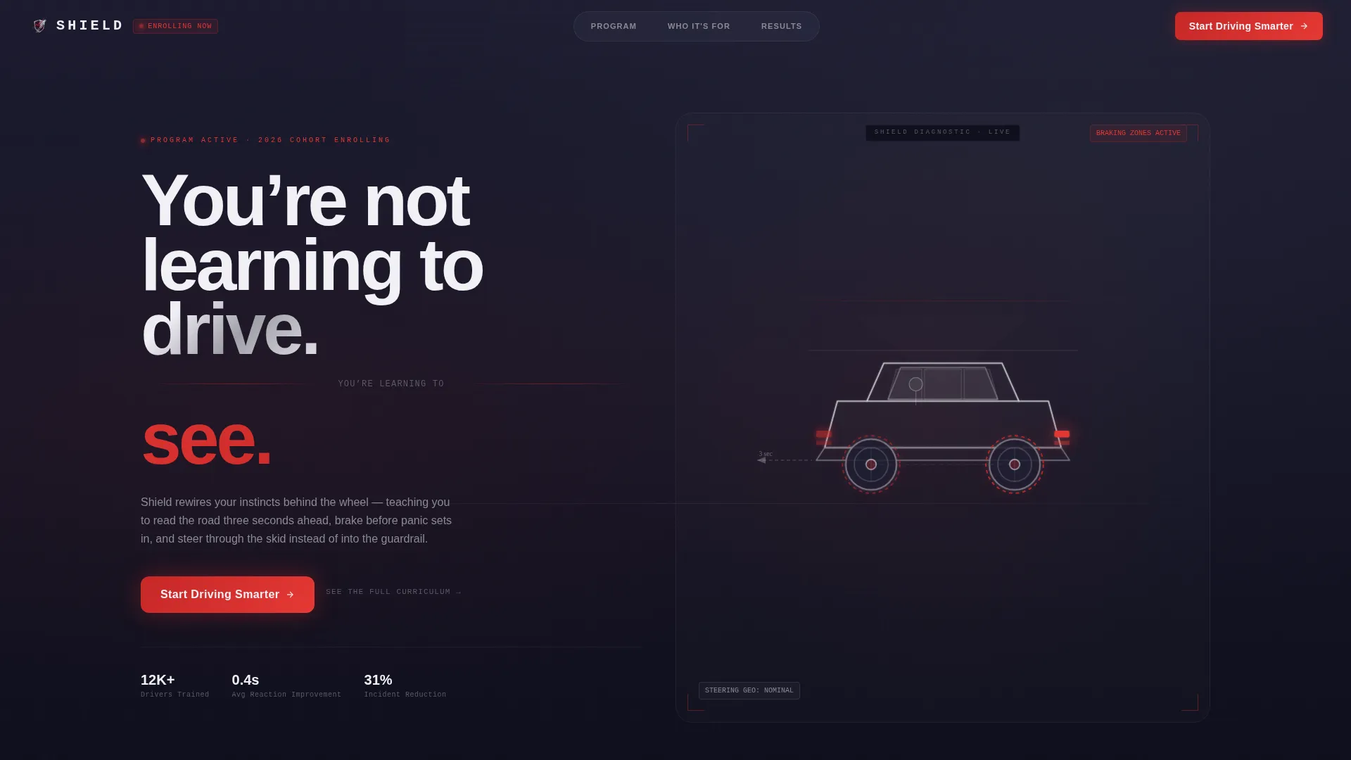
- A CSS 3D vehicle wireframe hero with braking zones, steering geometry, and driver sightlines built in
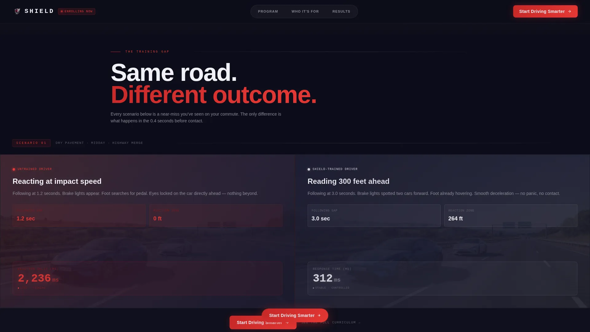
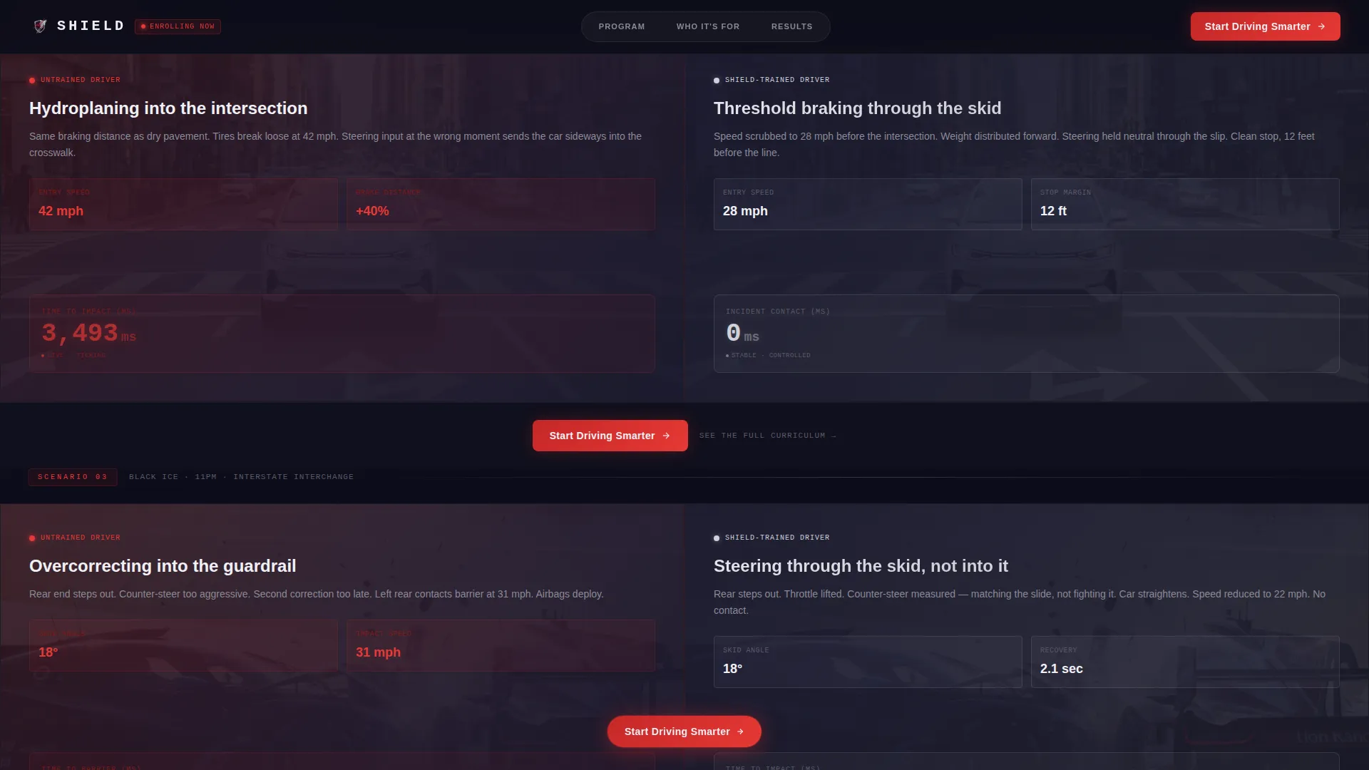
- Three escalating comparison scenario pairs covering dry pavement, wet roads, and black-ice intersections
- Floating ruby call-to-action buttons anchored to the header and to every comparison pair
Feature list
This template ships with a tight set of high-impact components that work together to move visitors from first impression to enrollment click.
CSS 3D Glass Cockpit Hero
A translucent, glass-shelled vehicle rotates on a dark stage at page load. Braking zones pulse in ruby, steering geometry articulates in chrome wireframe, and driver sightlines project as luminous cones through the windshield. The headline lands in clean chrome type after the full rotation completes.
Comparison Journey Split Panels
Three 50/50 split-panel pairs place untrained and trained scenarios side by side. Each pair escalates from dry pavement to wet roads to black-ice intersections. Millisecond counters run live on the untrained side and freeze on the trained side, making the gap between instinct and training visible at a glance.
Floating Click-Through Call to Action
The primary "Start Driving Smarter" button appears first in the hero and then floats at the bottom of every comparison pair as the visitor scrolls. A secondary text link, "See the Full Curriculum," sits beneath each call to action for visitors who need the syllabus before they commit.
Asymmetric Bento Who-It's-For Section
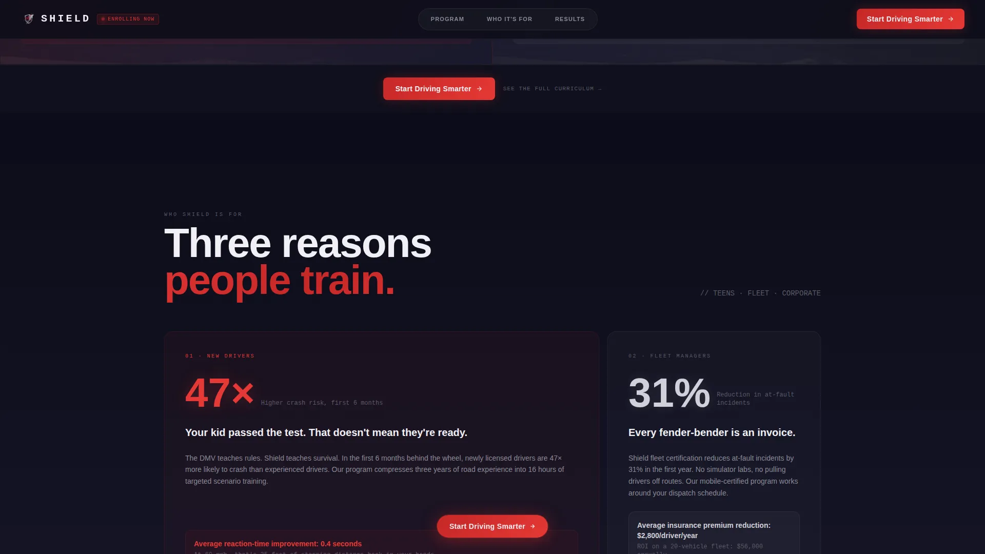
An asymmetric bento grid breaks down three distinct audience segments: teens, fleet drivers, and corporate teams. Each tile leads with a specific outcome rather than a generic description, keeping the case for enrollment concrete and audience-relevant.
Marquee Social Proof Strip
A scrolling testimonial marquee displays names, roles, and specific outcome statistics such as reaction time improvement percentages and insurance reduction figures. This format keeps proof in constant view without interrupting the comparison flow.
Full-Width Final Enrollment Push
The closing section is a full-width, ruby-dominant enrollment call to action. It concentrates urgency before the footer, giving hesitant visitors one last, high-contrast reason to click through to the scheduling page.
Page sections overview
| Section | Purpose |
|---|---|
| Hero with 3D Spin | Opens with rotating vehicle animation and primary headline |
| Comparison Journey Panels | Shows three escalating untrained-versus-trained scenario pairs |
| Who It's For | Breaks down outcomes for teens, fleet, and corporate audiences |
| Social Proof Marquee | Streams testimonials with specific performance statistics |
| Final Enrollment Call to Action | Delivers full-width ruby urgency push before the footer |
| Linear Single-Row Footer | Closes the page with minimal, structured link navigation |
Design & branding system
Shield runs on a Tech Glass visual identity built around four tightly controlled colors. The palette feels like staring through a rain-slicked windshield at night, where every surface is both transparent and reflective.
- Deep windshield tint (#1A1A2E) anchors all backgrounds like the dimmed interior of a luxury cabin
- Polished chrome (#D0D0D8) carries all typography and structural lines, with reflective highlight white (#F0F0F5) tracing glass edges and dividers
- Brake-light ruby (#C62828) dominates every call-to-action element and warning-state indicator, making danger and decision points instantly distinct
Mobile & speed optimization
Shield is designed desktop-first because the split-screen comparison concept depends on side-by-side viewing. A mobile fallback layout stacks each panel vertically so the comparison logic stays intact on smaller screens.
- All animations use GPU-accelerated transforms only, keeping scroll performance smooth on modern devices
- Scroll event listeners are set to passive mode, reducing input lag during comparison panel interactions
- The floating call-to-action element reflows gracefully on mobile so the enrollment click is never buried
How this template helps you convert
Shield builds its conversion case through accumulated emotional pressure rather than a single persuasive block. Each section adds one more reason to act.
- The 3D hero establishes credibility immediately by presenting the program as precise and data-driven before a single word of course description appears.
- Each comparison pair raises the personal stakes, turning abstract safety statistics into near-miss moments the visitor recognizes from their own commute.
- The floating call-to-action button stays in view throughout the scroll, so the decision to click is never more than one moment of recognition away.
Other information about this template
Shield is categorized under Automotive and Transport, Driving School, and Defensive Driving. It is localized for English-language audiences in the United States and priced in USD. Typography uses Manrope for large display headings and JetBrains Mono for data counters and millisecond readouts. The template intersection match score for this niche and layout combination is 13. Animation intensity is high throughout, with scan lines, character reveal effects, counter animations, and IntersectionObserver-triggered transitions all included in the build. The page carries no on-page form; the single conversion goal is a click through to an external enrollment and scheduling flow.
- Designed for defensive driving programs operating in the United States market
- Typography pairing: Manrope for headings, JetBrains Mono for counter and data elements
- No embedded form; conversion goal is a single click-through to a scheduling page
Theme
Tech Glass
Creative direction
Comparison Journey
Color system
Ruby & Chrome
Style
Split Screen (50/50)
Direction
Click-Through
Page Sections
CSS 3D Glass Cockpit Hero
Comparison Journey Split Panels
Floating Click-through Call to Action
Asymmetric Bento Audience Grid
Marquee Social Proof Strip
Full-width Enrollment Push
Related questions
Does this template include an enrollment form?
Can I use this template for a fleet safety training program?
How does the split-screen comparison layout work on mobile?
What animation elements are included in the hero section?
Is this template suitable for a corporate compliance training program?