Solopreneur & Indie Maker Content Specialist Blog Website Template
Ship is a bold editorial landing page template built for solopreneurs and indie makers who teach what they build. Styled like an indie zine, it presents an online course as a series of magazine feature stories. The masonry layout, warm Cloud Canvas palette, and chapter-opening header give your course page a voice that cuts through generic SaaS noise.
by Rocket studio
Quick summary
Ship turns your solopreneur online course into a magazine you actually want to read. The landing page opens like a chapter one, moves through masonry clusters of course modules and student case studies, and closes with a generous free preview before asking for anything. It is built for makers who teach, not marketers who pitch.
Who this template is for
This template speaks directly to people who build and teach from the edges of their day jobs. If your course feels more like a creative project than a product, Ship matches that energy.
- Developers, designers, and writers selling an online course they built after hours
- Indie makers and solopreneurs launching a digital workshop for the first time
- Course creators who want their page to feel editorial and human, not corporate
What problem this template solves
Generic course landing pages look like every other SaaS dashboard. They lead with pricing, hide the good stuff, and feel cold to the exact audience that craves warmth and honesty. Ship solves that mismatch.
- Most course pages bury the content and lead with the sale; Ship leads with generosity
- Masonry layouts built for editorial storytelling are rarely available as ready-made templates
- Indie makers need a page that reflects the lo-fi, high-conviction energy of their work
What you get with this template
Ship delivers a complete single-page layout structured around editorial storytelling and deliberate content sequencing. Every section is designed to earn trust before asking for a click.
- A chapter-styled hero section with a bold serif headline and diagonal rocket illustration
- Two masonry clusters presenting course modules and student case studies as magazine clippings
- Full-width mission manifesto blocks in oversized serif type between masonry clusters
- Three free lesson excerpt previews and a coral call-to-action block before any gate
- A sticky bottom call-to-action bar that appears after the visitor scrolls past case studies
- A single-field email capture card styled as a magazine subscription card
Feature list
This section covers the core built-in capabilities that make Ship work as a solopreneur course landing page.
Chapter-Opening Hero Section
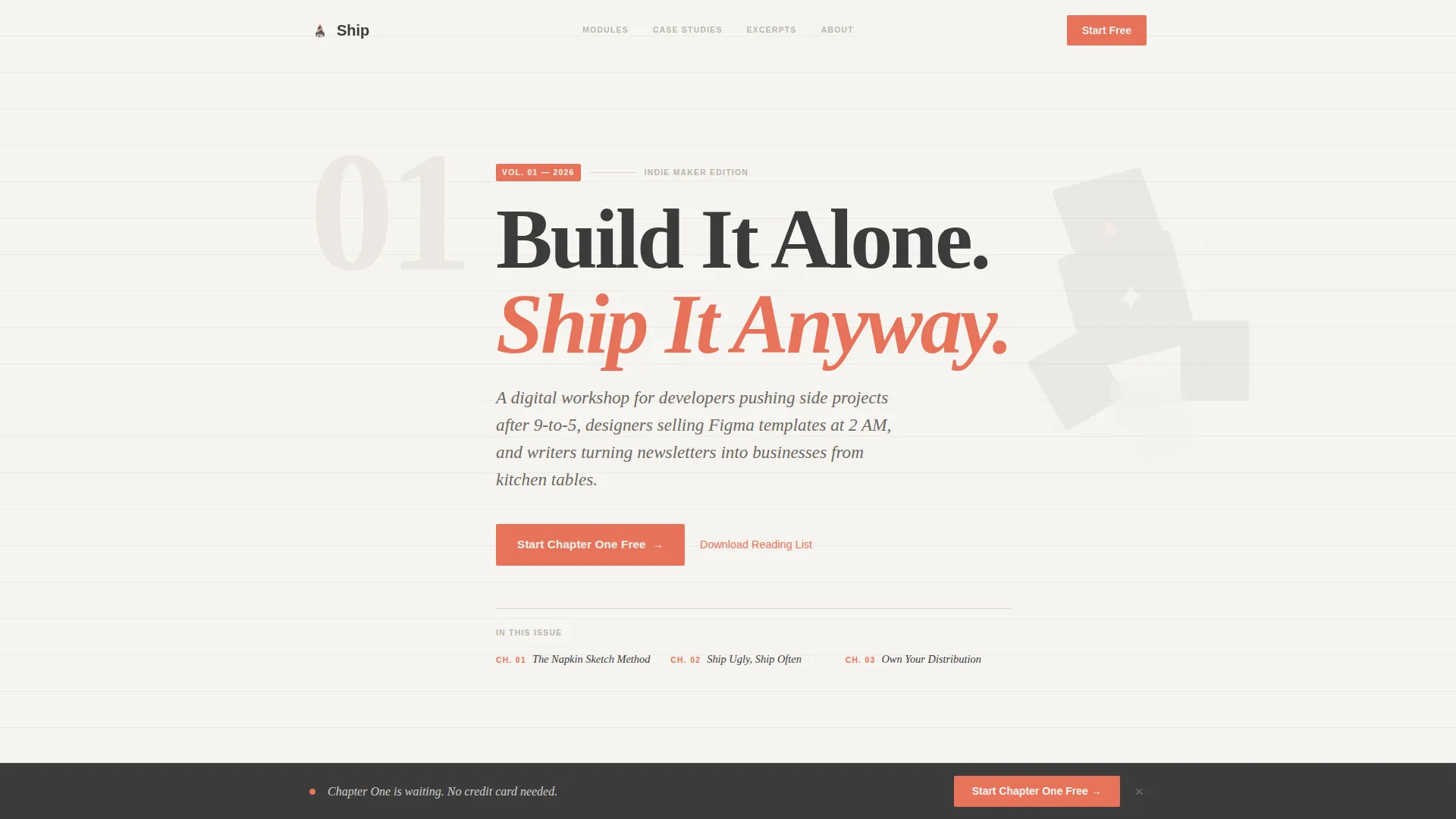
The hero opens with a large serif numeral "01" floating top-left like a chapter marker. A bold editorial serif headline sits beside it, with an italicized magazine-style subhead below. A diagonal pencil-stroke rocket illustration sits on cloudbank white background. No photography needed.
Masonry Card Layout
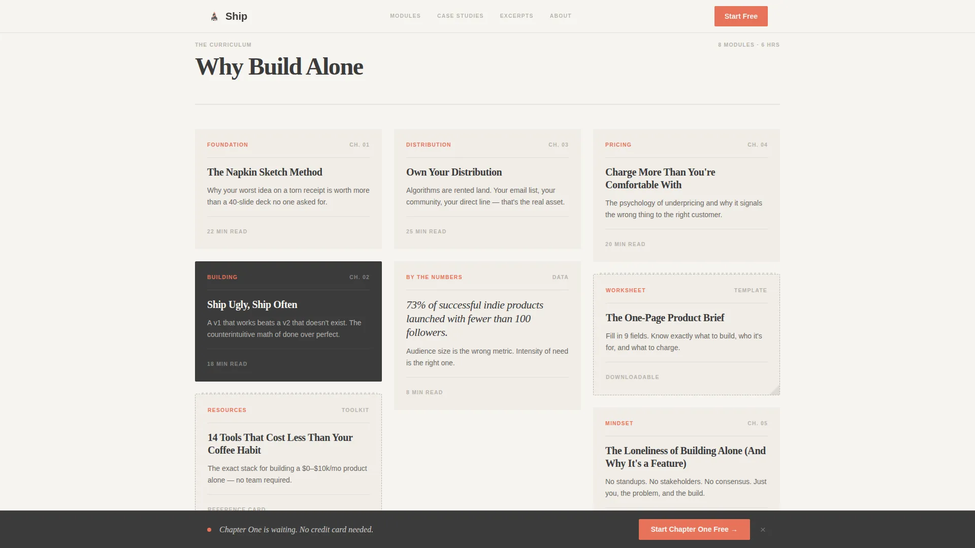
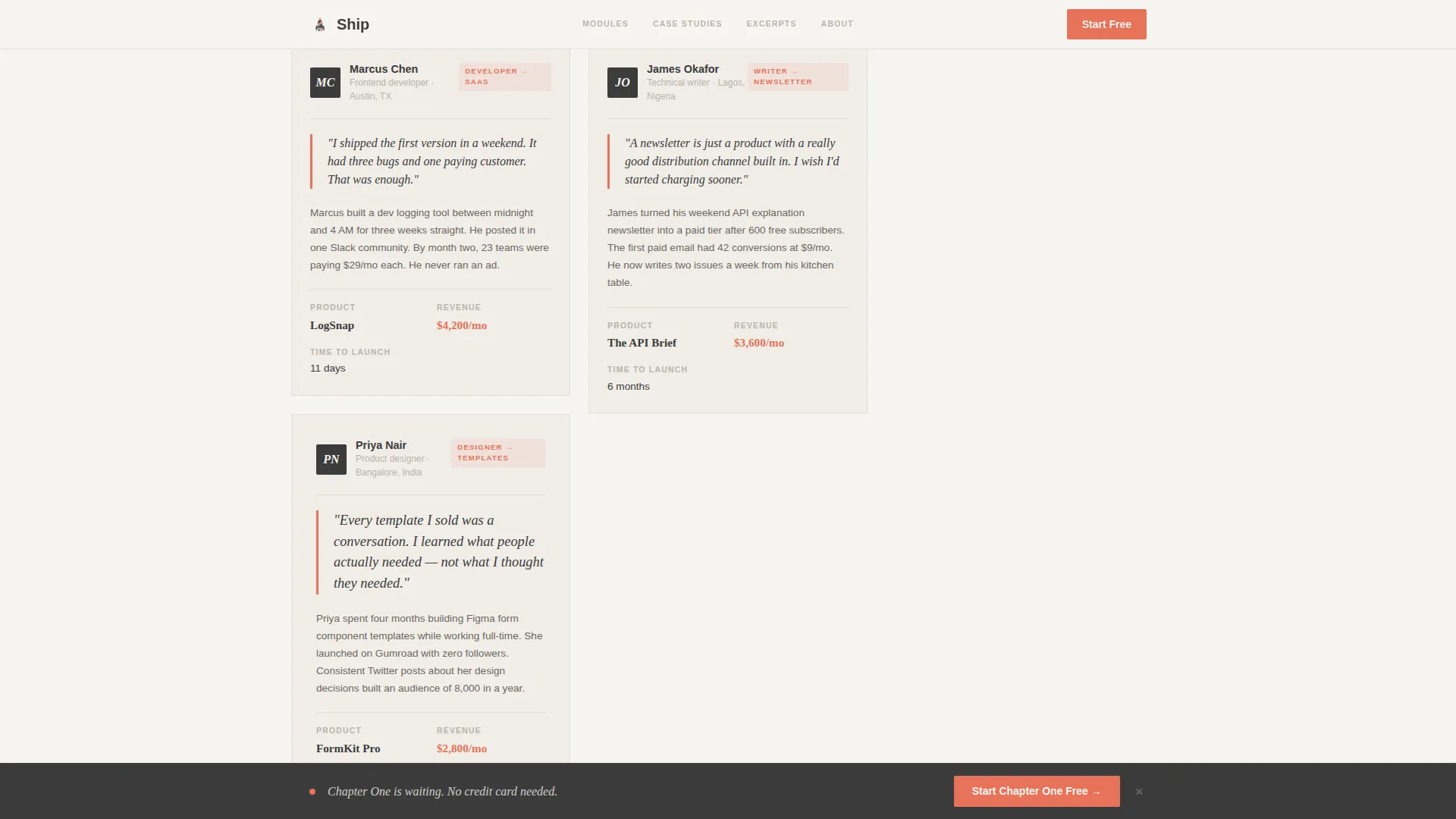
Course modules are styled as pinned magazine feature articles with bold headlines and two-line deckheads. Student case studies appear as profile interview cards with coral pull quotes. Resource cards use dotted borders to mimic torn-out zine pages. Cards include hover states and scroll-reveal animations with stagger.
Mission Manifesto Blocks
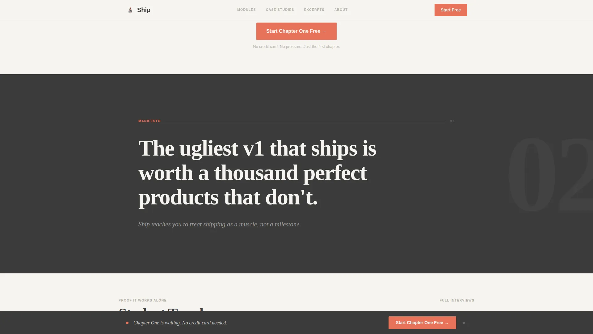
Full-width sections between masonry clusters display oversized serif type. These act as editorial breathing room and emotional anchors. Each manifesto block reinforces the course philosophy around shipping solo and owning your distribution.
Generous Free Preview Section
Three complete lesson excerpts are presented before any email gate or paywall. Two student teardown interviews appear as inline case study profiles. The table of contents is visible to all visitors, giving full transparency into the course structure.
Sticky Bottom Call-to-Action Bar
A persistent bottom bar activates after the visitor scrolls past the case study cluster. It carries the primary call to action and stays visible without interrupting the reading flow. The bar disappears on earlier scroll positions so it never feels premature.
Magazine Subscription Email Capture
A single email input field is styled as a subscription card from an indie print magazine. It offers a downloadable reading list as the incentive. The card design uses dotted borders and margin-note gray accents to stay consistent with the editorial theme.
Page sections overview
| Section | Purpose |
|---|---|
| Chapter 01 Hero | Opens the page like a book chapter with headline and rocket illustration |
| Masonry Cluster One | Presents course modules as editorial feature article cards |
| Mission Manifesto Block | Full-width serif statement that anchors the course philosophy |
| Masonry Cluster Two | Displays student case studies as profile interviews with pull quotes |
| Lesson Excerpts Block | Shows three free lesson previews to build trust before the gate |
| Primary Call to Action | Coral button block inviting visitors to start chapter one free |
| Email Capture Card | Magazine-style subscription card offering the indie maker reading list |
| Sticky Bottom Bar | Persistent call-to-action bar activated after case study scroll depth |
| Minimal Footer | Clean horizontal flow footer with essential links |
Design & branding system
Ship uses the Cloud Canvas color system, which feels like a Moleskine notebook left open on a café table. Every color choice is deliberate, warm, and restrained.
- Cloudbank white (#F6F4F0) fills all backgrounds; graphite (#3B3B3B) carries all body and headline type
- Margin-note gray (#B8B3AA) appears only as thin ruled-line section dividers, never as fill
- Highlighter coral (#E8735A) is used sparingly for links, buttons, and pull quotes so each instance feels intentional
- Typography pairs Fraunces editorial serif for headlines with DM Sans for body text and interface elements
Mobile & speed optimization
The template is built desktop-first but collapses gracefully for smaller screens. The masonry grid and editorial spacing adapt without losing the zine-like reading experience.
- Masonry card clusters reflow into single-column stacks on mobile without losing visual hierarchy
- Scroll-reveal animations and subtle parallax effects are kept at medium intensity to avoid heavy motion on smaller devices
- Server Components handle static content sections, keeping JavaScript usage minimal across the page
How this template helps you convert
Ship earns the conversion before it asks for it. The page is sequenced so that by the time a visitor reaches the call-to-action, they have already read real course content and real student stories.
- The free lesson excerpts and full table of contents are visible to every visitor, building trust without requiring any commitment first
- The primary call-to-action button placed after the first masonry cluster catches readers at their first moment of genuine interest, and the sticky bottom bar recaptures anyone who keeps scrolling
- The email capture card offers a tangible resource (the indie maker reading list) rather than a vague promise, making the single-field opt-in feel like a fair trade
Other information about this template
Ship sits inside the Blog and Editorial category and is purpose-built for the Solopreneur and Indie Maker Content subcategory. A few additional details worth knowing before you build with it.
- The template style is masonry and Pinterest-grid, making it well suited for content-heavy course pages that need visual variety without feeling cluttered
- The header concept follows a Chapter and Book opening structure, which reinforces the editorial storytelling theme throughout the scroll
- The creative direction is Vision and Mission, meaning the page uses manifesto-style copy blocks to communicate belief before it communicates features
- The landing page direction is Content and Resource, so the page is designed to give value first through free previews, excerpts, and a downloadable list before converting
- The intersection match between the editorial template style and the solopreneur online course niche is intentional; the design language mirrors the audience's own creative sensibility
Theme
Editorial Magazine
Creative direction
Vision & Mission
Color system
Cloud Canvas
Style
Masonry/Pinterest
Direction
Content/Resource
Page Sections
Chapter-opening Hero Section
Masonry Card Layout with Hover States
Mission Manifesto Blocks
Generous Free Preview Section
Sticky Bottom Call-to-action Bar
Magazine-style Email Capture Card
Related questions
Can I use this template for a course topic other than solopreneurship?
Does the template include actual course content or lesson materials?
How does the email capture section work in this template?
Is this template suitable for a solopreneur who is not a developer?
What makes this different from a standard course landing page template?



