Solopreneur & Indie Maker Content Blog Website Template
Shiplog is a heritage-styled solopreneur landing page template built for indie makers who write honestly about building in public. It combines a journal-like editorial layout with a focused lead generation flow, guiding readers from a split-hero entry point through four content chapters and into a weekly newsletter signup, using authentic entry cards, pull-quotes, and a free PDF offer.
by Rocket studio
Quick summary
Shiplog is a single-page solopreneur blog template with an anchor-nav hub structure. It documents the unglamorous middle of building side projects in public, using a warm, editorial aesthetic rooted in heritage print design. The template is built to convert curious readers into weekly newsletter subscribers through real content previews and two thoughtfully placed signup forms.
Who this template is for
This template is made for people building things alone, who want to write about it honestly. It suits makers who lead with authenticity rather than polish and who want their page to feel like a personal archive rather than a product site.
- Solo developers shipping side projects and software as a service products after hours
- Designers and writers bootstrapping newsletters, templates, or small digital products
- Aspiring solopreneurs who want to document their progress and grow an audience around it
What problem this template solves
Most blog and portfolio templates feel corporate or impersonal. They are built for brands, not for one person sitting at a kitchen table shipping something with borrowed time. Shiplog solves the mismatch between how indie makers actually work and how their web presence looks.
- Generic blog templates flatten the texture of a personal story into a sterile grid
- Newsletter signup forms appear too early, before the reader has any reason to trust the writer
- There is no natural editorial rhythm to guide a first-time visitor from curious stranger to engaged subscriber
What you get with this template
You get a fully structured, single landing page with a clear narrative arc. Every section has a defined purpose, and the layout guides the reader from an honest hero moment through real content entries before asking for anything in return.
- A split-hero header, four anchor-navigated content chapters, two newsletter signup placements, and a footer
- Asymmetric index-card grids, large italic pull-quotes, and a PDF lead magnet section built into the page flow
- A complete visual system using parchment, pencil-lead gray, faded ink blue, and terracotta, with three paired typefaces
Feature list
This section covers what makes Shiplog distinctly functional as a solopreneur blog landing page template.
Anchor Navigation with Chapter Labels
A sticky anchor nav pins to the top of the page as the reader scrolls. Each link is labeled as a chapter title rather than a category, giving the page the feel of a curated personal archive rather than a standard blog index.
Split-Hero Header with Sticky Note Detail
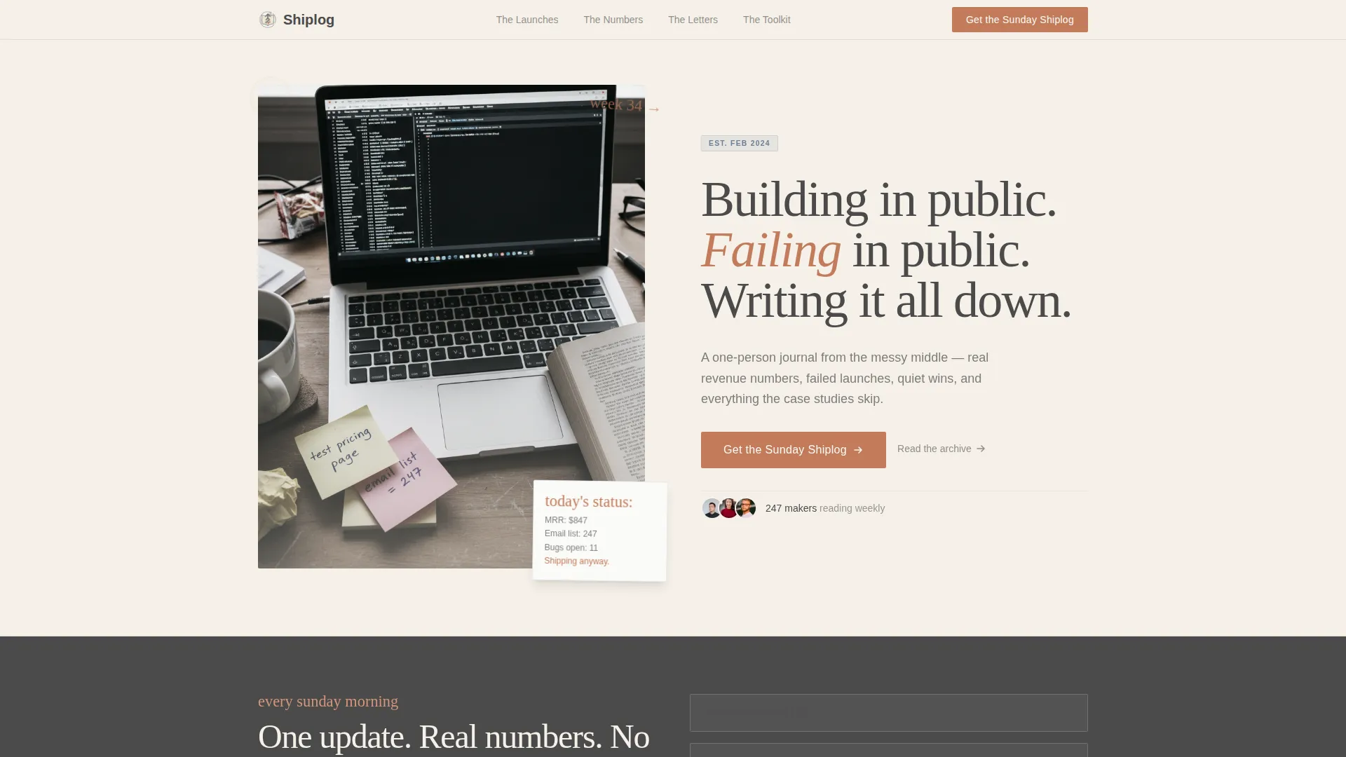
The hero section divides into a left-side photograph of a cluttered desk and a right-side serif headline block. A floating sticky note card overlays the image with handwritten-style text, grounding the page in a tactile, journal-like first impression.
Asymmetric Index Card Content Grids
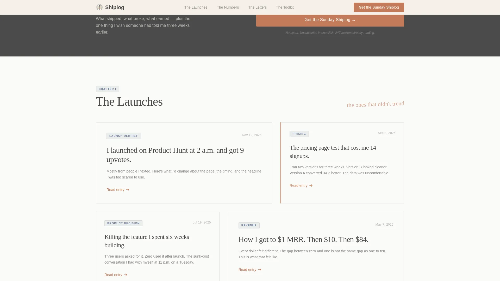
Each content chapter surfaces three to four cards arranged in a pinned, offset grid. Every card carries a date, a title, and a one-line hook, mimicking the feel of index cards tacked to a cork board rather than a uniform blog feed.
Dual Newsletter Signup Placements
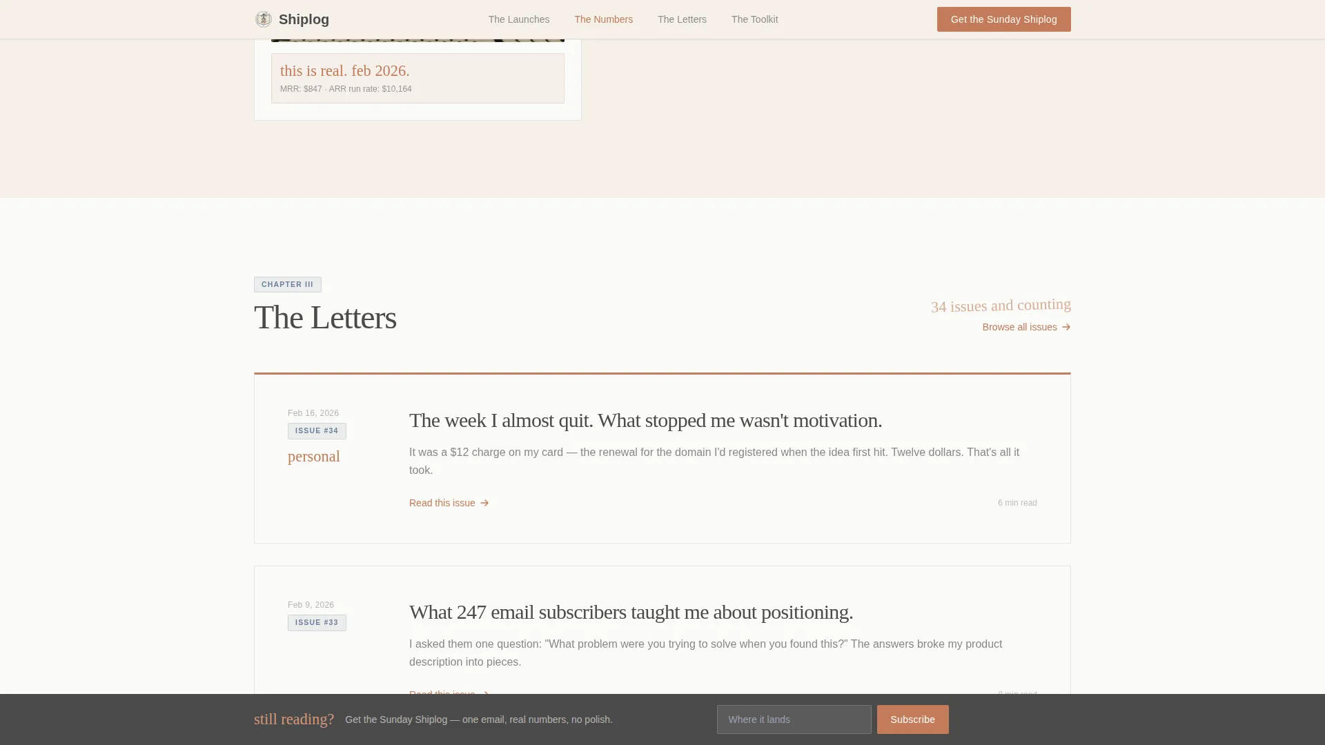
The primary call to action appears directly beneath the hero section. A second, persistent but unobtrusive signup bar appears after the second content chapter. Both forms ask only for a first name and email, reducing friction for the reader.
Pull-Quote Rhythm Breaks
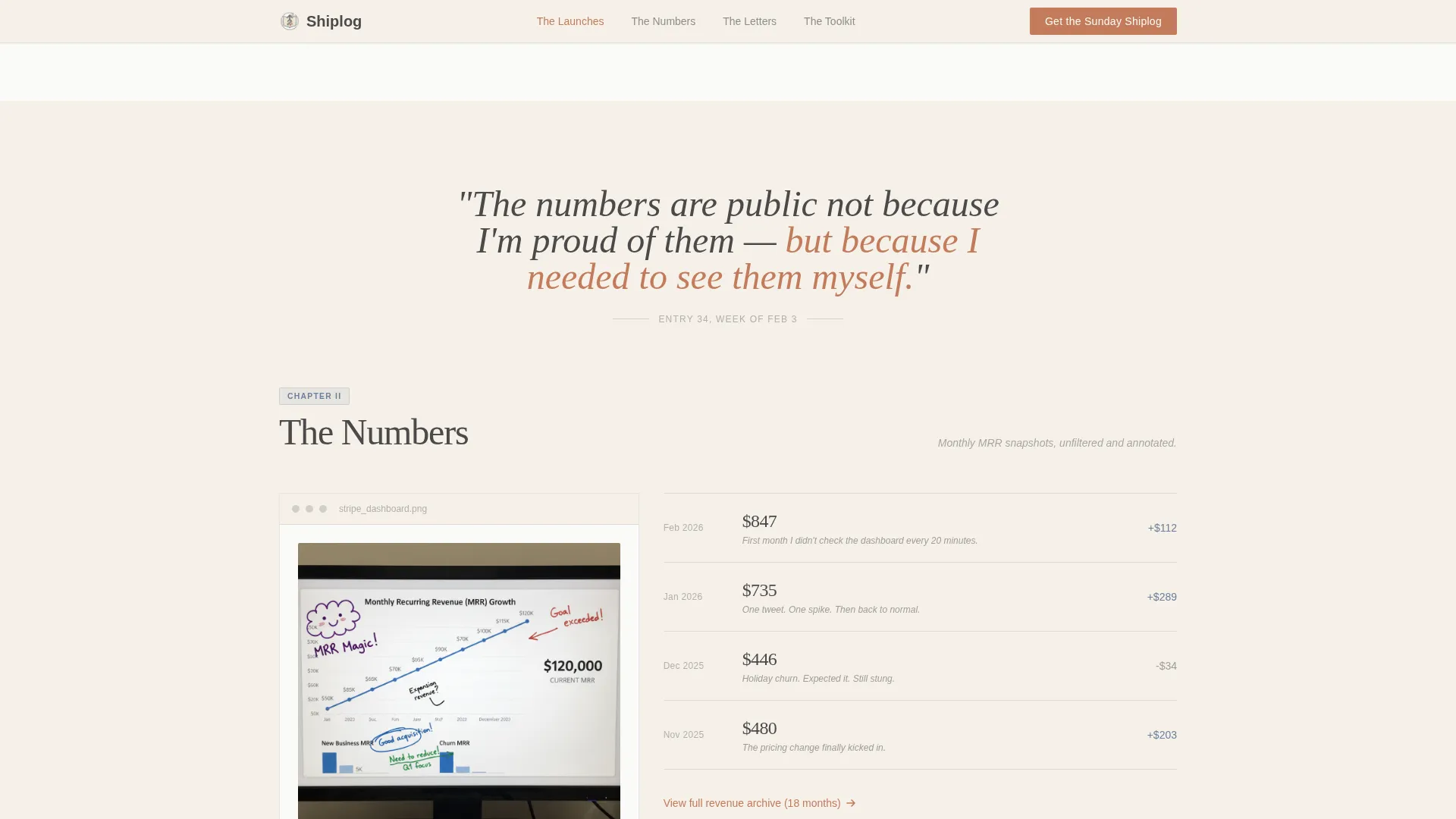
Between dense card clusters, large italic serif pull-quotes create breathing room in the scroll experience. These rhythm breaks build intimacy rather than momentum, letting the reader sit with an idea before moving deeper into the page.
PDF Lead Magnet Section
The Toolkit chapter includes a secondary conversion path offering a free downloadable PDF. It is gated behind the same two-field form, giving the reader a concrete reason to subscribe beyond the newsletter itself.
Page sections overview
| Section | Purpose |
|---|---|
| Hero Header | Introduces the journal premise with a split photo and serif headline |
| Newsletter Call to Action | Captures early signups with a two-field inline form |
| The Launches | Displays failed and successful launch entries as pinned index cards |
| The Numbers | Combines a pull-quote with a revenue-focused card cluster |
| The Letters | Surfaces intimate personal entries with an escalating tone |
| The Toolkit | Shows tools and stack cards alongside the PDF lead magnet offer |
| Page Footer | Closes with a horizontal flow footer layout |
Design & branding system
The visual identity follows a Heritage and Story theme, drawing from letterpress print and personal journal aesthetics. Nothing in the palette is loud; every color choice feels deliberate, as if applied with a careful hand rather than a brand guideline document.
- Colors: warm parchment (#F5F0E8), pencil-lead gray (#4A4A4A), faded ink blue (#6B7F99), and muted terracotta (#C27B5A) reserved for links, highlights, and the primary button
- Typography: DM Serif Display for headings, IBM Plex Sans for body text, and Reenie Beanie for handwritten accent details
- Backgrounds alternate between parchment and a near-white warm white (#FAFAF7), while terracotta appears sparingly to keep each instance feeling intentional
Mobile & speed optimization
The template is built desktop-first with a mobile-responsive fallback. Scroll-triggered reveals, subtle parallax effects, and hover card states are included to give the page life without overwhelming the reading experience.
- Sticky anchor nav and the persistent newsletter bottom bar are designed to work cleanly across screen sizes
- Static content is handled through server components, and scroll behavior is managed through CSS for reliable cross-device performance
- Hover states and card effects are scoped to pointer-capable devices so the mobile experience stays clean
How this template helps you convert
Shiplog earns conversions by showing value before asking for anything. The page is structured so that trust builds naturally through content exposure, not through pressure tactics.
- The reader sees real entry cards with dates and hooks before encountering any signup form, establishing credibility through content rather than claims
- The first newsletter call to action appears after the hero, and the second appears as a bottom bar after the second chapter, meeting the reader at two natural decision points
- The PDF lead magnet in the Toolkit chapter offers a tangible reason to subscribe, giving hesitant readers a concrete exchange rather than a vague promise
Other information about this template
Shiplog is a landing page template for solopreneurs who want their web presence to match the honest, unpolished nature of building something alone. A few additional details worth noting:
- The template uses English, United States dollar formatting, and United States date conventions throughout its placeholder content
- The page type is Hub and Spoke with Anchor Navigation, meaning each chapter section functions as a spoke reachable from the pinned hub nav at the top
- Animation intensity is set to medium, with scroll-triggered section reveals and hover effects that feel editorial rather than promotional
- The footer follows a horizontal flow layout pattern, keeping the closing section clean and uncluttered
- This template suits the Soft Mist color system and Curated Collection creative direction, making it a strong fit for solopreneur and indie maker blog use cases within the Blog and Editorial category
Theme
Heritage & Story
Creative direction
Curated Collection
Color system
Soft Mist
Style
Hub & Spoke (Anchor Nav)
Direction
Lead Generation
Page Sections
Sticky Anchor Chapter Navigation
Split-hero with Floating Detail Card
Pinned Index Card Entry Grids
Two-step Newsletter Capture Flow
Pull-quote Rhythm Breaks
PDF Lead Magnet in Toolkit Chapter
Related questions
Who is this template designed for?
How does the newsletter signup work in this template?
Can I use this template to offer a free download?
What does the anchor navigation do?
Is this template suitable for a blog with many posts?



