Editorial PM Interview Newsletter Landing Page Template
The Shipped Editorial PM Interview Newsletter Landing Page Template is a hub and spoke landing page built for a weekly product management interview newsletter. It combines an editorial magazine aesthetic with a waitlist-first conversion structure. The template features a manifesto header, anchor navigation, annotated issue previews, redact-and-reveal archive sliders, and a persistent email sign up form to turn curious visitors into committed subscribers.
by Rocket studio
Quick summary
Shipped is a weekly newsletter landing page template designed for product management interview content. It uses an editorial magazine visual system, a hub and spoke anchor navigation layout, and a waitlist-focused conversion flow. Every section is crafted to establish authority, deliver a clear value proposition, and move potential subscribers toward signing up with minimal friction.
Who this template is for
This template serves newsletter creators who want a landing page that feels like a premium publication rather than a generic email capture form. The design tone and structure are especially well suited for niche professional publishing in the career development space.
- Mid-career product managers preparing for senior-level interview panels who need a resource that reverse-engineers real hiring decisions
- Career-switchers from consulting or engineering who are entering product roles and need proof-based guidance to demonstrate their thinking
- Newsletter founders and solopreneurs launching a product management interview or profile publication who want a best newsletter landing page experience out of the box
What problem this template solves
Building a newsletter landing page that earns trust is hard. Most templates offer a generic sign up form with a headline and a button. They do not give potential subscribers enough context to commit. The landing page for a product management interview newsletter needs to establish immediate authority from the first scroll.
- Visitors arrive without context and leave before reading the value proposition, because the page fails to set clear expectations about what the newsletter actually delivers
- The subscription process feels transactional rather than editorial, which lowers perceived value and reduces sign ups for niche professional newsletters
- Newsletter creators lack a focused page structure that balances social proof, content preview, and a frictionless email capture in one cohesive layout
What you get with this template
This template gives you a complete, single-page waitlist landing page built around an editorial magazine framework. Every section has a defined role: build authority, demonstrate content depth, surface social proof, and capture the email address. The primary goal is to convert visitors into engaged subscribers before the newsletter launches.
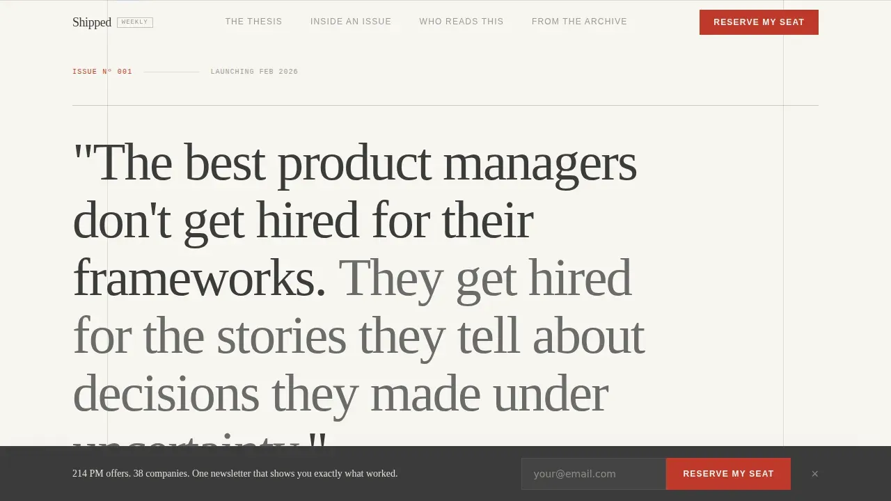
- A manifesto-style header with a large editorial serif quote, a live waitlist subscriber count display, and a "Reserve My Seat" call-to-action button placed above the fold
- An anchor navigation bar that pins to the top of the page as the visitor scrolls, with spoke labels styled as journal section headers for easy navigation between content areas
- A redact-and-reveal archive section with slider interactions that expose full profile analyses, giving visitors a concrete taste of exclusive content before they subscribe
Feature list
This template includes purpose-built components that work together as a cohesive newsletter landing page system. Each feature is drawn directly from the design brief and serves the waitlist conversion goal.
Editorial Manifesto Header
The header opens with a single sentence typeset in a large editorial serif font against a warm white background. There is no hero image. The quote breathes in generous whitespace, framed by thin graphite rules above and below like a broadsheet epigraph. A smaller sans-serif byline beneath it shows the newsletter name, the weekly cadence, and a live waitlist count. This clear headline approach sets the tone immediately and gives visitors a bold headline they remember.
Hub and Spoke Anchor Navigation
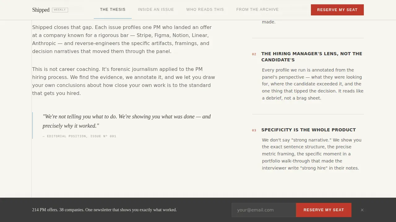
The anchor navigation bar pins to the top of the viewport as visitors scroll. Each spoke is labeled like a journal section: "The Thesis," "Inside an Issue," "Who Reads This," and "From the Archive." This structure creates a direct path through the page without letting casual visitors drift. The navigation highlights use a muted sky blue on hover, keeping the consistent color scheme intact throughout the scroll journey.
Annotated Issue Deconstruction
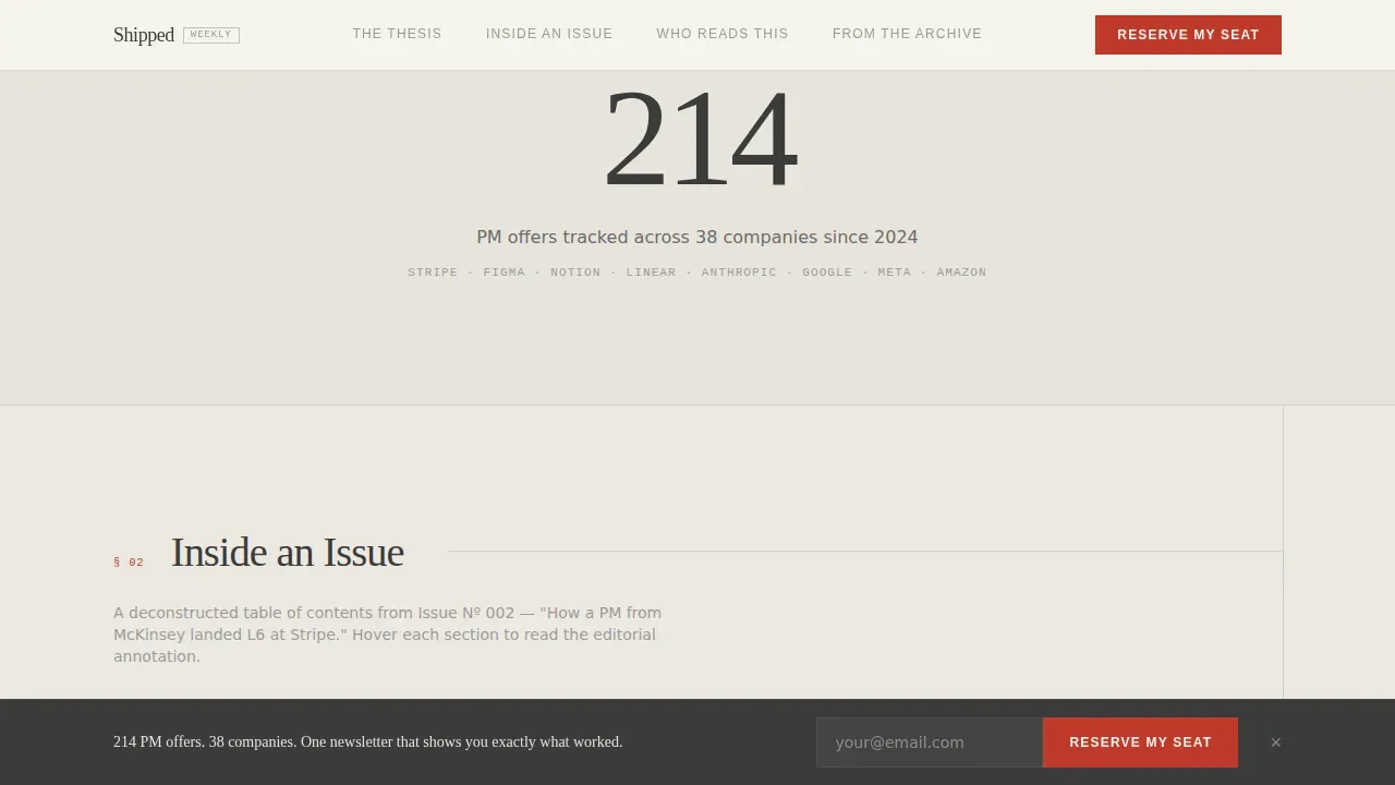
The "Inside an Issue" section presents a deconstructed table of contents from a real edition of the newsletter. Annotated callouts explain the editorial choices behind each piece. This section does the work of a concise description for potential subscribers who want to understand the format before they commit. The format of the newsletter can include deep-dive interviews, and this section makes that clear through direct visual evidence rather than marketing claims.
Redact and Reveal Archive Sliders
The "From the Archive" spoke presents three profile excerpts in a redacted state. A slider interaction reveals the full analysis on interaction. This gives visitors a preview of exclusive content and actionable insights they will receive as subscribers. It is the most powerful trust-building mechanism on the page, offering proof rather than promise as a secondary conversion path.
Persistent Waitlist Bar and Subscription Form
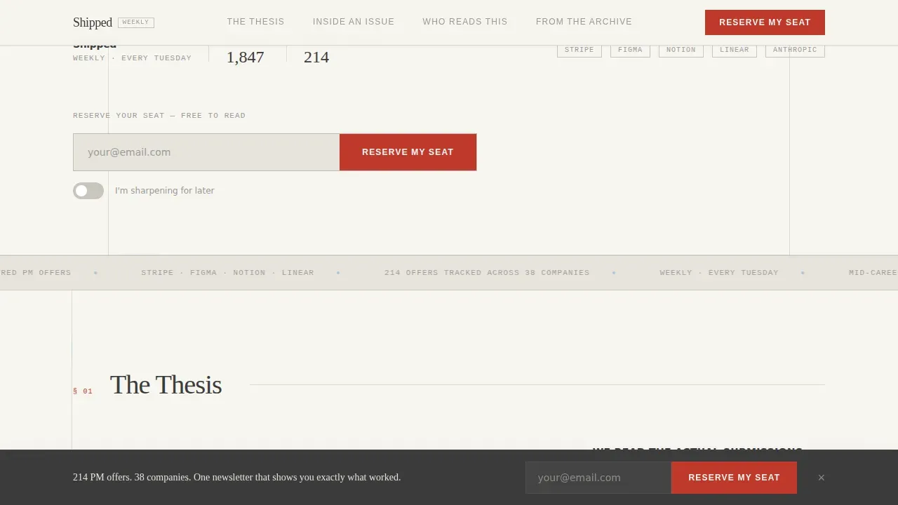
A persistent bottom bar activates after the visitor passes the first spoke. It stays visible across all screen sizes without covering key content. The subscription form asks only for an email address and a single intent toggle: "I'm actively interviewing" or "I'm sharpening for later." This simple signup form reduces friction and respects the visitor's time. Newsletter landing pages that keep their sign up form lean consistently see stronger conversion rates.
Single-Stat Breather Panels
Between content-dense column sections, the layout includes full-width panels displaying single statistics such as "214 PM offers tracked across 38 companies." These panels serve as visual punctuation, reinforcing social proof with measurable numbers. Displaying the subscriber count and tracked offer data gives potential subscribers clear expectations about the scale and credibility of the research behind the newsletter.
Page sections overview
| Section | Purpose |
|---|---|
| Manifesto Header | Opens with the editorial quote, newsletter byline, live waitlist count, and primary "Reserve My Seat" call-to-action |
| The Thesis Spoke | Explains what makes Shipped different using an editorial two-column layout that communicates the core value proposition |
| Inside an Issue | Shows a deconstructed table of contents from a real edition with annotated callouts explaining editorial decisions |
| Who Reads This | Presents reader profiles paired with single-stat breather panels to surface social proof and reader identity |
| From the Archive | Displays three redacted profile excerpts with slider interactions revealing the full analysis as a secondary conversion path |
| Footer Pattern | Closes the page with a horizontal flow footer that supports the overall brand identity and navigation wrap-up |
Design & branding system
The visual identity follows an Editorial Magazine theme built on the Cloud Canvas color system. The design language is restrained, literate, and confident. It communicates authority without relying on heavy imagery or loud color. Consistent branding runs through every element, from the typographic scale to the spacing rhythm.
- The color palette uses warm white (#F7F5F0) as the dominant background, quiet graphite (#3B3B3B) for body text, muted sky blue (#A8C4D6) for anchor navigation highlights, and dried ink red (#C0392B) reserved exclusively for the waitlist call-to-action button and issue numbers
- Typography pairs Fraunces as the editorial serif for headlines and pull quotes with DM Sans as the body sans-serif, creating a visually appealing contrast that feels typeset rather than assembled
- The layout alternates between dense information-rich columns and open single-stat breather panels, giving the scroll rhythm the cadence of flipping through a printed quarterly journal
Mobile & speed optimization
The template is built desktop-first to deliver the full editorial journal reading experience on large screens. Mobile responsiveness ensures that the same typographic clarity and layout hierarchy translate cleanly across all screen sizes. The design avoids heavy assets in the hero section to support fast loading on mobile devices.
- The persistent bottom waitlist bar adapts gracefully to smaller screen sizes, keeping the subscription form accessible without obscuring content as readers scroll
- Scroll-linked reveals and the redact-and-reveal slider interactions are implemented with medium-weight animations that prioritize smooth performance across devices without overloading the page
How this template helps you convert
This landing page is built around a single primary goal: turning curious visitors into waitlist subscribers. Every design and structural decision supports that outcome. Newsletter landing pages have the highest conversion rate of all signup forms, and this template is engineered to take full advantage of that fact.
- The manifesto header delivers a clear value proposition in a single sentence, setting clear expectations and giving visitors an immediate reason to keep reading rather than bouncing. The live subscriber count acts as instant social proof, showing that other professionals have already committed.
- The hub and spoke navigation keeps the page as a focused page by removing distracting outbound links and giving visitors a direct path through authority-building content before they reach the sign up form. This focused structure increases lead generation because it removes distractions and centers attention on a single action.
- The dual conversion paths, the primary "Reserve My Seat" waitlist form and the free sample issue PDF offer in the Archive spoke, convert visitors at different stages of intent. Casual visitors who need more proof convert through the archive. Ready visitors convert at the top. This layered approach improves overall conversion rates without adding complexity to the subscription process.
Other information about this template
This template is designed to be quickly customized by newsletter creators who want to launch a best newsletter landing page without writing code from scratch. The editorial structure is intentional: it draws on patterns seen in strong newsletter landing page examples from across the media and career publishing world.
- Strong newsletter landing page examples like Trends.vc demonstrate how prominently displaying a subscriber count drives trust. Demand Curve's landing page shows how logos of companies where interviewees work can be displayed to leverage authority. The GIST uses reader testimonials to add a personal touch to social proof. Milk Road leads with a clear and concise headline that communicates its value proposition. HeyOrca uses a bold headline that connects directly with its target audience based on job titles. These newsletter landing page examples all share a concise value proposition, visible social proof, and a simple signup form as key elements.
- The template supports easy integration with email marketing tools through a standard subscription form output. Builders using a drag and drop editor or drag and drop builder can adapt the layout sections quickly. The page can be published under a custom domain and connected to existing email campaigns and marketing channels. A free account on most newsletter platforms is enough to get started with the sign up form and welcome email sequence.
- Practical tips for using this template effectively: keep the subscription form focused on a single field, use the breather panels to visualize data points that reinforce credibility, and connect a welcome email that mirrors the editorial tone of the landing page. Practical guidance for increasing the page's effectiveness includes updating the live subscriber count regularly and refreshing the archive slider content as new issues are published. These steps support consistent brand identity and help maintain click through rates as the newsletter grows.
- High-performing newsletter landing pages focus on credibility, actionable insights, and setting clear expectations for new readers. A concise headline, concise copy, and visual consistency across the page all contribute to a successful landing page. The best newsletter landing page builder is one that lets you design a focused, high-converting newsletter page without relying on extra tools or technical skills. This template provides that foundation. You can easily create a polished, effective newsletter landing page that serves your specific niche and builds a list of engaged subscribers from day one. This shipped editorial pm interview newsletter landing page template is ready to support your own landing page launch with editorial confidence.
- Additional performance context: newsletter landing pages are a dedicated page type designed to collect email subscribers, and studies consistently show they outperform embedded signup forms in overall newsletter sign ups. A focused page that eliminates navigation keeps potential subscribers moving through the subscription process rather than drifting. Strategic insights about your target audience, such as whether they are actively interviewing or sharpening for later, can be captured directly through the intent toggle in the sign up form, giving you early access to segmentation data that improves future email communications. This comprehensive guide approach to your newsletter page helps you convert casual visitors into newsletter subscribers with a clear, strong call to action and a brand identity that earns trust before the first welcome email is sent.
Theme
Editorial Magazine
Creative direction
Industry Report
Color system
Cloud Canvas
Style
Hub & Spoke (Anchor Nav)
Direction
Waitlist/Coming Soon
Page Sections
Editorial Manifesto Header with Live Count
Hub and Spoke Anchor Navigation
Annotated Issue Deconstruction Section
Redact and Reveal Archive Sliders
Persistent Waitlist Bar and Intent Toggle
Single-stat Breather Panels
Related questions
Can I quickly customize the color palette and typography?
Does the template include the redact-and-reveal slider interaction?
What does the subscription form collect from visitors?
Is the anchor navigation included and how does it behave?
Does the template include the persistent bottom waitlist bar?



