Cinematic Time-Lapse Photography Course Landing Page
Shutter is a cinematic landing page template built for a time-lapse photography online course. It combines a short-form reel header, a masonry module grid, and a sticky call-to-action bar to turn visual proof into enrollments. The Heritage and Story aesthetic, typewriter headline, and hover-reveal course cards create a browsing experience as immersive as watching a full day collapse into seconds.
by Rocket studio
Quick summary
Shutter is a single-page, click-through landing page template designed for a time-lapse photography online course. The layout leads with a cinematic reel header and flows into a Pinterest-style masonry grid of course modules. Every design decision, from the darkroom color palette to the typewriter headline, reinforces one idea: time can be bent, and this course teaches you how.
Who this template is for
This template is built for creators and educators who want a high-impact page that sells a photography course without relying on long sales copy. The visual density of the masonry grid does the persuading.
- Hobbyist photographers who have mastered stills and are ready to learn motion and time-lapse technique
- Travel content creators who want thumb-stopping reels and are looking for a structured curriculum
- Working photographers ready to add time-lapse as a client-facing service offering
What problem this template solves
Most course landing pages bury the proof. They use testimonial blocks and bullet-point curricula that ask visitors to imagine the outcome rather than feel it. This template flips that approach entirely.
- The masonry grid replaces abstract promises with actual student work, letting visual proof carry the conversion weight
- The sticky call-to-action bar keeps the enrollment path visible without interrupting the browsing experience
- A secondary low-commitment link gives hesitant visitors an entry point before the full click-through
What you get with this template
You get a fully structured, single-page layout with every section pre-built and ready to populate with your course content and student footage. Nothing needs to be invented from scratch.
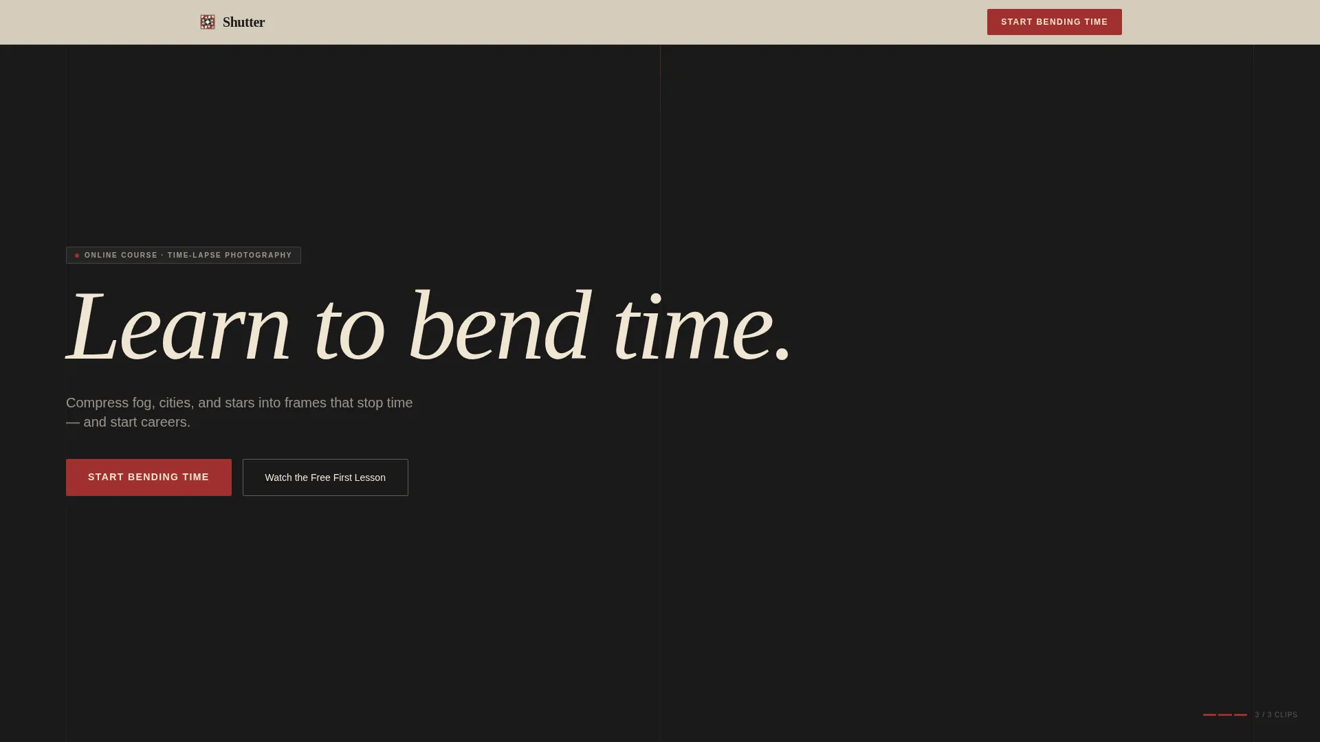
- A simulated short-form reel hero with a typewriter headline and dual call-to-action placement
- A themed masonry module grid with hover-reveal card interactions grouped by subject cluster
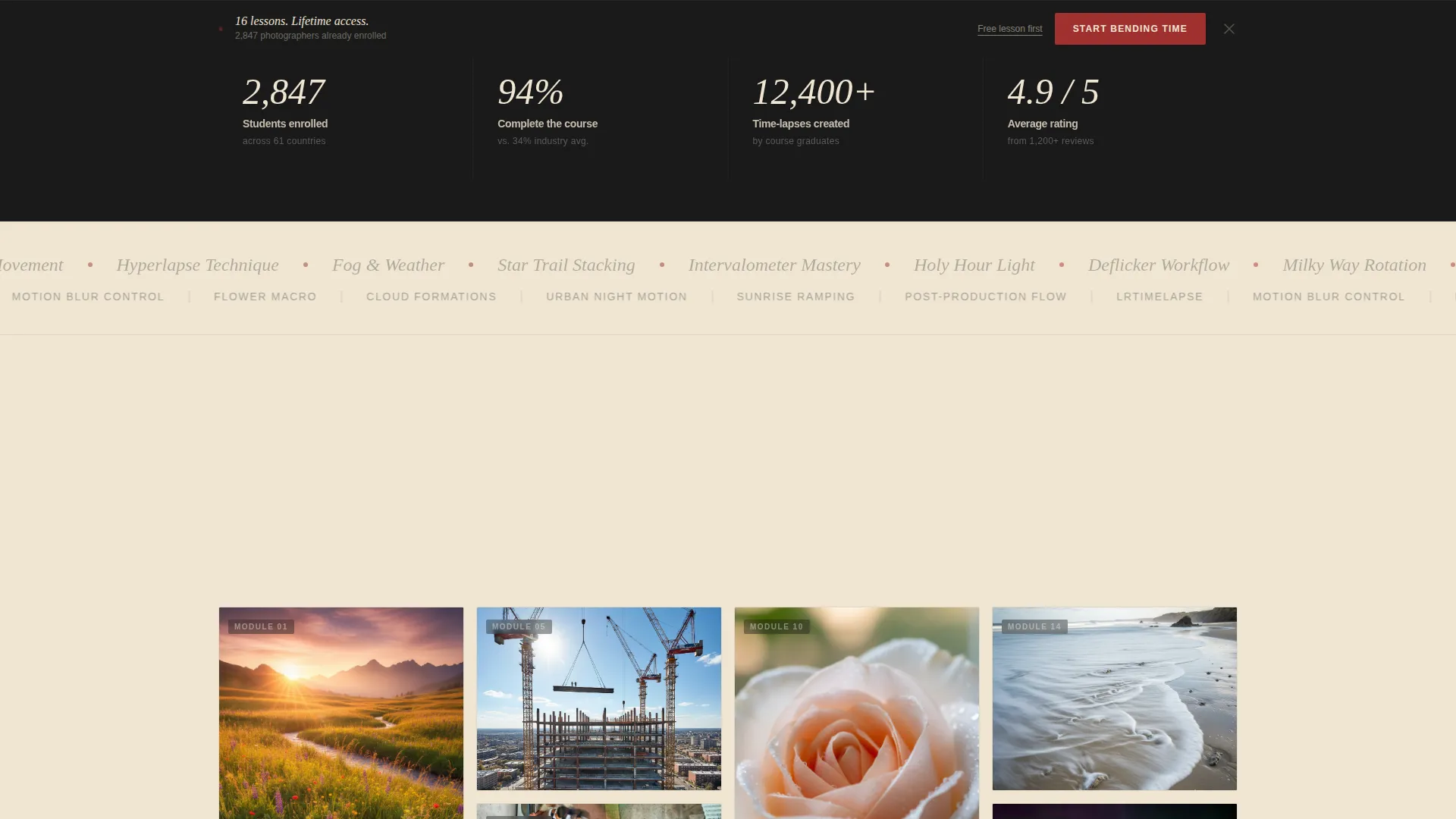
- A proof strip, a bidirectional marquee scroller, a sticky call-to-action bar, and an ultra-minimal footer
Feature list
This template packages several purpose-built components that work together to move a visitor from curiosity to enrollment.
Simulated Reel Hero with Typewriter Headline
The header opens with a 12-second vertical-to-widescreen CSS animation sequence stitched from student work stills. It accelerates subtly across clips, cuts hard to black, and then types the headline letter by letter: "Learn to bend time." The effect creates immediate emotional pull before a single word of copy is read.
Pinterest-Style Masonry Module Grid
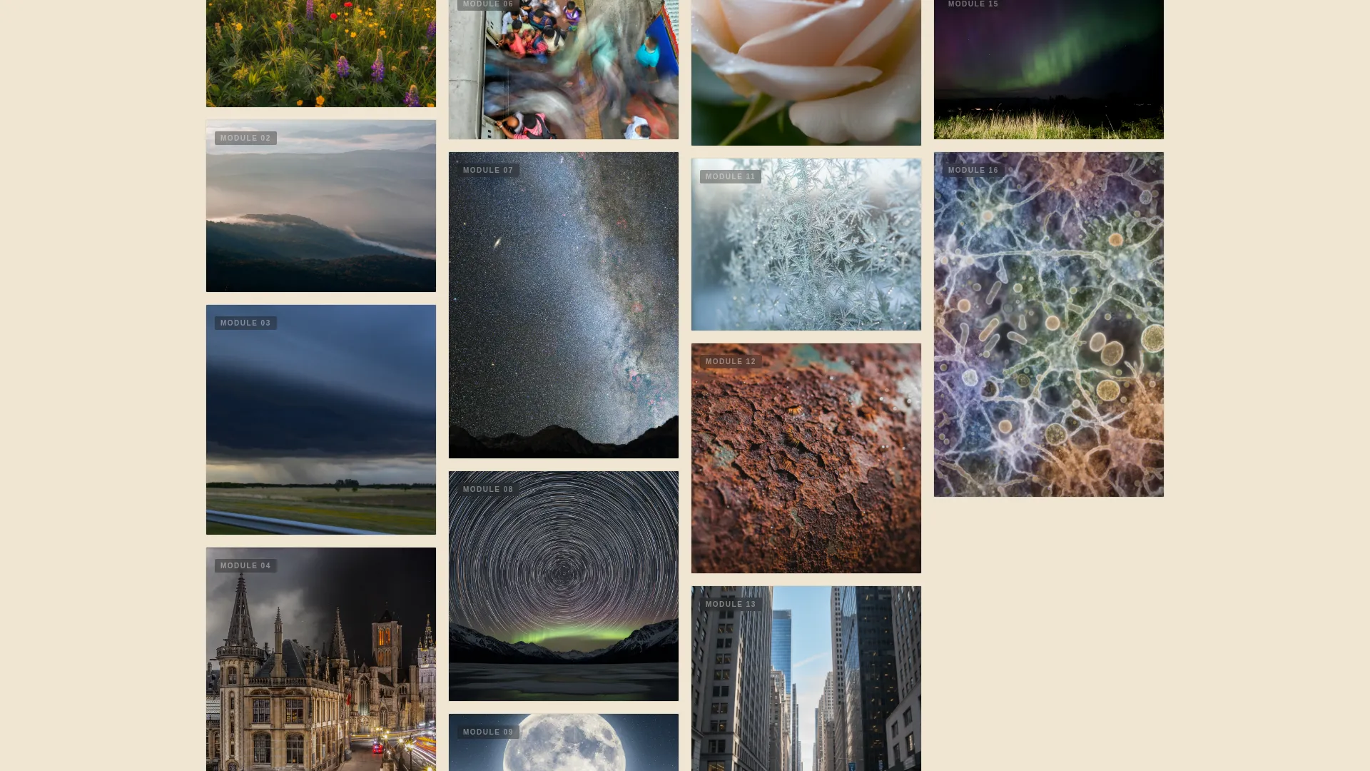
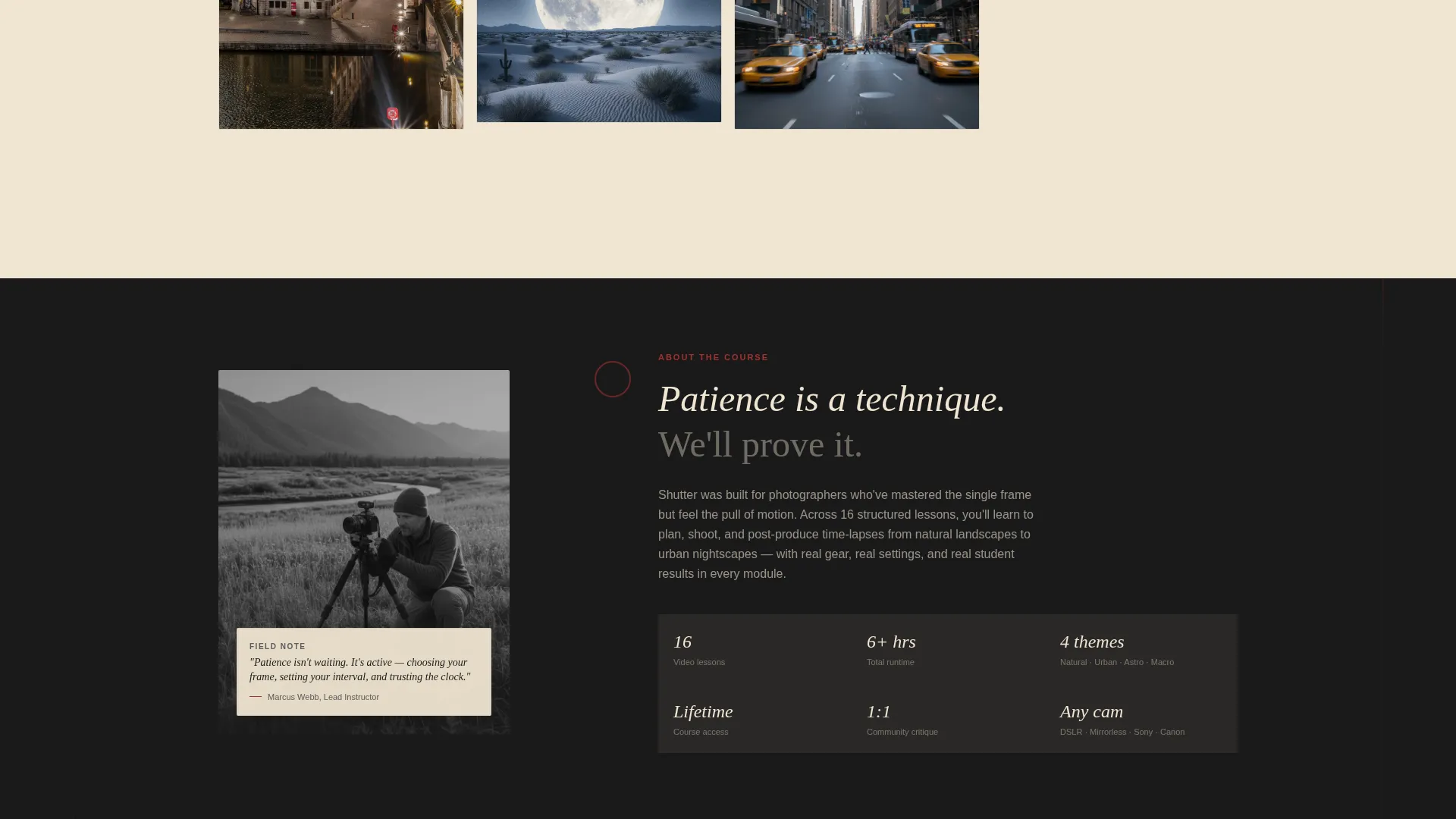
Course modules are laid out as visual cards of varying heights in a masonry grid. Cards cluster by theme, covering natural light, urban motion, astro, and macro time-lapse. Large hero cards showcase cinematic student results while smaller technique cards highlight intervalometer settings, rail movements, and deflicker workflows. Each row feels more advanced than the last.
Hover-Reveal Course Cards
Hovering over any card in the masonry grid reveals the lesson title and duration. The interaction is lightweight and does not require page navigation. It gives visitors a fast way to scan the full curriculum depth without leaving the page.
Sticky Call-to-Action Bar
After the visitor scrolls past the third masonry row, a sticky bar surfaces at the bottom of the viewport. It carries the primary call-to-action button so the enrollment path is always within reach without anchoring above the fold permanently.
Bidirectional Marquee Scroller
A CSS-only marquee animates course topic names in two directions simultaneously. It reinforces curriculum breadth and keeps the eye moving without requiring any JavaScript library.
Proof Strip and Social Credibility Block
A dedicated section surfaces student counts, project completions, and outcome statistics directly above the masonry grid. The numbers give first-time visitors a reason to trust the course before they dive into the module cards.
Page sections overview
| Section | Purpose |
|---|---|
| Hero Reel Header | Opens with simulated student footage, accelerating CSS animation, hard cut to black, and typewriter headline with dual call-to-action |
| Proof Strip | Displays student count, project completions, and outcome stats to establish credibility early |
| Masonry Module Grid | Pinterest-style course cards grouped by theme cluster with hover-reveal lesson titles and durations |
| Sticky Call-to-Action Bar | Surfaces after the third masonry row and keeps the enrollment button visible during scroll |
| Marquee Scroller | Bidirectional CSS animation listing course topics to reinforce curriculum breadth |
| Minimal Footer | Ultra-minimal horizontal footer pattern with no distraction from the primary conversion goal |
Design & branding system
The visual identity follows a Heritage and Story theme that feels like flipping through a photographer's field notebook. Every color choice and type pairing reinforces the craft and patience behind time-lapse work.
- Color palette: darkroom black (#1A1A1A) as the primary surface, aged parchment (#F0E6D3) for backgrounds and card fills, graphite annotation gray (#5C5C5C) for supporting text, and archival red (#A03030) reserved for buttons, hover states, and progress indicators
- Typography: Fraunces handles all display and hero text for its editorial weight; DM Sans handles body copy and interface elements for clean readability at small sizes
- The masonry grid alternates between large cinematic cards and smaller technique cards, creating a gallery-wall rhythm that feels curated rather than templated
Mobile & speed optimization
The template is designed desktop-first but collapses gracefully across smaller viewports. Performance choices keep the page feeling fast even with high animation density.
- The masonry grid reflows into a single-column layout on mobile without losing the visual hierarchy between hero cards and technique cards
- Scroll-triggered reveals use IntersectionObserver so animations fire only when elements enter the viewport, avoiding unnecessary rendering overhead
- The CSS-only marquee scroller requires no external JavaScript library, keeping the dependency footprint small
How this template helps you convert
This template is built as a click-through page, meaning every element points toward one action: getting the visitor to the enrollment and pricing page. There is no form, no friction, and no dead ends.
- The reel hero and typewriter headline create an emotional hook in the first few seconds, priming the visitor before any course detail is shown
- The masonry grid replaces written promises with visual proof, letting the volume and quality of student work do the persuading across multiple scroll depths
- The sticky call-to-action bar and the secondary "Watch the Free First Lesson" link together serve visitors at every readiness level, from ready-to-buy to still-exploring
Other information about this template
This template belongs to the Blog and Editorial category with a Time-Lapse Photography Content subcategory focus. A few additional details worth knowing before you build with it.
- The template uses Fraunces and DM Sans via standard web font loading; no custom font licensing is bundled
- The page carries no pricing display by design; the click-through structure routes all currency and enrollment detail to a separate destination page
- Animation intensity is high by default, including beam drops, spotlight card effects, and the typewriter sequence; these can be scaled back through CSS variable adjustments
- The footer follows a Vercel Horizontal ultra-minimal pattern with no navigation links, keeping exit paths minimal and focus on the single call-to-action
Theme
Heritage & Story
Creative direction
Curated Collection
Color system
Ink & Paper
Style
Masonry/Pinterest
Direction
Click-Through
Page Sections
Simulated Reel Hero with Typewriter Effect
Pinterest-style Masonry Module Grid
Hover-reveal Lesson Cards
Scroll-triggered Sticky Call-to-action Bar
Css-only Bidirectional Marquee
Proof Strip with Student Statistics
Related questions
Does this template include an enrollment form?
Can I replace the simulated reel with my own footage or images?
How does the masonry grid display on mobile devices?
Can I update the color palette to match a different brand identity?
When does the sticky call-to-action bar appear on the page?



