AI Blog Landing Page Template, Editorial Briefing
Signal is a single-column landing page template built for weekly AI intelligence briefings. It pairs a full-bleed editorial hero with self-contained trend briefs, a trust bar, and two strategically placed call-to-action buttons. The design reads like a printed broadsheet, warm parchment tones, serif headlines, and a scroll rhythm that earns the reader's click before asking for anything.
by Rocket studio
Quick summary
Signal is a single-column landing page template for an AI editorial briefing. It opens with a full-bleed overhead photo and a serif headline, then guides readers through three intelligence briefs before delivering a clear call to action. The aesthetic is broadsheet-editorial: warm parchment, deep charcoal, and oxidized iron accents that feel authoritative without being cold.
Who this template is for
This template is built for editorial teams, independent researchers, and founders who publish a weekly AI briefing and need a landing page that matches the quality of their content. It suits creators who want to earn subscriber trust through demonstrated editorial depth rather than a hard sell.
- Machine learning engineers and researchers who publish analysis between paper drops
- Startup founders documenting open-source competitive intelligence for a focused readership
- Policy advisors or think-tank writers who publish structured AI trend briefings for decision-makers
What problem this template solves
Most newsletter landing pages either over-promise with flashy animations or under-deliver with a plain form and a vague pitch. Neither approach works for a technically sophisticated audience that can detect fluff immediately. Signal solves this by building credibility directly into the scroll experience.
- Readers see three real intelligence briefs before any subscription ask appears
- The layout signals editorial seriousness through typographic restraint and structured data sections
- Two clearly placed call-to-action buttons reduce friction without interrupting the reading flow
What you get with this template
You get a complete, ready-to-customize single-column landing page designed around an AI briefing product. Every section is pre-structured and purposeful, from the hero image down to the quiet email capture footnote at the footer.
- A full-bleed hero section with a serif headline overlay and a primary call-to-action button
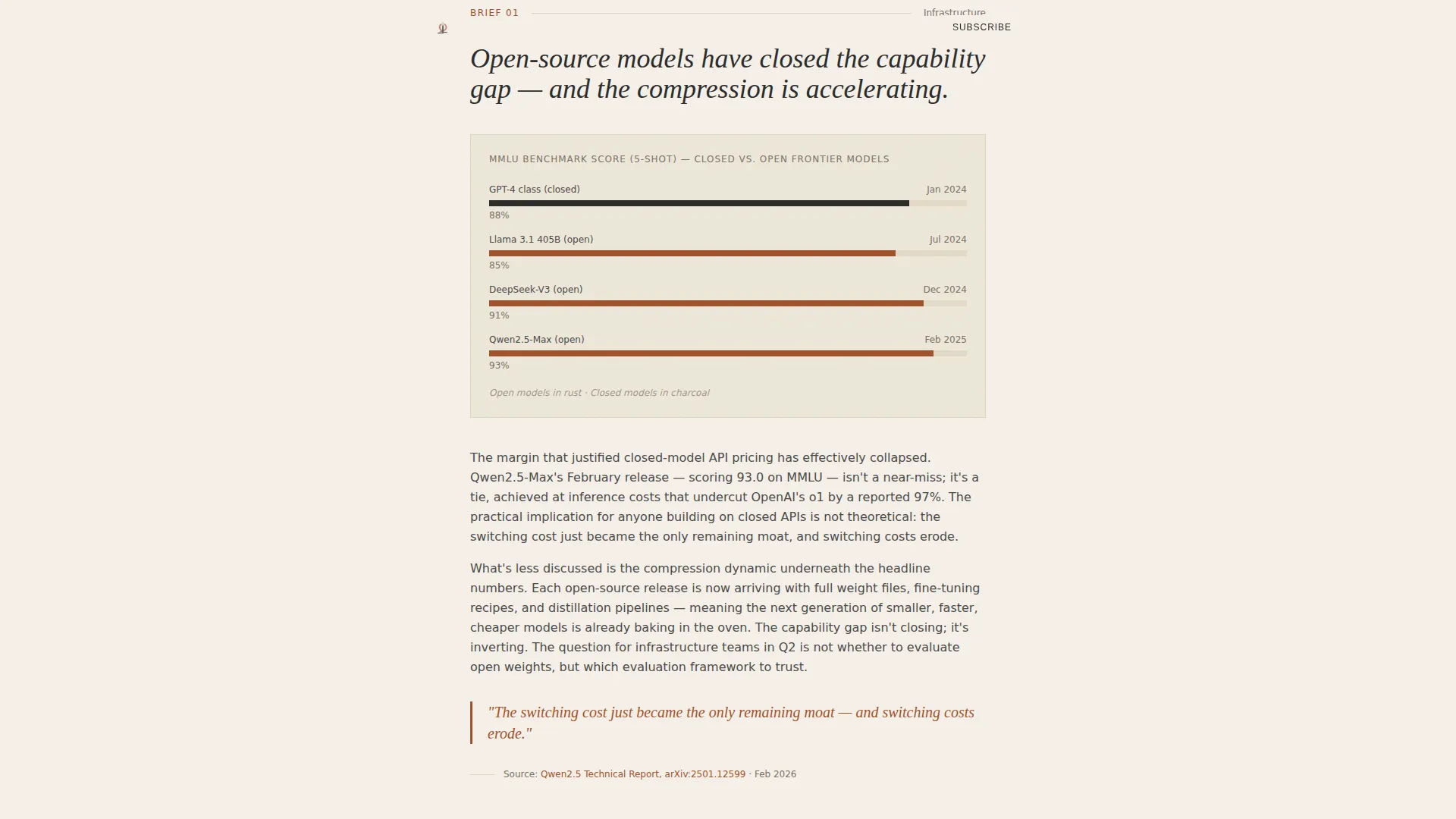
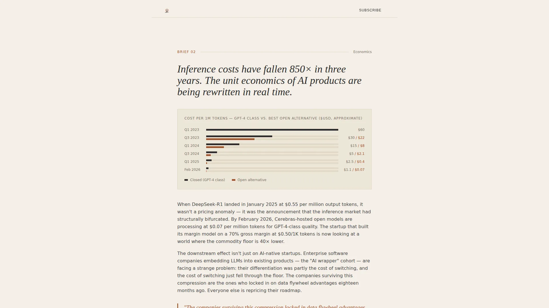
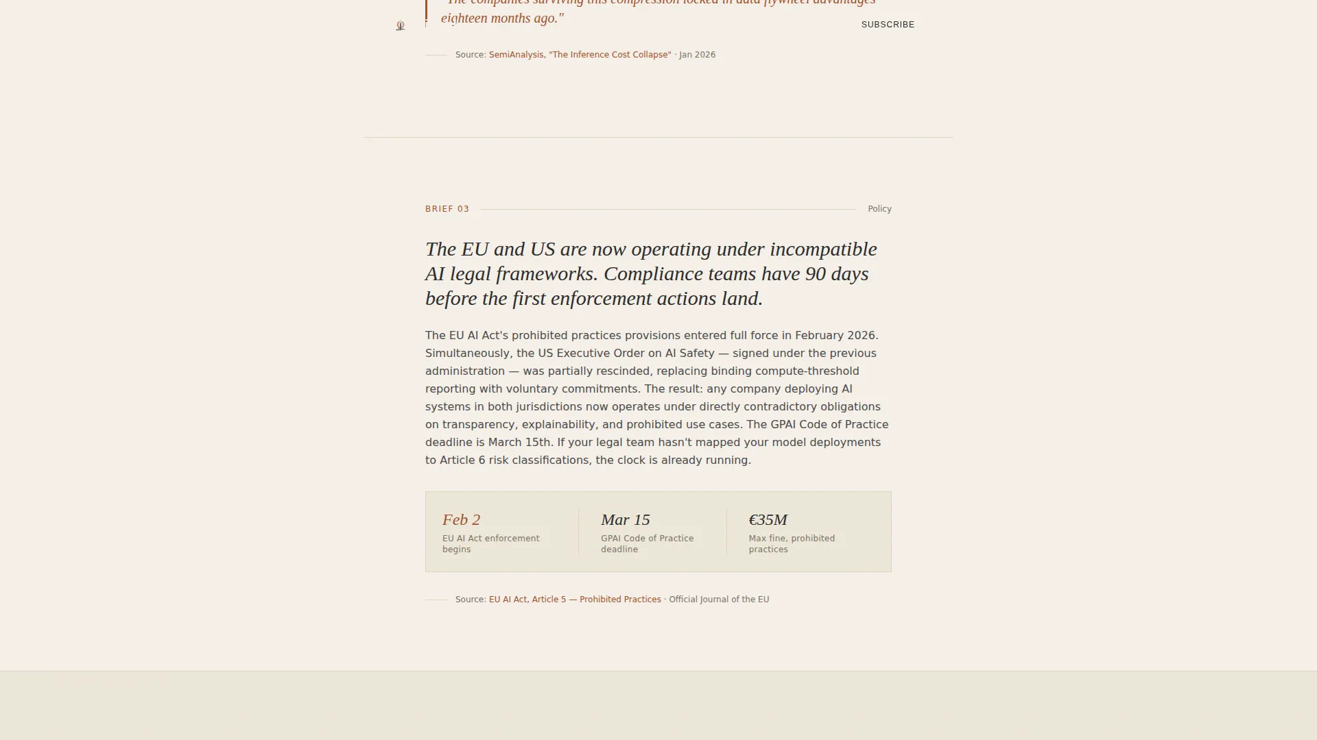
- Three pre-built intelligence brief sections, each with a thesis block, data visualization space, two-paragraph analysis layout, and a cited source link slot
- A trust bar for credibility markers, a secondary email capture field, and a minimal footer styled after a Superhuman-pattern layout
Feature list
This template includes a focused set of built-in sections and design decisions drawn directly from the Signal brief.
Full-Bleed Editorial Hero
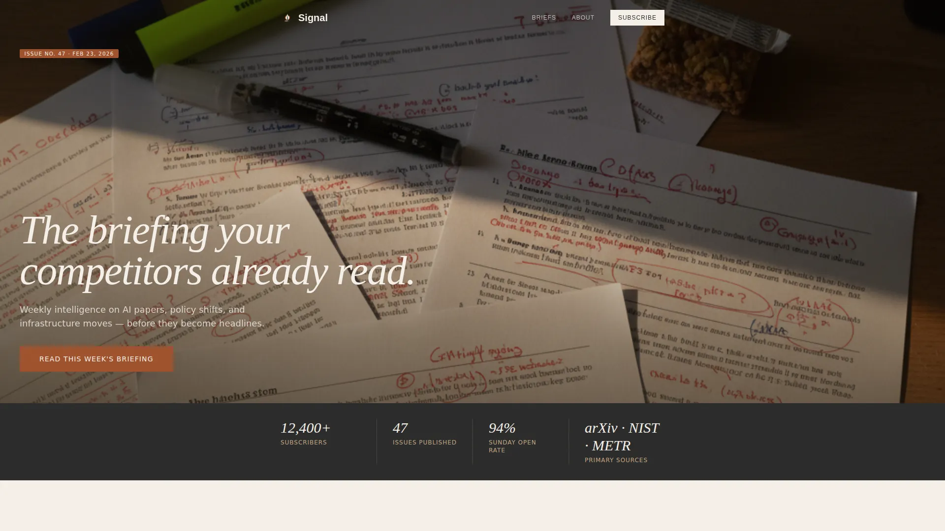
The hero opens with an overhead photo of scattered printed pages, red margin annotations, and a ceramic mug casting a directional morning shadow. A single serif headline fades in over the image. There is no gradient overlay and no animation beyond the headline fade. The composition is built to hold attention through stillness and contrast.
Intelligence Brief Sections
Three self-contained trend sections structure the page's middle content. Each brief includes a bold thesis statement, a charcoal-and-rust data visualization area, a two-paragraph analysis block, and a cited source link. The rhythm shifts as you scroll, early briefs are expansive, the final one is deliberately terse and urgent.
Dual Call-to-Action Placement
The primary call-to-action button, "Read This Week's Briefing," appears twice: once directly beneath the hero and once after the final trend section. Both instances are full-width rust-colored buttons set against parchment. No form fields are attached, the click goes straight to the latest issue.
Quiet Email Capture Footnote
A secondary conversion path sits below the final call-to-action button. It is a single email input field styled as a footnote, understated and unobtrusive. It offers "Get the Briefing Every Sunday" without interrupting the reading experience with a modal or pop-up.
Trust Bar with Credibility Markers
A trust bar sits between the hero and the first intelligence brief. It is designed to hold reader count figures, institution names, and issue cadence information. This section communicates social proof at the moment readers are deciding whether to keep scrolling.
Broadsheet Scroll Rhythm
The page uses generous whitespace and thin faded-clay divider rules to separate each section. The pacing accelerates intentionally toward the end, mimicking the feeling of a briefing dossier that rewards readers who reach the final section.
Page sections overview
| Section | Purpose |
|---|---|
| Hero with headline | Opens the page with editorial authority and the primary call to action |
| Trust credibility bar | Displays reader count, institutions, and issue cadence for immediate social proof |
| Intelligence Brief One | Presents the first AI trend with thesis, data visualization, and analysis |
| Intelligence Brief Two | Covers the second trend at a measured, contextual pace |
| Intelligence Brief Three | Delivers the final trend as a terse, urgent closing brief |
| Footer email capture | Provides a quiet single-field subscription path and repeats the primary call to action |
Design & branding system
The visual identity follows a Luxe Minimal direction. Every typographic and color choice is intentional, the page is meant to feel like a leather-bound research journal left open on a walnut desk.
- Color palette: warm vellum (#F5F0E8) for backgrounds, deep editorial charcoal (#2B2B2B) for body text, oxidized iron (#A0522D) for pull-quotes and accent links, and faded clay (#C4A882) for secondary borders and dividers
- Typography: Fraunces serif for display headlines and DM Sans for body text and interface elements
- Visual tone: overhead photography with visible film grain, golden-hour directional light from the upper left, and red-ink margin annotations visible in the hero image
Mobile & speed optimization
The template is built desktop-first to match the working habits of machine learning engineers and policy advisors who read on large screens. A clean mobile fallback ensures the single-column layout translates well to smaller viewports without losing its editorial character.
- Single-column flow adapts naturally to mobile without requiring a separate layout structure
- Animation is intentionally minimal: one headline fade-in on the hero and subtle scroll reveals across sections
- The static-first, server-component-dominant build keeps the page lean and fast to load on any connection
How this template helps you convert
Signal earns clicks by demonstrating value before asking for anything. The conversion strategy is built into the content structure itself, not layered on top as a pop-up or interstitial.
- Three full intelligence briefs appear on the landing page, giving readers genuine insight before either call-to-action button appears, proof of editorial quality replaces persuasion copy.
- The primary call-to-action button appears at two high-intent moments in the scroll: right after the hero establishes trust, and right after the final brief creates urgency, each placement matches the reader's decision-making state.
Other information about this template
Signal is a template built for a specific editorial voice and audience. A few additional details help set realistic expectations for teams considering it.
- The template is designed for English-language publishing with a United States editorial context and no currency display
- Typography choices (Fraunces and DM Sans) are intentional to the broadsheet aesthetic and should be preserved for visual consistency
- The footer follows a Superhuman-style minimal pattern: no heavy navigation, no social link clusters, just the email capture and the closing call to action
- The page is structured for a weekly publication cadence, but nothing in the layout is hard-coded to a specific issue date or topic
- Customization of the three intelligence brief sections requires only swapping the thesis copy, data visualization asset, analysis paragraphs, and source link for each issue cycle
Theme
Luxe Minimal
Creative direction
Industry Report
Color system
Parchment & Rust
Style
Single Column Flow
Direction
Click-Through
Page Sections
Full-bleed Editorial Hero Section
Three Intelligence Brief Blocks
Dual Rust-colored Call to Action Buttons
Trust Bar for Social Proof
Quiet Single-field Email Capture
Broadsheet Whitespace and Divider System
Related questions
Can I change the three intelligence brief topics to match my own content?
Does this template include a working email subscription form?
Is this template suitable for a briefing topic other than artificial intelligence?
What does the primary call-to-action button link to?
How much animation does the template use?



