Startup Fundraising Newsletter Booking Website Template
Signal is a startup fundraising weekly newsletter landing page template built on a 60/40 asymmetric grid. It opens like a clothbound book chapter, guides readers through curated editorial content, and routes them to a separate email capture page. Designed for newsletter publishers in the fundraising space, it converts curious founders into subscribers through content density before ever showing a form.
by Rocket studio
Quick summary
Signal is a single-page, click-through landing page template for a startup fundraising weekly newsletter. It uses a 60/40 asymmetric editorial grid, a Chapter/Book header concept, and a Warm Artisan visual identity to move founders from first impression to subscription confirmation. Content proves the newsletter's value before any email address is requested.
Who this template is for
This template is built for newsletter publishers, indie editors, and solo founders who package fundraising intelligence into a weekly digest. It works best when the content itself is the product and the brand relies on editorial trust rather than flashy design.
- First-time founders actively raising pre-seed or seed rounds who need practical intel
- Series A operators and solo general partners building thesis decks or negotiating terms
- Independent newsletter creators covering venture capital, deal flow, or startup finance
What problem this template solves
Most newsletter landing pages ask for an email before they earn it. Founders are skeptical readers. They need to feel the weight of what they are missing before they subscribe. This template solves the trust gap by letting content accumulate authority across multiple editorial sections before a single call to action appears.
- Generic newsletter pages lead with a headline and a form, skipping the proof entirely
- Fundraising audiences are high-intent but low-patience; they need substance fast
- A single call-to-action button placed too early kills conversions from informed readers
What you get with this template
The template ships as a fully structured single landing page organized into five editorial sections and a footer. Every section has a defined layout role and a clear content slot. No form lives on the page itself; the primary call to action routes to a separate email capture page styled like a book's final page.
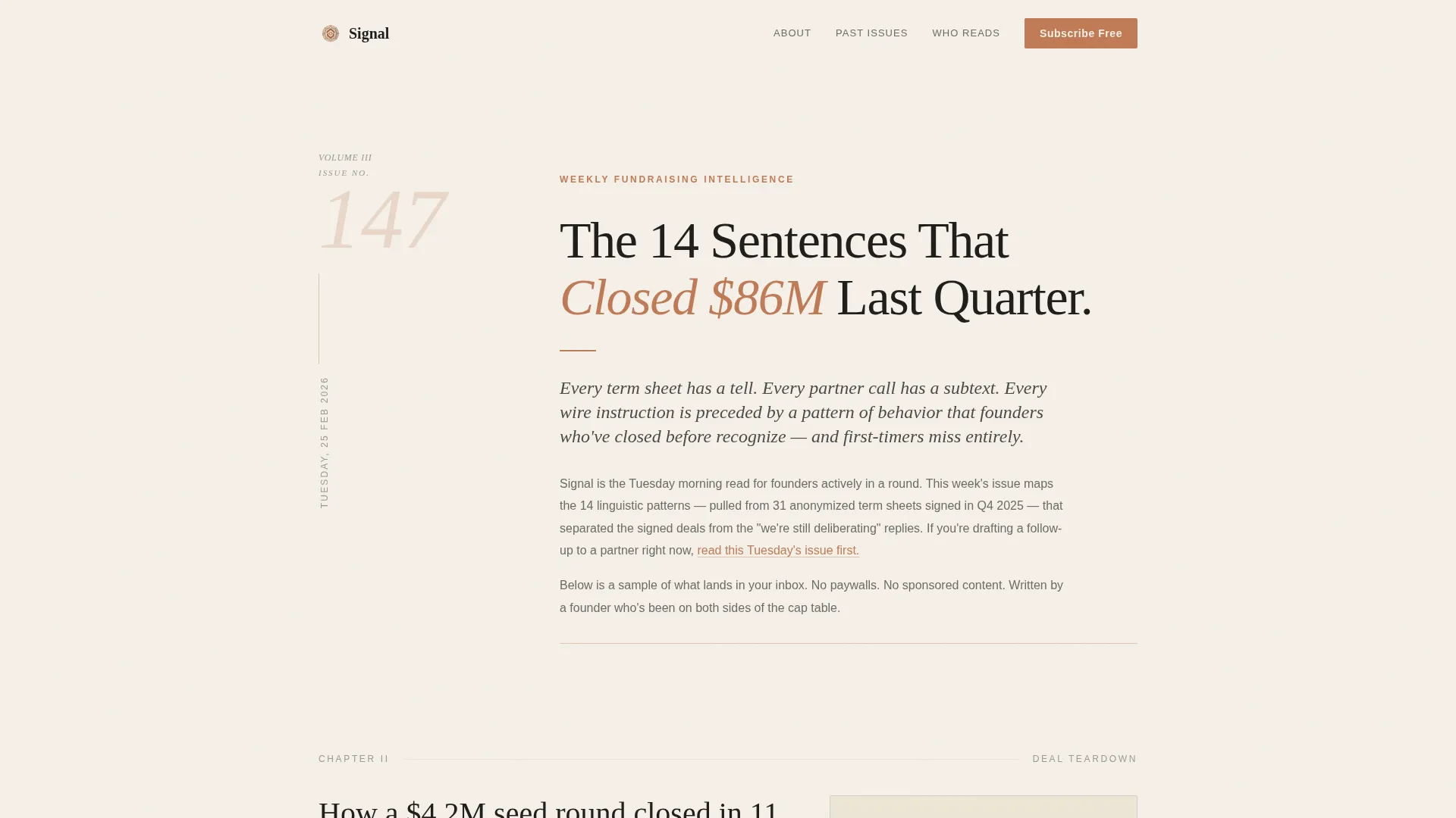
- A Chapter/Book hero section with Issue framing, massive serif typography, and an inline text link
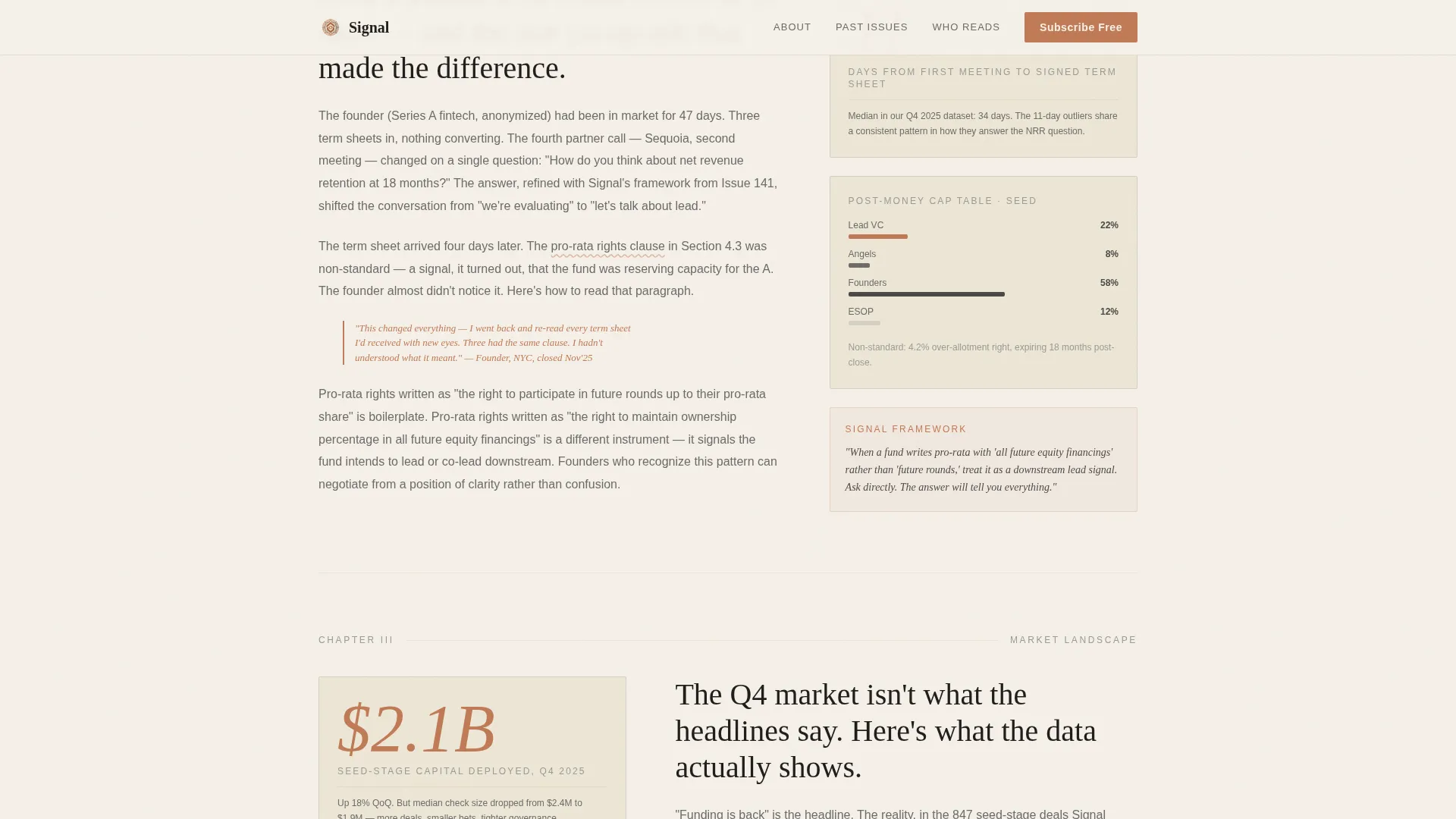
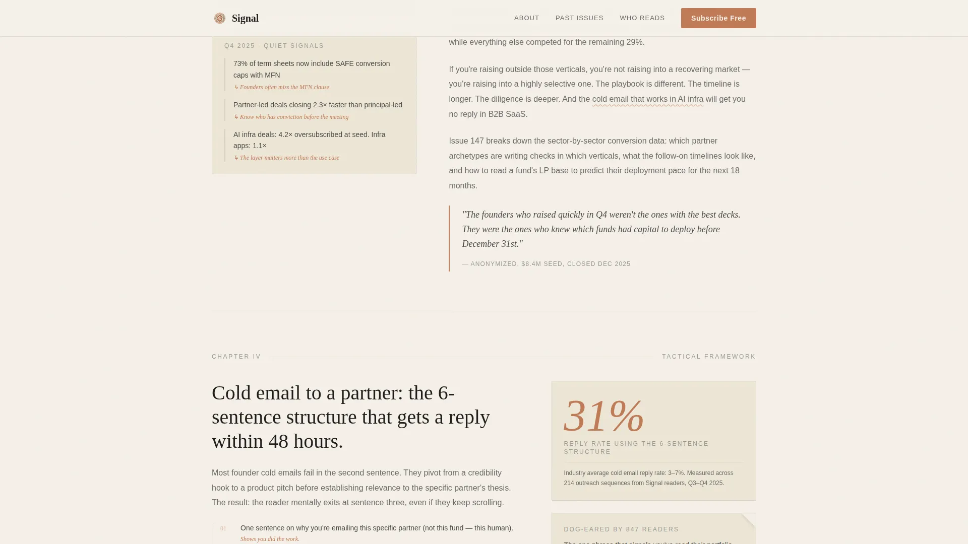
- A 60/40 asymmetric editorial grid section with narrative analysis on the left and stat callouts on the right
- An audience lens section, a proof section with oversized numerals, a full-width call-to-action button, and a Vercel Horizontal Flow footer
Feature list
This template includes a structured set of design and layout features drawn directly from the project brief.
Chapter/Book Hero with Issue Framing
The header opens like an interior book spread. A chapter number ("Issue 147") sits in a delicate serif on the left column. A single editorial headline anchors the right column. A thin terracotta rule separates the chapter head from a two-line subhead written in long-form essay style. Typography is the sole hero element; no photography or illustration is used.
60/40 Asymmetric Editorial Grid
The core content area divides into a 60 percent narrative column and a 40 percent artifact column. The wider left column carries anonymized deal teardowns, trend commentary, and quoted founder reflections. The narrower right column holds supporting elements: embedded chart snippets, mini cap-table diagrams, and pull-stat callouts in oversized terracotta numerals.
Staged Click-Through Call-to-Action Structure
The primary call to action, "Read This Tuesday's Issue," appears first as an inline text link inside the header paragraph. It resurfaces as a full-width terracotta button only after the third content section. This staged approach ensures readers have consumed enough sample content before the subscription ask arrives.
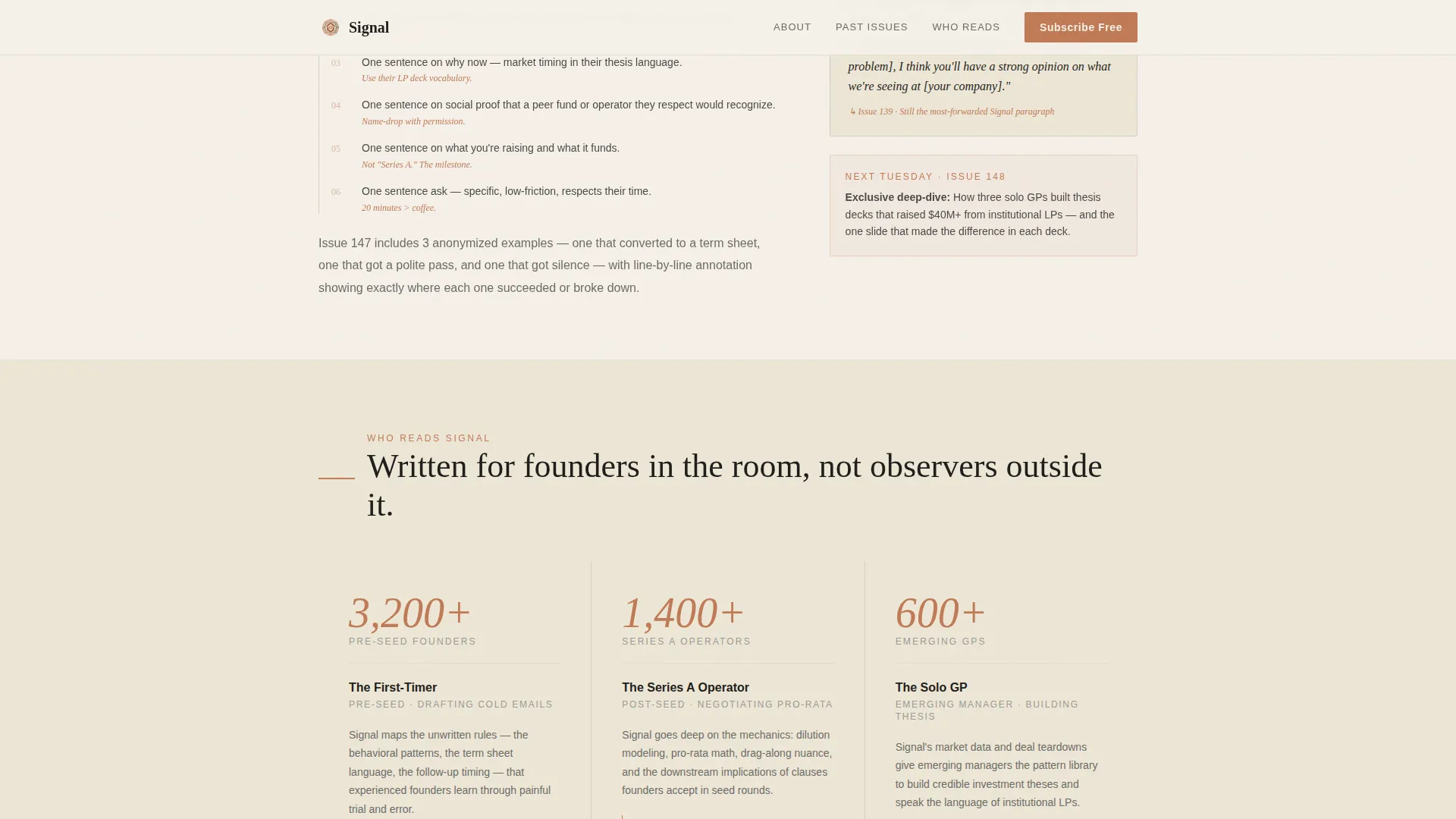
Reader Archetype Audience Section
A dedicated section presents three distinct reader profiles for the newsletter. Each archetype is specific: the pre-seed founder drafting cold emails, the Series A operator negotiating pro-rata rights, and the solo general partner assembling a thesis deck. This specificity builds immediate recognition and trust with the target audience.
GSAP Scroll Animation and Interactive Details
The template includes medium-level animation via GSAP scroll reveals, staggered text entrances, and subtle parallax movement on chapter numbers. Editorial cards include hover states. The call-to-action button uses a magnetic interaction. Chapter numbers use a counting animation on scroll entry.
Archive Proof and FOMO Section
A dedicated proof section previews what the last four issues covered. Oversized terracotta numerals anchor each entry visually. This section builds urgency by showing the volume and specificity of intel a reader would have missed by not subscribing sooner.
Page sections overview
| Section | Purpose |
|---|---|
| Hero Chapter Header | Sets editorial authority with issue framing and inline call to action |
| Editorial Sample Grid | Delivers anonymized deal intel across the 60/40 asymmetric layout |
| Audience Lens | Identifies three reader archetypes to build immediate recognition |
| FOMO Proof Block | Shows last four issues with oversized numerals to create urgency |
| Final Call to Action | Full-width terracotta button that routes to the email capture page |
| Vercel Footer | Closes the page with horizontal flow navigation pattern |
Design & branding system
The visual identity follows a Warm Artisan theme built entirely around the Soft Mist color palette. Typography is the primary design element. The aesthetic references a letterpress broadsheet printed on thick cotton stock, warm enough to read for hours and crafted enough to signal human editorial care.
- Colors: aged parchment (#F5F0E8) for backgrounds, pencil graphite (#4A4A48) for body text, warm fog (#D6CFC4) for dividers, and muted terracotta (#C07A56) for links, pull quotes, and the subscribe button
- Typography: DM Serif Display for hero headings, Fraunces for pull quotes, and DM Sans for body copy
Mobile & speed optimization
The template is built desktop-first to match the reading habits of founders consuming content at early morning on laptops. Mobile layouts are solid and maintain the editorial hierarchy without collapsing the grid awkwardly.
- Server Components handle static content sections to keep JavaScript minimal and initial load fast
- The asymmetric grid stacks cleanly on smaller screens while preserving the parchment-and-terracotta visual rhythm
How this template helps you convert
The entire page is structured as a click-through landing page. Conversion is earned through content accumulation, not form pressure. Every section is placed in deliberate sequence to move a skeptical founder closer to clicking.
- The hero section establishes editorial credibility immediately through chapter framing and a soft inline call to action, so readers engage without feeling pushed.
- The editorial grid and proof sections build density and urgency across multiple scroll steps, so the full-width call-to-action button at the bottom arrives when trust is already established.
Other information about this template
This template is part of the Blog and Editorial category under the Startup Fundraising Newsletter subcategory. It targets the Startup Fundraising Weekly Newsletter niche and is optimized for B2B newsletter publishers operating in the United States venture capital ecosystem. The page uses US-centric terminology throughout, including references to term sheets, cap table mechanics, pro-rata rights, and partner-level outreach language.
- The footer uses Pattern 3 (Vercel Horizontal Flow) for clean horizontal navigation layout
- Localization defaults to English with USD context and US venture capital terminology
- The intersection match score for this template's niche alignment is 13, placing it in a tightly focused category
Theme
Warm Artisan
Creative direction
Industry Report
Color system
Soft Mist
Style
Asymmetric Grid (60/40)
Direction
Click-Through
Page Sections
Chapter/book Hero with Issue Framing
60/40 Asymmetric Editorial Grid
Staged Click-through Call-to-action
Reader Archetype Audience Section
Archive Proof and FOMO Block
GSAP Scroll Animation and Interactions
Related questions
Does this template include an email form on the landing page?
Can I update the issue number and headline in the hero section?
What kind of newsletter is this template designed for?
Is the 60/40 grid layout adjustable?
Does the template include scroll animations by default?



