Product Management Newsletter Landing Page Template
Signal is a single-column landing page template built for a weekly product management data newsletter. It pairs a broadsheet editorial aesthetic with a focused waitlist conversion flow. The Ink and Paper design, oversized pull statistics, sample excerpt section, and a frictionless email form give founders and publishers everything they need to launch a credible, high-converting newsletter waitlist page.
by Rocket studio
Quick summary
Signal is a waitlist landing page template for a weekly product management data newsletter. It uses a broadsheet editorial style to build immediate credibility. The single-column flow guides readers from a commanding hero headline through data pull statistics, a sample excerpt, and a table of contents, before presenting a low-friction email capture form.
Who this template is for
This template suits publishers and content creators who want their newsletter to feel authoritative before the first issue ships. It is designed for people who care as much about the reading experience as the conversion rate.
- Newsletter creators targeting senior product managers (PMs) and heads of product at growth-stage companies
- Aspiring PM educators or analysts launching a data-driven content brand
- Founders or operators running a coming-soon campaign who need a polished, credible waitlist page
What problem this template solves
Most newsletter landing pages look like every other email capture form. They use generic hero copy, stock visuals, and placeholder testimonials. That approach loses trust immediately with a sophisticated, senior audience. Signal fixes that by making the page itself feel like a piece of the product.
- Readers cannot evaluate a newsletter's voice before subscribing, so the sample excerpt section lets the writing do the selling
- Vague value propositions fail with data-fluent PM audiences who want to know exactly what they will read
- Generic page designs undercut editorial credibility before anyone reads a single line
What you get with this template
Signal gives you a complete, production-ready landing page built around one goal: converting skeptical, senior readers into waitlist subscribers. Every section has a clear editorial role, and nothing is decorative without purpose.
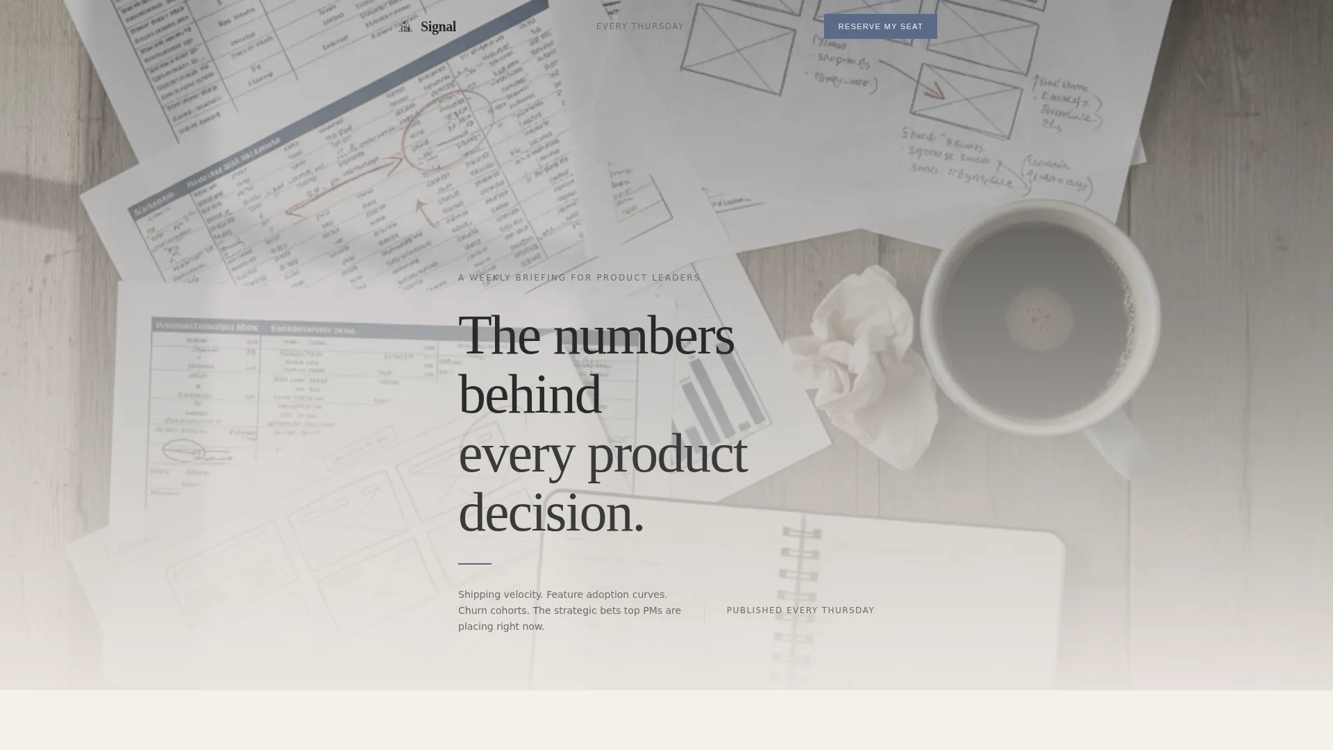
- A Type Over Image hero with a large serif headline, masthead byline, and issue frequency line
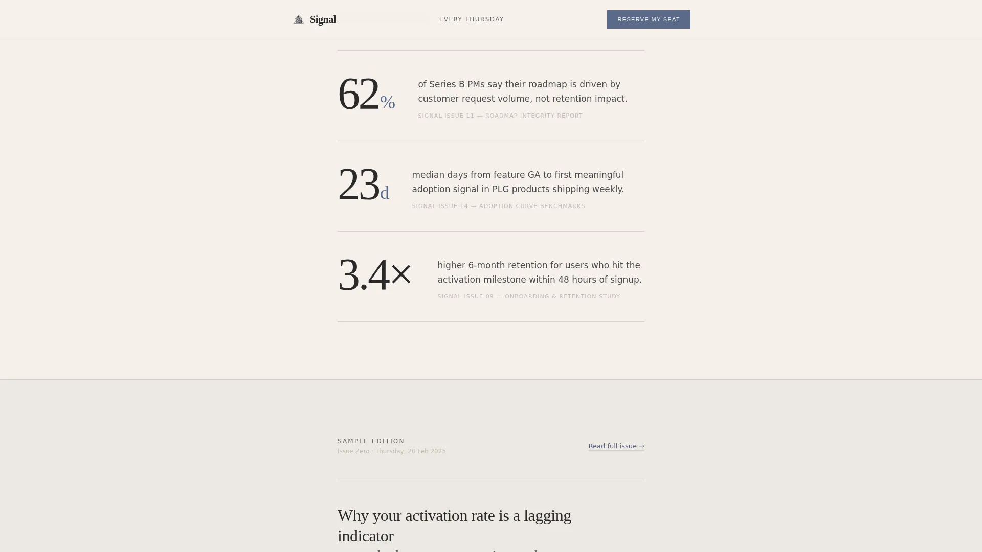
- Three oversized pull statistics with one-line annotations, a formatted sample excerpt column, and a "What We Cover" editorial listing section
- A dual call-to-action (call to action) setup: an inline email form after the sample excerpt and a sticky bottom bar on mobile, both tied to a live waitlist counter
Feature list
A brief note on what makes this template work: every feature listed here is drawn directly from the template's defined structure and visual system.
Type Over Image Hero Section
The hero places a large, unhurried serif headline over a softly desaturated overhead photograph. The image features scattered data printouts, annotated wireframes, and a half-drunk coffee, shot with shallow depth of field. A paper-grain texture overlay unifies the photograph and background into one tactile surface.
Oversized Pull Statistics Block
Three data points from a recent issue are typeset at display scale, each paired with a single-line editorial annotation. This section establishes the newsletter's analytical voice immediately, before any prose is read.
Sample Edition Excerpt Column
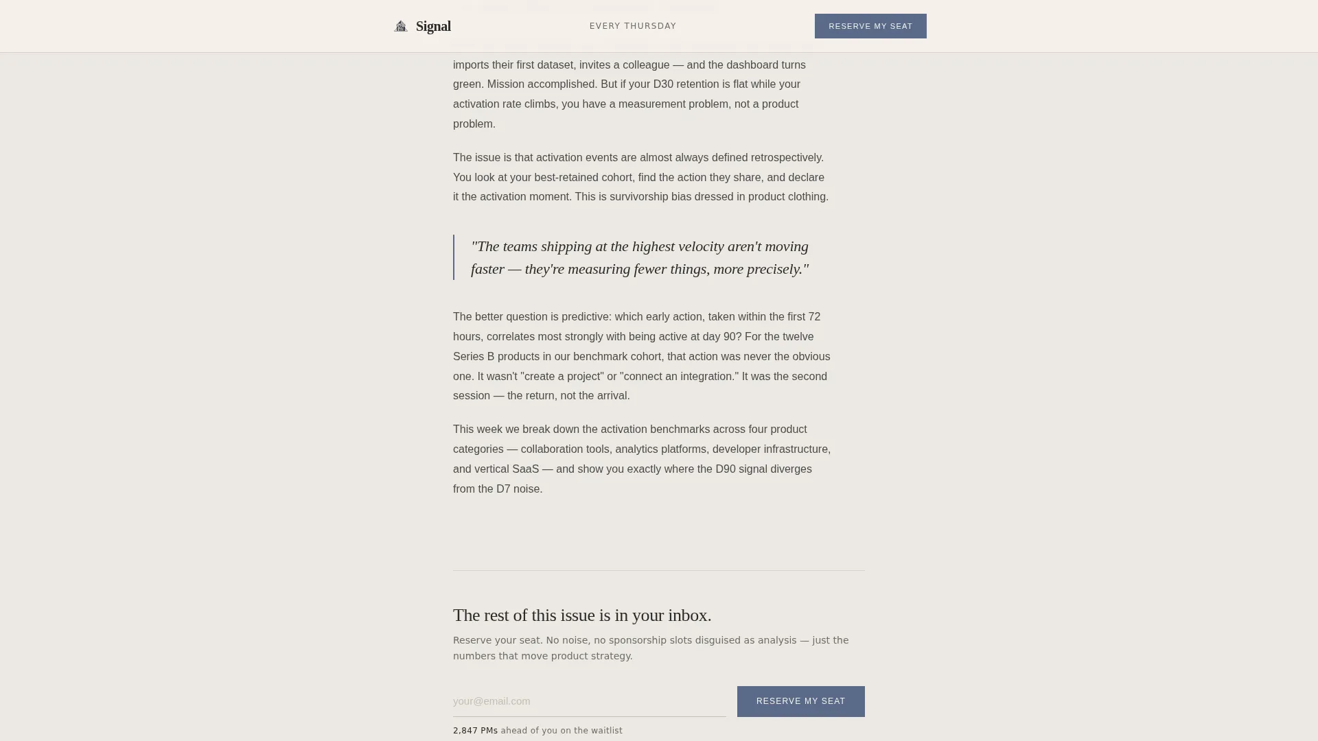
A formatted column of actual newsletter prose renders the publication's voice in context. Readers experience the writing style and depth before they are asked for their email address. This section is the most persuasive element on the page.
Editorial Table of Contents
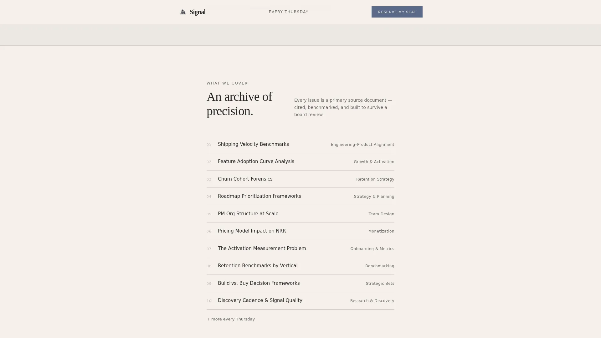
A "What We Cover" section lists issue themes as single confident lines with no icons. Topics such as retention benchmarks, roadmap prioritization frameworks, and PM org structures are presented as a clean editorial index.
Frictionless Waitlist Form with Counter
The email capture form asks for one field only. A live waitlist counter sits directly below the input, displaying the number of subscribers ahead in the queue. This creates genuine scarcity cues without fabricating urgency.
Sticky Mobile Call-to-Action Bar
On mobile devices, a persistent bottom bar keeps the primary call to action visible at all times. This means readers never have to scroll back up to subscribe, regardless of how deep they read into the page.
Page sections overview
| Section | Purpose |
|---|---|
| Hero header | Establish editorial authority with a large serif headline over a desaturated photograph |
| Pull statistics block | Show three real data points from a recent issue with one-line annotations |
| Sample excerpt column | Render actual newsletter prose to prove voice before asking for commitment |
| What We Cover list | Present issue themes as a confident editorial table of contents |
| Social proof row | Display a monotone company logo row in mist gray to whisper reader credibility |
| Waitlist form and call to action | Capture a single email field with a live waitlist counter and "Reserve My Seat" button |
| Sticky mobile bar | Keep the primary call to action persistent at the bottom of the screen on mobile |
| Page footer | Horizontal footer pattern with minimal supporting links |
Design & branding system
The Ink and Paper theme treats typography and whitespace as the primary design tools. No gradients, no saturated color, and no visual noise compete with the editorial content. The result feels like a broadsheet opened on a quiet morning.
- Soft Mist color system: warm newsprint white (#F5F0EB) as the background, faded graphite (#4A4A4A) for body text, mist gray (#D6D1CB) for hairline section dividers, and muted indigo (#5B6A8A) reserved for links, pull-quote rules, and the subscribe button
- Typography pairing: Fraunces serif for display headlines and pull statistics, DM Sans for body text and interface elements
- All company logos in the social proof row render in mist gray monotone, so they support credibility without dominating the visual hierarchy
Mobile & speed optimization
The template is built with a mobile-first layout. The single-column flow means no element needs to reflow dramatically between breakpoints. The sticky bottom call to action bar is a mobile-specific component that keeps conversion always one tap away.
- Low-to-medium animation level: paper grain texture overlay, subtle scroll reveals, and a sticky mobile bar are the only interactive layers
- Minimal JavaScript footprint with server-side static components handling the majority of the page rendering
- The single-column layout loads section by section without complex grid calculations or heavy asset dependencies
How this template helps you convert
Signal is designed around one insight: sophisticated readers convert when trust is earned before the ask arrives. The page architecture reflects that in a deliberate sequence.
- The hero headline and masthead byline establish immediate editorial authority, so the reader feels they have landed on a credible publication rather than a generic signup page
- The sample excerpt and pull statistics do the selling before the form appears, meaning the call to action arrives after proof of value rather than before it
- The dual call to action placement, inline after the excerpt and persistent on mobile via the sticky bar, ensures the subscribe option is always present without being aggressive
Other information about this template
This template is categorized under Blog and Editorial, with a specific focus on the product management newsletter and product management data and trends niche. It is designed as a single-column flow landing page, making it well-suited for focused campaign pages and waitlist launches.
- The creative direction follows an Industry Report cadence, where scrolling feels like paging through a well-structured annual briefing
- The secondary conversion path, a "Read Issue Zero" link opening a full sample edition in a new tab, lets skeptical readers self-qualify before committing their inbox
- The template is built for an English-language, US and global PM audience, and the design language speaks directly to senior readers who value precision over spectacle
Theme
Ink & Paper
Creative direction
Industry Report
Color system
Soft Mist
Style
Single Column Flow
Direction
Waitlist/Coming Soon
Page Sections
Type Over Image Hero with Grain Texture
Oversized Pull Statistics Display
Sample Edition Prose Column
Editorial Table of Contents Block
Frictionless Email Form with Live Counter
Sticky Mobile Call to Action Bar
Related questions
Can I update the waitlist counter to show my real subscriber count?
Does the template work if I have not yet written a sample issue?
Can this template be used after my newsletter has already launched?
How many fields does the email signup form include?
What typography is used in this template?



