Telecom Thought Leadership Editorial Landing Page
Signal is a hub-and-spoke editorial landing page built for telecommunications thought leadership. It presents up to six contributor essays in a scrolling chapter format, guided by a fixed left anchor nav. The design follows an ink-and-paper aesthetic with a cinematic dark palette, copper-foil accents, and deliberate serif typography that commands the authority its senior audience expects.
by Rocket studio
Quick summary
Signal is a single-page editorial landing page for serious telecom thought leadership. It organizes contributor essays as scrollable chapters, anchored by a fixed table-of-contents nav. The cinematic dark design, deep editorial black, aged parchment type, and copper-foil gold accents, gives each analysis the weight it deserves before a boardroom audience.
Who this template is for
This template is built for publishers and editorial teams who serve senior infrastructure professionals. It suits organizations producing dense, citation-worthy telecom analysis rather than general-interest content.
- Telecom media teams and independent broadsheets publishing engineering and policy analyses
- Thought leadership platforms whose contributors include Open RAN architects, spectrum advisors, and regulatory affairs directors
- Infrastructure-focused firms presenting expert essays to CTOs, private equity analysts, and strategy consultants
What problem this template solves
Generic blog layouts undercut serious telecom content. When your readers evaluate billion-dollar infrastructure decisions, a standard card grid signals the wrong editorial weight. Signal solves the gap between the depth of the argument and the credibility of the container.
- Standard templates present dense technical essays as casual blog posts, diluting perceived authority
- Contributors lack a visible, structured showcase that reflects their professional standing
- Readers with limited time need a clear entry point into each argument without wading through a homepage
What you get with this template
Signal delivers a fully structured editorial landing page ready to present up to six contributor chapters. Every section is purpose-built for a senior professional audience that reads with intent.
- A hero section built around oversized serif typography and copper-foil headline treatment, with no images or animations competing for attention
- Six vertically scrolling contributor chapter sections, each with a portrait, bio, essay excerpt, and a copper-foil call-to-action button
- A persistent bottom subscribe bar framed as a limited distribution list, plus an ultra-minimal footer in horizontal flow layout
Feature list
This template is built around a focused set of editorial components. Each one serves the landing page's core purpose: presenting authoritative telecom analysis in a format that earns trust.
Oversized Book-Title Hero
The viewport opens on a dark linen-textured background with a single centered serif headline set in copper-foil gold. Thin rules frame it above and below, and a single pulsing anchor arrow invites the scroll. No imagery, no animation beyond that pulse, just typographic authority.
Fixed Left Anchor Navigation
A persistent left-edge nav lists contributor surnames like a printed table of contents. Clicking any name triggers a smooth scroll to that contributor's chapter section. The active entry updates as the reader moves down the page, maintaining orientation throughout.
Scrolling Contributor Chapter Sections
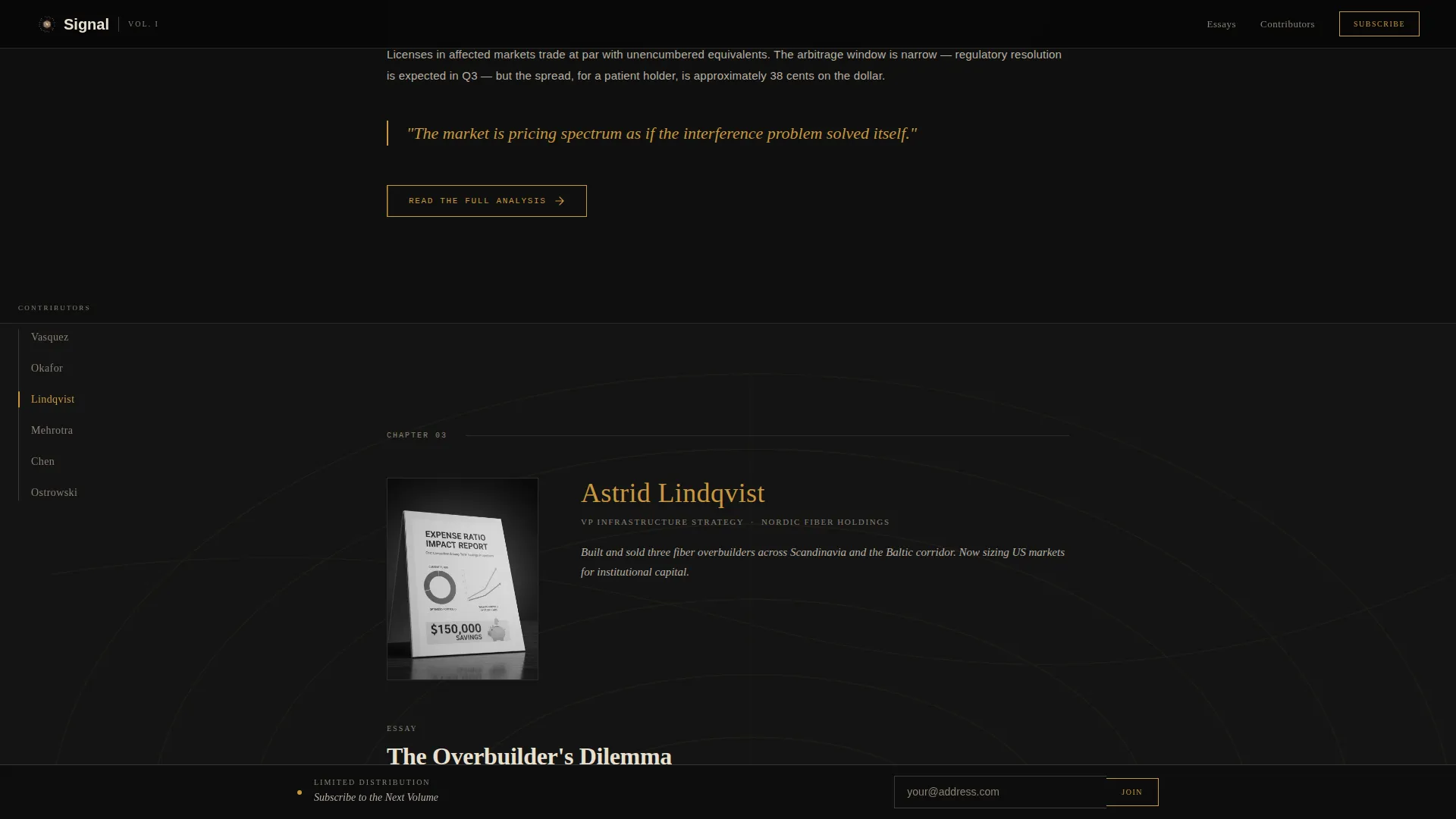
Six contributor sections stack vertically, each deepening in visual weight as the reader scrolls. Backgrounds progress from pure black to graphite to a faint topographic network-map watermark, giving the page a sense of moving through a physical book.
High-Contrast Portrait and Bio Block
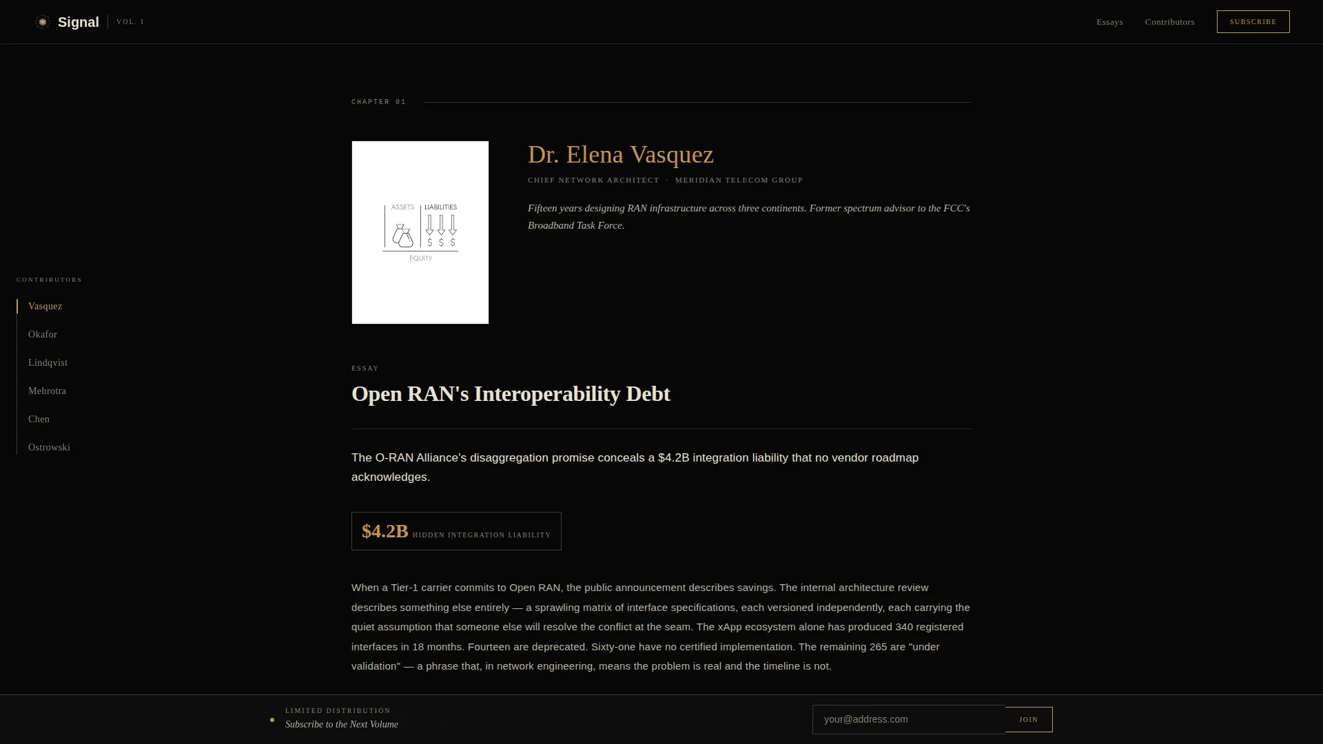
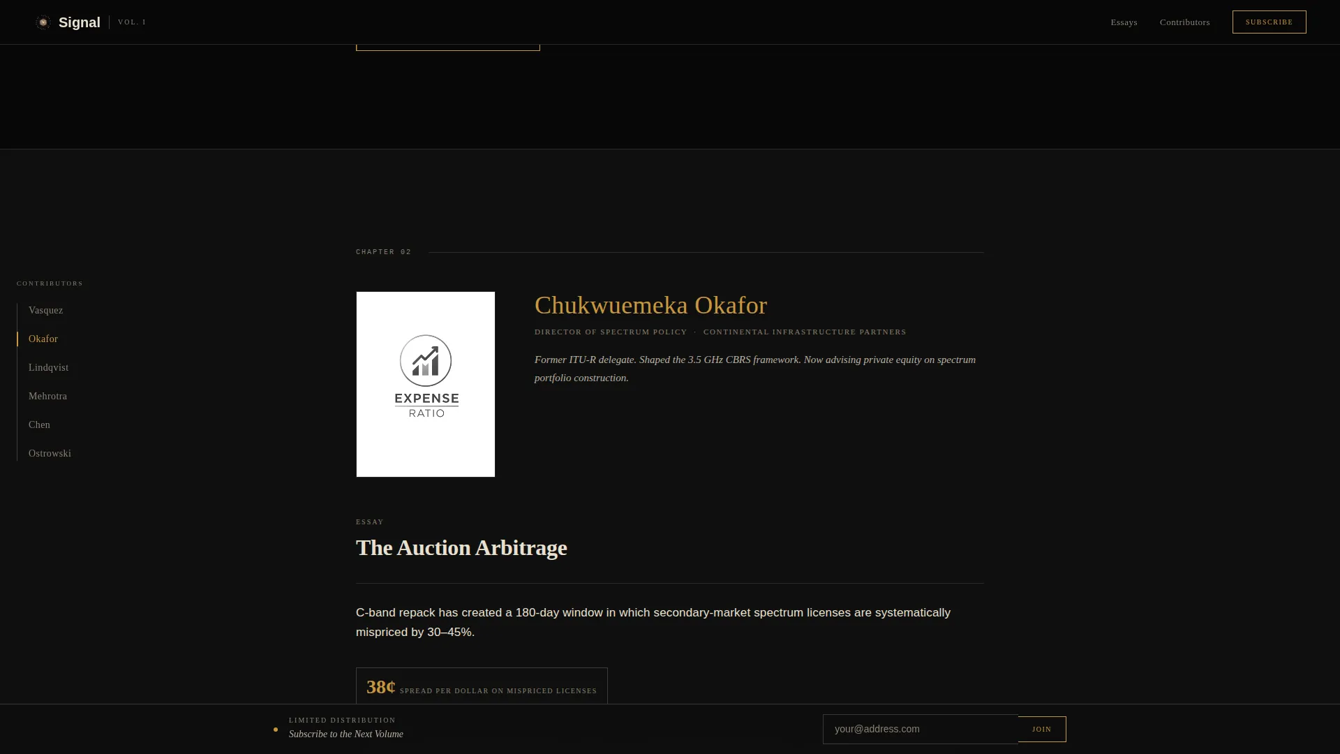
Each chapter opens with a black-and-white portrait, a two-line italic bio in parchment type, and the opening paragraph of the contributor's signature essay. The format mirrors a printed contributor page and reinforces professional credibility at a glance.
Copper-Foil Call-to-Action Buttons
Every contributor section ends with a "Read the Full Analysis" button in copper-foil gold. The treatment is reserved exclusively for this action, ensuring it reads as a deliberate editorial choice rather than a generic interface element.
Persistent Subscribe Bottom Bar
A fixed bottom bar offers email capture framed as joining a limited distribution list for the next volume. The single-field form sits alongside the subscription prompt, keeping the path to sign-up visible throughout the entire scroll.
Page sections overview
| Section | Purpose |
|---|---|
| Hero Book Title | Sets editorial tone with oversized copper-foil serif headline and thin typographic rules |
| Left Anchor Nav | Fixed table-of-contents nav linking to each contributor chapter by surname |
| Contributor Chapter 1 | Opens on pure black; portrait, bio, essay excerpt, and call to action button |
| Contributor Chapter 2 | Shifts to graphite background; same chapter structure, deeper visual weight |
| Contributor Chapter 3 | Introduces faint topographic watermark; chapter structure continues |
| Contributor Chapters 4-6 | Continue layered depth progression with consistent chapter structure |
| Subscribe Bottom Bar | Persistent email capture framed as limited-distribution next-volume sign-up |
| Minimal Footer | Ultra-minimal horizontal flow footer |
Design & branding system
The visual identity follows an ink-and-paper theme executed through a cinematic dark color system. Every palette and type decision serves editorial credibility over visual novelty.
- Colors: deep editorial black (#0D0D0D) as the base, aged parchment (#E8E0D0) for body text, muted graphite (#3A3A3A) for secondary surfaces, and copper-foil gold (#C8973E) reserved for author names, pull quotes, and hover states
- Typography: Fraunces as the display serif for headlines and contributor names, DM Sans for body copy and interface elements, and IBM Plex Mono for statistics and labels
- Dividers use thin graphite rules that evoke broadsheet column breaks, while section backgrounds shift progressively to reinforce the physical sensation of turning deeper into a book
Mobile & speed optimization
The template is built desktop-first, reflecting its boardroom audience. Mobile fallback is included so the content remains accessible on smaller screens without sacrificing readability.
- Desktop-first layout prioritizes large-monitor reading with the full left anchor nav and chapter depth visible simultaneously
- Server Components handle static content to keep JavaScript minimal, supporting fast initial load without complex client-side dependencies
- Low-animation approach, one pulse on the hero arrow and smooth anchor scroll transitions, keeps the page responsive and free of unnecessary render overhead
How this template helps you convert
Signal is built around two conversion paths: the essay click-through and the subscription sign-up. Both are introduced with enough editorial substance to make acting feel like a natural next step.
- Each contributor chapter delivers the sharpest statistic and the most provocative thesis sentence from the full essay, giving readers just enough to make leaving the argument unfinished feel like closing a book mid-chapter, which drives the "Read the Full Analysis" click.
- The persistent bottom subscribe bar reframes email capture as joining a limited distribution list for the next volume, making sign-up feel exclusive rather than routine and keeping the prompt visible throughout the entire scroll.
Other information about this template
Signal is a specialized template built for a narrow and demanding use case. A few additional details help clarify its scope and fit.
- The template style is hub and spoke with anchor navigation, making it distinct from paginated blog archives or multi-page editorial sites
- The header concept follows a chapter and book framing, which sets reader expectations from the first viewport
- Creative direction centers on a creator spotlight model, meaning the contributors are the primary editorial asset and the design is built to amplify their authority
- The template is localized for English-language publication with a US and EU regulatory context in mind
- It is designed for B2B thought leadership in the telecommunications sector, with a target readership of senior infrastructure professionals

Theme
Ink & Paper
Creative direction
Creator Spotlight
Color system
Cinematic Dark
Style
Hub & Spoke (Anchor Nav)
Direction
Click-Through
Page Sections
Oversized Book-title Hero Section
Fixed Left Anchor Navigation
Scrolling Contributor Chapter Sections
Portrait, Bio, and Essay Excerpt Block
Copper-foil Call-to-action Buttons
Persistent Subscribe Bottom Bar
Related questions
How many contributors can this landing page feature?
Can I update the contributor content without redesigning the page?
Is this template suitable for a single author rather than multiple contributors?
What does the subscribe bar collect?
Does the template include the full essay content?



