Cybersecurity Newsletter Specialist Professional Website Template
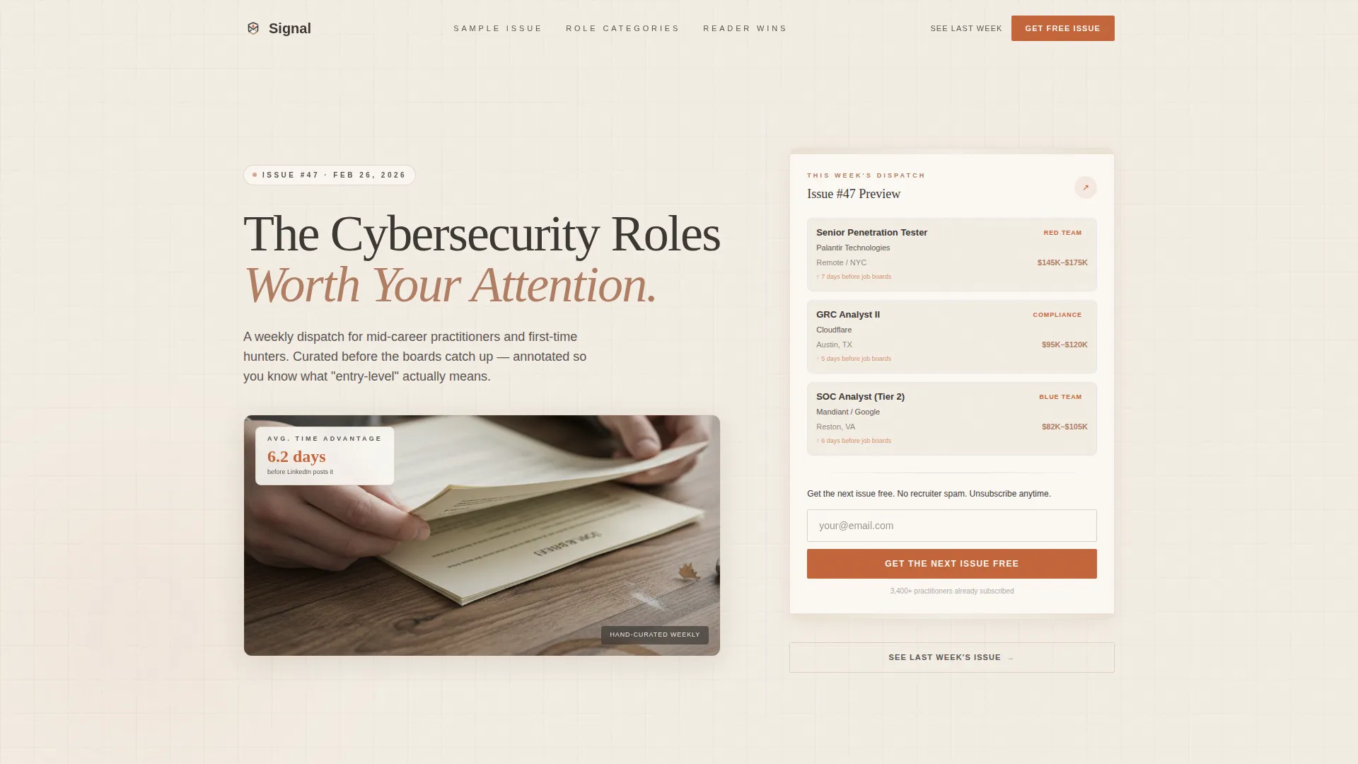
Signal is a lead generation landing page template built for a curated cybersecurity jobs and opportunities newsletter. It uses an asymmetric 60/40 grid, a Warm Artisan visual identity, and a Gallery Walk creative structure to earn subscriber trust before asking for an email. Real roles, salary bands, and reader outcomes are visible throughout the page.
by Rocket studio
Quick summary
Signal is a single-page newsletter landing page template designed for a curated cybersecurity jobs and opportunities newsletter. The asymmetric 60/40 grid holds cinematic artifacts in the wide column and supporting context in the narrow one. Every scroll section is framed as a gallery exhibit, showing real roles and reader outcomes before the email form ever appears.
Who this template is for
This template is built for newsletter operators and independent curators who serve cybersecurity professionals. It works best when the publication has a clear point of view and real curation to show off.
- Cybersecurity newsletter publishers targeting mid-career professionals such as penetration testers and governance, risk, and compliance analysts
- Independent job curators who surface roles before they reach oversaturated job boards
- Security career coaches or community leads who want a polished lead generation page without a generic look
What problem this template solves
Most newsletter landing pages ask for an email before proving they have earned it. Security professionals in particular are skeptical readers. They spot bait-and-switch copy immediately and leave.
- The page has no ask before the proof: real role titles, salary bands, and placement outcomes appear first
- Generic dark-mode cybersecurity aesthetics blend together; this template deliberately breaks from neon-on-black with a warm, tactile identity that signals a human curator
- Readers who are quietly job hunting need a frictionless path to preview content before committing, which the lightbox sample issue provides
What you get with this template
You get a fully structured, single-page lead generation layout built around the Signal newsletter concept. Every section is purposefully ordered to build trust and move readers toward a signup.
- A hero section with a 60/40 asymmetric split: a large-format serif headline over a desaturated photo on the left, and a torn-paper issue preview card with an email capture form on the right
- A five-section gallery walk structure with annotated sample issues, a role category mosaic with flip cards, and testimonials styled as handwritten margin notes
- A sticky email capture aside that resurfaces after each gallery frame, plus a secondary lightbox path for skeptical readers to preview last week's issue before subscribing
Feature list
This template is built from a tightly defined set of components. Each one is purposeful and grounded in the source brief.
Asymmetric 60/40 Grid Layout
The page uses a persistent 60/40 column split throughout every scroll section. The wider column holds the primary artifact, photo, annotated issue, flip card mosaic, or testimonial screenshot. The narrower column holds the story, the context, or the call to action.
Gallery Walk Section Structure
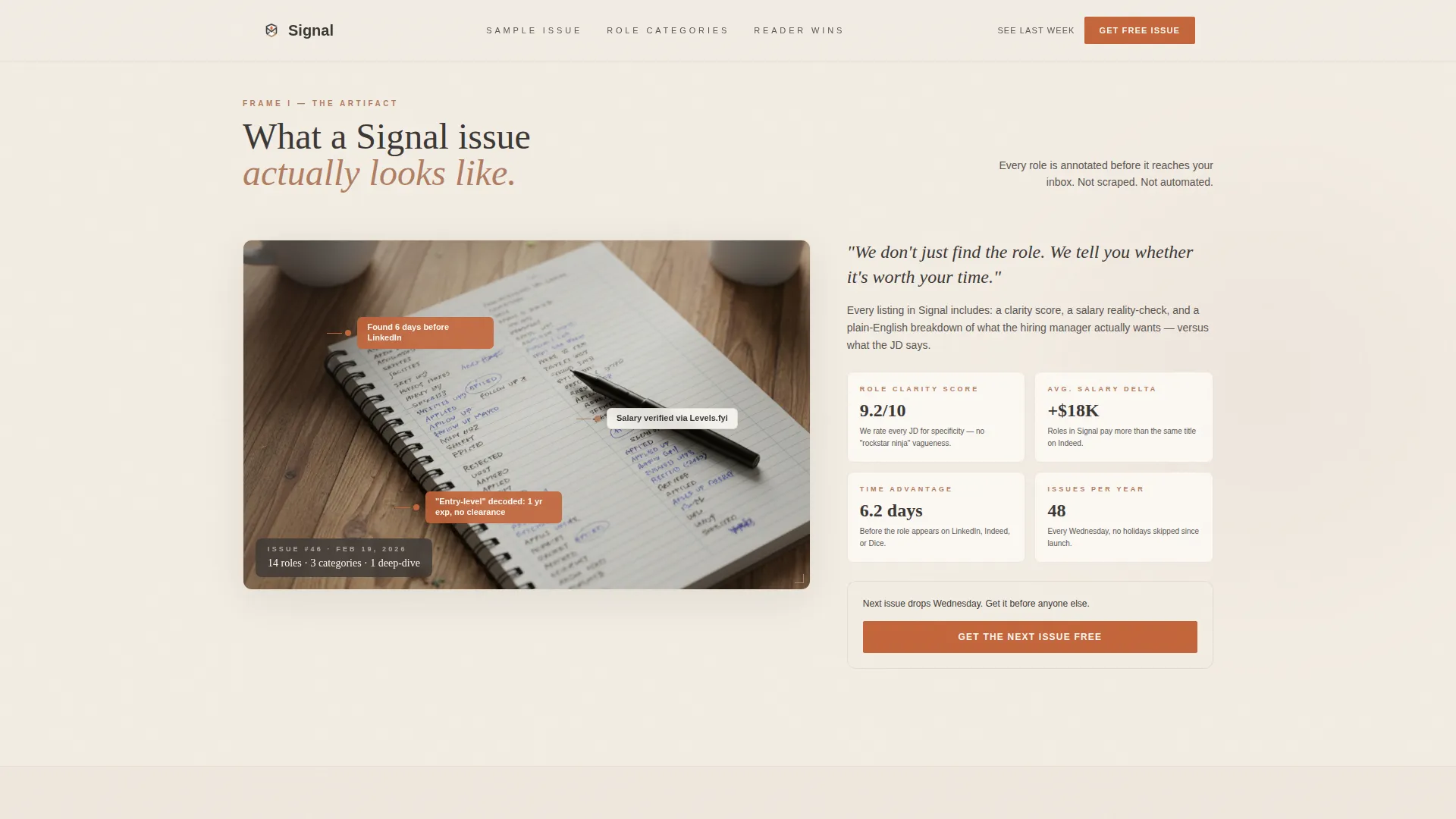
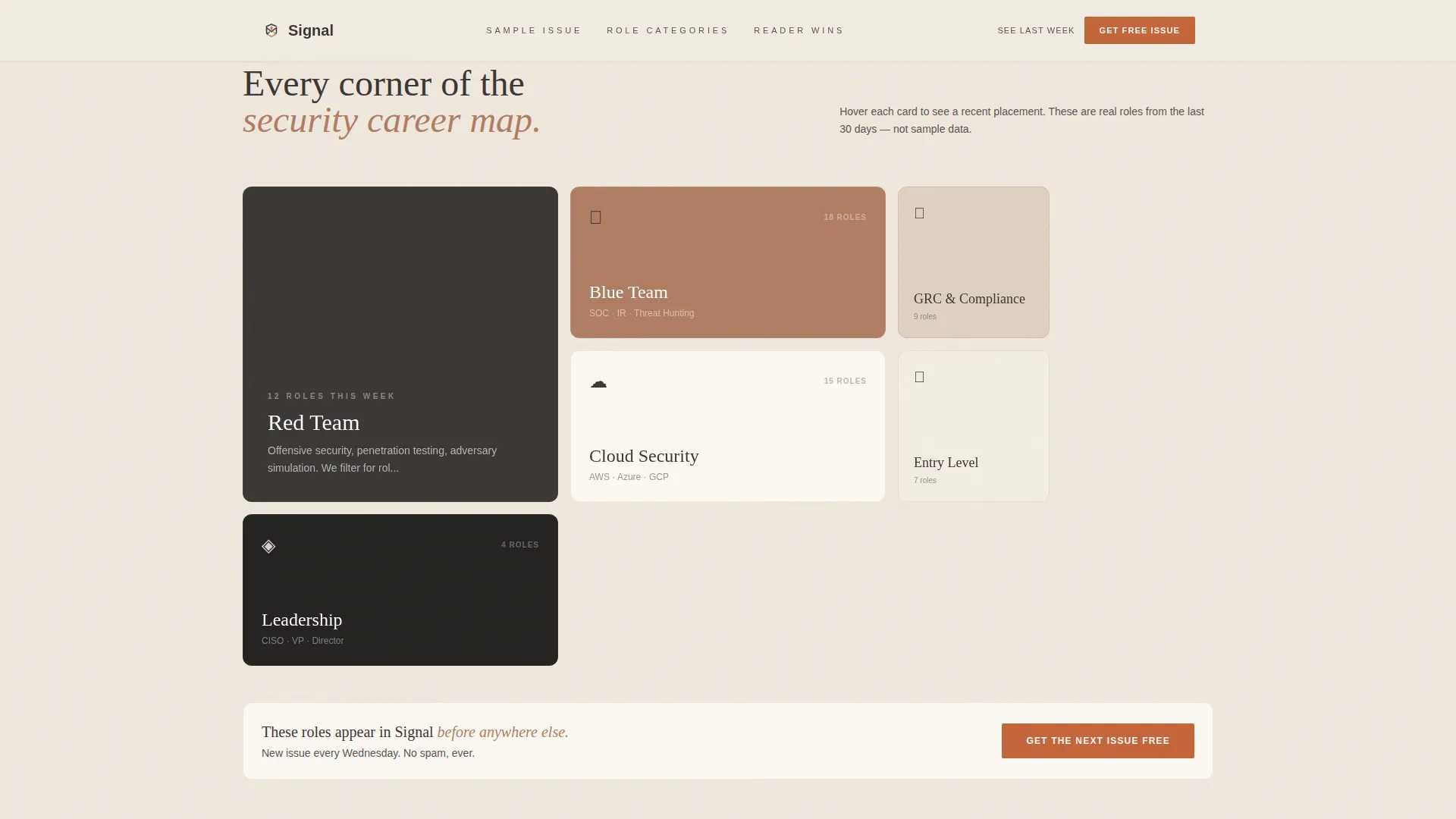
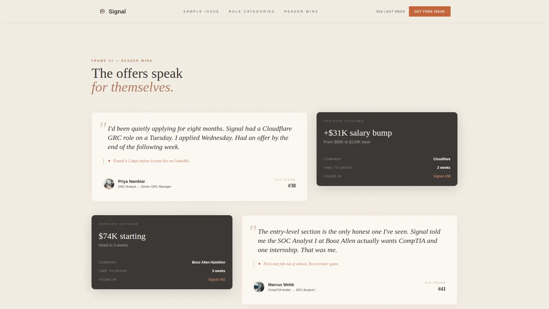
Each scroll section is framed as a distinct exhibit. The first frame shows an annotated sample issue spread. The second presents a mosaic of role categories, red team, blue team, compliance, and cloud security, each as a flip card. The third displays reader testimonials styled as handwritten margin notes beside offer letter screenshots.
Flip Card Role Category Mosaic
The role category section uses interactive flip cards. Each card face shows a category label. On hover, the card flips to reveal a recent placement from that category. This interaction lets readers self-identify with their specialization and see immediate proof of curation quality.
Lightbox Sample Issue Preview
A secondary call-to-action reading "See Last Week's Issue" opens the full sample issue inside a lightbox overlay. Skeptical readers can read before they commit. This path reduces friction for professionals who need to evaluate before trusting.
Sticky Email Capture Aside
The primary call to action, a single email field with a paprika-colored submit button, appears first in the hero's 40-column. It then resurfaces as a sticky aside after each gallery frame. The form never obscures content and never asks before the page has shown its proof.
Scroll Reveal and Card Flip Animations
The template includes medium-intensity animations: scroll-triggered reveals for section entries, staggered card appearances in the mosaic, hover shimmer on interactive elements, and the card flip interaction. These are applied selectively to add tactile energy without distracting from content.
Page sections overview
| Section | Purpose |
|---|---|
| Hero split layout | Introduces the newsletter with a cinematic photo, serif headline, torn-paper issue preview card, and email capture form |
| Annotated issue frame | Shows a sample issue spread open with callout annotations proving early role discovery |
| Role category mosaic | Presents flip cards for red team, blue team, GRC, and cloud security role categories |
| Reader testimonials frame | Displays handwritten-style margin note testimonials beside offer letter screenshots |
| Final email capture | Full-width email capture section with a paprika submit button for last-chance signup |
| Footer row | Single-row linear footer with essential links and minimal branding |
Design & branding system
The visual identity is Warm Artisan: tactile, unhurried, and deliberately human in a space that defaults to cold, neon aesthetics. Typography pairs Fraunces for display headings and DM Sans for body text.
- Parchment cream (#F3EDE4) covers all backgrounds; hearthstone charcoal (#3B3735) anchors body text and section dividers; kiln-fired clay (#B07D62) warms secondary headings and card borders
- Smoked paprika (#C4653A) is reserved exclusively for buttons and hover states, so every interactive element earns attention through contrast
- The hero image is a softly desaturated photograph of hands arranging printed job briefs on a wooden desk, with a coffee ring visible at the edge, reinforcing the handcrafted workshop aesthetic
Mobile & speed optimization
The template is built desktop-first, designed for professionals reading at a workstation. Full mobile support is included so the layout reflows cleanly on smaller screens.
- Scroll reveal animations, card flip interactions, and lightbox behavior are handled client-side only where interactivity is needed; static sections use server components for faster initial rendering
- The asymmetric grid adapts to a stacked single-column layout on mobile, preserving the artifact-then-story reading order without breaking the visual hierarchy
How this template helps you convert
Signal is structured around one principle: show before you ask. The page earns the signup by making the newsletter's value visible at every scroll depth.
- The hero places the issue preview card and email form side by side with the cinematic photo, so the first impression is content, not a pitch
- Each gallery frame resurfaces a sticky email capture aside, giving readers a low-friction signup path at the exact moment they encounter proof
- The lightbox secondary path lets skeptical readers open a full sample issue before typing a single character into the form, removing the last objection before commitment
Other information about this template
This template is categorized under Blog and Editorial with a Cybersecurity Newsletter subcategory. It is purpose-built for the cybersecurity jobs and opportunities newsletter niche.
- The layout style is an asymmetric grid with a 60/40 column split, and the creative direction follows a Gallery Walk structure
- The header concept is Type Over Image: a large-format serif headline letterspaced generously in warm cream over the hero photograph
- The landing page direction is Lead Generation, with a single primary conversion goal of email subscriber acquisition
- Content is localized for English-speaking audiences with United States dollar salary bands and a mix of US-based and remote roles
- The color system is Warm Stone, and the overall theme is Warm Artisan, making this template visually distinctive within a niche where dark, technical aesthetics dominate
Theme
Warm Artisan
Creative direction
Gallery Walk
Color system
Warm Stone
Style
Asymmetric Grid (60/40)
Direction
Lead Generation
Page Sections
Asymmetric 60/40 Grid Layout
Gallery Walk Section Structure
Flip Card Role Category Mosaic
Lightbox Sample Issue Preview
Sticky Email Capture Aside
Scroll Reveal and Interaction Animations
Related questions
Who is this landing page template designed for?
Can readers preview the newsletter before subscribing?
What makes this template different from a standard newsletter landing page?
How does the role category mosaic work?
Is this template suitable for both desktop and mobile readers?



