ML Jobs Newsletter Landing Page Template
Signal is an editorial landing page template built for curated machine learning job newsletters. It uses an asymmetric 60/40 grid, a manifesto-style scroll structure, and a five-step career-positioning quiz as its primary conversion path. The design draws from an aged-parchment editorial aesthetic, with serif typography, a rust-and-charcoal palette, and a field-notebook texture that sets it apart from generic newsletter templates.
by Rocket studio
Quick summary
Signal is a single-page landing page template designed for weekly machine learning job newsletters. It combines a manifesto scroll layout with a five-step interactive quiz, an asymmetric 60/40 grid, and an editorial magazine visual identity. The template is built to convert skeptical, mid-career engineers into engaged subscribers by leading with conviction before asking for an email.
Who this template is for
This template is built for newsletter operators and independent curators who publish targeted job intelligence for the machine learning and applied artificial intelligence community. It works especially well when your audience is sophisticated enough to ignore generic job boards and recruiter blasts.
- Mid-career machine learning engineers and researchers exploring their next move quietly
- Independent newsletter publishers covering roles in MLOps, natural language processing, computer vision, and research science
- PhD candidates and senior practitioners who want curated context, not raw listings
What problem this template solves
Most newsletter landing pages look like email-capture forms dressed up with a headline. They fail to communicate why a curated newsletter is worth more than a LinkedIn job alert or a Slack channel scroll. Signal solves that credibility gap by treating the page itself as an argument.
- Readers arrive skeptical and leave with enough context to subscribe, because the manifesto structure earns trust before the call to action appears
- The five-step quiz replaces the blunt "enter your email" prompt with a diagnostic that feels personalized and specific
- The 40-column sidebar runs proof artifacts alongside every philosophical claim, so conviction and evidence arrive together
What you get with this template
Signal delivers a fully structured landing page with a clear visual hierarchy, a conversion-oriented quiz component, and a cohesive editorial design system ready to customize. Every section is mapped to a specific persuasion job, from opening chapter header through final quiz card.
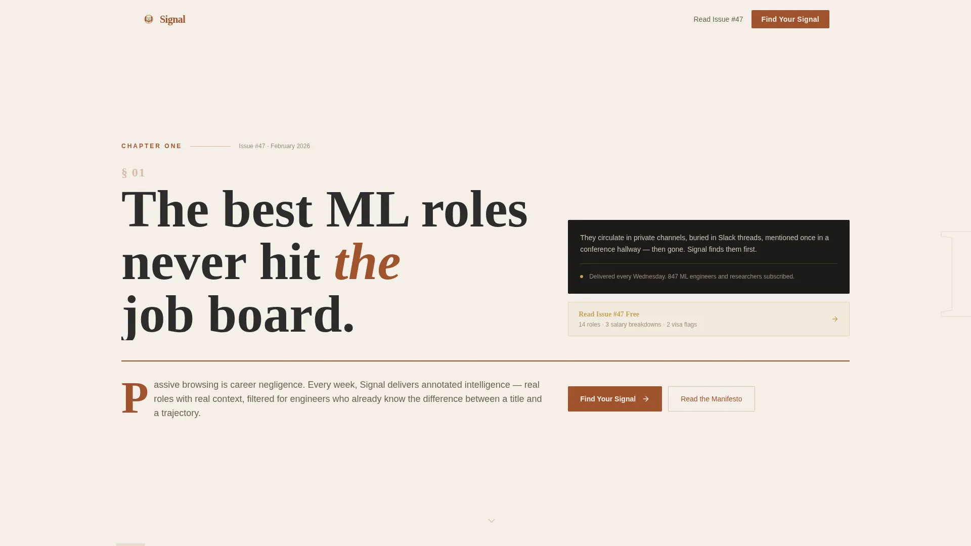
- A Chapter One hero section with drop-cap treatment, oversized serif type, a rust-colored rule, and a manifesto thesis statement
- Three numbered manifesto sections, each pairing a bold declaration in the 60-column with a proof artifact in the 40-column
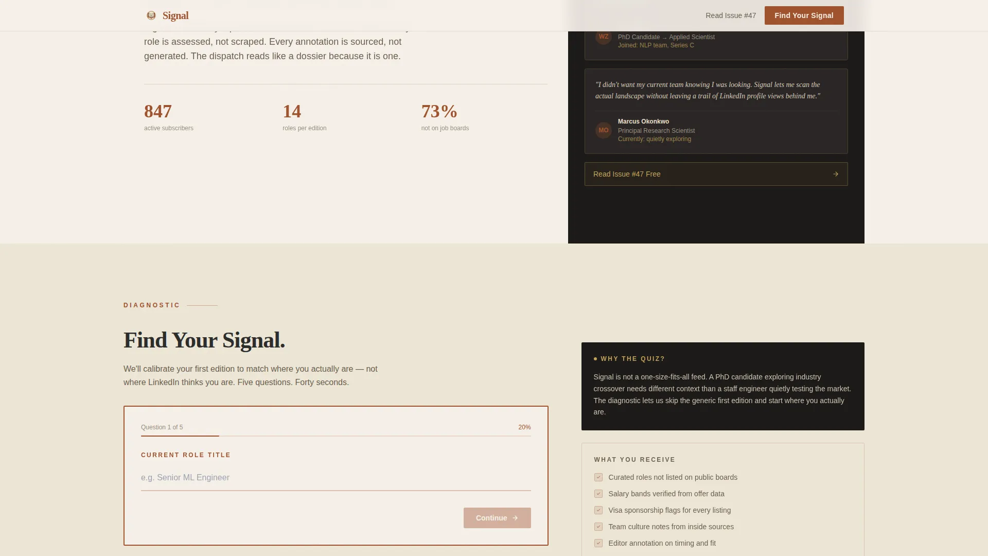
- A five-step "Find Your Signal" quiz card with autocomplete, a slider, multi-select, single-choice, and email capture
Feature list
Signal ships with carefully considered interactive and visual features drawn directly from its editorial brief. Each feature serves the goal of converting a cautious, technically literate reader into a subscriber.
Chapter One Hero Section
The header opens as a typographic book page. A large drop cap, an oversized chapter number, and a single provocative thesis statement fill the viewport. A thin rust rule separates the heading from the body. No hero image is used; the typography carries all the visual weight.
Asymmetric 60/40 Manifesto Grid
The layout divides each manifesto section into a 60-column narrative lane and a 40-column proof lane. The 60-column holds bold serif declarations. The 40-column runs a darker charcoal tone and displays proof artifacts such as redacted salary comparisons, newsletter previews, and subscriber testimonials.
Five-Step Career-Positioning Quiz
The "Find Your Signal" quiz lives in a rust-bordered card that slides into the 60-column after the final manifesto point. It collects role title via smart autocomplete, years of experience via slider, specialization interests via multi-select, job search urgency via single-choice, and an email address. It is framed as a diagnostic, not a signup form.
Persistent Secondary Conversion Path
A "Read Issue #47 Free" link sits in the 40-column throughout the scroll. It gives skeptical readers a low-commitment sample before they reach the quiz. This secondary path runs independently from the primary quiz conversion flow.
Scroll-Reveal Animation System
The template uses medium-weight scroll reveal animations, staggered entry effects, and quiz step transitions. The paper-grain background texture includes a parallax effect. Animations are applied at a pace that feels editorial rather than flashy.
Fraunces and DM Sans Typography Pairing
Headlines, the drop cap, and manifesto declarations use Fraunces, a variable serif designed for editorial contexts. Body copy, interface labels, and quiz fields use DM Sans for clean readability. The pairing reinforces the notebook-meets-product-interface feel of the overall design.
Page sections overview
| Section | Purpose |
|---|---|
| Chapter One Hero | Opens the page as a book chapter with thesis statement and drop cap |
| Manifesto Point I | Declares "The algorithm feed is not your career strategy" with proof artifact |
| Manifesto Point II | Declares "Context matters more than compensation" with salary redaction artifact |
| Manifesto Point III | Declares "The best signal is human, not automated" with subscriber testimonials |
| Find Your Signal Quiz | Five-step diagnostic card collecting career data and email address |
| Footer Section | Horizontal flow footer completing the page structure |
Design & branding system
The visual identity follows an Editorial Magazine theme that reads like a leather-bound journal found in a university library. Every color choice and type decision reinforces the idea that this newsletter is a curated intelligence product, not a content mill.
- Aged parchment (#F5F0E8) as the dominant background, deep rust (#A0522D) for headlines and primary accents, charcoal ink (#2B2B2B) for body text, and tarnished brass (#C4A35A) for hover states and interactive highlights
- Fraunces serif for all display type including the drop cap and manifesto declarations; DM Sans for body paragraphs and quiz interface elements
- A subtle paper-grain background texture with parallax behavior, rust-colored horizontal rules as section dividers, and a darker charcoal tone in the 40-column sidebar to visually separate proof from argument
Mobile & speed optimization
The template is designed desktop-first to match the reading habits of engineers at workstations, while remaining fully mobile-responsive for readers checking the page on a phone. The interactive quiz components are isolated as client-side elements, keeping the rest of the page static.
- Static-first architecture with client components used only for quiz interactivity, keeping the base page lightweight
- Asymmetric grid collapses gracefully to a single-column stacked layout on smaller screens
- Scroll reveal and parallax animations are applied at a medium weight, preserving visual polish without overwhelming mobile rendering
How this template helps you convert
Signal is structured around a deliberate persuasion arc. Each section earns the right to ask for the next commitment, so the quiz at the end feels like a natural conclusion rather than an interruption.
- The manifesto scroll builds conviction through numbered philosophical declarations before any conversion element appears, so the reader arrives at the quiz already persuaded.
- The five-step quiz replaces a cold email field with a personalized diagnostic, lowering the perceived cost of subscribing and making the reader feel seen rather than harvested.
- The persistent "Read Issue #47 Free" link in the 40-column sidebar offers a low-friction sample path for skeptics who are not yet ready to complete the quiz.
Other information about this template
Signal is a strong match for newsletter operators who want a template that does more than collect emails. It is also well-suited to anyone building a personal brand in the machine learning space who needs a credible, high-context first impression.
- The template style is Asymmetric Grid (60/40), and the layout is intentionally uncommon for newsletter pages, which helps it stand out in a category full of centered single-column designs
- The header concept follows a Chapter/Book structure, the creative direction is Manifesto, and the landing-page direction is Quiz/Assessment, making this a rare three-way intersection in the editorial newsletter space
- The Parchment and Rust color system is distinctive enough to be recognizable across social shares and email previews, reinforcing newsletter brand identity beyond the landing page itself


Theme
Editorial Magazine
Creative direction
Manifesto
Color system
Parchment & Rust
Style
Asymmetric Grid (60/40)
Direction
Quiz/Assessment
Page Sections
Chapter One Hero with Drop Cap
Asymmetric 60/40 Manifesto Grid
Five-step Career-positioning Quiz
Persistent Sidebar Conversion Link
Scroll-reveal and Parallax Animation
Editorial Typography System
Related questions
Can I edit the quiz steps to match my own newsletter topic?
Does this template work for newsletters outside machine learning?
What fonts does Signal use?
Is the secondary 'Read Issue Free' link a built-in component?
Is this template designed for desktop or mobile users?


