No-Code Jobs Newsletter Landing Page Template
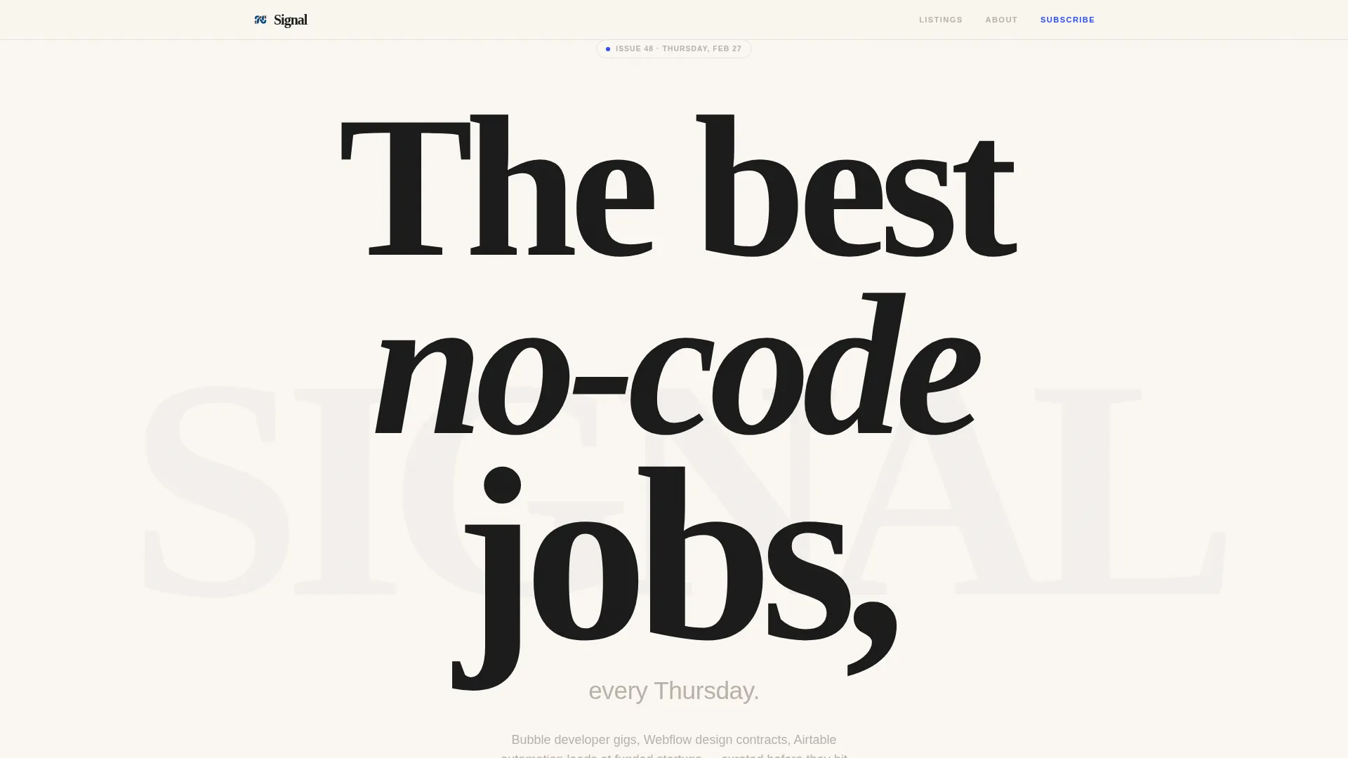
Signal is a Luxe Minimal landing page template built for no-code and low-code jobs newsletters. It pairs an oversized serif headline with a single-field email capture and a staggered masonry job-card grid. The Ink and Paper color system and editorial broadsheet layout make curation feel like authority, turning every scroll into a reason to subscribe.
by Rocket studio
Quick summary
Signal is a single-page newsletter landing page template designed for curated no-code and low-code job dispatches. It leads with a giant centered serif headline, flows into a staggered masonry grid of job cards, and closes with a frictionless email capture. The restrained Ink and Paper palette makes every element feel deliberately placed.
Who this template is for
This template is built for newsletter publishers and indie operators who curate job opportunities in the no-code and low-code space. If your content reaches builders, freelancers, or career-switchers, Signal gives you a fitting first impression.
- No-code newsletter creators who want a polished, press-ready landing page
- Freelance operators and job board curators promoting weekly dispatches
- Career coaches or community builders targeting the no-code and low-code job market
What problem this template solves
Generic email capture pages look like every other signup form. They give visitors no reason to trust the sender before handing over an inbox address. Signal fixes that by leading with visible proof of curation value rather than a promise.
- Visitors see actual job listings before they are asked to subscribe
- The masonry grid communicates breadth and quality of curation at a glance
- A restrained, editorial design signals that the newsletter is worth their attention
What you get with this template
You get a complete, single-page landing page structure built around one conversion goal: the email subscriber. Every section earns its place, and nothing competes with the signup flow.
- A giant serif hero section with a centered headline and a single email input field
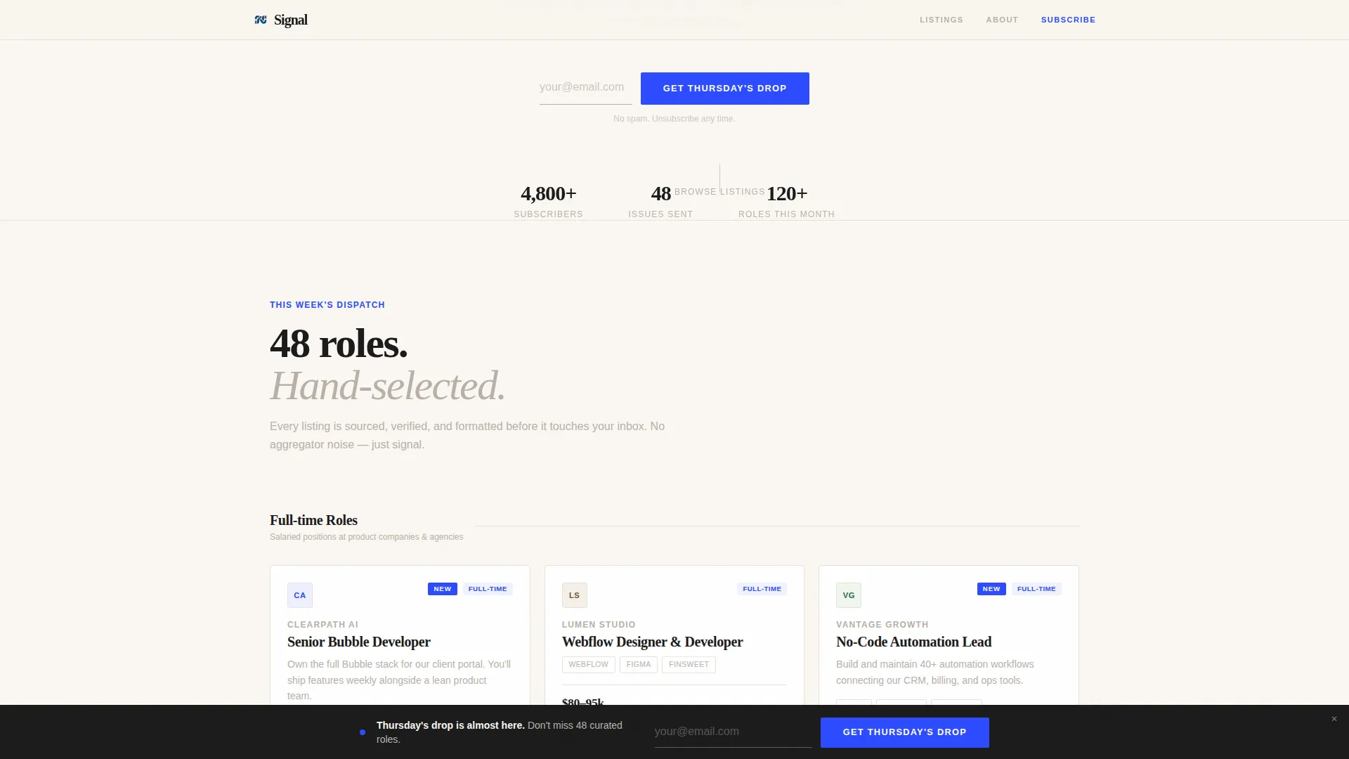
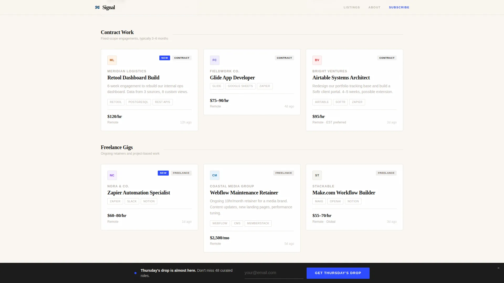
- A staggered masonry job-card grid showing role title, company logo, tool stack, and salary band
- A sticky email capture bar that floats into view after a defined scroll depth
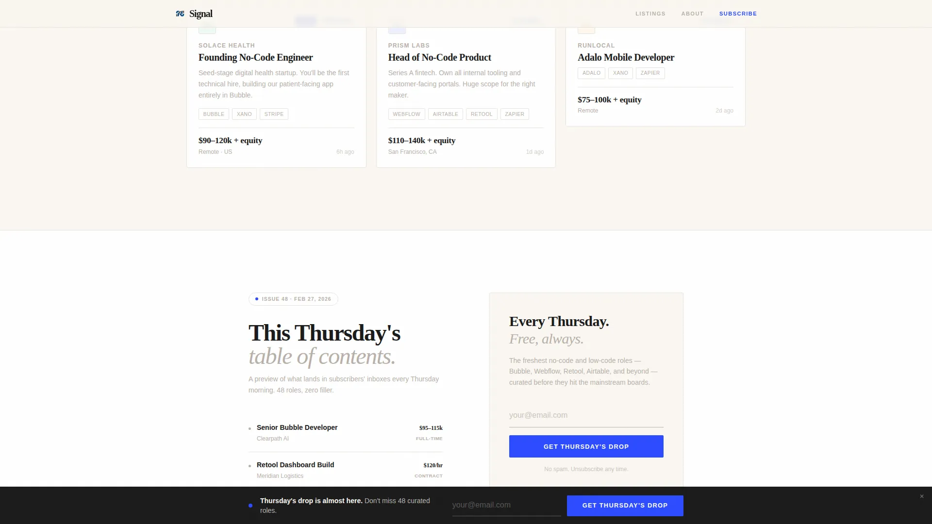
- A closing issue-preview section with a table of contents and a final email field
Feature list
A paragraph introducing the features: Signal's feature set matches the editorial ambition of the brief. Each built-in component is designed to do specific work, so the page never feels padded or over-designed.
Giant Headline Hero Section
The hero opens with an oversized, tightly kerned Fraunces serif headline on a bare cotton-white background. A single light sans-serif subhead sits beneath it, and one fountain-pen blue email field floats below like a finishing detail. No images, no gradients, no distractions.
Staggered Masonry Job Grid
The main content section renders job cards at staggered heights, styled like pinned clippings on a studio wall. Each card displays a role title, company logo, tool stack tags, and a salary band. Typographic category dividers separate full-time, contract, freelance, and founding-role clusters.
Scroll-Triggered Sticky Bar
After the visitor scrolls past a defined depth, a minimal sticky email bar floats into view. It stays present without interrupting reading flow, keeping the signup option visible throughout the browsing session.
Issue Preview Closing Section
The final section previews the latest issue's table of contents. It gives visitors a concrete look at what a Thursday drop contains before the closing email field asks for their address.
IntersectionObserver Stagger Reveals
Job cards animate into view using staggered reveal timing as the visitor scrolls. The effect feels like cards being placed one by one, reinforcing the curated, hand-selected quality of the editorial direction.
Magnetic Call-to-Action Button
The primary call-to-action button responds with a subtle magnetic pull on hover. Combined with a grain overlay texture, the interaction adds a tactile quality that matches the letterpress design restraint.
Page sections overview
| Section | Purpose |
|---|---|
| Hero Headline | Oversized serif headline with a single email capture field |
| Masonry Job Grid | Staggered job cards showing roles, tool stacks, and salary bands |
| Sticky Email Bar | Floating signup bar triggered after scroll depth |
| Category Dividers | Typographic labels separating job type clusters |
| Issue Preview | Latest issue table of contents with a closing email field |
Design & branding system
Signal uses the Ink and Paper color system, a four-value palette that reads like a limited-run letterpress print. The Fraunces serif typeface handles all headlines, while DM Sans handles body copy and interface elements.
- Deep editorial black (#1A1A1A) for body text, warm cotton stock (#FAF7F2) as the page background, and pencil-sketch gray (#B8B0A8) as a secondary tone
- Fountain-pen blue (#2C4BFF) reserved exclusively for links, the email field, and call-to-action buttons
- A grain overlay texture adds a tactile, printed quality that reinforces the broadsheet editorial feel
Mobile & speed optimization
The template is designed desktop-first to honor the broadsheet reading experience, with a graceful mobile collapse built in. The masonry grid and sticky bar adapt to narrower viewports without losing the editorial character.
- The masonry layout reflows cleanly on smaller screens so card content stays readable
- Static job-card components use server-side rendering patterns while scroll and sticky behaviors are handled client-side
How this template helps you convert
Signal builds subscriber trust before asking for a commitment. The conversion flow is structured so that proof comes first and the ask comes after.
- The masonry grid of live job listings acts as social proof, showing exactly what subscribers receive before they are asked to sign up
- The no-friction single-field email capture (no name field, no preferences) removes every reason to hesitate at the signup moment
- The sticky bar and closing issue-preview section give visitors two additional conversion touchpoints after they have already seen the value
Other information about this template
Signal sits at the intersection of editorial design and lean conversion strategy. It is built for a specific niche but adaptable to any curated content newsletter that needs a credible, polished first page.
- The template style is classified as Masonry and Pinterest layout, making it a strong match for content-dense dispatches that need visual hierarchy
- The Luxe Minimal theme and Curated Collection creative direction are baked into the layout structure, not just the color choices
- The header concept follows the Giant Headline Centered approach, where typography alone carries the visual weight of the hero
- The lead-generation direction means every design decision serves the single-field email capture as the primary outcome
Theme
Luxe Minimal
Creative direction
Curated Collection
Color system
Ink & Paper
Style
Masonry/Pinterest
Direction
Lead Generation
Page Sections
Giant Serif Hero with Email Capture
Staggered Masonry Job Card Grid
Scroll-triggered Sticky Email Bar
Issue Preview Closing Section
Intersectionobserver Stagger Reveals
Magnetic Call-to-action and Grain Overlay
Related questions
Can I use this template for a newsletter in a niche other than jobs?
Does the template require a no-code tool to edit?
What is the single-field email capture and why does it matter?
How does the sticky email bar work?
Can I add more job categories or card types to the masonry grid?



