SEO & Content Newsletter Pre-Launch Website Template
Signal is a horizontal scroll landing page template built for a weekly SEO and content curation newsletter. It combines a full-viewport manifesto header, five folio-style case study panels, and a single-field waitlist form into one deliberate, editorial experience. The design uses a Japanese Zen palette and oversized serif typography to convert discerning SEO professionals with taste as much as copy.
by Rocket studio
Quick summary
Signal is a single-page horizontal scroll landing page template for a curated SEO and content strategy newsletter. It opens with a bold manifesto header, moves through five editorial case study panels, and closes with a frictionless waitlist capture form. The layout is desktop-first, typographically driven, and built for one goal: email sign-ups from high-signal professionals.
Who this template is for
This template speaks directly to newsletter founders and independent editors who publish in the SEO and content strategy space. It is also well suited for anyone building a curated links digest or a coming soon page for a B2B editorial product.
- In-house SEO leads and freelance content strategists who want a credible launch presence
- Agency founders building a waitlist for a weekly curated dispatch
- Independent editors launching a coming soon page for a content curation newsletter
What problem this template solves
Most newsletter landing pages look like forms with headers. They ask for trust before they earn it. Signal flips this. It builds credibility laterally through case study panels before it ever asks for an email address.
- Visitors leave generic newsletter pages without signing up because there is no proof of editorial quality
- A coming soon page with no substance fails to create urgency or desire
- Long intake forms with name, company, and role fields add friction that kills conversion for busy SEO professionals
What you get with this template
You get a complete, ready-to-customize horizontal scroll landing page structured around a single conversion goal. Every section is purposeful, sparse, and sequenced to move a skeptical reader toward one action.
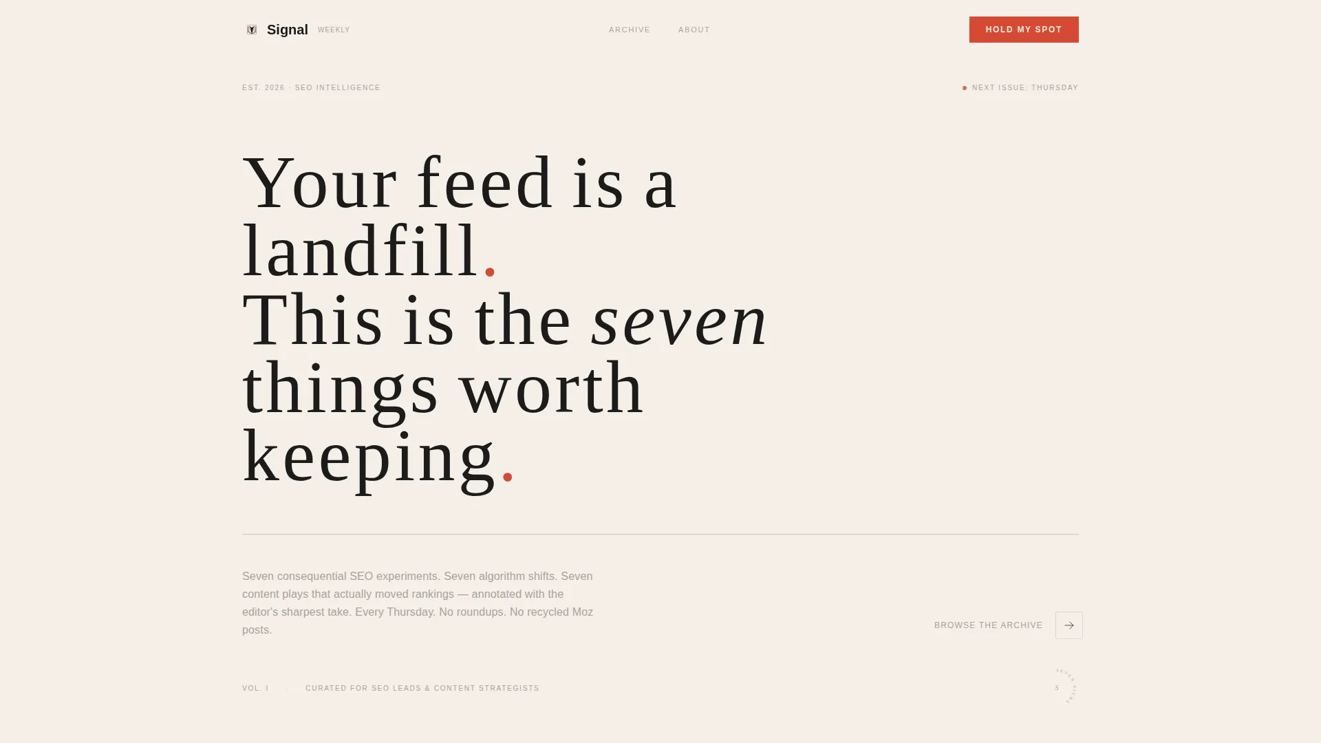
- A full-viewport manifesto hero section in oversized serif type on a washi cream background
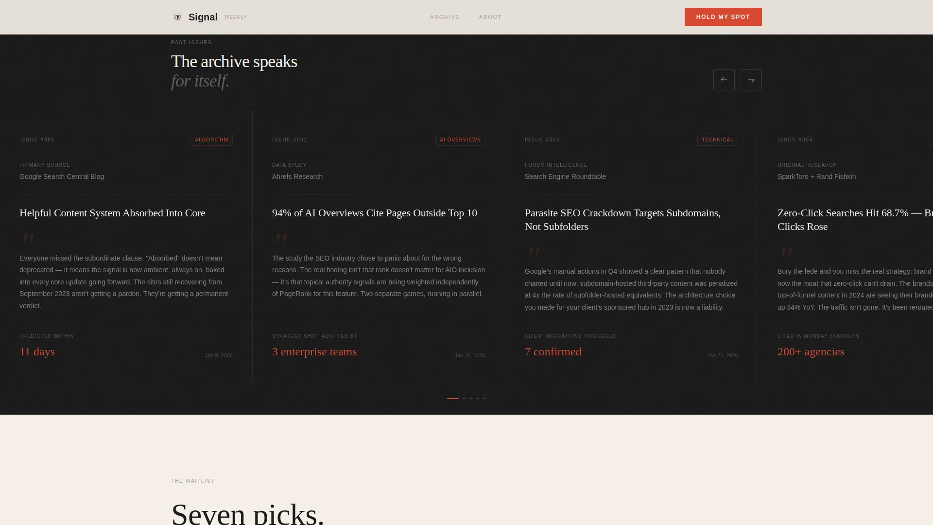
- Five horizontal scroll case study panels that build editorial credibility before the call to action
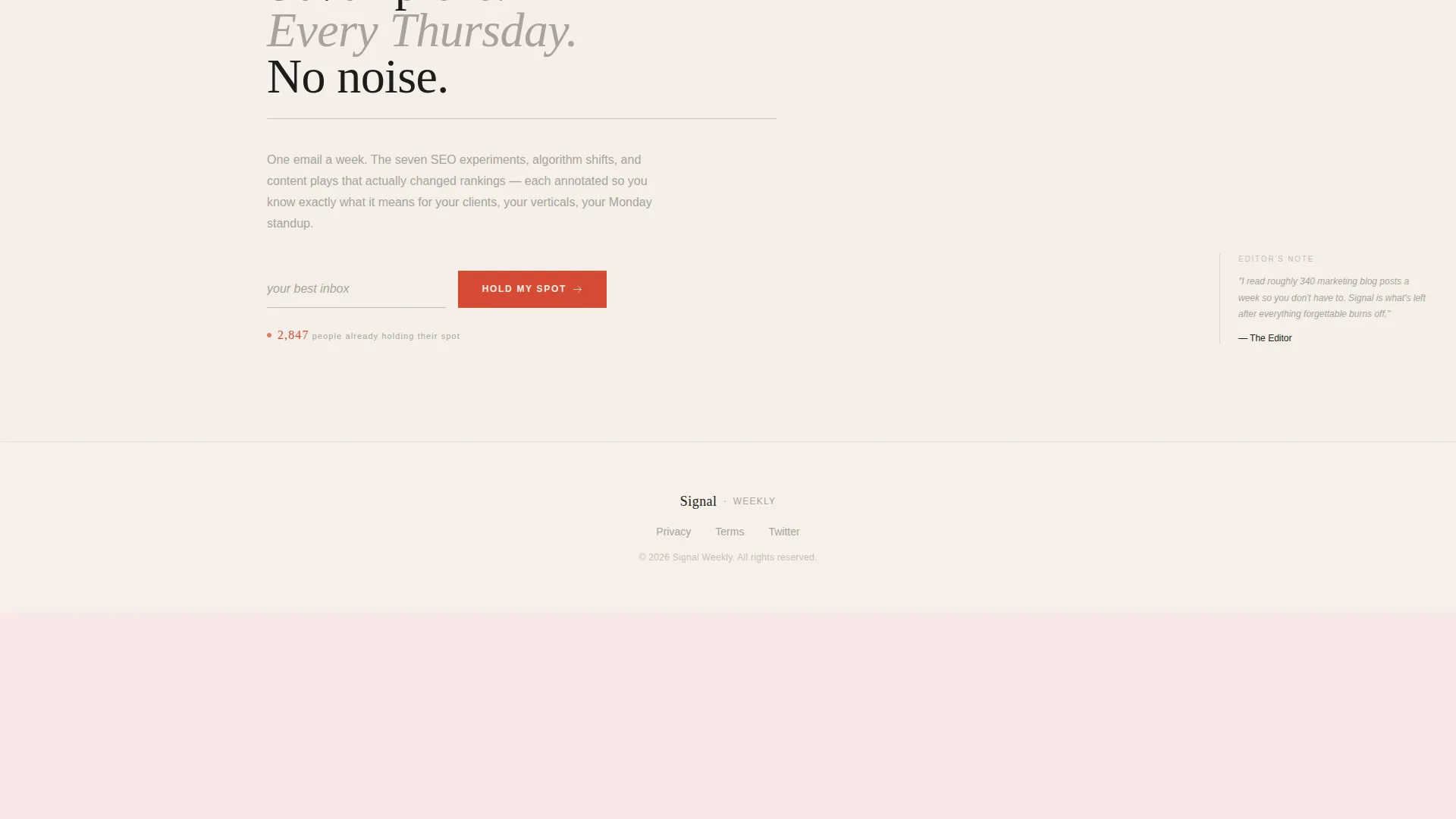
- A waitlist capture section with a single email field, a torii vermillion submit button, and a live waitlist position counter
Feature list
This template is built around deliberate, minimal components that each do specific work. Nothing is decorative without purpose.
Full-Viewport Manifesto Header
The hero section fills the entire screen with a single oversized serif statement set against a warm washi cream background. Wide letter spacing, an ink-black rule beneath the headline, and a subtle horizontal scroll indicator at the right edge create immediate editorial authority without any imagery or illustration.
Horizontal Scroll Folio Panels
Five panels reveal past issue case studies one at a time, each showing a source link, the editor's annotated take, and an outcome metric. The fifth panel is an intentionally empty frame labeled "Next issue drops Thursday," which creates pull through absence rather than a countdown timer.
Single-Field Waitlist Form
The conversion section uses one email input field with ghost text reading "your best inbox" and a torii vermillion "Hold My Spot" button. There is no name field, no company field, and no additional friction. The form is anchored to a live counter showing the visitor's waitlist position.
Live Waitlist Position Counter
A real-time counter beneath the email field shows the current waitlist number. This acts as passive social proof and adds a sense of momentum without manufactured scarcity tactics.
Japanese Zen Color System
The palette is built on four values: sumi ink black, washi paper cream, dry stone gray, and torii vermillion. Vermillion appears only on interactive elements and the subscribe button, giving every call to action a clear visual priority in an otherwise restrained layout.
Editorial Typography Pairing
The template uses Fraunces as the serif display face for headlines and manifesto text, paired with DM Sans for body copy and interface elements. The pairing balances literary weight with clean readability across all panel sizes.
Page sections overview
| Section | Purpose |
|---|---|
| Manifesto Hero Panel | Opens with conviction; sets editorial tone immediately |
| Horizontal Scroll Panels | Proves editorial taste through four annotated case studies |
| Empty Fifth Frame | Creates urgency through deliberate absence, not a timer |
| Waitlist Capture Section | Collects email with a single field and live counter |
| Minimal Footer | Closes the page without clutter or distraction |
Design & branding system
The visual identity follows a Luxe Minimal approach rooted in a Japanese Zen color system. Restraint is the design principle. Generous negative space replaces graphic decoration at every turn.
- Four-color palette: sumi ink black (#1A1A1A), washi paper cream (#F5F0E8), dry stone gray (#A8A29E), and torii vermillion (#D64933) reserved exclusively for interactive elements
- Backgrounds alternate between deep ink and warm cream panels, with text always in the opposing tone for contrast
- Fraunces serif display type for headlines, DM Sans for body and interface copy, with wide letter spacing in the hero
Mobile & speed optimization
The template is designed desktop-first to preserve the horizontal folio aesthetic. On smaller screens, the horizontal scroll panels gracefully reflow to a vertical scroll layout so the content remains fully readable and accessible on any device.
- Desktop layout prioritizes the horizontal scroll folio experience with momentum-based panel transitions
- Mobile fallback converts the horizontal panel sequence to a vertical scroll stack without losing the editorial hierarchy
- The build is static-first with minimal JavaScript, keeping the page light and fast to load
How this template helps you convert
Signal is engineered around a single conversion goal: capturing the email address of a discerning, time-poor professional. Every design and copy decision exists to earn that click.
- The manifesto header establishes a strong editorial voice before any ask is made, so the visitor arrives at the form already leaning in
- The four annotated case study panels build proof of taste and prescience laterally, replacing testimonials with demonstrated judgment
- The empty fifth frame and "Next issue drops Thursday" label manufacture urgency through absence, turning the missing content into the most persuasive element on the page
Other information about this template
Signal sits at the intersection of editorial design and high-intent conversion architecture. It is a coming soon and waitlist page format built specifically for the SEO and content strategy newsletter niche.
- The template category is Blog & Editorial, with a subcategory focus on SEO and content newsletters
- The creative direction is Curated Collection, meaning the layout is structured to present past picks as credibility artifacts rather than generic feature bullets
- The header concept is Quote and Manifesto, a deliberate choice that positions the newsletter as a point of view, not just a product
- The landing page direction is Waitlist and Coming Soon, optimized for a single email capture before a newsletter goes live
- The template style is Horizontal Scroll, which is uncommon in the newsletter space and immediately signals that this publication operates at a different level of craft
- Low-motion animations include a subtle scroll indicator pulse at the right edge of the hero and a stagger effect on panel reveal during horizontal navigation

Theme
Luxe Minimal
Creative direction
Curated Collection
Color system
Japanese Zen
Style
Horizontal Scroll
Direction
Waitlist/Coming Soon
Page Sections
Full-viewport Manifesto Hero
Horizontal Scroll Folio Layout
Frictionless Waitlist Form
Live Waitlist Position Counter
Japanese Zen Color System
Editorial Typography Pairing
Related questions
Can I customize the case study panel content with my own past issues?
Is the horizontal scroll layout usable on phones and tablets?
Can I change the submit button color or other interactive element colors?
Does the empty fifth panel stay empty permanently?
How does the live waitlist counter work?



