Editorial Telecommunications Landing Page Template
Signal is an editorial telecommunications landing page template built for telecom review blogs. It follows a single-column gallery walk flow, guiding readers through carrier comparison guides, speed data visualizations, and reader-submitted stories. The Parchment and Rust visual identity gives dense broadband and phone plan content an analog warmth that feels handcrafted, not clinical.
by Rocket studio
Quick summary
Signal is a single-column editorial landing page template for telecommunications review blogs. It organizes complex carrier and broadband content into three curated gallery rooms, each building trust before a newsletter call to action. The Atelier Studio design system pairs aged vellum tones with rust and brass accents, making technical telecom content feel like a well-kept field journal.
Who this template is for
This template is built for independent telecom journalists, broadband researchers, and editorial bloggers who need a home for serious carrier analysis. It suits anyone whose audience arrives with specific, urgent questions about phone plans or home internet.
- Telecom review bloggers and independent broadband journalists
- Newsletter operators building a subscriber base around carrier and internet plan analysis
- Editorial content creators who cover rural connectivity, 5G fixed wireless, and family phone plan comparisons
What problem this template solves
Most telecom review pages look like carrier spec sheets. They overwhelm readers with tables and drop them before any trust is established. Signal solves this by pacing content like a curated editorial experience rather than a data dump.
- Readers arrive mid-research and need to trust the source quickly before they will subscribe or download anything
- Dense comparison content lacks visual hierarchy, causing abandonment before the call to action
- Generic blog layouts do not reflect the editorial craft that sets independent telecom reviewers apart
What you get with this template
You get a fully structured single-column landing page that moves readers through editorial content in a deliberate sequence. Every section is designed to deepen credibility before asking for an email address.
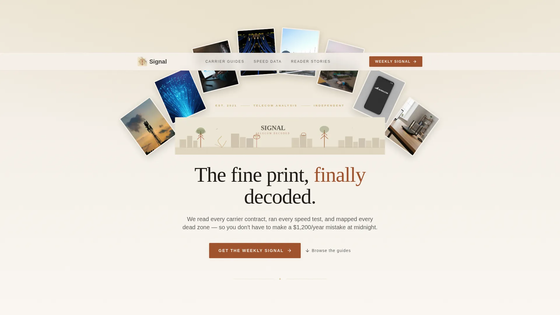
- A panoramic hand-drawn hero illustration of a stylized cityscape with cell towers, fiber optic roots, and satellite dish blooms
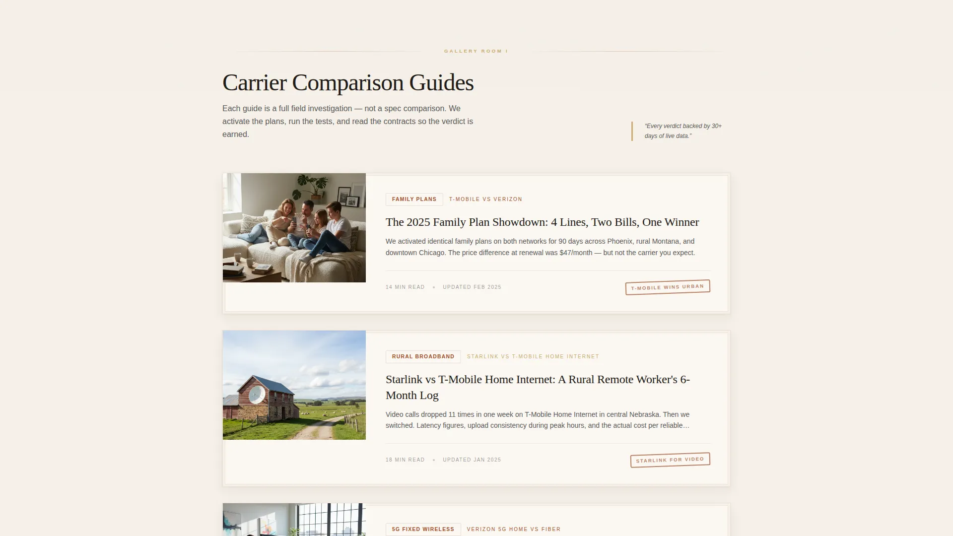
- Three gallery rooms covering carrier guides, speed test data, and reader-submitted coverage stories
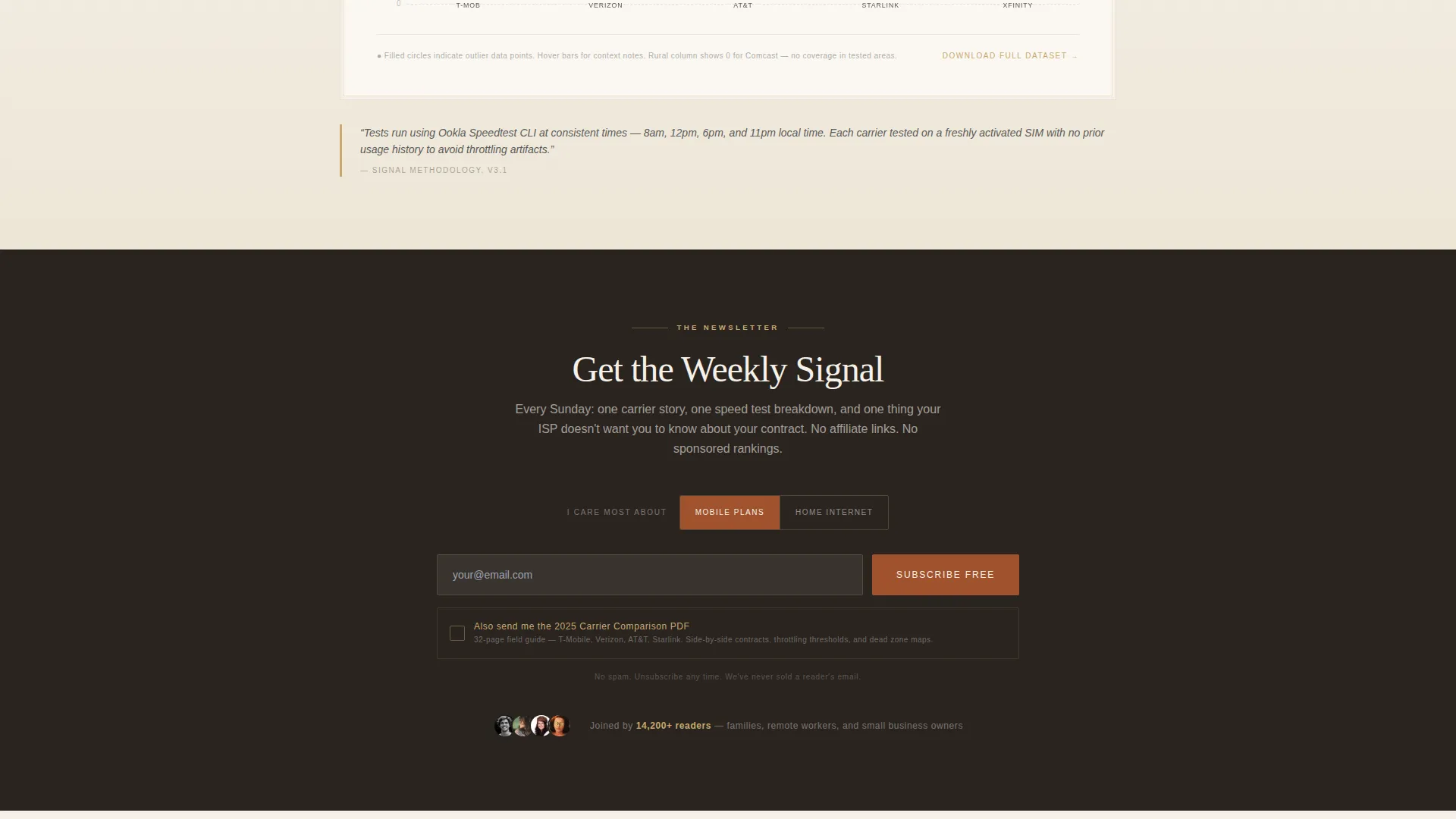
- A dual-path newsletter call to action with an email field, a Home Internet and Mobile Plans toggle, and a carrier comparison PDF download offer
Feature list
This template is organized around deliberate editorial pacing and a distinctive visual identity. Each feature below comes directly from the template's design and structural brief.
Panoramic Custom Hero Illustration
The hero section features a wide, hand-drawn cityscape SVG where cell towers appear as trees, fiber optic cables emerge like roots, and satellite dishes bloom on rooftops. The line work is ink-style, washed in rust and brass on parchment, with the blog title letterpressed into the sky. It reads as editorial art rather than tech media.
Gallery Walk Content Architecture
The page is divided into three sequential gallery rooms. Each room displays a different content type as framed work on a gallery wall, moving from carrier comparison guides to speed data visualizations to reader-submitted coverage stories. The pacing is unhurried, with generous white space between each room.
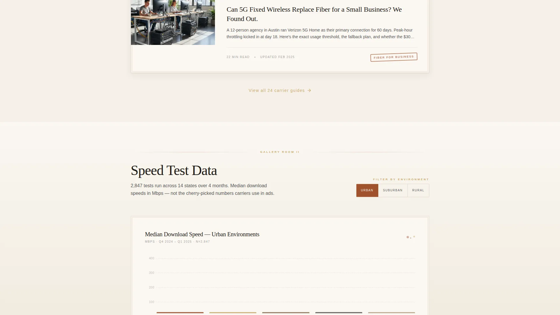
Hand-Drawn Speed Data Visualization
Room Two presents speed test data as hand-drawn bar charts with ink-splatter markers highlighting outliers. This gives raw performance data a crafted, editorial quality that reinforces the blog's voice rather than clashing with its visual identity.
Segmented Newsletter Call to Action
Placed after the second gallery room, the newsletter section asks only for an email address and a single toggle between Home Internet and Mobile Plans. This segmentation lets readers self-select their interest before subscribing, improving list relevance from the first sign-up.
Carrier Comparison PDF Download
A secondary conversion path offers a downloadable 2025 Carrier Comparison PDF gated behind the same email field as the newsletter. Readers receive a tangible, portable reference document, giving them a concrete reason to share their email address.
GSAP ScrollTrigger Animation System
The template includes high-fidelity scroll animations built with GSAP ScrollTrigger. These cover arch image staggers, scroll reveals for gallery room cards, and hover states for framed editorial content, creating a reading experience that feels active rather than static.
Page sections overview
| Section | Purpose |
|---|---|
| Hero Illustration | Establishes editorial identity with panoramic hand-drawn cityscape art and blog title |
| Room One: Carrier Guides | Displays framed carrier comparison editorial cards side by side with illustrated logos |
| Room Two: Speed Data | Presents hand-drawn bar chart speed test visualizations with ink-splatter outlier markers |
| Newsletter Call to Action | Captures email with a Home Internet and Mobile Plans toggle and a PDF download offer |
| Room Three: Reader Stories | Shows postcard-sized vignettes of reader-submitted coverage stories in a grid layout |
| Footer | Single-row linear footer pattern closing the page |
Design & branding system
The visual identity follows an Atelier Studio theme built around a Parchment and Rust color system. The palette is designed to feel like a leather-bound field journal left open beside a warm desk lamp, bringing analog warmth to digital infrastructure content.
- Colors: aged vellum (#F5F0E8) for backgrounds, terracotta rust (#A0522D) for primary accents, charcoal graphite (#3B3B3B) for body text, and muted brass (#C9A96E) reserved for links, pull-quote borders, and hover states
- Typography: DM Serif Display for editorial headings and Manrope for body text, pairing serif gravitas with clean readable body copy
- Illustration and texture: loose ink-style line work, rust and brass color washes, and a hand-crafted editorial art direction throughout
Mobile & speed optimization
The template is built desktop-first, reflecting the audience of midnight researchers working on laptops during extended carrier comparison sessions. It is also designed to remain fully functional and readable on mobile viewports.
- Desktop-first layout with mobile-responsive breakpoints across all gallery rooms and the newsletter section
- Server Components handle static editorial content while Client Components manage animations and interactive states, keeping the page load lean
- Scroll animations and framed card interactions are scoped to avoid layout blocking on smaller screens
How this template helps you convert
Signal earns its conversions by building editorial trust before making any ask. The structure is intentional: readers move through substantive content before encountering the newsletter call to action.
- The three-room gallery sequence moves readers from analysis to data to community, each step deepening credibility so the email request feels earned rather than premature.
- The dual-path call to action offers both a newsletter subscription and a PDF download behind the same email field, giving readers two concrete reasons to convert without adding friction.
Other information about this template
This template is a strong fit for telecom-focused editorial projects that need to stand out from generic review aggregators. A few additional details are worth noting for builders evaluating the template.
- The template is localized for English-language, US-centric content with carrier naming and USD pricing contexts in mind
- The newsletter toggle between Home Internet and Mobile Plans is a built-in segmentation feature, not a third-party integration
- Animation is powered by GSAP ScrollTrigger for arch image staggers, framed card scroll reveals, and interactive hover states
- The footer follows a Pattern 1 Linear Single-Row layout, keeping the page close cleanly without competing with earlier content sections
- This template suits editorial projects covering topics like broadband bundle comparisons, rural internet throttling frustrations, and 5G fixed wireless versus fiber evaluations
Theme
Atelier Studio
Creative direction
Gallery Walk
Color system
Parchment & Rust
Style
Single Column Flow
Direction
Content/Resource
Page Sections
Panoramic Hand-drawn Hero Illustration
Three-room Gallery Walk Layout
Hand-drawn Speed Data Visualization
Segmented Newsletter Call to Action
Carrier Comparison PDF Download
GSAP Scrolltrigger Animations
Related questions
Who is this landing page template designed for?
What conversion paths does this template include?
Can I use this template for a telecommunications review blog focused on rural internet?
What animation and interactivity does this template include?
Is the hand-drawn illustration included with the template?



