Data Science Newsletter Booking Website Template
Signal is an editorial data science interview newsletter landing page template built around a masonry layout, a book-spread hero, and a numbered manifesto. It captures waitlist signups with a single email field, a scarcity indicator, and a fixed scroll-triggered bar. The design uses Japanese Zen tones, sharp serif type, and vermillion accents to deliver the feel of a literary journal dedicated to real hiring stories.
by Rocket studio
Quick summary
Signal is a single-page waitlist landing page built for a data science interview newsletter. It opens with a hardcover book-spread header, unfolds into a numbered manifesto, and organizes content into a staggered masonry grid. The sign up form appears as a fixed bottom bar on scroll and again as a full-width section after the manifesto, keeping the primary action visible without overwhelming the reader.
Who this template is for
This template is designed for newsletter creators who want their landing page to do editorial heavy lifting before asking for an email address. It works especially well for founders, independent writers, and career-content creators building a data science newsletter from scratch.
- Mid-career analysts and bootcamp graduates who want a newsletter landing page that speaks their language
- Writers launching a niche career intelligence newsletter and need a high converting landing page without writing code
- Data science educators who want to convert visitors into newsletter subscribers before Issue 001 ships
What problem this template solves
Most newsletter landing page examples in the career and tech space look identical: a bold headline, a two-sentence brief description, and a signup form floating in empty space. That generic pattern fails audiences who are skeptical and technically literate. Potential subscribers in the data science space expect content quality before they commit to anything.
- Casual visitors land on generic newsletter pages and leave before reading a single line of useful copy
- Creators struggle to communicate a clear value proposition when their content is nuanced and evidence-based
- A flat, template-heavy newsletter page destroys the editorial credibility the writer spent years building
What you get with this template
This template gives you a complete, ready-to-customize newsletter landing page structured around content density and conversion. Every section is built to earn the signup rather than demand it. The layout rewards scroll depth with increasingly specific and compelling content before the subscription form ever appears.
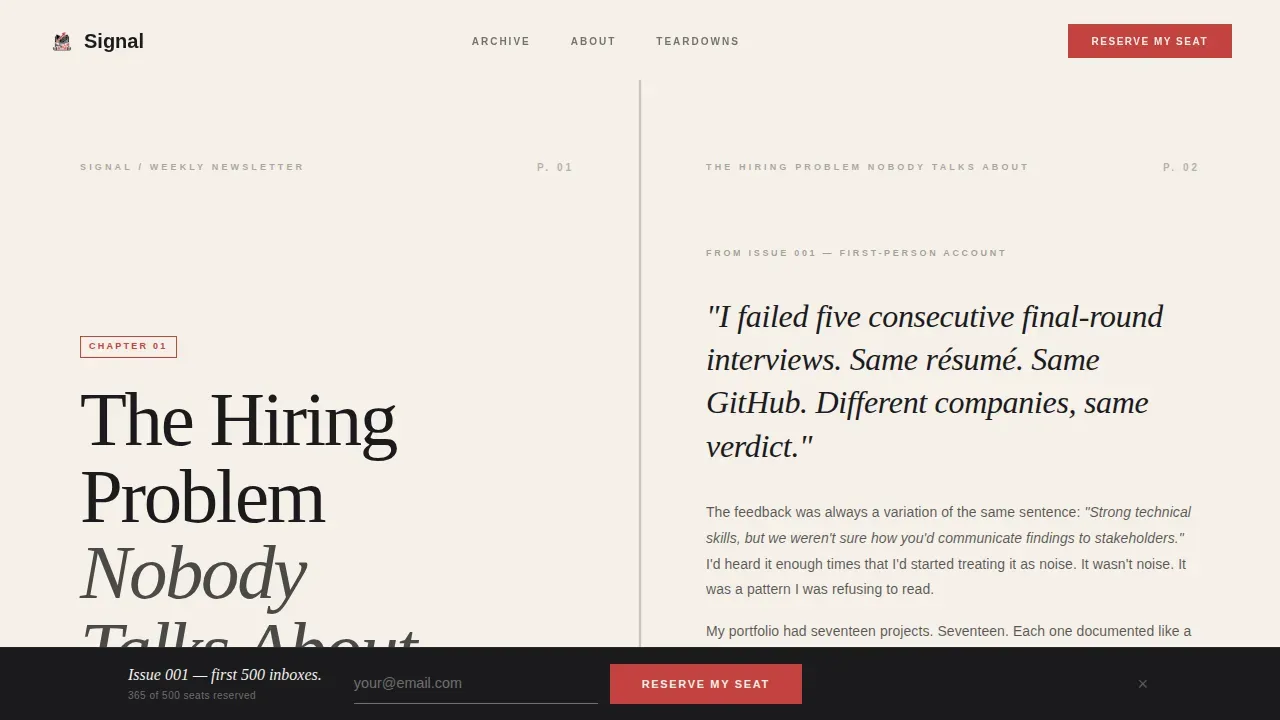
- A book-spread hero section with spine shadow effect, editorial chapter heading, and typographically rich first-person excerpt
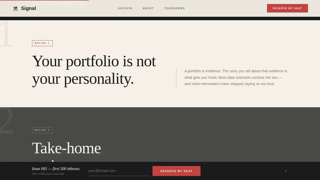
- A manifesto section with numbered belief declarations, each anchoring a staggered masonry grid of profile cards, interview teardowns, and essay excerpts
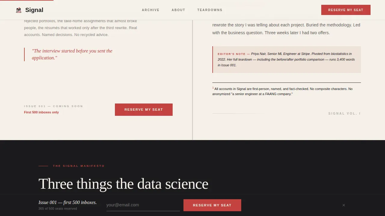
- A waitlist call to action section featuring a single email sign up form, a scarcity indicator reading "Issue 001 drops to the first 500 inboxes," and a fixed scroll-triggered bottom bar
Feature list
This newsletter landing page is built from purpose-designed components, each chosen to maximize subscriber engagement and editorial impact.
Book-Spread Chapter Hero
The hero formats the viewport like the interior of a hardcover book, with a visible spine shadow running down the center. The left page carries a sharp serif chapter heading at editorial scale. The right page holds a dense, typographically rich first-person excerpt from an actual newsletter issue. Typography is the visual. No images are needed. The effect establishes immediate intellectual credibility for your newsletter page.
Numbered Manifesto with Masonry Grid
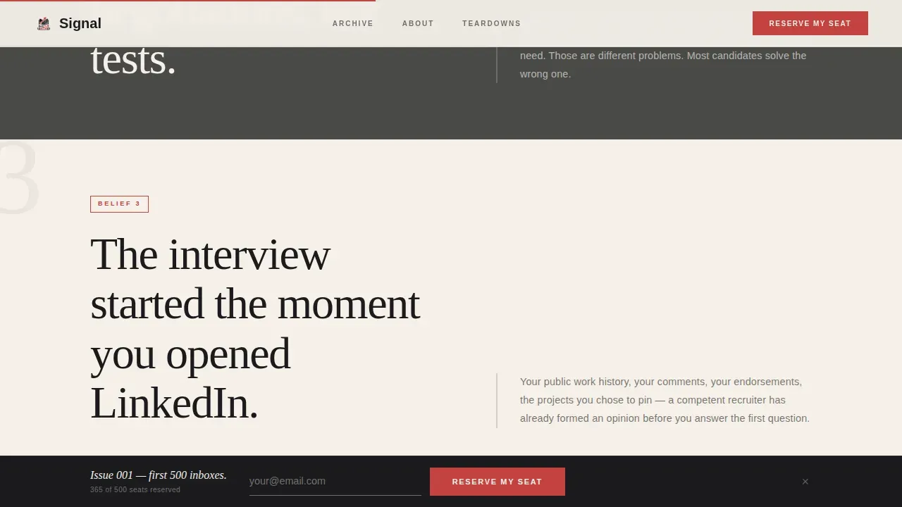
Scrolling past the hero reveals a bold, numbered list of belief declarations. Each belief anchors a masonry section below it containing profile cards, interview teardowns, and essay excerpts arranged at staggered heights. This structure builds conviction gradually. Each section grows more specific and more contrarian, so by the final belief, the reader feels the gap between Signal and every other piece of generic career advice they have ever consumed.
Scroll-Triggered Waitlist Bar
After two scroll depths, a fixed bottom bar appears with a single email field and the "Reserve My Seat" button. This keeps the primary action visible without interrupting the reading experience. The bar reappears as a full-width section after the manifesto ends, delivering a strong call to action at the precise moment conviction peaks.
Zero-Friction Subscription Form
The sign up form asks for one thing: an email address. No name field, no segmentation dropdowns, no multi-step sign up process. Every extra field in a signup form reduces conversions, so this template strips the subscription form to its essential elements. The scarcity line below the button sets clear expectations and creates a natural sense of urgency.
Japanese Zen Editorial Typography System
DM Serif Display handles all headings and pull quotes. Manrope handles body copy. Bold typography at editorial scale carries the core message without relying on imagery. Vermillion accents appear only on interactive elements and pull quotes, making each instance feel like a deliberate editorial decision rather than decoration.
Staggered Masonry Content Grid
The masonry layout arranges profile cards and essay excerpts at varied heights, mimicking pinned magazine clippings. GSAP ScrollTrigger powers staggered entry animations so content reveals feel earned rather than automatic. Hover states on cards add depth and encourage visitors to engage more deeply before reaching the signup forms.
Page sections overview
| Section | Purpose |
|---|---|
| Book-Spread Hero | Establishes editorial credibility with a chapter heading and a first-person newsletter excerpt |
| Belief One Masonry | Opens the manifesto and anchors the first portfolio-focused grid of profile cards and teardowns |
| Belief Two Masonry | Presents take-home assignment content with staggered cards and interview teardown excerpts |
| Belief Three Masonry | Closes the manifesto with LinkedIn presence evidence and final contrarian argument |
| Full-Width Waitlist | Delivers the primary email signup with scarcity indicator after conviction has built |
| Fixed Scroll Bar | Keeps the sign up form accessible after two scroll depths without disrupting reading |
| Minimal Footer | Provides contact details and closes the page cleanly with a horizontal minimal layout |
Design & branding system
The visual identity follows a Japanese Zen color system that feels like a freshly printed literary journal. Backgrounds alternate between washi paper warm white (#F5F0E8) and stone garden gray (#4A4A48). Body text lives in sumi ink black (#1A1A1D) with generous leading and ample white space. Torii vermillion (#C3423F) appears only on interactive elements and pull quotes, preserving visual balance and ensuring each instance carries real weight. The result is a visually appealing, visually consistent page that feels deliberately unhurried.
- DM Serif Display for editorial headings and pull quotes; Manrope for all body text
- Alternating washi white and stone gray section backgrounds create rhythm without imagery
- Vermillion reserved exclusively for interactive moments, maintaining visual consistency and preventing cognitive load from competing elements
Mobile & speed optimization
The template is designed desktop-first to honor the editorial reading experience, with mobile responsiveness built in for readers accessing the newsletter landing page on mobile devices. The masonry grid adapts to narrower viewports. The fixed bottom bar remains functional across screen sizes, so the sign up form stays reachable whether the reader is at a desk or on a phone.
- Mobile responsiveness ensures the book-spread hero and masonry grid reflow cleanly on smaller screens
- Minimal Client Components handle scroll behavior, keeping the page lean and reducing unnecessary JavaScript load
- Server Components power all static content sections, supporting fast initial render for website visitors arriving from paid ads or organic search engines
How this template helps you convert
The Signal newsletter landing page is built on a content-first conversion philosophy. It gives away real, dense, useful material before the subscription form appears, which is exactly what a skeptical, technically minded audience requires. Newsletter landing pages that follow this model consistently outperform generic forms. In fact, newsletter landing pages have the highest conversion rate of all signup forms, averaging 23%.
- The manifesto and masonry content deliver a sneak peek of the newsletter's voice, argument, and evidence depth, so potential subscribers already understand the value proposition before they see the email field
- Social proof appears through first-person accounts and named stories from real data scientists, showing that others have faced these exact hiring problems and found value in this kind of content
- The simple signup form with its single email field and scarcity indicator creates immediate action at the moment of peak conviction, capturing newsletter sign ups with the least possible friction
Other information about this template
This template is a single-page newsletter landing page, not a site with multiple pages. It does not require writing code to customize. The layout can be edited through a drag and drop editor, making it accessible to newsletter founders who are not developers. A drag and drop builder removes the technical barrier entirely, so the creator can focus on copy and growth strategies rather than markup.
- The drag and drop editor supports full color, font, and copy customization so you can align the page to your own landing page brand voice
- You can connect a custom domain to publish the page under your own professional address, which helps with credibility when sharing the link in a blog post, on social, or through paid ads
- The free account tier available on most website builder platforms lets you explore the template and set up a new landing page before committing to a paid plan
- Email marketing platforms and tools for creating and managing newsletter landing pages can be connected through standard embed or form integration supported by the template structure
- Strong call-to-action copy and action-oriented button labels like "Reserve My Seat" are pre-written and ready to adapt for your own page
- The template follows best newsletter landing pages practices: a clear headline, benefit-focused copy, social proof placement, clear value propositions, and a simple signup form that reduces friction throughout the sign up process
- Growth strategies like A/B testing button copy or scarcity language are easy to execute by swapping text inside the drag and drop editor without touching the underlying layout
- Performance metrics such as click through rates and conversion rate can be tracked by embedding your preferred analytics snippet into the page head, keeping the template flexible for your email marketing stack
- The page is structured to support keyword research and search engines discovery through clean semantic markup and scannable headings
- Platforms like Mailchimp and beehiiv work well alongside this template for managing newsletter subscribers and existing subscribers once the waitlist converts to an active list
Theme
Editorial Magazine
Creative direction
Manifesto
Color system
Japanese Zen
Style
Masonry/Pinterest
Direction
Waitlist/Coming Soon
Page Sections
Book-spread Chapter Hero
Numbered Manifesto Layout
Scroll-triggered Waitlist Bar
Zero-friction Email Signup
Japanese Zen Typography System
GSAP Masonry Animation
Related questions
Does this template require coding skills to customize?
Can I use this template before my newsletter is live?
How does the masonry grid display on mobile devices?
Does the template include social proof sections?
Can I publish this landing page on a custom domain?



