Startup Fundraising Newsletter Advanced Blog Website Template
Signal is an editorial landing page template built for curated startup fundraising newsletters. It uses a warm artisan aesthetic rooted in a Japanese Zen color palette to create a reading experience that feels intentional and unhurried. The single-page layout guides pre-seed founders and Series A operators from a textured hero section through a day-in-the-life narrative scroll, toward a focused email signup.
by Rocket studio
Quick summary
Signal is a single-page editorial landing page template designed for a curated startup fundraising newsletter. It presents five hand-picked fundraising links delivered every Sunday evening to founders and investors. The layout mirrors the newsletter's own rhythm: slow, considered, and built entirely on typography, texture, and trust.
Who this template is for
This template is built for newsletter creators and curators who serve the startup fundraising community. It works best when the product is a high-signal, low-volume weekly digest aimed at busy, skeptical readers who guard their inboxes carefully.
- Pre-seed founders drafting their first pitch decks and needing tactical fundraising education
- Series A operators preparing for board conversations and partner meetings
- Solo general partners building thesis conviction through pattern recognition and curated reading
What problem this template solves
Most newsletter landing pages either oversell with feature lists or undersell with a plain form and a vague promise. Neither approach earns the trust of a founder who receives dozens of pitches per week. This template solves the credibility gap by letting the product demonstrate its own taste before asking for an email address.
- Founders and investors need proof of curation quality before they subscribe, not after
- Generic lead-capture pages fail editorial newsletters because they ignore reader skepticism
- A cold signup form without context converts poorly in a high-trust, niche fundraising audience
What you get with this template
You get a fully structured single-page lead generation layout designed around an editorial reading experience. Every section is purposefully ordered to build familiarity and earn the signup through demonstrated value rather than marketing copy alone.
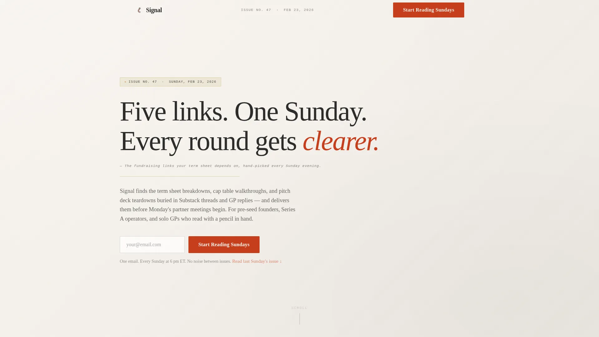
- A linen-texture hero section with a large serif headline and an inline email capture form
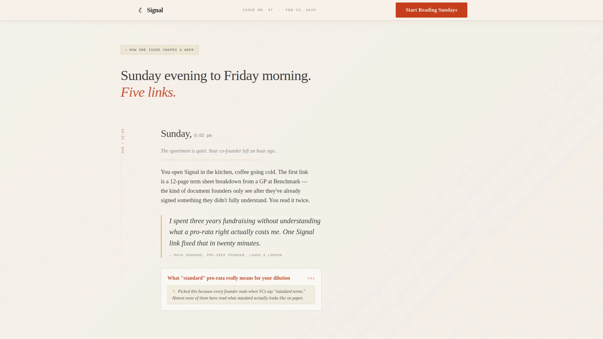
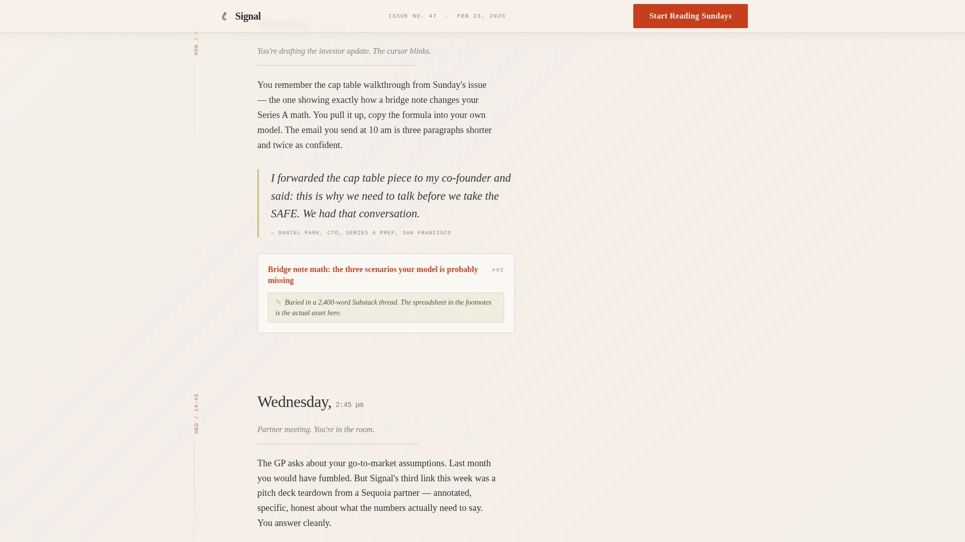
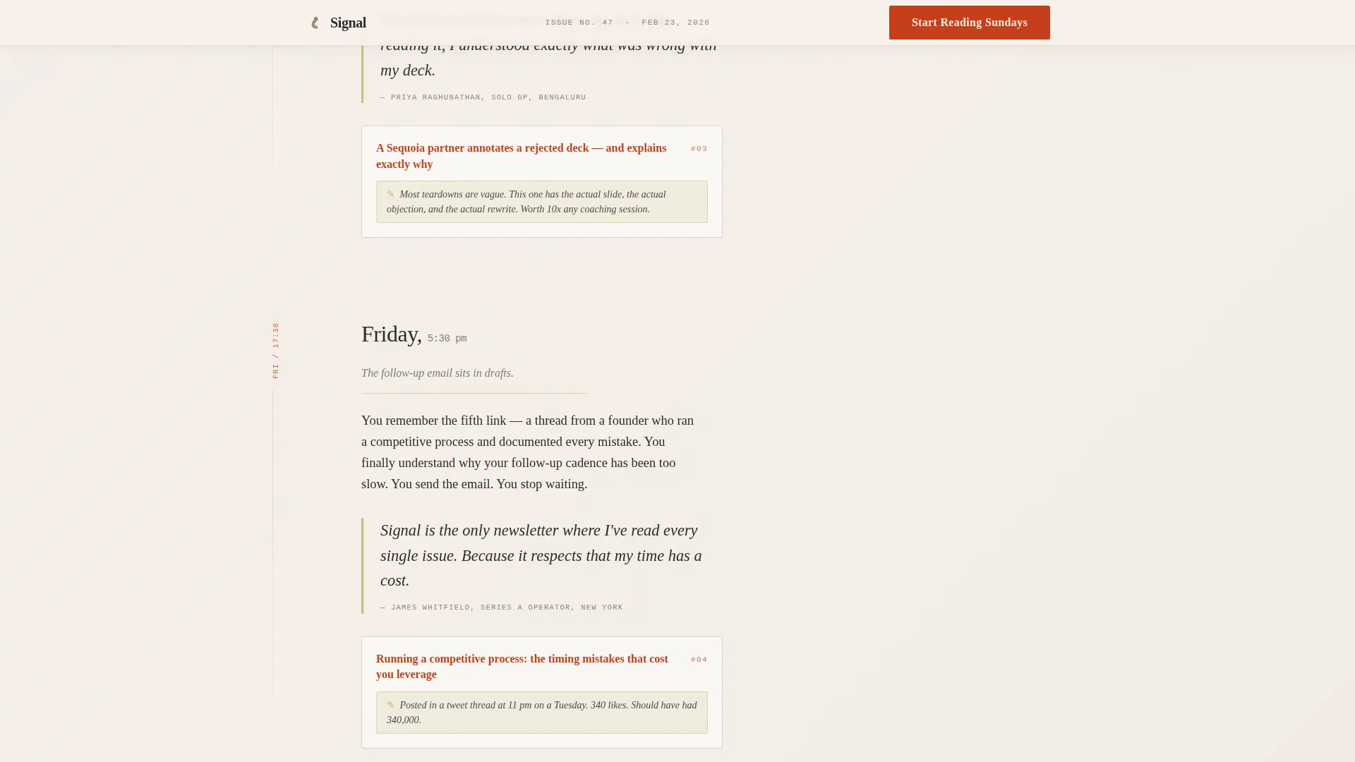
- A day-in-the-life narrative scroll with margin timestamps for Sunday, Monday, Wednesday, and Friday
- Three sample link cards from past issues, each with a handwritten-style annotation explaining the curation choice
- Subscriber pull-quote blocks featuring three distinct reader voices in editorial pull-quote styling
- A second call-to-action section with a trust-earning signup and a "Read Last Sunday's Issue" text link escape hatch
- A minimal footer following a horizontal flow pattern
Feature list
This template is built around six purposeful components that work together to convert curious visitors into newsletter subscribers.
Textured Hero with Inline Email Capture
The hero fills the full viewport with a linen grain paper surface and soft directional light. A large Fraunces serif headline anchors the reading surface, with the primary call-to-action email field sitting directly beneath it. Vermillion is used sparingly on the key accent word in the headline, making it feel like a deliberate underline rather than decoration.
Day-in-the-Life Temporal Narrative Scroll
The page unfolds as a founder's actual week. Margin timestamps mark Sunday evening, Monday, Wednesday, and Friday. Each moment shows how one curated link changed a specific decision. The rhythm is intimate and sequential, slowing the reader down the way the newsletter itself does.
Sample Link Cards with Handwritten Annotations
Three real link cards from past issues appear mid-scroll. Each card carries a one-sentence handwritten-style annotation explaining why that link was chosen. Hover states are styled with vermillion to signal interactivity without breaking the editorial calm. These cards are the template's central proof of taste.
Editorial Pull-Quote Blocks
Three subscriber pull-quotes are presented in a distinct editorial style with tatami gold borders separating them from surrounding body text. Each quote represents a different reader archetype, giving prospective subscribers a way to recognize themselves in the audience.
Trust-Earned Second Call to Action
A second email capture reappears after the third day-in-the-life section, placed at the moment when reader trust is highest. The secondary path, a plain text link reading "Read Last Sunday's Issue," lets skeptics sample the product before committing to a subscription.
Scroll-Linked Animation and Interaction
The template uses scroll-linked word reveals, staggered fade-ins, and intersection-observer-based animations to pace the reading experience. Link card expansions mimic a frequently-asked-questions style interaction, and hover states are consistent throughout.
Page sections overview
| Section | Purpose |
|---|---|
| Hero with Form | Establish editorial identity and capture email above the fold |
| Day-in-the-Life | Show real founder week with timestamped link impact moments |
| Sample Link Cards | Prove curation quality with annotated past issue examples |
| Subscriber Pull-Quotes | Build social proof through three distinct reader voices |
| Second Call to Action | Re-capture intent with trust-earned form and sample escape hatch |
| Minimal Footer | Close the page with horizontal flow pattern and clean navigation |
Design & branding system
The visual identity follows a Warm Artisan editorial direction built on a Japanese Zen color system. The palette feels like a handbound notebook left open on a cedar desk: unhurried, considered, and warm without being loud.
- Washi paper cream (#F5F0E8) dominates the reading surface; sumi ink charcoal (#2C2C2C) handles all body type at generous sizing
- Torii gate vermillion (#C73E1D) appears only on links, hover states, and the single accented headline word, making every instance feel intentional
- Tatami soft gold (#C9B97A) marks dividers and pull-quote borders; typography uses Fraunces for display, Crimson Text for body, and JetBrains Mono for datelines and margin timestamps
Mobile & speed optimization
The template is designed desktop-first to match the primary reading context: a founder at a desk on Sunday evening. It is fully responsive and scales cleanly to smaller screens without losing the editorial atmosphere.
- Scroll-linked animations use IntersectionObserver fades and GSAP stagger effects sized to avoid heavy JavaScript loading
- Static server components handle the majority of content delivery, keeping interactive JavaScript limited to the form, hover states, and animation triggers
How this template helps you convert
The page earns its signup by building trust incrementally rather than asking upfront. Every design and copy decision is oriented around one outcome: getting the right reader to enter their email address.
- The hero captures intent early with an inline form, then the day-in-the-life narrative holds attention long enough to build genuine belief in the curation
- The sample link cards provide concrete proof mid-scroll, removing doubt about whether the newsletter delivers what the headline promises
- The second call-to-action form appears at peak trust, with the "Read Last Sunday's Issue" link as a low-commitment path for hesitant readers who need one more signal before subscribing
Other information about this template
This template is categorized under Blog and Editorial with a focus on the startup fundraising curated links newsletter niche. It is intended for newsletter operators who want a standalone lead generation landing page that reflects the editorial quality of their product.
- Template style is Editorial and Magazine, suited for curated content products, founder-market newsletters, and subscription-based digest publications
- The creative direction follows a Day-in-the-Life structure, a narrative format that works particularly well when the product's value is experiential rather than feature-driven
- The header concept is Type Over Image, relying entirely on typography and texture rather than photography or illustration
- The landing page direction is Lead Generation, with a single conversion goal: email signup
- The color system is Japanese Zen, which distinguishes this template visually from typical startup landing pages that default to dark mode or high-contrast tech aesthetics
- This template does not include pre-built integrations, analytics connections, or backend automation; the email form is a user interface component ready for connection to your preferred email service provider
Theme
Warm Artisan
Creative direction
Day-in-the-Life
Color system
Japanese Zen
Style
Editorial/Magazine
Direction
Lead Generation
Page Sections
Textured Hero with Inline Email Capture
Day-in-the-life Narrative Scroll
Annotated Sample Link Cards
Editorial Pull-quote Blocks
Trust-earned Second Call to Action
Scroll-linked Animation System
Related questions
What kind of newsletter is this template designed for?
Does this template include a working email signup form?
How many call-to-action sections does this landing page include?
Can this template be adapted for a newsletter on a different topic?
What typography and color choices come with this template?



