SEO & Content Newsletter Pre-Launch Website Template
Signal is a minimalist SEO newsletter landing page template built for a single purpose: turning first-time visitors into waitlist sign-ups. It pairs a bold editorial aesthetic with a distraction-free layout, a one-field sign-up form, a live waitlist counter, and a fixed call to action bar that activates after 60 percent scroll. One page, one goal, zero noise.
by Rocket studio
Quick summary
Signal is a single-column, single-goal landing page template designed for a weekly SEO newsletter called Signal. The template captures email sign-ups through restrained editorial design, a prominent call to action in torii vermillion, and a live waitlist counter that creates a genuine sense of urgency. Every element earns its place. Nothing distracts from the one ask: your email address.
Who this template is for
This landing page speaks directly to newsletter creators and content publishers who want a high-converting, editorially confident presence without the bloat of a full website. The template suits operators who understand that restraint is a conversion strategy, not a compromise.
- In-house SEO leads, freelance content strategists, and startup founders handling their own organic growth who want to launch a credible newsletter landing page fast.
- Newsletter creators and independent publishers who want a visually appealing, focused layout that earns trust before asking for an email address.
- Anyone running paid ads or content marketing campaigns who needs a compelling landing page with one primary call to action and a clean sign-up process.
What problem this template solves
Most newsletter landing pages fail because they try to do too much. They stack multiple pages worth of content onto a single screen, add navigation menus that pull visitors away, and bury the sign-up form under paragraphs of filler copy. The result is poor conversion rates and a fragmented experience that loses potential subscribers in just a few seconds.
- A cluttered, unfocused layout dilutes visitor's attention and reduces newsletter sign-ups before the value proposition even lands.
- Overloaded subscription forms that ask for too much information create friction that drives potential subscribers away from the sign-up process.
- A weak or delayed call to action means website visitors leave before they ever reach the moment of commitment.
What you get with this template
Signal delivers a complete, ready-to-use newsletter landing page with every section thoughtfully pre-built. There is no writing code required. The structured layout is intentional from the first pixel to the final call to action bar, making it one of the best newsletter landing pages available for editorial-minded creators.
- A single-column page flow with five distinct sections: a hero section, three day-in-the-life narrative sections, and a final call to action with a live waitlist counter and sign-up form.
- A fixed bottom call to action bar that activates after 60 percent scroll depth, keeping the conversion moment always within reach without interrupting the reading experience.
- A Luxe Minimal Japanese Zen design system with a defined four-color palette, two serif and sans-serif typefaces, and alternating dark and cream background image sections that create visual breathing rhythm.
Feature list
Signal is built around a specific set of design and functional decisions. Each one is deliberate. Together they form one of the most effective newsletter landing page examples in the editorial category.
Giant Centered Hero Section
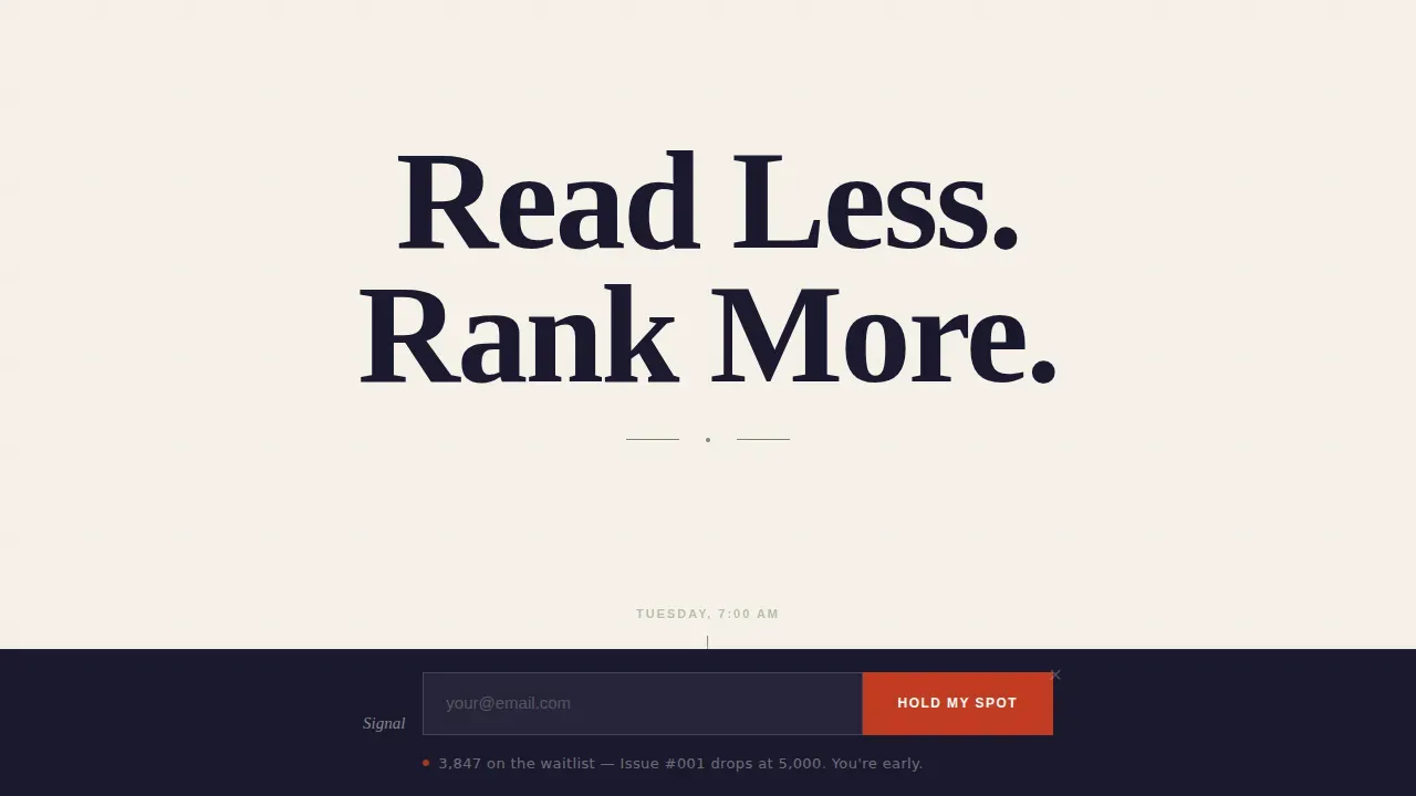
The hero section opens with a bold headline set in an oversized, letter-spaced serif typeface on a field of washi cream. The concise headline reads "Read Less. Rank More." and sits alone in the viewport with a thin moss-stone rule beneath it and a single supporting copy subline. There is no navigation, no background image, and no illustration. The emptiness is the design. This approach captures visitor's attention in just a few seconds and makes the value proposition impossible to miss.
Day-in-the-Life Narrative Scroll
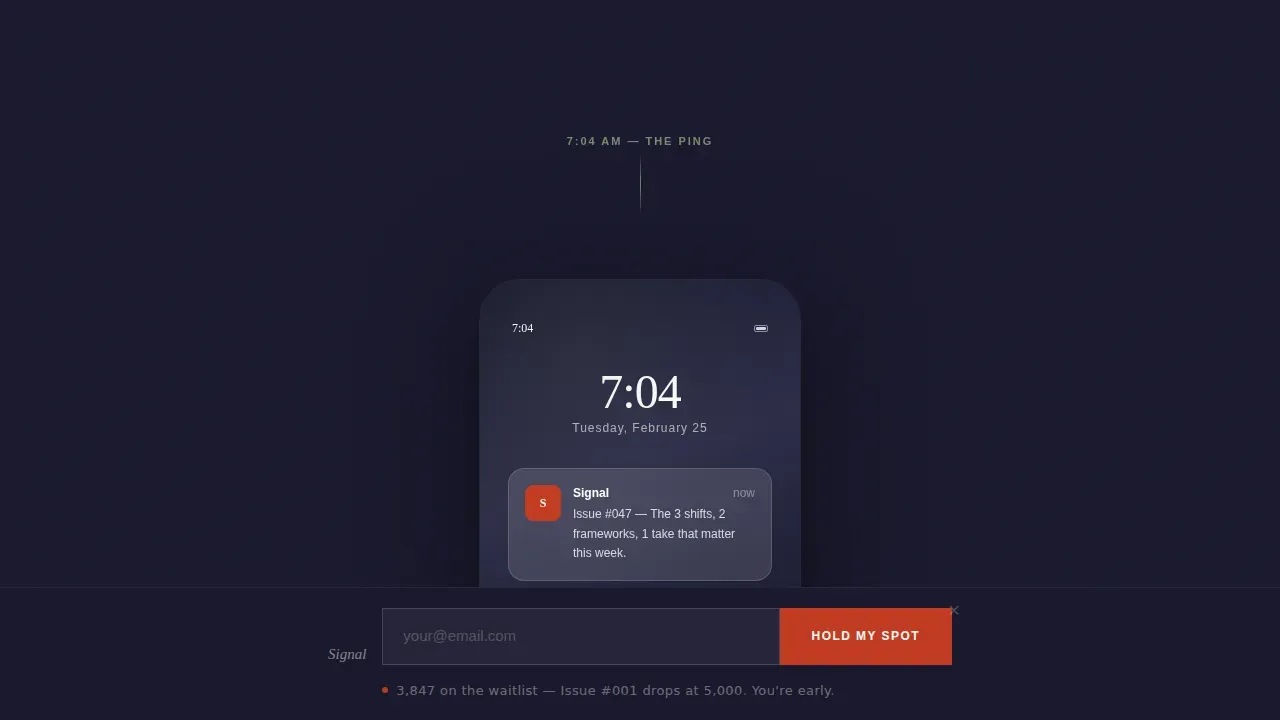
Four scroll sections follow the reader through a single Tuesday, from the 7 AM inbox ping to a 3 PM Slack debate sparked by the contrarian take. Each section deepens trust by showing how one issue of the newsletter intervenes in a real workday. The pacing slows as you scroll, paragraphs get shorter, and white space expands. This narrative structure is a proven creative direction for newsletter landing page examples that need to prove value before asking for a commitment.
Single-Field Email Sign-Up Form
The sign-up form asks for one thing only: an email address. A user-friendly subscription form that minimizes friction dramatically increases the likelihood of visitors completing the sign-up process. The simple signup form appears first beneath the hero subline and again inside the final call to action section. Keeping the form to only essential information is what separates a high-converting landing from one that leaks sign-ups at the last step.
Fixed Bottom Call to Action Bar
After a visitor scrolls past 60 percent of the page, a fixed bottom bar appears with the "Hold My Spot" call to action button in torii vermillion. This interactive element ensures that the call to action is always visible without feeling aggressive. It is one of the key landing page elements that keeps conversion rates strong across both desktop and mobile viewports. There are no multiple forms on the page; the bar and the inline form share one submission target.
Live Waitlist Counter with Social Proof
Below the sign-up form, a live counter displays the current waitlist size alongside the line: "Issue #001 drops when we hit 5,000. You're early." Social proof, such as displaying the number of subscribers, can significantly enhance the credibility of a newsletter landing page. Using social proof effectively creates a sense of urgency and a fear of missing out, motivating visitors to subscribe before the launch milestone is reached. Displaying the number of subscribers provides measurable social proof, signaling that others already find the newsletter valuable.
Luxe Minimal Japanese Zen Color System
The entire page runs on four colors: sumi ink (#1A1A2E), washi cream (#F5F0E8), moss stone (#7A8B6F), and torii vermillion (#C23B22). Vermillion is reserved exclusively for the call to action button and one pull-quote per scroll section. Backgrounds alternate between washi cream and sumi ink to create a breathing rhythm that guides the eye. Body text lives in soft graphite (#4A4A4A) against cream, and flips to cream type on dark sections. The result is a visually appealing, editorially restrained design that feels nothing like a generic sales page.
Page sections overview
| Section | Purpose |
|---|---|
| Hero Headline Section | Delivers bold headline and first call to action with subscription form |
| 7 AM Lock Screen | Opens day-in-the-life narrative with inbox preview moment |
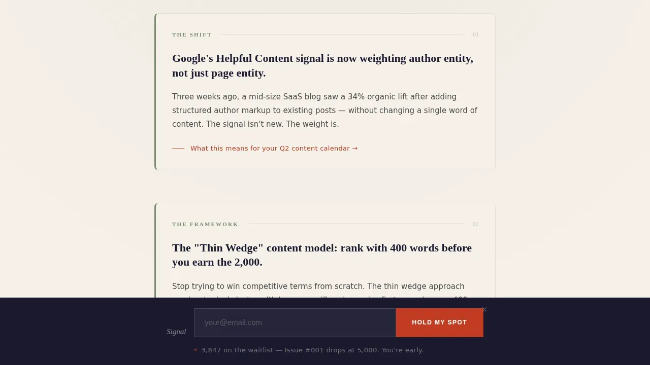
| Noon Framework Excerpt | Demonstrates newsletter voice with three shifts and framework content |
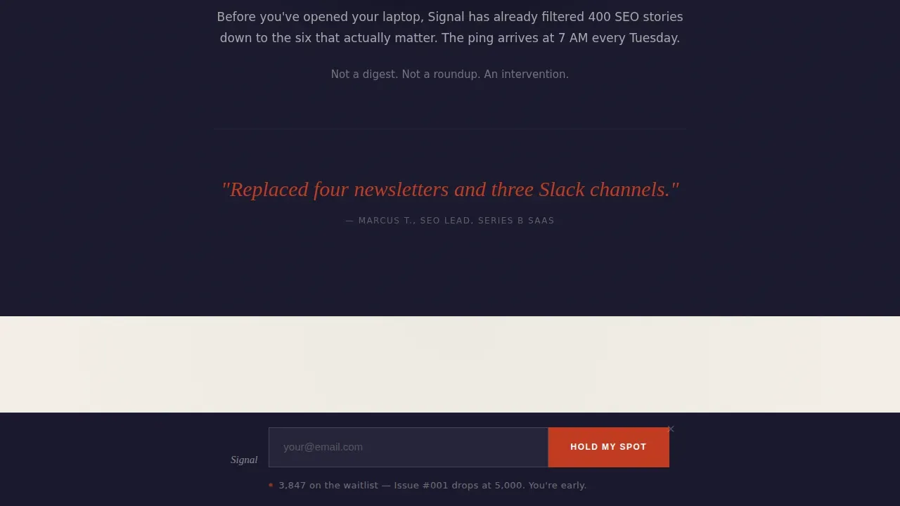
| 3 PM Contrarian Take | Builds trust by showing real editorial impact on a reader's workflow |
| Final call to action Section | Closes with waitlist form, live counter, and launch milestone copy |
| Fixed Bottom Bar | Activates at 60% scroll depth with persistent call to action button |
Design & branding system
The Signal landing page template uses a Japanese Zen color system and a Luxe Minimal design philosophy. Every visual decision is made to remove noise and direct attention to the sign-up form and the value proposition. The result is a clean layout that feels visually appealing without relying on decoration. Plenty of white space is used throughout the design to create visual balance and direct attention to the form and headline, following best practices for high-converting landing pages.
- Typography: Fraunces (a contemporary serif) for all headlines, DM Sans for all body text. The combination creates editorial authority without feeling academic.
- Color palette: Four colors only. Sumi ink and washi cream alternate as section backgrounds. Moss stone appears in rules and secondary accents. Torii vermillion is used exclusively for the call to action button and one pull-quote accent per section.
- Layout structure: Single column flow, no navigation, no footer links, no social links. The focused layout removes every exit point that is not the sign-up form, keeping conversion rates high and the visitor's attention intact.
Mobile & speed optimization
The Signal landing page template is built desktop-first with equal mobile care. The single-column flow reads cleanly on any screen width. Intent-driven visuals and the alternating background image sections adapt fluidly without breaking the editorial rhythm. Mobile-first design is essential since many users will access landing pages via mobile devices, and this template accounts for that reality at the structural level.
- The single-column, distraction-free layout collapses naturally to mobile without requiring separate breakpoint overrides for content order or visual hierarchy.
- The fixed bottom call to action bar is designed to sit cleanly at the bottom of mobile viewports, keeping the call to action button visible and tappable throughout the scroll.
- Scroll-linked reveals and staggered text animations are kept at a low-to-medium intensity to keep the experience smooth and avoid unnecessary rendering overhead on mobile connections.
How this template helps you convert
An effective newsletter landing page converts visitors not by overwhelming them with options, but by making one path feel inevitable. Signal is built around this principle. A focused structure increases lead generation because it removes distractions and centers attention on a single action. This template applies that logic to every detail, from the hero section to the closing waitlist counter.
- The hero section delivers a concise, benefit-driven headline immediately, so the clear value proposition lands before a visitor has time to scroll away or question the ask. Key elements of a minimalist SEO landing page include a compelling headline, minimal form fields, a high-contrast call to action, and social proof, and Signal has all four above the fold.
- The day-in-the-life narrative sections build trust progressively. Instead of relying on static claims or video testimonials alone, they show the newsletter working inside a real Tuesday workflow, giving potential subscribers a concrete reason to believe the value proposition before committing to sign up.
- The live waitlist counter and fixed bottom bar maintain momentum through the scroll. Social proof can include displaying subscriber counts or testimonials to build credibility, and the counter does exactly that. A well-designed newsletter landing page not only captures leads but also sets the tone for ongoing communication and future marketing efforts, and Signal's closing section does both in a single, restrained frame.
Other information about this template
Signal is a purpose-built template for the SEO and content newsletter niche. It is designed to function as a standalone waitlist landing page before newsletter launch, making it one of the more specific and effective newsletter landing page examples available for editorial publications in the B2B media and SEO industry space. The template's approach to conversion is editorial, not aggressive.
- This template is ideal as a pre-launch squeeze page or early-access waitlist page. It is not a sales page, a blog post hub, or a multi-section website with multiple pages. Its single-goal focus is intentional.
- A well-structured page addresses trust by providing details about email frequency and privacy policies to reduce concerns about spam. The template includes space for a brief privacy note beneath the sign-up form, which serves as a trust signal that can alleviate concerns about data handling.
- The template supports a drag-and-drop editor workflow for teams that want to customize color tokens, swap headline copy, or update the waitlist counter target number without writing code.
- Using a drag-and-drop builder makes it straightforward to adapt the template for different newsletter niches, different launch milestones, or different editorial voices while keeping the focused layout intact.
- A/B testing different elements of the landing page can help identify which variations of the headline, call to action button color, or supporting copy perform best for your target audience. The template's single-column structure makes it well-suited for A/B testing because changes are isolated and measurable.
- Tracking sign-ups and monitoring submission data is essential for optimizing newsletter landing pages over time. The template's single sign-up form and single-goal architecture make it straightforward to tie every email sign-up back to a specific traffic source or paid ads campaign.
- Including recent newsletter content, such as a real excerpt from an issue, can help potential subscribers evaluate the value of the newsletter before committing. The day-in-the-life sections serve this function, showing real editorial voice rather than abstract benefit claims.
- The Landingi platform provides tools to design, publish, and test newsletter landing pages without coding. Moosend's editor allows users to craft converting landing pages for newsletters. Both tools are compatible with the kind of template structure Signal uses, and the Signal minimalist SEO newsletter landing page template can be adapted within such environments.
- Integrating the sign-up form with email marketing tools ensures that new newsletter subscribers receive instant access to a welcome sequence or launch notification without manual work.
- The editor's note beneath the waitlist counter, "You're early," functions as both a trust signal and a positioning line. It rewards early visitors, creates a sense of belonging, and frames the newsletter as something worth waiting for. This kind of exclusive content positioning is common in the best newsletter landing pages.
- Click through rates from paid ads campaigns to this template benefit from the distraction-free layout and the absence of navigation links. There is no exit path on the entire page except the sign-up form, which keeps click through rates from ad traffic to email sign-ups as high as possible.
- The template's unique selling point is the combination of editorial restraint and waitlist mechanics. Most newsletter landing page examples in the SEO niche rely on generic layouts. Signal's Japanese Zen design language makes it visually distinctive and immediately credible to a sophisticated target audience of SEO professionals and content strategists.
- A well-designed newsletter landing page not only captures leads but also sets the tone for ongoing communication. Signal's design language signals the kind of newsletter it promotes: precise, curated, and worth the wait.
- Best newsletter landing pages share one trait: they make the value proposition feel proportional to what is being asked. Giving only an email address feels right here, and the template earns that proportionality through restraint, not persuasion volume.
- The best landing page examples in the editorial newsletter space treat white space as a design element, not an absence. Signal applies this principle across every section, making the page visually appealing and psychologically calm at the same time.
Theme
Luxe Minimal
Creative direction
Day-in-the-Life
Color system
Japanese Zen
Style
Single Column Flow
Direction
Waitlist/Coming Soon
Page Sections
Bold Centered Hero with Single Call to Action
Day-in-the-life Narrative Scroll
One-field Email Sign-up Form
Fixed Bottom Call to Action Bar
Live Waitlist Counter and Launch Milestone
Japanese Zen Four-color Design System
Related questions
Can I edit the headline and waitlist counter target without writing code?
Does the template use a single sign-up form or multiple forms?
How does the live waitlist counter support social proof?
Is this template a good fit for paid ads traffic?
Can I adapt this template for a newsletter in a different niche?



