Creator Economy Revenue Intelligence Landing Page
Signal is a dashboard-style landing page template built for creator economy startups at the seed stage. It uses a dark glassmorphic visual system, animated data panels, and a stats-first content rhythm to show visitors exactly what revenue intelligence looks like before they ever sign up. Two conversion paths capture both ready and early-stage leads.
by Rocket studio
Quick summary
Signal is a single-page, data-forward landing page template designed for a creator economy revenue intelligence platform. It leads with animated metric panels, escalates stakes through real numbers, and closes with a two-step conversion flow. The result is a page that feels less like a marketing site and more like a live product preview.
Who this template is for
This template was designed for venture-stage startups solving real revenue visibility problems for independent creators. It speaks directly to the people building tools that replace chaotic manual workflows with structured, real-time financial clarity.
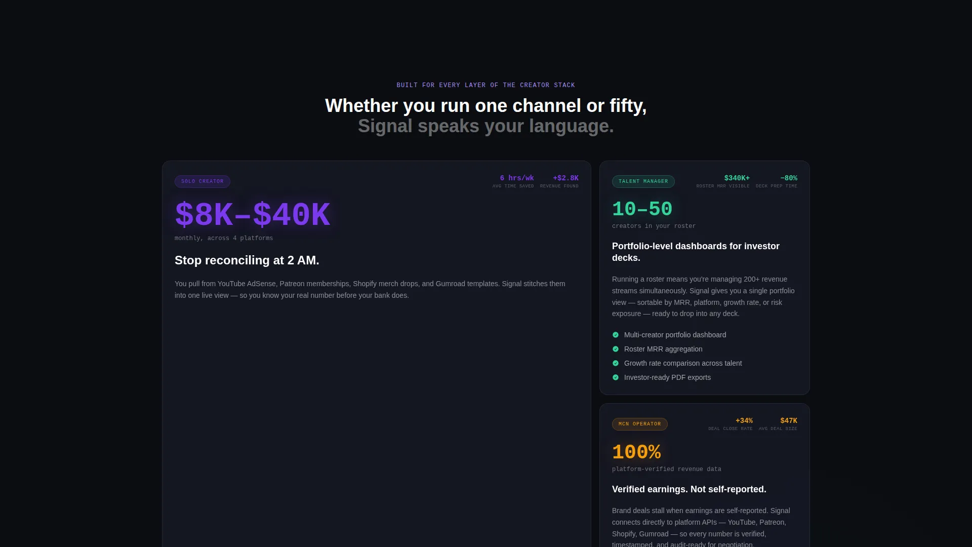
- Solo creators earning between roughly $8,000 and $40,000 per month across multiple platforms who need a single place to see all their income
- Talent managers running rosters of ten to fifty creators who require portfolio-level dashboards suitable for investor presentations
- Multichannel network operators who need verified, non-self-reported earnings data when negotiating brand partnerships
What problem this template solves
Creators who earn across multiple platforms often have no clear, unified view of their revenue. They reconcile figures manually, miss income sources, and lack the kind of clean data that impresses investors or informs business decisions. This template gives a startup the visual language to communicate that problem and present its solution immediately.
- Fragmented revenue data spread across multiple platforms makes it nearly impossible to see total monthly earnings at a glance
- Manual spreadsheet reconciliation is slow, error-prone, and completely unusable for investor-ready reporting
- Self-reported earnings figures are unreliable, making it difficult to negotiate brand deals or secure funding with confidence
What you get with this template
Signal delivers a complete, ready-to-customize landing page structured around data credibility and conversion momentum. Every section is built to move the visitor from curiosity to trust to action without unnecessary friction.
- A six-panel frosted-glass header grid displaying live-feel creator metrics including monthly recurring revenue, platform revenue splits, subscriber growth, top product performance, earnings-per-hour, and cohort retention
- A stats-first content rhythm where every scroll depth opens with a bold number in 72-pixel type before any explanatory copy appears
- A two-step lead generation flow with a primary OAuth-style platform connection row and a secondary frosted-glass email capture card with a revenue range selector
Feature list
Signal includes purpose-built components that communicate product sophistication without requiring a single line of real data from the visitor.
Animated Six-Panel Metric Header
Six frosted-glass cards arranged in a three-by-two grid each display a distinct creator metric. Numbers count up from zero to their target values over 1.2 seconds on page load, making the header feel like a live dashboard from the first moment of contact.
Stats-First Section Rhythm
Every content section opens with a large, high-impact number before any supporting text appears. This structure creates a pattern of proof followed by clarity, keeping the reader engaged as the stakes grow from personal earnings visibility to tax exposure to investor-ready reporting.
Two-Step Conversion Flow
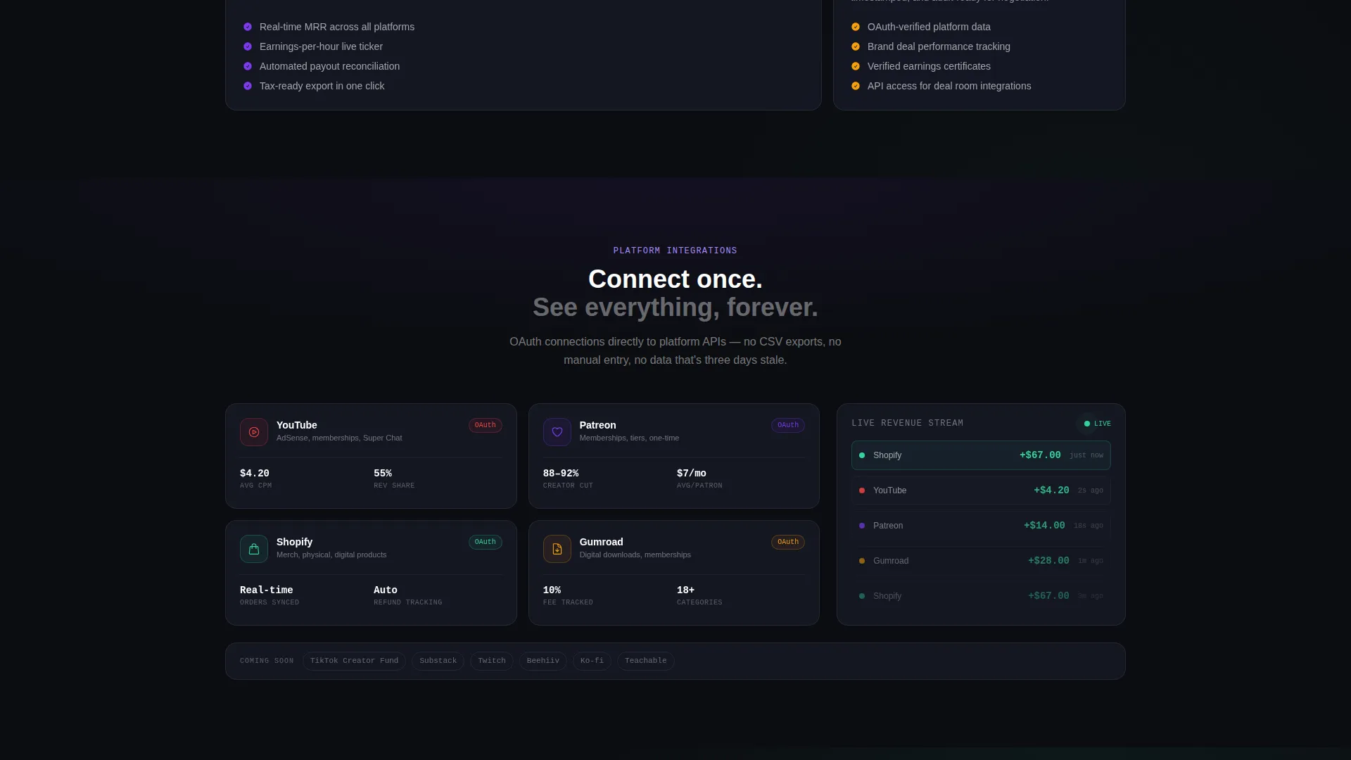
The primary call to action presents a row of OAuth-style platform connection buttons that mimic the first action inside the product itself. A secondary frosted-glass card captures email and monthly revenue range for visitors who are not yet ready to connect, ensuring no interested lead is lost.
Glassmorphic Data Card System
Every panel in the template uses a consistent card language: frosted panel surfaces at 60 percent opacity, 1-pixel semi-transparent white borders, and electric violet accents on live data points. Signal green pulses on positive revenue changes, directing the eye exactly where the data matters.
Escalating Stakes Content Architecture
The page is structured so that each successive section raises the cost of inaction. It moves from individual earnings clarity to potential tax exposure to investor-ready reporting, building a narrative that makes the gap between the visitor's current situation and the product's promise feel impossible to ignore.
Glass-Panel user interface Preview Sections
Between stat reveals and explanatory paragraphs, the template places glass-panel interface screenshots that show what real dashboard states look like. Visitors see their data could look before they ever sign up, which is the core engine of the page's conversion logic.
Page sections overview
| Section | Purpose |
|---|---|
| Animated Metric Header | Opens with six live-feel data panels that establish product credibility instantly |
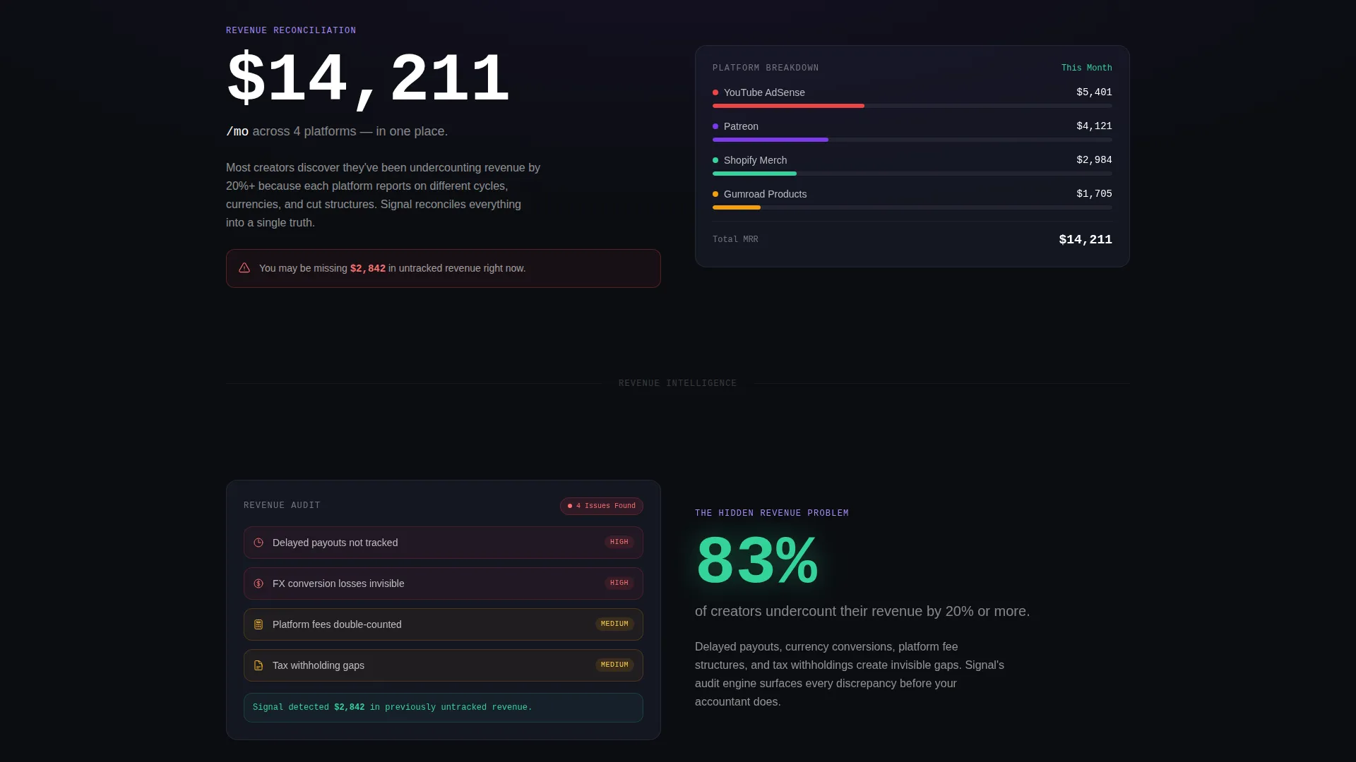
| Primary Revenue Stat | Leads the first content section with a large earnings figure to anchor platform value |
| Platform Reconciliation Copy | Explains the multi-platform income problem after the number has already made the case |
| Creator Undercount Stat | Opens the audit section with the claim that most creators undercount their revenue |
| Audit Feature Reveal | Introduces the revenue audit capability beneath the undercount figure |
| Dashboard user interface Preview | Shows a glass-panel product screenshot to make the data promise feel tangible |
| Tax Exposure Section | Raises the stakes by connecting invisible income gaps to real financial risk |
| Investor Reporting Section | Frames clean, verified earnings data as a tool for funding and brand deal negotiations |
| Primary call to action Row | Presents OAuth-style platform connection buttons as the first real product action |
| Early Access Card | Captures email and revenue range for visitors not ready to connect a platform yet |
Design & branding system
The visual identity runs on a Data Command theme built entirely around a glassmorphic color system. The palette is designed to feel like a financial cockpit: dark everywhere except where live information demands attention, with every glow tied to real data rather than decoration.
- Core colors include void black (#0B0D11) as the deep background, frosted panel gray (#1A1D2E at 60 percent opacity) for card surfaces, electric violet (#7C3AED) on primary accents and live data points, and signal green (#34D399) pulsing on positive revenue changes
- Typography uses a medium-weight sans-serif for the headline treatment, with 72-pixel stat figures as the dominant typographic element in content sections
- Card borders use 1-pixel rgba white at 8 percent opacity, giving each panel the visual quality of smoked glass floating above a dark void
Mobile & speed optimization
The template layout is structured to remain readable and visually coherent across screen sizes. The data-dense header grid and stat-led sections are designed to restack cleanly without losing their visual hierarchy on smaller displays.
- The six-panel metric grid is built to adapt from a three-by-two desktop arrangement to a stacked single-column format on mobile without losing the count-up animation effect
- Content sections follow a consistent one-column reading flow on mobile, ensuring the stats-first rhythm lands with the same impact regardless of device
How this template helps you convert
Signal treats the product experience itself as the conversion argument. By the time a visitor reaches either call-to-action, they have already seen what their revenue data could look like inside a real dashboard.
- The animated metric header and stat-first section structure build trust and product familiarity before any ask is made, so the primary call to action feels like a natural next step rather than a cold request
- The two-step conversion flow removes friction for both high-intent and early-stage visitors, with the OAuth platform row capturing ready leads and the email card with revenue range selector capturing everyone else
Other information about this template
Signal is categorized under Startup and Launch with a focus on the creator economy seed stage startup niche. It is built as a single landing page and is well suited to early fundraising moments, waitlist campaigns, and pre-launch product validation efforts.
- The template style is Dashboard and Data Grid, making it particularly effective for products that need to demonstrate data sophistication at a glance
- The creative direction is Stats-First Impact, which means proof always precedes explanation throughout the entire page flow
- The header concept is Dark Glass Panels, and the theme is Data Command, giving the template a consistent visual language that communicates technical credibility without requiring a single real data connection
- This template is designed for seed-stage startups that want to attract both creator-side users and institutional or investor audiences simultaneously

Theme
Data Command
Creative direction
Stats-First Impact
Color system
Glassmorphic
Style
Dashboard/Data Grid
Direction
Lead Generation
Page Sections
Animated Six-panel Metric Header
Stats-first Section Rhythm
Two-step Lead Conversion Flow
Glassmorphic Data Card System
Escalating Stakes Content Architecture
Glass-panel User Interface Preview Sections
Related questions
Who is this landing page template built for?
Does this template require real data to look credible?
Can I customize the metric panels and stat figures?
What conversion paths does this template include?
Is this template suited to investor-facing use cases?



