Adtech Landing Page Template for Programmatic Buyers
Signal is a scroll-reveal landing page template built for adtech seed-stage startups. It combines live-ticking metric panels, an interactive bid-stream visualizer, a hoverable spend-leak map, and a latency comparison slider into a single dark-glass command center. The primary call to action drives beta installs, with a secondary path for API access requests.
by Rocket studio
Quick summary
Signal is a single-page, scroll-reveal landing page template for programmatic advertising intelligence platforms. It opens with four live-animated metric panels floating over a near-black void, then guides visitors through interactive proof points before landing on a dark-glass install card. Every section is designed to show the product in action, not describe it from a distance.
Who this template is for
This template is built for seed-stage adtech startups that need to earn trust fast. The ideal user has a working product, real performance data, and an audience of skeptical, number-literate buyers.
- Media traders at mid-market agencies who evaluate tools by what they save, not what they promise
- Direct-to-consumer growth leads watching cost-per-acquisition creep past breakeven
- Independent ad operations consultants who bill by recovered budget and need proof before they recommend anything
What problem this template solves
Most adtech landing pages describe features with static screenshots and bullet points. That approach fails with a technical audience that wants to see the system behave before committing an email address. Signal solves this by turning the page itself into a product demo.
- Visitors interact with anonymized live data across multiple sections before they ever reach the call to action
- The scroll sequence escalates stakes deliberately, moving from "see the waste" to "quantify it" to "watch it disappear"
- The design removes every visual distraction so the numbers and interactions carry all the weight
What you get with this template
This template delivers a complete, production-ready landing page structure with high interactivity and a clear conversion path. Every section is purposeful and sequenced to build confidence progressively.
- A hero section with four live-ticking key performance indicator panels, a draggable bid-stream visualizer, a hoverable spend-leak map with node-level dollar amounts, and a latency comparison slider
- A social proof section paired with a dark-glass install card offering platform toggles for macOS and Windows plus a single email field
- A sticky call-to-action pill in the top navigation rail and a secondary "Get API Access" path for technical buyers
Feature list
This template includes the following built-in interactive and visual components.
Live-Ticking Hero Metric Panels
Four translucent dark-glass cards float over a forge-black void. Each card displays a single animated key performance indicator, such as impressions audited, spend recovered, bid latency, or fraud intercepts. Numbers count upward in reactor-blue monospace type, and the reflections on each card shift subtly as the cursor moves.
Draggable Bid-Stream Visualizer
An interactive channel filter lets visitors drag to sort and isolate bid-stream data by channel. Anomaly detection patterns surface visually as the filter moves. This gives technically minded visitors a hands-on sense of how the platform processes live data.
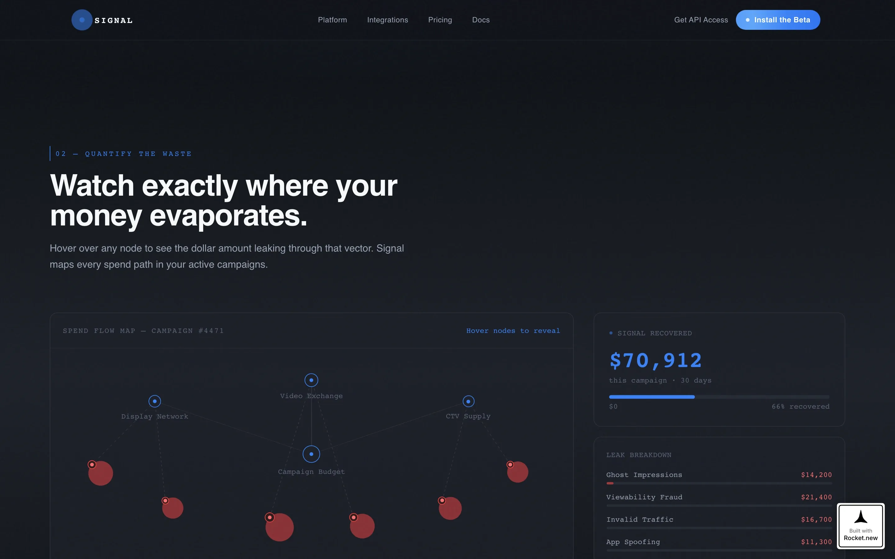
Hoverable Spend-Leak Map
A node network fills one full section of the page. Hovering over individual nodes reveals dollar amounts attributed to wasted impressions by channel. The interaction makes the cost of inaction concrete and specific rather than abstract.
Latency Comparison Slider
A side-by-side slider lets visitors compare Signal's response times directly against legacy demand-side platform benchmarks. The control is draggable and responds immediately, making the performance gap tangible without requiring any technical explanation.
Scroll-Reveal Progressive Animation
Each section materializes from darkness as the visitor scrolls, triggered by Intersection Observer reveals. Scan lines, live number tickers, and cursor parallax on the glass panels create a cockpit-style atmosphere that reinforces the command-center positioning throughout the page.
Dual Conversion Path Install Card
The page climax is a dark-glass card with platform toggles for macOS and Windows and a single email field for the download link. A secondary call to action, "Get API Access," runs alongside the primary install prompt to capture technical buyers who want to integrate Signal into existing dashboards.
Page sections overview
| Section | Purpose |
|---|---|
| Hero Metric Panels | Display four live-animated KPIs over a dark void to establish immediate credibility |
| Bid-Stream Visualizer | Let visitors drag-filter channel data to demonstrate anomaly detection in action |
| Spend-Leak Map | Show hoverable nodes that reveal dollar amounts lost by channel |
| Latency Comparison Slider | Pit Signal response times against legacy DSP benchmarks interactively |
| Social Proof Block | Present trader and growth-lead testimonials with saved-spend figures |
| Install call to action Card | Drive beta downloads with platform toggles and an email field |
Design & branding system
The visual identity is built around a Monochrome Steel color system that communicates precision and restraint. There is no warmth, no decorative imagery, and no stock photography. The product data is the visual.
- Colors: forge black (#0E1117) as the base, brushed gunmetal (#1C2028) for scroll-depth backgrounds, cold alloy gray (#9BA4B5) for body text, pure white (#F8FAFC) for headlines, and reactor blue (#3B82F6) reserved exclusively for interactive hotspots and live data pulses
- Typography: JetBrains Mono for all numerical and data displays, Manrope for body copy and headlines
- Backgrounds graduate from forge black to gunmetal as the user scrolls deeper, and every clickable element glows reactor blue on hover like a status indicator activating
Mobile & speed optimization
The template is built desktop-first, reflecting the reality that media traders and ad operations professionals work on large monitors with multiple tabs open. A mobile fallback layout is included for visitors arriving on smaller screens.
- GPU-accelerated transforms handle all panel animations and parallax effects to keep motion smooth during heavy interactive sequences
- The requestAnimationFrame loop powers the live number counters, keeping ticker updates consistent without blocking the main thread
- Interactive components including the draggable filter, hoverable nodes, and comparison slider are all designed to degrade gracefully on touch devices
How this template helps you convert
The page earns the install rather than asking for it immediately. By the time a visitor reaches the call-to-action card, they have already interacted with the product through multiple data-driven experiences.
- The sticky install pill appears in the navigation rail from the first scroll position, keeping the primary action visible without interrupting the interactive demo experience below it
- The dual conversion path separates technical buyers from product buyers, giving each group a clear next step without either path diluting the other
Other information about this template
Signal is built under the Startup Velocity theme with a Scroll Reveal progressive template style. The creative direction is Interactive Explorer, meaning all proof points are participatory rather than passive. The header concept is Dark Glass Panels, a specific visual treatment where frosted translucent cards float over a near-black void with cursor-driven parallax reflections.
- The footer follows the Vercel Horizontal Flow pattern, keeping the page's structural logic clean and consistent with modern developer-audience expectations
- The template is categorized under Startup and Launch, specifically within the AdTech Seed Stage Startup niche, making it suitable for early-stage teams pitching to both product and technical buyers
- Localization is set to English with United States dollar currency references, targeting the US programmatic advertising market


Theme
Startup Velocity
Creative direction
Interactive Explorer
Color system
Monochrome Steel
Style
Scroll Reveal (Progressive)
Direction
App Download
Page Sections
Live-ticking Dark Glass Metric Panels
Draggable Bid-stream Visualizer
Hoverable Spend-leak Node Map
Latency Comparison Slider
Scroll-reveal Progressive Section Animations
Dual-path Install and API Conversion Card
Related questions
Who is this landing page template designed for?
Can the interactive sections be customized with real campaign data?
Does this template support both beta download and API access conversion paths?
Is this template suitable for a desktop-first audience?
How does the scroll-reveal structure guide visitors toward conversion?


