Signal - Precision VC Landing Page Template
Signal is a split-screen landing page template built for early-stage venture capital firms that back technical founders. It pairs a live scatter plot header with a scrolling feature matrix to eliminate the need for persuasion. The template uses a void-black and iridescent color system that feels purpose-built for engineers, not pitch-deck readers.
by Rocket studio
Quick summary
Signal is a single-page landing page template designed for early-stage venture capital firms targeting solo technical founders. It opens with an interactive portfolio scatter plot, transitions into a scrolling comparison matrix, and closes with a staged intake form. Every design choice speaks directly to infrastructure engineers and applied machine learning builders who distrust conventional investor marketing.
Who this template is for
This template is built for early-stage VC firms that lead with technical conviction rather than brand recognition. It suits teams who write first checks into founders still deep in the build phase, well before a polished pitch deck exists.
- Early-stage venture capital firms focused on technical founders in infrastructure, applied machine learning, or developer tools
- Solo general partners or small investment teams who want their website to communicate depth over polish
- Funds that use codebase reviews and commit history as primary diligence signals
What problem this template solves
Most venture capital landing pages look identical: partner headshots, portfolio logos, and a generic contact form. That approach signals nothing meaningful to an engineer evaluating whether a fund actually understands their work. Signal solves this by replacing familiar marketing patterns with data-first design and a comparison layout that makes the fund's edge visible at a glance.
- Engineers distrust vague claims about "founder-friendly" funds, so the template uses proof rendered as a living portfolio diagram
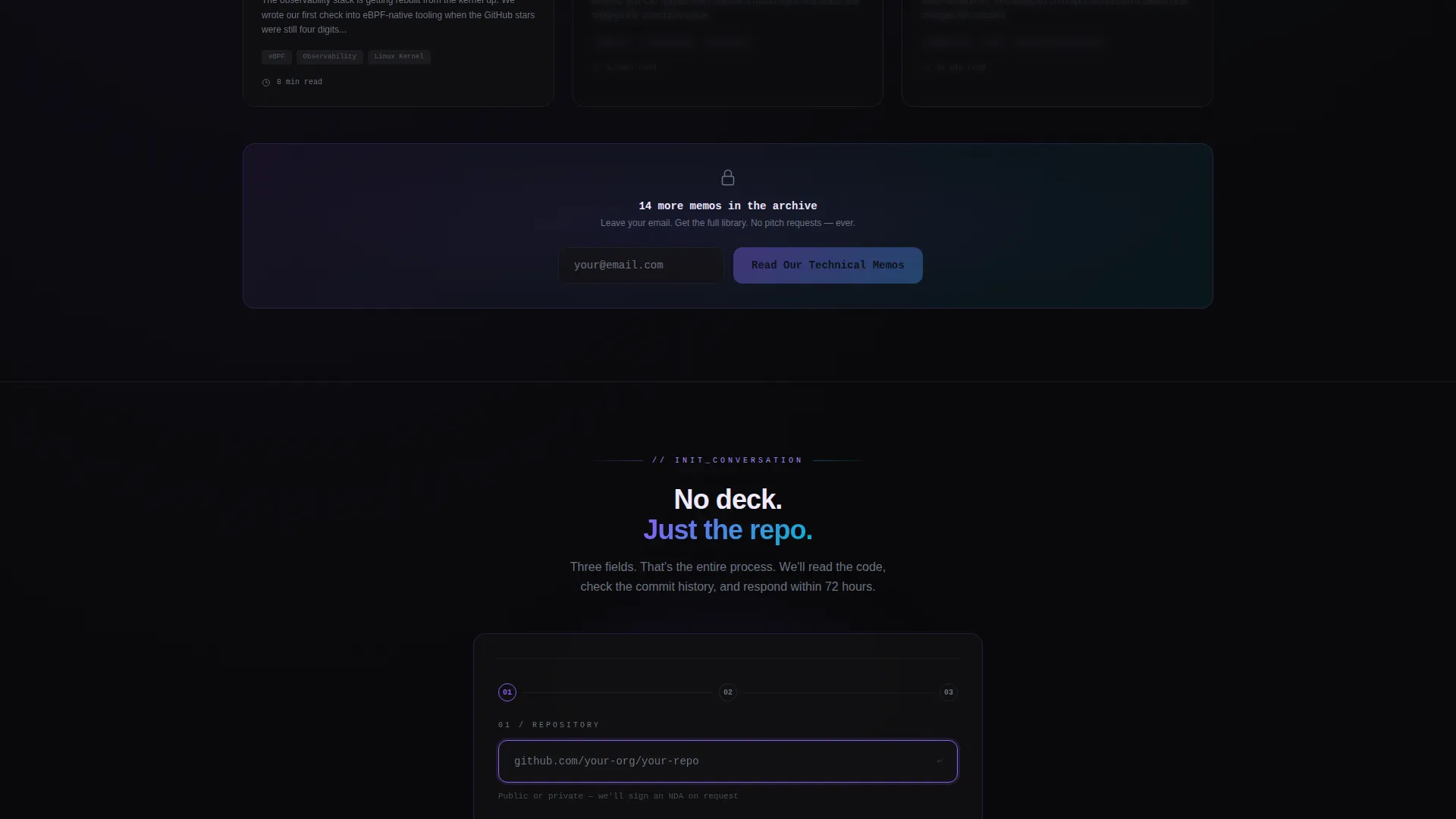
- The intake form skips revenue questions and deck uploads entirely, asking only for a repository link, a one-line technical description, and an email address
- Founders who land on generic VC pages often leave without converting; Signal holds attention by speaking the language of the builder from the first scroll
What you get with this template
The template delivers a complete single-page layout with distinct, purposeful sections built around conversion for technical audiences. Each component has a defined visual role in the Data Command theme.
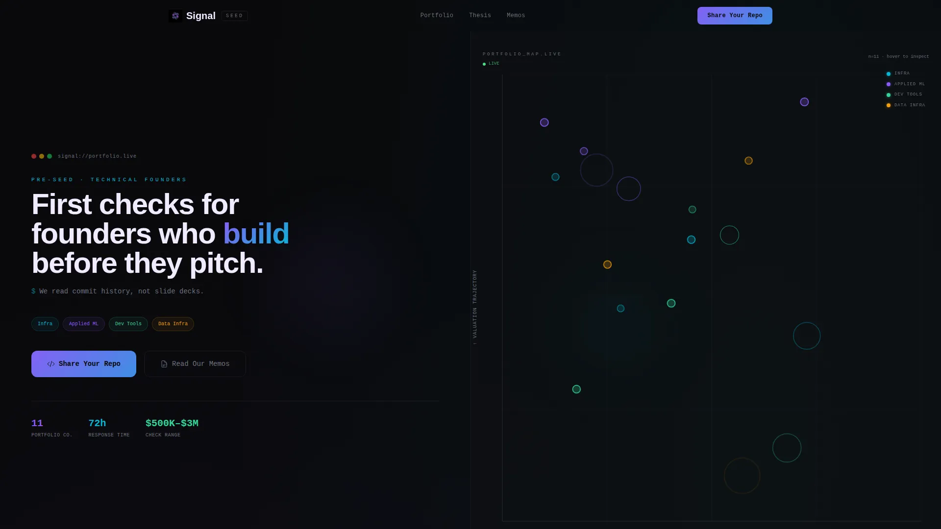
- An interactive scatter plot hero section showing portfolio companies mapped by founding stage and valuation trajectory, with hover states revealing check size and months-to-next-round
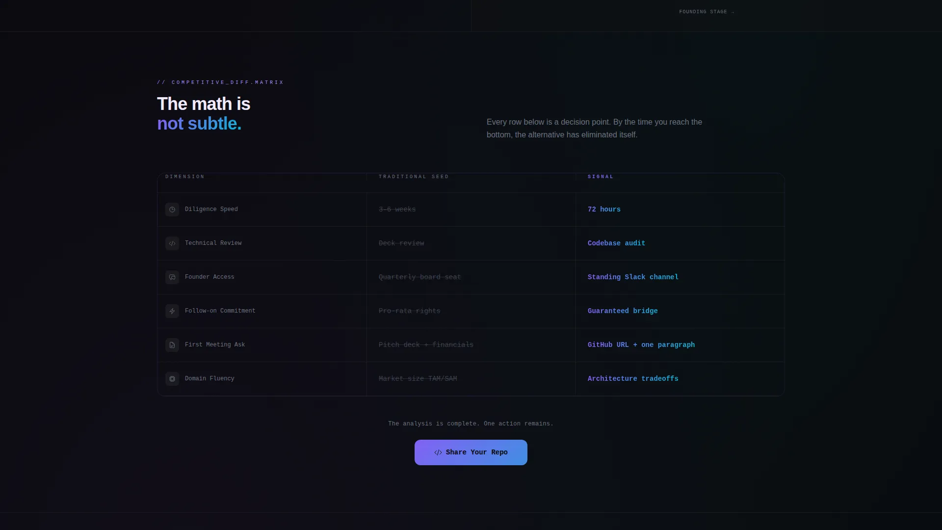
- A 50/50 split-screen feature matrix comparing traditional seed fund behavior against the firm's approach, row by row, with scroll-triggered animations
- A primary call-to-action form sequencing three fields (repository URL, one-line description, founder email) and a secondary email-gated path to a technical memo library
Feature list
This template is built around a set of tightly scoped, prompt-defined components that work together to create a high-trust, data-forward landing page experience.
Interactive Portfolio Scatter Plot
The header section renders the firm's portfolio as a live, explorable scatter plot. Each node is color-coded by sector and pulses with iridescent animation. Hovering a node surfaces company name, check size, and estimated months to the next funding round, turning portfolio data into the most persuasive element on the page.
Scroll-Triggered Feature Matrix
The left panel locks in place displaying a "Traditional Seed Fund" comparison column rendered in muted gray. The right panel scrolls through the firm's corresponding approach across four dimensions: diligence speed, technical depth, founder access, and follow-on commitment. Each row animates in with a violet-to-cyan gradient as the visitor scrolls down.
Staged Three-Field Intake Form
The primary conversion form appears at the bottom of the matrix and avoids overwhelming the visitor. It asks for a GitHub or GitLab repository URL first, a one-line technical description second, and a founder email address third. There is no deck upload field and no revenue question.
Sticky Call-to-Action Bar
After the visitor has scrolled past 60 percent of the page, a sticky bar appears repeating the primary "Share Your Repo" call to action. It keeps the conversion path visible without interrupting the reading flow earlier in the session.
Email-Gated Technical Memo Library
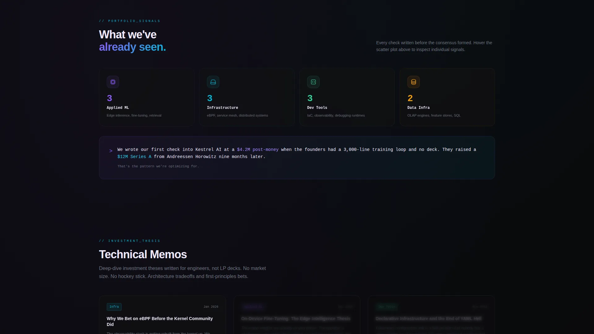
A secondary conversion path offers founders access to a library of deep-dive investment theses. Entry requires only an email address. This path captures founders who prefer to research before submitting a repository, extending the funnel without adding friction to the primary form.
Split-Screen 50/50 Layout
The template uses a persistent 50/50 split-screen structure that anchors the comparison context throughout the scrolling experience. The left panel stays fixed as a reference column while the right side delivers new information on each scroll step, keeping the visual hierarchy clean and the narrative controlled.
Page sections overview
| Section | Purpose |
|---|---|
| Interactive scatter plot header | Maps portfolio companies across stage and trajectory axes with hover detail states |
| Split-screen matrix | Compares traditional seed fund behavior against the firm's approach row by row |
| Matrix call-to-action | Places the primary "Share Your Repo" form at the end of the comparison sequence |
| Sticky bar trigger | Repeats the primary call to action after 60 percent scroll depth |
| Technical memo gate | Offers a secondary email-capture path to an investment thesis library |
Design & branding system
The visual identity follows a Data Command theme built on an AI Iridescent color palette. The result feels like light refracting through a prism placed on a matte black surface: each accent color carries a distinct functional meaning.
- Void black (#09090B) holds all backgrounds; holographic violet (#8B5CF6) marks conviction metrics; liquid cyan (#06B6D4) codes portfolio signals; shimmer white (#F0EAFF) burns clean against dark surfaces for text and data labels
- Violet-to-cyan gradients define interactive boundaries, hover states, and the animated right panel of the feature matrix
- There is no stock photography and no partner headshots; the scatter plot and comparison matrix carry the full visual weight of the page
Mobile & speed optimization
The template is structured for clean rendering across screen sizes, with layout decisions that translate the split-screen and scatter plot experience to smaller viewports without losing the data-forward identity.
- The 50/50 split-screen collapses to a stacked single-column layout on mobile, keeping the comparison matrix readable without horizontal scrolling
- Scatter plot nodes and hover interactions are adapted for touch input so mobile visitors can still explore portfolio data
- The sticky call-to-action bar is sized and positioned to remain accessible without obscuring key content on smaller screens
How this template helps you convert
Signal is designed around a specific conversion logic: earn trust through demonstrated technical fluency before asking for anything. Every structural decision on the page supports that sequence.
- The scatter plot hero immediately signals that this fund operates on data, not narrative, creating credibility before a single word of copy is read
- The scroll-triggered matrix systematically removes the case for every alternative, so by the time the visitor reaches the intake form, the choice already feels obvious
- The three-field form removes every conventional barrier (no deck upload, no revenue questions) so the friction matches the audience's tolerance precisely
Other information about this template
Signal is part of the Startup and Launch category, sitting within the Venture Capital and Fund subcategory, and is optimized for the Early-Stage VC Firm niche. It carries an intersection match score of 13, indicating strong alignment across template style, creative direction, header concept, color system, and landing-page direction.
- The template style is Split Screen (50/50), the header concept is Interactive Preview, and the creative direction is Feature Matrix
- The landing-page direction follows a Comparison/Versus conversion model, which is well-suited for positioning a differentiated fund against conventional alternatives
- The color system is AI Iridescent and the theme is Data Command, making this template a strong fit for technical brand identities that want to avoid conventional startup aesthetics
Theme
Data Command
Creative direction
Feature Matrix
Color system
AI Iridescent
Style
Split Screen (50/50)
Direction
Comparison/Versus
Page Sections
Interactive Portfolio Scatter Plot Header
Scroll-triggered Comparison Matrix
Staged Three-field Intake Form
Sticky Conversion Bar
Email-gated Memo Library
Related questions
Can I edit the portfolio scatter plot to show my own fund's companies?
Does the intake form ask founders to upload a pitch deck?
How does the secondary technical memo path work?
Is this template suited for a multi-stage venture capital fund?
Can I update the color palette to match my fund's existing brand identity?



