Luxe Minimal Telecom Podcast Landing Page Template
Signal is a Luxe Minimal telecommunications podcast landing page built on an asymmetric 60/40 grid. It pairs a silent Short-Form Reel hero with a Gallery Walk episode display, a five-question "Find Your Signal" assessment modal, and a Soft Mist color palette. The result is a focused, gallery-calm page that converts curious visitors into self-segmented subscribers.
by Rocket studio
Quick summary
Signal is a single-page landing page template built for a professional telecommunications podcast. It uses an asymmetric 60/40 grid, a Luxe Minimal visual identity, and a five-step interactive assessment to match each visitor to a personalized content pathway. Every design decision serves one goal: turn a passing visit into a committed subscription.
Who this template is for
This template is built for podcast creators, media brands, and editorial teams operating in technically demanding markets. The ideas behind it suit anyone whose audience arrives with real expertise and a low tolerance for noise.
- Telecom engineers, Federal Communications Commission policy analysts, and regional carrier executives who want a page that respects their intelligence
- Independent podcast producers and media companies launching a professional audio brand in the telecommunications or technology category
- Editorial teams who need a page that can carry a strong brand identity without relying on decorative clutter
What problem this template solves
Most podcast pages try to do too much. They stack episode lists, social feeds, sponsor logos, and pop-ups until the core value disappears. For a professional audience in a high-complexity market, that packaging feels dismissive. Readers with real industry knowledge decide within seconds whether a page deserves their attention.
- There is no easy way to segment a professional audience at the moment they land, so most visitors leave without subscribing to the right content tier
- Generic podcast page designs lack the visual confidence and clarity that luxury brands in media use to signal quality and authority
- A crowded layout competes with itself for most attention, burying the episode content and the call to action beneath visual noise
What you get with this template
You get a complete, fully designed landing page ready to carry a bold brand identity in the telecommunications podcast market. The template delivers every section needed to introduce the show, present episodes, build trust, and convert visitors into subscribers through a guided assessment.
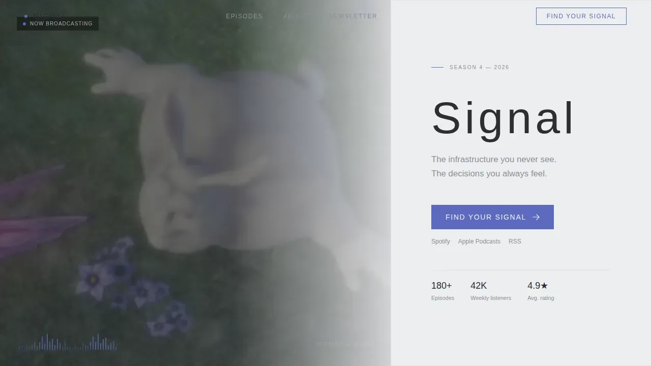
- A hero section with a 60/40 asymmetric grid, a vertical short-form video reel panel, a waveform animation, and a headline-plus-tagline panel sitting in generous negative space
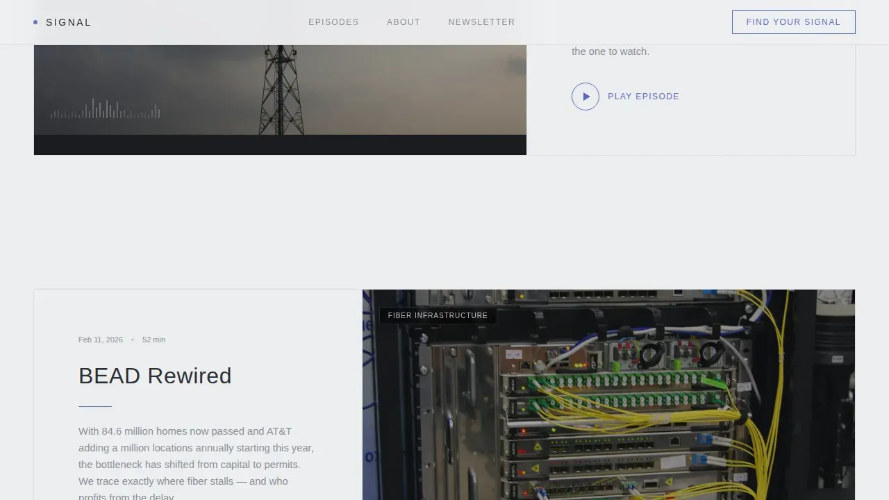
- A Gallery Walk episodes section with alternating 60/40 zigzag frames, waveform thumbnails, episode premise copy blocks, and individual play buttons
- A "Find Your Signal" five-question assessment modal, a sticky bottom call-to-action bar, an About editorial identity section, a social proof strip with professional listener testimonials, and an ultra-minimal footer
Feature list
This section walks through the core capabilities built into the template. Each feature reflects a deliberate design and strategy decision grounded in the brief.
Asymmetric 60/40 Hero with Video Reel
The hero splits the viewport into a 60-column video panel and a 40-column title panel. The video auto-plays silently with quick cuts of cell towers, broadcast consoles, and satellite dishes. A waveform animation pulses over the footage. The title panel holds the show name in thin, wide-tracked type and a single tagline line floating in open space. This ratio directs most attention to the moving visuals while keeping the brand message immediately legible.
Gallery Walk Episode Display
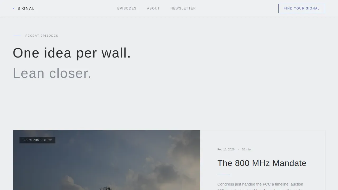
Each episode appears as its own exhibition frame in an alternating 60/40 zigzag layout. The larger panel holds a waveform thumbnail or video still. The narrower panel carries the episode title, a two-sentence premise, and a play button. Spacing increases gradually as the visitor scrolls deeper, slowing the pace and letting each idea land fully before the next one appears. This approach gives the audio content the same visual respect that gallery packaging gives a fine art print.
Five-Step "Find Your Signal" Assessment Modal
The assessment opens from a sticky bottom bar that appears after the third page section. It asks five questions: industry role, preferred telecom layer, listening cadence, self-rated knowledge level via a slider, and preferred format. Results deliver a personalized content pathway including a curated playlist, a recommended starting episode, and a newsletter tier. This turns passive browsers into self-segmented subscribers before they ever reach a generic subscribe button. Product-led content built this way is inherently buyer-centric, focusing on solving real customer problems with real tools.
Sticky Bottom Call-to-Action Bar
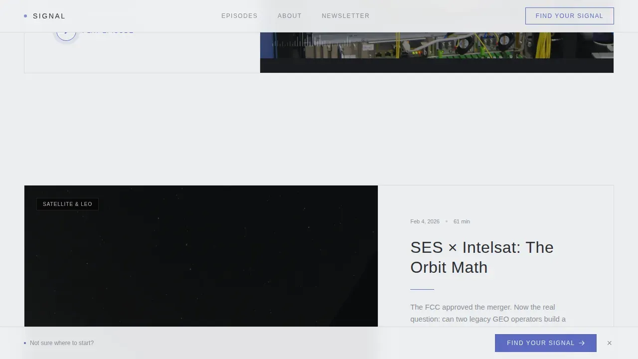
The "Find Your Signal" call-to-action bar anchors to the bottom of the viewport and appears after the visitor passes the third section. It stays visible as the visitor continues scrolling, keeping the conversion prompt accessible without interrupting the reading experience. The muted indigo accent color is reserved exclusively for this interactive element, so it reads as intentional rather than decorative.
Social Proof Marquee Strip
A marquee-style strip carries professional testimonials from engineers, analysts, and executives alongside a listener count metric. The rolling format keeps the section compact while giving the brand credibility from recognizable professional roles. Social proof placed in this way builds confidence for first-time visitors who arrive skeptical of a new media property in a serious market.
Scroll-Linked Animation System
The template uses scroll-linked section reveals, staggered zigzag entrances for episode frames, and modal transition animations. The waveform SVG pulses throughout the page. These motion elements create a sense of depth and pacing without adding visual clutter, keeping the overall identity firmly within the Luxe Minimal aesthetic.
Page sections overview
| Section | Purpose |
|---|---|
| Hero Video Panel | Establishes visual identity and brand tone immediately |
| Episode Gallery Frames | Presents audio content as exhibition-style editorial pieces |
| About Signal Brief | Communicates editorial identity and host credibility |
| Social Proof Strip | Builds listener confidence through professional testimonials |
| Find Your Signal call to action | Drives assessment completion and subscriber segmentation |
| Ultra-Minimal Footer | Closes the page cleanly with essential links |
Design & branding system
The visual identity follows a Luxe Minimal strategy built around restraint and precision. Every color, typographic choice, and spacing decision works together to create a brand experience that feels like brushed aluminum under gallery lighting. Aesthetics in brand design should encompass more than just surface-level visual appeal, and this system reflects that principle by treating each design element as a carrier of meaning.
- The Soft Mist color palette uses whisper-gray (#EDEEF0) for the background, deep graphite (#2C2E33) for body text, pale quartz (#C8CCD2) for card surfaces and dividers, and muted indigo (#5B6ABF) reserved exclusively for interactive elements and hover states
- Typography pairs Manrope in thin, wide-tracked headings with DM Sans for body copy, creating a clear visual hierarchy that guides readers through the page without effort
- The logo treatment, headline sizing, and negative space ratios are calibrated so visitors can quickly identify the show's identity and professional positioning within the first scroll
Mobile & speed optimization
The template is designed desktop-first to match the primary listening context of its audience, with full responsive behavior across smaller screens. Mobile layout adjustments maintain the visual hierarchy and keep the assessment modal functional on touch devices. Note that podcast listeners increasingly browse on mobile, so the responsive layer matters even for a desktop-first audience.
- The asymmetric grid collapses gracefully for mobile viewports, preserving the waveform animation and play button interactions without layout breakage
- Server Components handle static sections such as the hero, episode frames, and social proof strip, while Client Components manage the quiz modal and sticky bar to keep interactive elements snappy
- The sticky call-to-action bar and five-step assessment are fully touch-friendly, so mobile visitors can complete the assessment and reach their personalized content pathway without friction
How this template helps you convert
The conversion strategy built into this template works in layers. Each layer adds a reason to stay, a reason to trust, and finally a reason to act. Great product-led content is inherently buyer-centric, and this page is built on that principle: it delivers value to the visitor before asking them for anything.
- The Gallery Walk episode layout lets visitors sample the show's editorial voice and audio depth before committing, building genuine interest and trust through content quality rather than sales pressure
- The "Find Your Signal" assessment reframes the subscribe decision as a personalization moment, making the visitor feel seen rather than funneled, which measurably increases the confidence that drives subscription conversions
- The sticky call-to-action bar maintains a consistent, low-pressure conversion prompt throughout the scroll, ensuring the path to the assessment is never more than one click away regardless of how deep the visitor has scrolled
Other information about this template
The Signal Luxe Minimal Telecommunications Podcast Landing Page Template sits at an unusual intersection in the market: it combines the visual confidence of luxury brands with the functional clarity that professional telecom audiences demand. Understanding where this template fits helps you decide whether it is the right starting point for your project.
- The expertise lies in the balance between bold visual design and practical information architecture. A brand is a network of designed stimuli that gain significance through perception and use, and this template is designed with that in mind from the first scroll to the last interaction
- Effective brand design requires a balance between aesthetics and distinctiveness to avoid sameness. Designing for aesthetics alone can lead to a lack of distinctiveness in brand identity, which is why the Signal template pairs its restrained color palette with a structured content strategy rather than relying on visuals alone
- The logo placement, heading hierarchy, and use of space are all calibrated for brand positioning in a competitive media market. Visitors can quickly identify the show as a professional, established voice in the telecommunications world rather than a casual hobbyist project
- A good email signature is simple, informative, and professional. The same principles apply here: this page avoids including too much information in any single section, uses a small color palette to maintain a cohesive identity, and limits font variety to complement the overall design system. Including social media links on this page can drive traffic to audio platforms and enhance brand visibility. Making the design mobile-friendly is essential since a significant number of users open email links and social links on mobile devices
- 71 percent of business-to-business buyers consume multiple content assets before making a decision. The template addresses this by giving visitors a clear content pathway through the assessment, filling knowledge gaps about the show's format, depth, and relevance. Product-led content fills key knowledge gaps at every stage of the user journey, and the five-step quiz is the practical embodiment of that idea
- Screenshots and video clips are pivotal in showcasing features and functionalities. The short-form reel in the hero and the waveform thumbnails throughout the episode gallery serve exactly this purpose, giving visitors a direct sensory sample of the show's production quality and editorial culture
- The template is flexible enough to carry different podcast formats. Whether the show leans toward long-form audio interviews, shorter editorial briefings, or a video-first approach, the section structure and interchangeable content blocks can complement each format without requiring a redesign
- Aesthetics should be understood as a dynamic interaction between sensory forms and cognitive-emotional systems. This page uses motion (the waveform SVG, scroll reveals, staggered zigzag entrances) as a sensory layer that reinforces the editorial personality of the show rather than decorating the surface
- The "Find Your Signal" assessment is specifically designed to segment visitors by role, interest, and knowledge level before they subscribe. This gives the show's team actionable data on who is listening and what they want, without relying on third-party research or post-subscription surveys
- The trend toward personalized content delivery is reshaping how media companies grow their subscriber base. This template positions the show to lead that trend in the telecommunications podcast category rather than follow competitors who still rely on static subscribe buttons and generic episode lists
Theme
Luxe Minimal
Creative direction
Gallery Walk
Color system
Soft Mist
Style
Asymmetric Grid (60/40)
Direction
Quiz/Assessment
Page Sections
Asymmetric 60/40 Hero with Silent Video Reel
Gallery Walk Episode Display with Zigzag Layout
Five-step Personalized Assessment Modal
Scroll-linked Animation and Reveal System
Social Proof Marquee with Professional Testimonials
Soft Mist Color Palette and Typographic Hierarchy
Related questions
Can I change the colors and typography to match my existing brand?
Does the five-step assessment work out of the box?
Is this template suitable for podcasts outside of telecommunications?
How does the sticky call-to-action bar behave on mobile screens?
Can I add more episode frames to the Gallery Walk section?



