Personal Blog Pre-Launch Website Template
Pare is a minimal landing page built for a minimalism and simple living editorial journal. It uses a day-in-the-life narrative scroll, a Heritage and Story visual identity, and a single waitlist conversion goal. The page design trades photography for pure typography and white space, creating an unhurried reading experience that draws the right audience in and moves them toward signing up.
by Rocket studio
Quick summary
Pare is an editorial landing page template built for a minimalism and simple living journal. The page design relies entirely on serif typography, generous white space, and a warm four-color palette to carry readers from dawn to dusk through a scrolling narrative. A single conversion goal anchors the entire page: a waitlist signup paired with an instant free essay offer.
Who this template is for
Pare is built for writers, editors, and independent creators who want to launch a minimalism or simple living blog with a landing page that feels literary rather than commercial. It suits anyone who values intentional page design over visual noise and wants landing pages that convert visitors through emotional depth rather than aggressive promotion.
- Burned-out professionals in their mid-thirties to early fifties who write about owning less and living with more intention
- Young parents or retirees building a personal journal, newsletter, or editorial platform around a slower, simpler life
- Independent creators or web developers who need a professionally designed minimal landing page without starting from scratch
What problem this template solves
Most editorial landing pages try to do too much. They pile on eye catching images, multi step forms, pop up windows, and competing calls to action until the page feels more like a storefront than a story. For a minimalism brand, that kind of visual clutter immediately breaks trust with the target audience.
Pare solves this by removing every element that does not serve the single conversion goal. The result is a landing page design that never risks overwhelming visitors with noise, instead earning attention through restraint.
- Eliminates the tension between rich editorial storytelling and a focused conversion goal on minimal landing pages
- Replaces the temptation to add more images, more sections, or more interactive elements with a disciplined narrative structure that builds emotional connection naturally
- Provides a ready-made page design that aligns the visual identity, the copy structure, and the form placement before the creator writes a single word
What you get with this template
Pare delivers a complete minimal landing page built around five narrative sections, a Heritage and Story visual identity, and a single RSVP-style waitlist form. Everything on the entire page has a deliberate role. No section is decorative. Each one deepens the reader's investment before the call to action appears.
- A full set of pre-built page sections following a dawn-to-dusk editorial narrative, complete with a hero, four thematic content sections, and a minimal footer
- A four-color Soft Mist palette, a paired serif and user-interface font system, and a faint paper texture that together define the visual appeal of the journal from the first scroll
- A dual conversion path: a waitlist signup form styled as a handwritten RSVP card, and a secondary offer of a free essay delivered immediately on signup
Feature list
Pare is a purpose-built editorial landing page. The key features listed below reflect exactly what the template delivers, grounded in the source brief.
Chapter-Style Hero Section
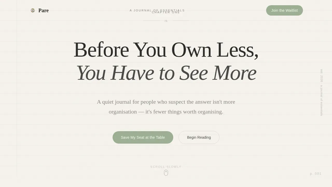
The hero section frames the viewport as a physical book page. A small serif label reads "Chapter One" at the top. A generous display headline sits beneath it. A faint paper texture fills the background. There is no hero image, no photography, and no dark background competing for attention. The value proposition is delivered through typography alone, making an immediate emotional impression within the first five seconds of the visit. This approach reflects one of the most effective principles in landing page design: that a compelling hero section communicates the value proposition clearly, even without high quality visuals.
Dawn-to-Dusk Narrative Scroll
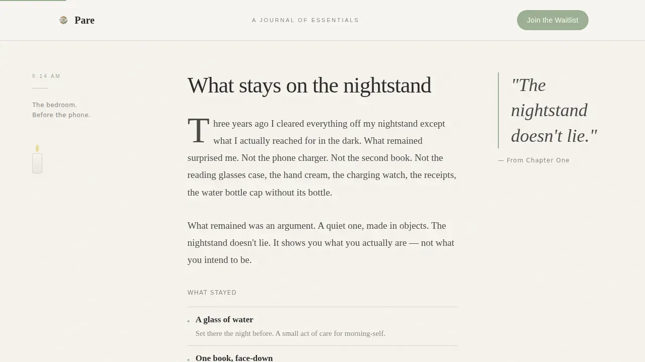
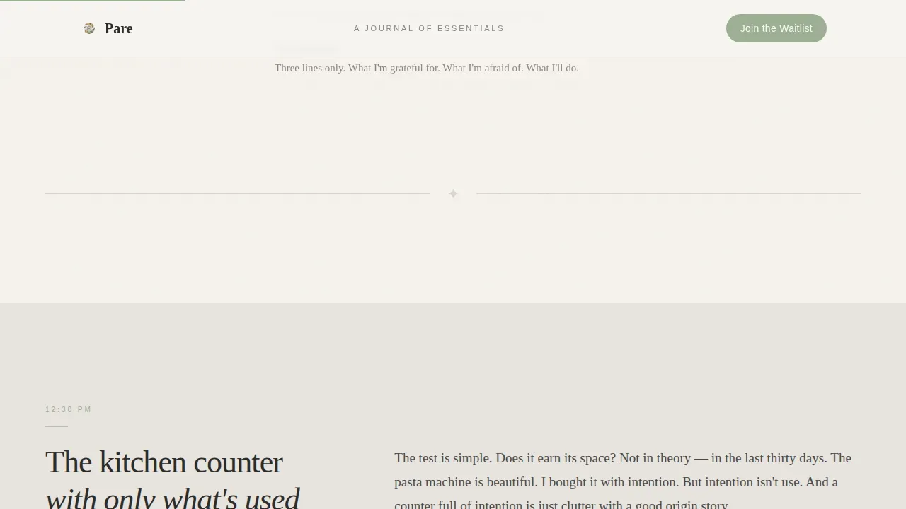
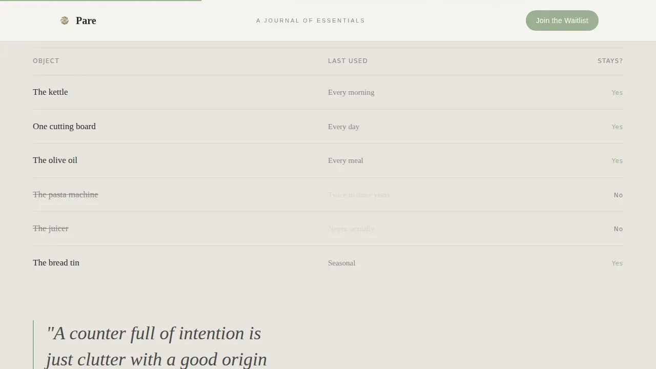
The page unfolds as a day-in-the-life story. Morning, midday, afternoon, and evening each occupy a distinct section with its own editorial tone. Morning focuses on nightstand intimacy. Midday presents a kitchen counter pull-quote layout. Afternoon introduces the author's voice through a handwritten-style letter. Evening closes with a candlelit reflection and a direct question posed to the reader. This progressive disclosure technique prevents overwhelming visitors by revealing information at the right moment, which is a core principle behind effective landing pages built for emotional storytelling.
RSVP Waitlist Form with Dual Conversion Path
The conversion section appears after the evening section, when emotional investment is at its peak. The form asks only for a first name and an email address, keeping form length deliberately short to reduce friction. This minimal form placement follows the principle that shorter form length improves conversion rates. A secondary call to action offers a free essay immediately upon signup, labeled "Read Chapter Zero Now." This dual path lets prospective customers choose between waiting and receiving value right away, which is one of the most trusted patterns for lead generation on minimal landing pages.
Scroll-Linked Animation System
The template uses scroll-linked reveals and word-by-word text animations powered by a medium-intensity animation approach. Each section enters at the right reading pace, reinforcing the unhurried tone of the editorial. These interactive elements transform passive readers into active participants, matching a core principle that interactive landing pages create more memorable user experiences. Strategic call to action button behavior includes a magnetic hover effect that draws attention without demanding it.
Soft Mist Four-Color Palette
The color system uses exactly four values: warm fog (#E8E4DF), faded linen (#F5F2ED), pencil graphite (#4A4A48), and a single dried-herb sage (#9CAF94). Sage appears only on interactive moments and the waitlist button, making clear calls visually distinct without introducing visual clutter. Successful minimalist layouts maintain a limited color palette of three to four colors, and this template follows that principle precisely. The palette creates a sense of unhurried visual appeal throughout, from the main page hero down to the footer.
Extreme Minimal Footer
The footer follows a superhuman-minimal pattern: social icons and a copyright line only. No navigation links, no contact forms, no secondary menus, no other pages listed. This limited navigation approach keeps visitors focused on the single conversion goal rather than giving them a reason to leave. Limiting exit routes is one of the most consistent practices across real landing page examples built for waitlist or newsletter growth.
Page sections overview
| Section | Purpose |
|---|---|
| Chapter One Hero | Opens the journal with a book-page viewport, serif headline, and paper texture |
| Morning Nightstand | Intimate editorial prose about what stays on the nightstand at dawn |
| Midday Kitchen | Pull-quote layout exploring daily kitchen essentials and intentional curation |
| Afternoon Author Letter | Handwritten-style letter introducing the author's voice and personal credibility |
| Evening Reflection | Candlelit close with a direct question to the reader at emotional peak |
| Waitlist RSVP Form | Two-field signup card with dual path: waitlist and instant free essay |
| Minimal Footer | Social icons and copyright only, zero navigation distractions |
Design & branding system
The landing page design draws from a Heritage and Story theme interpreted through the Soft Mist color system. Every design decision reflects the philosophy of simplicity: the design of a simple living editorial landing page should declutter relentlessly and focus on quality. The result is one of the more considered minimal landing page examples in the editorial category, where white space does as much work as the words themselves.
- Typography uses Fraunces as the serif display face, Crimson Text as the body serif for long-form reading, and DM Sans for user interface labels, keeping the total font count at three purposeful choices that support rather than compete with the editorial voice
- White space is used structurally throughout the entire page, following the principle that ample white space reduces cognitive load and directs attention to the most important elements, including the value proposition and the waitlist form
- The sage accent color appears only on interactive elements such as hover states and the call to action button, ensuring clear calls are visually distinct while the rest of the palette remains calm and warm
Mobile & speed optimization
Mobile optimization is essential for landing pages because many visitors browse on phones, including during commutes, quiet evenings, and weekend decluttering sessions. Pare is built desktop-first with complete mobile adaptation so the long-form editorial narrative reads cleanly on every screen size. Mobile responsiveness is not an afterthought here; it is part of the template's conversion logic.
- The scroll-linked animation system adapts to mobile devices so that section reveals and word animations perform correctly across screen sizes, maintaining the visual hierarchy that guides readers through the narrative on any device
- Touch-friendly form elements, large call to action buttons, and a short form length ensure that mobile optimization extends all the way to the conversion moment, keeping the signup experience frictionless on small screens
- Content prioritization on mobile follows the same editorial sequence as desktop, preserving the dawn-to-dusk narrative order without collapsing or hiding key sections, which supports consistent conversion rates across traffic sources
How this template helps you convert
An effective landing page guides visitors down a frictionless path to a single, clear action through strategic design, persuasive copy, and social proof. Pare applies each of these principles in a way that matches the minimalism niche, where trust is built through restraint rather than volume.
- The day-in-the-life narrative structure builds emotional connection section by section, so by the time the waitlist form appears, the reader already feels like they know the author. This approach replaces traditional social proof formats like video testimonials or security badges with something more intimate: editorial credibility earned through specific, personal writing that speaks directly to the reader's own experience of accumulation and exhaustion.
- Strategic call to action placement ensures the waitlist form arrives at the precise emotional peak, after the evening reflection section poses a direct question to the reader. This is a textbook example of strategic call to action placement: the conversion goal appears only when the visitor is most ready to act, not before. Clear calls are present throughout the scroll as well, so readers always know where the page is heading.
- The dual conversion path reduces hesitation by giving before asking. Offering a free essay immediately upon signup means prospective customers who are not ready to wait still receive value, which keeps conversion rates healthy even among visitors who are cautious about joining a waitlist. This approach helps convert visitors who would otherwise leave without taking action.
Other information about this template
Pare is a good fit for creators who want to generate leads for an editorial journal or newsletter through organic search, paid ads, or social traffic. The landing page template is designed for a single traffic source strategy as well as broader multi-channel campaigns. Because the page focuses on one conversion goal, it performs consistently whether visitors arrive from organic search, paid ads, or a direct link shared on social media.
- The pare intentional simple living editorial landing page template is built for the minimalism and simple living niche, making it a relevant choice for creators who want landing page design that reflects their editorial identity rather than a generic commercial template
- Landing page templates like Pare can serve as landing page inspiration for creators exploring how minimal landing pages can carry emotional weight without relying on eye catching images, a dark background, or heavy visual content
- Web developers and non-technical creators alike can use this template as a starting point; landing page creation tools that support drag and drop editing make it straightforward to adapt the sections, swap the copy, and adjust the palette without deep coding skills
- For creators tracking performance, many landing page tools offer analytics integration and some support connection to platforms like Google Analytics so conversion goals can be tracked from the first visitor onward
- The template is a useful reference among real landing page examples in the editorial and personal blog category, offering a clear study in how form placement, form length, and persuasive copy interact in a minimal landing page context
- The page is intentionally built without contact forms beyond the waitlist, without other pages linked from the footer, and without a main website navigation bar, which keeps the entire site experience contained to a single focused flow
- Creators who have looked at best landing page examples in the lifestyle and editorial space will recognize the principles at work here: limited navigation, a clear value proposition, social proof through author voice rather than testimonials, and conversion rate optimization achieved through restraint rather than complexity
- The template does not include video testimonials, multi step forms, security badges, or pop up overlays by design; these elements would work against the minimal aesthetic and the intentional calm the brand requires
- For those who want one stop shop convenience, the template bundles page design, copy structure, color system, and animation behavior into a single ready-to-use package
- Semrush's landing page studies and similar industry recognition research consistently show that minimal landing pages with clear calls, short form length, and a focused value proposition outperform cluttered alternatives in conversion rate optimization tests; Pare is designed with those principles embedded in its structure
- The f pattern layout principle, which describes how readers scan content in an F-shaped path, is naturally supported by the left-aligned editorial prose and the pull-quote asymmetric layout in the midday section
- Beautiful landing pages in the personal blog and editorial category often succeed not through spectacle but through stillness, and Pare is built to be one of those beautiful websites that earns trust quietly
Theme
Heritage & Story
Creative direction
Day-in-the-Life
Color system
Soft Mist
Style
Editorial/Magazine
Direction
Waitlist/Coming Soon
Page Sections
Chapter-style Hero with Paper Texture
Dawn-to-dusk Narrative Scroll
RSVP Waitlist with Dual Conversion Path
Scroll-linked Animations and Magnetic Button
Soft Mist Four-color Palette System
Extreme Minimal Footer
Related questions
Does Pare work for someone who has never built a landing page before?
What is the single conversion goal of this landing page template?
Can I use Pare as a standalone page separate from my main website?
How does the template handle social proof without traditional testimonials?
Is the template adapted for mobile readers?



