Minimalism & Decluttering Content Professional Website Template
Pare is a hub-and-spoke landing page template built for minimalism and decluttering communities. It opens with a full-viewport manifesto header, guides visitors through five curated gallery spokes, and converts them through an inline seven-question Clutter Score Quiz. The Parchment and Rust color system and generous negative space make embracing minimalism feel quiet, intentional, and inviting.
by Rocket studio
Quick summary
Pare is a single-page, anchor-navigated landing page template designed for a minimalism and decluttering online community. It leads with a serif manifesto statement set against a warm parchment field, guides visitors through five gallery-style spokes covering Kitchen, Wardrobe, Digital Life, Sentimental Objects, and Finances, and converts them through a calm inline quiz experience that captures an email at the results screen.
Who this template is for
This template is built for community founders, content creators, and educators who teach intentional living. It speaks directly to the people who most need a structured path toward embracing minimalism: those whose house, car, and closets feel beyond their control.
- Overwhelmed new parents whose kids have filled every room with piles of plastic stuff and boxes of outgrown clothes
- Recently divorced professionals rebuilding life from one suitcase, deciding what to sell, store, or release
- Remote workers whose home office crept into every space until no room felt like rest, and general minimalism enthusiasts ready to commit to a minimalist lifestyle
What problem this template solves
Most community landing pages feel like the house they are trying to fix: too much stuff, no clear path forward. Visitors arrive feeling the weight of clutter and leave without taking a single step because the page overwhelmed them before the community could help.
- No clear entry point: People feel it is impossible to know where to start, whether with clothes, closets, finances, or the car
- No emotional resonance: Generic pages sell features; this template sells the feeling of a drawer that closes without force, earning trust before asking for an email
- No conversion rhythm: Without a structured quiz or secondary resource path, interested visitors leave without any commitment, and the community loses the moment
What you get with this template
You get a fully designed, section-complete landing page template ready to customize with your own photographs, member quotes, and community branding. Every component reflects the philosophy it teaches: nothing is here without a reason.
- Eight purpose-built sections from the manifesto hero through the One-Shelf Library secondary call to action, each mapped to a specific conversion stage
- An inline seven-question quiz that walks visitors through photo-choice cards and a range slider before displaying a scored result inside a circle, then gently requests a name and email
- A secondary low-commitment path via the One-Shelf Library, a curated reading list download that collects an email through a quieter form for visitors not yet ready for the quiz
Feature list
This template brings together five specific capabilities. Each one is grounded in the source brief and serves a distinct purpose in the visitor journey.
Hub-and-Spoke Anchor Navigation
A thin horizontal navigation rail sits fixed at the top of the page. It displays five one-word labels: Kitchen, Wardrobe, Digital Life, Sentimental Objects, and Finances. The active spoke is underlined in rust, so the navigation itself models the editing principle the community teaches. Visitors can jump directly to the spoke most relevant to their life right now, whether that is a wardrobe full of clothes they never wear or closets packed with boxes they have not opened in a season.
Manifesto Hero Header
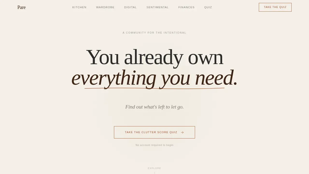
The hero is a full-viewport parchment field holding a single serif manifesto line: "You already own everything you need." A thin rust underline draws itself left to right beneath the statement. Below it, a smaller charcoal line reads: "Find out what's left to let go." The emptiness of the viewport performs the philosophy before a single word of copy explains it. The primary call to action, "Take the Clutter Score Quiz," appears immediately below in rust on a parchment button with a hairline border.
Gallery-Style Spoke Sections
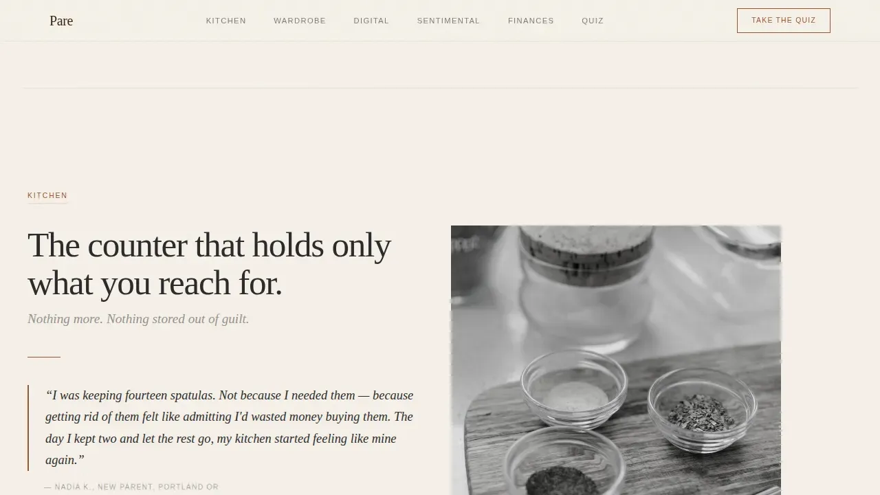
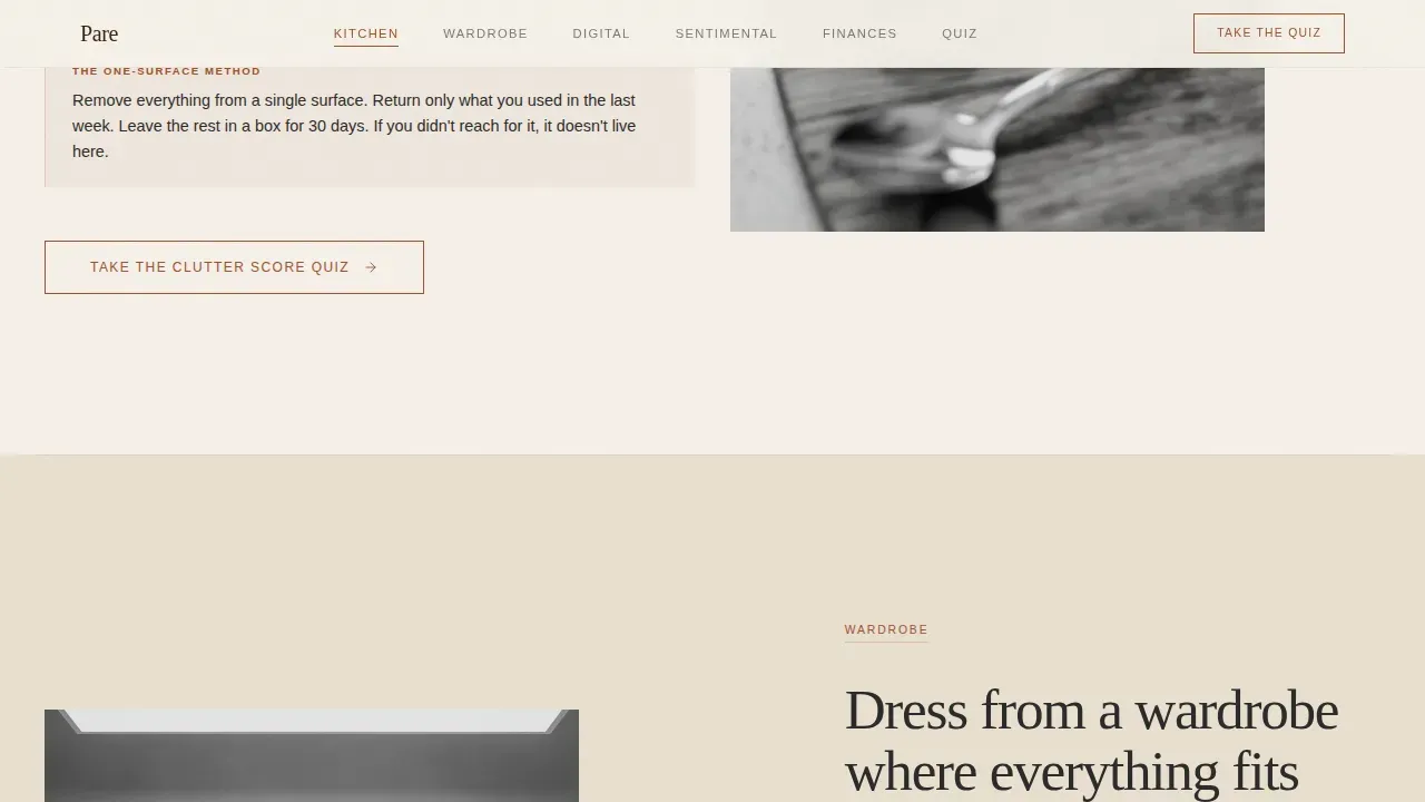
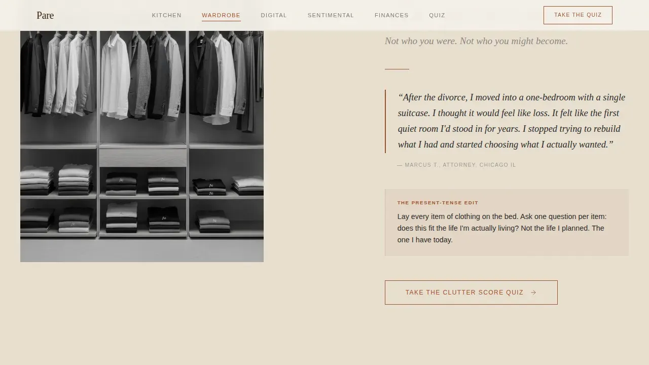
Each of the five spoke sections presents one facet of community life as if it were a room in a gallery. Scrolling within a spoke reveals a single large photograph of a pared-down space, a member quote in italic serif for social proof, and one actionable principle. Generous padding between elements forces the eye to rest and gives each idea the space to land. The rhythm is slow and deliberate, creating the sense of turning a page in a monograph rather than scrolling a feed. The quiz call to action resurfaces at the bottom of every spoke, so the invitation to take the Clutter Score Quiz is always within reach without ever feeling pushy.
Inline Seven-Question Clutter Score Quiz
The quiz opens inline rather than in a modal, preserving the page's calm atmosphere. Seven questions appear one per screen. Each question asks the visitor to choose between two photographs, the cluttered version and the pared version, then rate how their own space compares on a simple one-to-five slider. No email is required until the results screen, where the score appears as a single number inside a circle. The prompt then reads "See your personalized decluttering path" with a name and email field. This sequence respects the visitor's time and mirrors the community's philosophy of earning trust before asking for anything.
One-Shelf Library Secondary Path
Not every visitor is ready for a quiz. The One-Shelf Library gives them a quieter entry point: a curated reading list that reflects the life-changing depth of the community's content. An email capture form sits beneath the list, lower in commitment than the quiz results screen. This secondary path ensures that visitors who want to browse free resources before committing still leave a contact detail, giving the community two distinct conversion channels without adding visual noise to the page.
Page sections overview
| Section | Purpose |
|---|---|
| Manifesto Hero | Opens with serif quote, rust animated underline, and primary quiz call to action |
| Kitchen Spoke | Gallery photo, member quote, actionable principle, quiz call to action |
| Wardrobe Spoke | Gallery photo, member quote on clothes and closets, quiz call to action |
| Digital Life Spoke | Gallery photo, member quote on digital clutter, quiz call to action |
| Sentimental Objects Spoke | Gallery photo, member quote, principle on letting go, quiz call to action |
| Finances Spoke | Gallery photo, member quote on intentional spending, quiz call to action |
| Quiz Section | Inline seven-question assessment with photo cards, slider, and results screen |
| One-Shelf Library | Curated reading list with secondary email capture form |
| Footer Bar | Horizontal espresso-toned footer bar |
Design & branding system
The visual identity follows a Luxe Minimal theme. Every color choice feels like something unnecessary was removed to arrive at it, which makes the palette itself a statement about embracing minimalism.
- Color system: Warm parchment (#F5F0E8) as the dominant background, muted rust (#A0522D) for primary accents and active navigation states, charcoal ink (#2B2B2B) for body text, sun-bleached linen (#E8DFD0) for alternating section fills, and a single deep espresso (#3C2415) anchoring the footer and header bars
- Typography: Fraunces display serif for headlines and manifesto lines, DM Sans for body text, creating a pairing that feels like a well-curated monograph
- Animation and interaction: Medium animation with SVG stroke draw on the rust underline, fadeUp stagger on scroll reveals, grayscale hover states on gallery images, and scroll-triggered section reveals that give the page a page-turning quality
Mobile & speed optimization
The template is designed desktop-first with a clear priority on excellent mobile adaptation. The single-column spoke layout and fixed anchor navigation translate naturally to smaller screens without losing the generous spacing that defines the design.
- Static-first build: The template uses static rendering as the default, with client-side components reserved only for the quiz interaction and navigation active-state tracking, keeping the initial load light and the experience smooth
- Responsive spoke layout: Each gallery spoke collapses gracefully on mobile, maintaining the photograph-quote-principle rhythm without crowding; closets, wardrobe details, and piles of clothes render cleanly at any screen width
- Fixed anchor nav on mobile: The thin navigation rail remains accessible at the top of the screen across all devices, so visitors can always pull themselves back to any spoke without losing their place
How this template helps you convert
The Pare template is built around a single, clear conversion goal: quiz completion followed by email capture. Every design decision serves that goal without rushing the visitor.
- The hero earns attention before asking anything: The manifesto header and its breathing negative space make visitors feel understood. By the time they see "Take the Clutter Score Quiz," they are already curious, not defensive. The first thing a visitor does on this page is exhale.
- The spoke structure builds trust incrementally: Each gallery section offers value, a beautiful photograph, a real member quote, and one practical principle, before the quiz call to action reappears. Visitors who scroll through even one spoke are more invested than visitors who hit a single wall of text. The One-Shelf Library then catches anyone who needs one more reason before sharing their email.
Other information about this template
This section covers additional context that may be useful for builders and community operators considering the Pare template.
- Frugal minimalism alignment: The community model this template supports is rooted in intentional consumption. Frugal minimalism promotes the idea of "thing in, thing out," meaning every new item that enters the house should prompt letting go of an old one. The Finances spoke reflects this directly, addressing the desire to spend less by owning less. Frugal minimalism can help members save money by focusing on what is truly essential rather than filling closets with stuff bought out of fear or habit.
- Method compatibility: The template's category-by-spoke structure aligns well with approaches that encourage decluttering by category rather than location, such as working through clothes and wardrobe items before moving to sentimental objects and finances. This mirrors the principle that organizing items by category can simplify daily decisions and reduce stress over time on a daily basis.
- Emotional transformation arc: Minimalism can lead to improved mental health by reducing anxiety and stress associated with clutter. Living a minimalist lifestyle can enhance clarity of thought by eliminating emotional clutter. The Pare template structures this transformation arc visually: the visitor arrives overwhelmed and leaves with a score, a path, and a community. Decluttering can create a sense of freedom and empowerment, allowing people to focus on what truly matters in their lives.
- Mindful consumption focus: Communities focused on curated minimalism often share techniques for mindful consumption, digital detoxing, and maintaining a clutter-free life. The Digital Life spoke addresses this directly, making the template relevant beyond physical closets and clothes piles.
- Wardrobe and clothing depth: Minimalist fashion emphasizes simplicity and elegance in clothing choices. Creating a capsule wardrobe can simplify daily outfit decisions and make packing for trips far less stressful. Organizing a wardrobe by category, color, or season can streamline the process of selecting outfits each morning. The Wardrobe spoke gives members a space to talk about shirts, pants, and the clothes they wear on rotation versus the clothes that sit unworn for a full season.
- Vision statement principle: Marie Kondo's method emphasizes the importance of a vision statement for successful decluttering. A vision statement can help guide the process of creating a minimalist space by clarifying personal goals. The manifesto hero header functions as a collective vision statement for the entire community, giving every visitor a shared north star before they engage with any spoke.
- Social proof integration: A curated minimalism landing page should include social proof such as short testimonials from current members to build trust. Every gallery spoke includes an italic serif member quote, so social proof is distributed across the page rather than concentrated in one section that visitors might scroll past.
- Curated minimalism philosophy: Curated minimalism emphasizes thoughtful curation over simply discarding items, focusing on creating a peaceful, functional, and personalized environment. This is the key distinction between the Pare community and a generic decluttering checklist: members are not filling trash bags at random. They are deciding with intention what to keep, what to sell, what to donate, and what truly deserves space in their home, their car, and their life.
- This is the Pare curated minimalism decluttering community landing page template, designed specifically for community builders who believe that less is not a sacrifice but a kind of relief.
- Sell, donate, or store decisions: Members frequently ask whether to sell, donate, or store items that no longer serve them. The community structure within this template creates space to post questions, share pictures of items, and get input from friends who have already been through the process. The idea of maintaining a tight inventory of possessions reminds members that every item they decide to store still costs them attention and space.
- Kids and family: Families with kids face unique clutter challenges. Toys fill boxes faster than they can be emptied. Clothes are outgrown before they are worn out. Intuitive storage helps family members, including kids, find their belongings without assistance, which reduces the daily friction of a busy house. Grouping similar items together in storage can enhance organization and accessibility for everyone in the family, making the minimalist lifestyle sustainable rather than aspirational.
- Packing and travel: A minimalist lifestyle can lead to a more enjoyable and less stressful packing experience. Members who have pared down their wardrobe realize that packing for a week away becomes effortless when their closets contain only what they actually wear. Packing boxes for a move, or packing a car for a weekend trip, feels completely different when the inventory of stuff is intentional and tight.
Theme
Luxe Minimal
Creative direction
Curated Collection
Color system
Parchment & Rust
Style
Hub & Spoke (Anchor Nav)
Direction
Quiz/Assessment
Page Sections
Hub-and-spoke Anchor Navigation
Manifesto Hero Header
Gallery-style Spoke Sections
Inline Seven-question Clutter Score Quiz
One-shelf Library Secondary Path
Parchment and Rust Visual System
Related questions
Does the quiz require coding to customize?
Can I add more spoke sections beyond the five included?
Is the One-Shelf Library email form connected to a mailing list provider?
How does the inline quiz differ from a modal quiz?
Who is this template designed to attract?



