Intentional Minimalist Living Landing Page Template
Pare is an editorial-style minimalist landing page built for a decluttering and minimalism TikTok channel. It pairs a phone-frame hero reel with a manifesto spread, photo-essay grid, and a single-field email opt-in. Every section breathes with ample white space, rust-on-parchment typography, and calm, intentional pacing that mirrors the channel's philosophy of keeping only what earns its place.
by Rocket studio
Quick summary
Pare is a conversion focused, editorial minimalist landing page designed for a decluttering TikTok channel. It opens with a silent phone-frame reel, flows through a manifesto, a before-and-after photo-essay grid, and a method section, then closes with a single-field email call to action. The landing page design keeps every section intentionally spare, letting white space and bold typography do the persuading.
Who this template is for
This template is built for content creators who need minimalist landing pages that reflect a carefully considered brand identity rather than a busy promotional hub. It suits anyone whose value proposition is calm, slow, and intentional.
- TikTok creators in the minimalism and decluttering niche who want a landing page that earns clicks before visitors ever open the app
- New media publishers building a minimalist website around editorial storytelling, viewer community, and lead generation
- Independent creators launching a challenge, a zine, or a content series who need clean, conversion focused landing pages without bloated page elements
What problem this template solves
Most content creator landing pages suffer from visual clutter and overwhelming users with too many choices. They stack social links, merch banners, press kits, and pop-ups until the original value proposition disappears. Pare solves this by stripping landing pages back to essential elements only.
- Cluttered designs confuse visitors and raise cognitive load before they reach the call to action
- A missing clear value proposition means visitors scroll past without understanding what the channel offers or why it matters
- Unnecessary elements compete for users attention and pull the user flow away from the single desired action the page exists to drive
What you get with this template
You get a complete, ready-to-use minimalist landing page with six purposeful sections, each built around one idea and one goal. The template includes all layout blocks, typography settings, color tokens, and interactive elements described below.
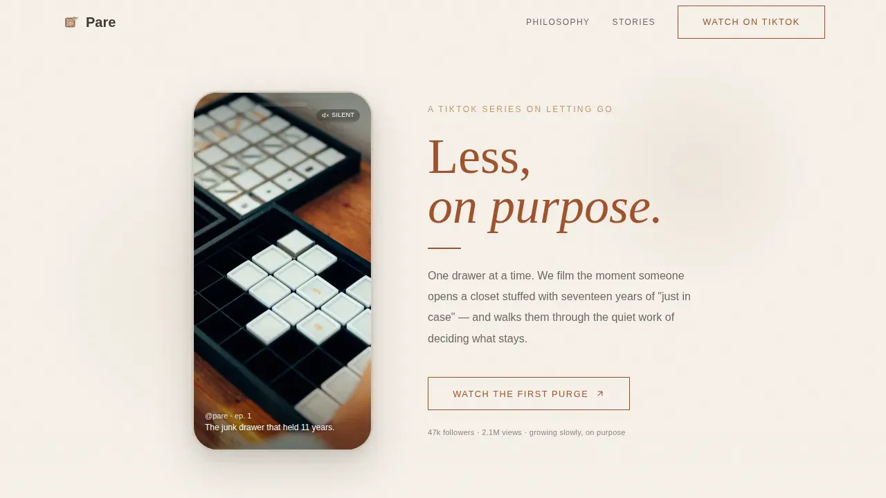
- A hero block with a phone-frame video loop area, a rust serif editorial headline, and ample white space on a parchment field
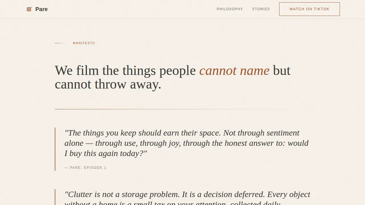
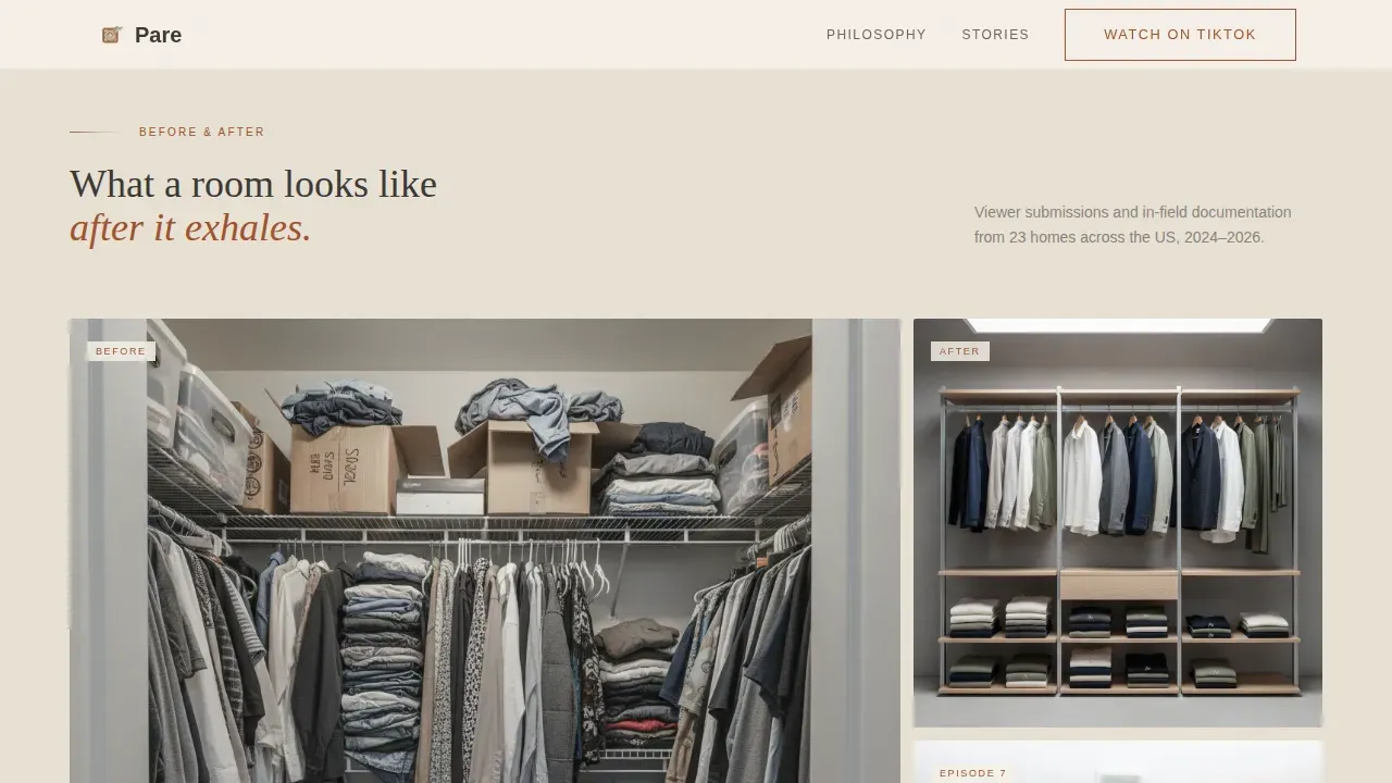
- A manifesto spread with large pull-quote typography and generous leading, followed by a bento-asymmetric photo-essay grid with viewer comment overlays
- A method and series section plus a single-field email opt-in block and an ultra-minimal footer
Feature list
Every feature in this template is designed around minimalist design principles: nothing is included unless it earns its space.
Phone-Frame Hero Reel Block
The hero opens with a tall, phone-shaped frame centered on a parchment background. Inside it, a vertical video loop area simulates a short-form reel of hands working through a drawer in slow motion. The visual element is paired with a rust-colored serif headline and wide negative space so the clear value proposition lands above the fold immediately.
Manifesto Pull-Quote Spread
Below the hero, a full-width manifesto section presents the channel's philosophy in large display type with generous leading. Bold typography and neutral backgrounds keep the section readable and emotionally resonant. This section establishes brand personality before any call to action appears, which is a key element of successful minimalist landing pages.
Photo-Essay Grid with Viewer Comments
A bento-asymmetric grid arranges before-and-after room stills alongside real viewer comments styled as editorial pull-quotes. High quality images sit in linen-toned card backgrounds. The layout uses clear visual hierarchy so social proof supports the value proposition without adding visual clutter or unnecessary elements.
Method and Series Section
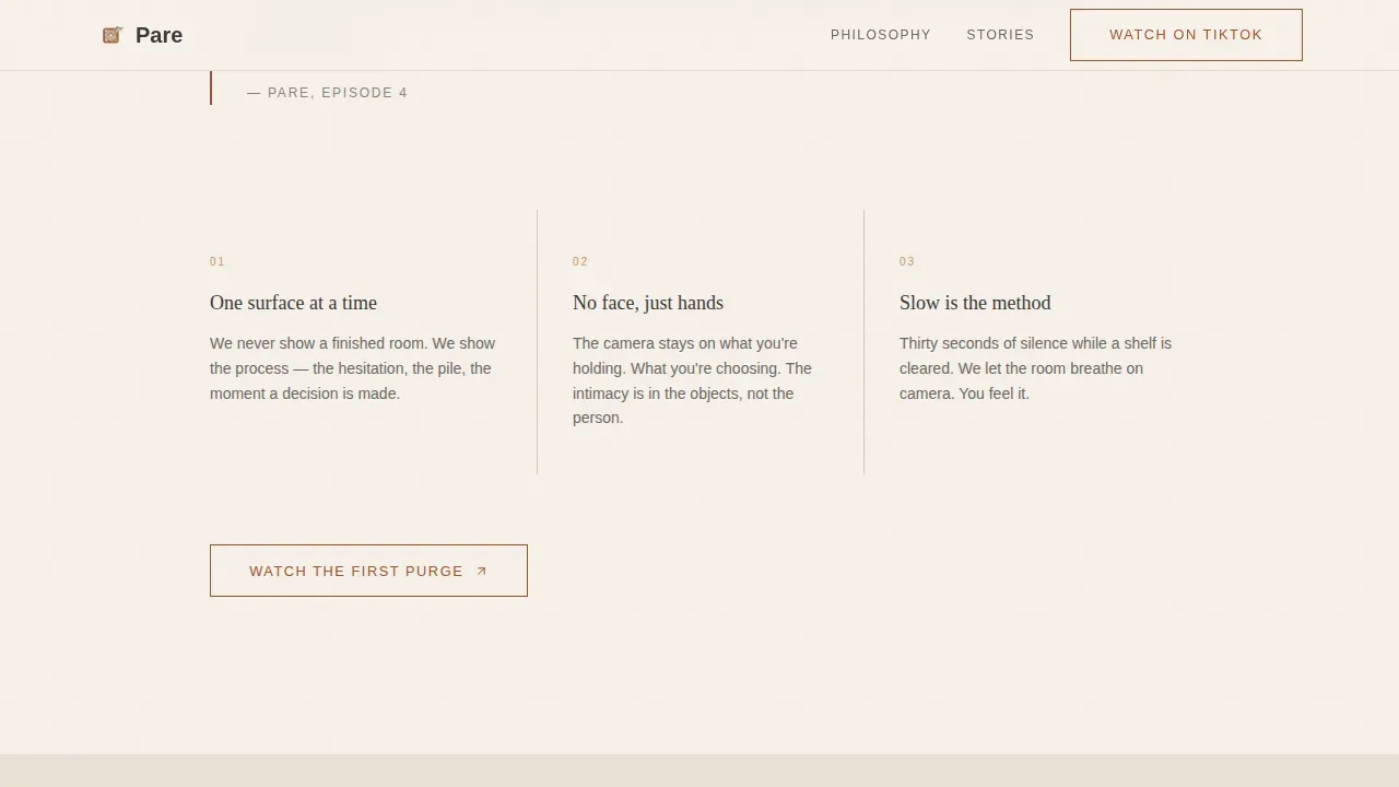
This section explains what the channel teaches, introduces the upcoming content series, and previews the 30-day challenge. The clean layout keeps essential information scannable. Each idea occupies one point on the page, preventing the section from overwhelming users with too much at once.
Dual Call-to-Action System
The primary call to action, "Watch the First Purge," appears in rust on parchment after the manifesto and again after the photo-essay grid. A secondary call to action, "Join the 30-Day Pare Down," leads to the email opt-in. This minimalist lead capture form uses a single field, because asking for less is the channel's entire philosophy.
Ultra-Minimal Footer
The footer follows a horizontal ultra-minimal pattern. It contains only essential content: no navigation bar maze, no repeated links, no decorative elements that distract from the page's single conversion goal. Fewer elements at the bottom keep the user flow clean from first scroll to final click.
Page sections overview
| Section | Purpose |
|---|---|
| Hero phone-frame reel | Introduce channel identity and deliver the clear value proposition above the fold |
| Manifesto pull-quote spread | Set the channel's philosophy and slow the visitor down intentionally |
| Photo-essay before/after grid | Provide social proof through high quality images and real viewer comments |
| Method and series block | Explain the channel's teaching approach, upcoming series, and 30-day challenge |
| Email opt-in block | Capture leads with a single-field form, the minimalist approach to lead generation |
| Ultra-minimal footer | Close the page cleanly without adding visual clutter or extra page elements |
Design & branding system
The overall aesthetic draws from a Japanese stationery shop translated into minimalist website design. Every color, typeface, and spacing decision is rationed the way the channel rations possessions. The design elements work together to create a landing page that feels like physical editorial matter rather than a screen.
- Color palette: aged parchment (#F5F0E8) as the dominant background, warm rust (#A0522D) for headlines and accent strokes, charcoal (#3B3936) for body text, and faded linen (#E8E0D4) for card backgrounds and section dividers
- Typography: Fraunces serif for display headlines with bold typography and editorial weight; DM Sans for body text with clear typography that stays readable at every size
- Spacing and texture: ample white space between every section, subtle use of negative space inside cards, and staggered scroll reveals with fadeUp animation to give each idea room to breathe
Mobile & speed optimization
The template is mobile-first by design. The TikTok audience is almost entirely mobile-native, and the minimalist landing page layout translates naturally to smaller screens without losing editorial quality. Minimalist websites tend to perform well on mobile because fewer elements mean less to reflow.
- The phone-frame hero is sized for vertical viewing on smaller screens, making the reel feel native rather than adapted
- CSS-only animations and image lazy loading keep the page light; interactive elements use hover states on desktop and tap states on mobile
- The clean layout and simple layout grid reflow gracefully across breakpoints, keeping the landing page user friendly on every device size
How this template helps you convert
Minimalist landing pages improve clarity, focus attention, and increase conversion rates by eliminating distraction. This template is conversion focused at every layer: the pacing, the typography, the call to action placement, and the form design all work toward one desired action.
- The editorial pacing slows visitors down deliberately, letting them experience the channel's brand identity before the primary call to action appears. By the time they reach "Watch the First Purge," they already feel the product. This reduces cognitive load and makes the click feel earned rather than forced.
- The single-field email opt-in reduces friction to its lowest possible point. Minimalist lead capture forms with one to three fields minimize friction and improve conversion rates. Asking for only an email address is a clear value proposition in itself: the channel practices what it teaches.
- Repeating the primary call to action after two major content sections follows proven minimalist landing page design logic. Visitors who engage with the manifesto and the photo-essay grid are warmer leads. Placing the button again at that moment keeps visitors focused on the desired action without overwhelming users with new choices.
Other information about this template
This template is a strong fit for any creator who wants to build their own minimalist landing page without starting from scratch. Pre-designed minimalist templates streamline the process and remove the decision fatigue of building from a blank canvas.
- The Pare less on purpose minimalism landing page template is a good example of how a minimalist design approach can carry strong brand personality without relying on animation-heavy or image-heavy cluttered designs
- Minimalist websites tend to load faster and require less maintenance because fewer components mean fewer things to update; this template follows that logic by keeping page elements purposeful and the codebase clean, with no unnecessary code snippets or bloated scripts
- As a perfect example of minimalist web design applied to content creation, the template demonstrates that a photography website, a creator channel page, or a broader audience editorial brand can all benefit from the same minimalist design principles: clear visual hierarchy, neutral backgrounds, a limited color palette, and one focused call to action
- Website builders and teams looking for design inspiration in the Blog and Editorial category will find that this template adapts naturally to adjacent niches while maintaining essential brand elements and a user friendly straightforward navigation experience
- The template also illustrates how successful minimalist landing pages handle social proof without visual clutter: viewer comments appear as editorial pull-quotes inside the grid, adding authority the same way companies like Apple and Squarespace use white space and product photography to guide users toward the desired action
Theme
Editorial Magazine
Creative direction
Vision & Mission
Color system
Parchment & Rust
Style
Editorial/Magazine
Direction
Click-Through
Page Sections
Phone-frame Hero with Editorial Headline
Manifesto Pull-quote Spread
Bento Photo-essay Grid
Method and Series Content Block
Dual Call-to-action and Single-field Opt-in
Ultra-minimal Footer
Related questions
Is this template suitable for content niches outside of decluttering?
Does the email opt-in form connect to a mailing list provider?
Can I customize the color palette and typography?
How does the dual call-to-action system work?
Is this landing page mobile friendly for a TikTok audience?



