Adtech Waitlist Landing Page Template
Spendguard is a split-screen adtech waitlist landing page template built for startups intercepting wasted ad spend in real time. It pairs a Feature Tab Switcher header with a Problem→Solution Arc layout, a minimal two-field signup form, and a live queue counter, all wrapped in a dark Dashboard Pro visual system designed to signal command and precision.
by Rocket studio
Quick summary
Spendguard is a single-page waitlist template for adtech startups. It uses a 50/50 split-screen layout, a three-tab interactive header, and a scrolling Problem→Solution Arc to move growth-minded visitors from skepticism to signup. The form collects work email and monthly ad spend tier, then instantly reveals a live queue position, creating urgency without requiring a credit card.
Who this template is for
This template is built for adtech founders and product teams who need to validate demand before a full launch. It speaks directly to performance marketers and growth leads who already feel the pain the product solves.
- Adtech startups collecting early-access signups before their platform goes live
- Growth leads and media buyers who manage six-figure monthly ad budgets and want smarter tooling
- Founders who need a high-trust, low-friction waitlist page that qualifies leads by spend tier
What problem this template solves
Most waitlist pages are generic. They capture emails, say "coming soon," and leave visitors with no sense of urgency or priority. For an adtech product targeting sophisticated buyers, a flat signup page destroys credibility before the pitch even lands.
- Budget-conscious media buyers need to see the product working, not just described
- A static page gives no reason to sign up now rather than later
- Generic forms fail to segment leads by value, making follow-up outreach scattered and inefficient
What you get with this template
You get a fully structured waitlist landing page designed to qualify, engage, and convert performance marketers in a single scroll. Every section is purpose-built to build trust and drive action.
- A split-screen layout with a Feature Tab Switcher header showing three animated dashboard states: Detect, Reroute, and Report
- A Problem→Solution Arc with paired columns that scroll through escalating pain points and matching product screens, resolving into a full-width dashboard panel
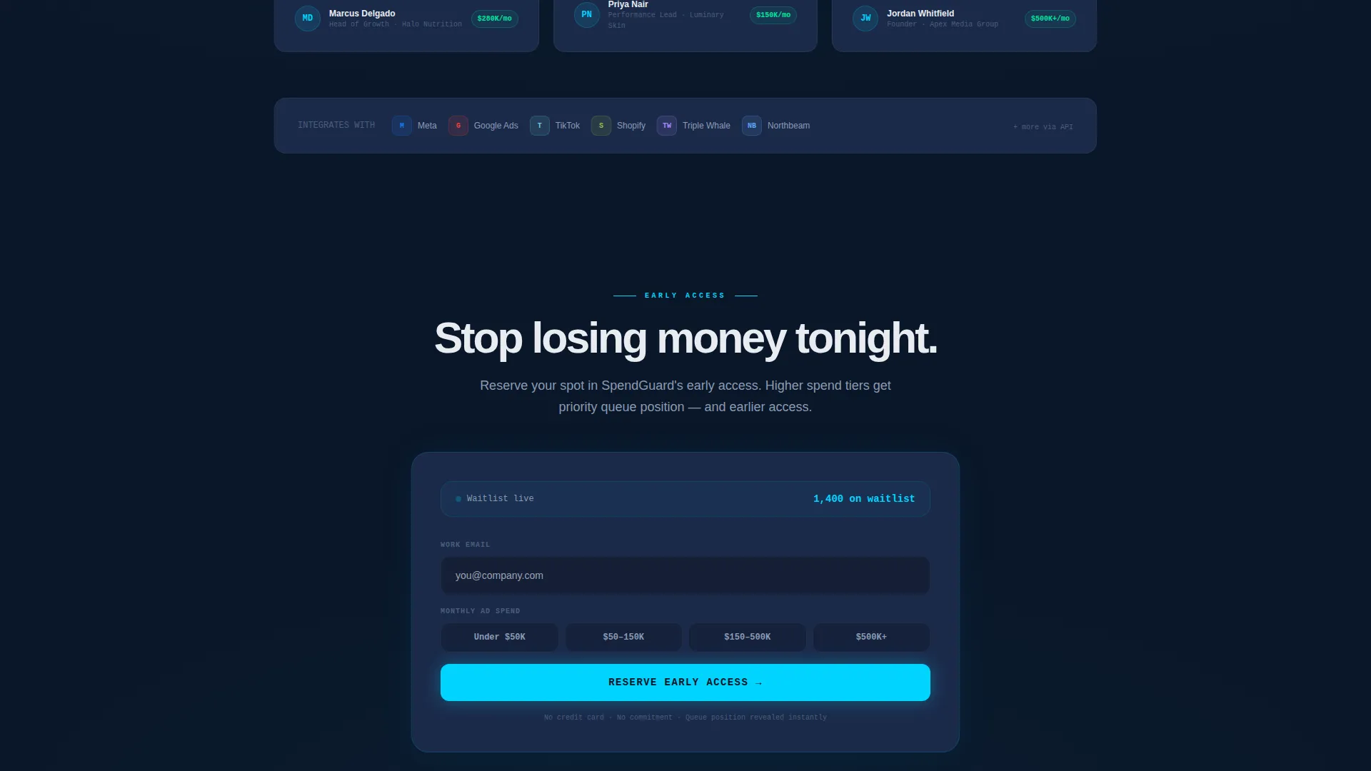
- A minimal two-field waitlist form with a four-tier spend selector and a live queue counter that reveals position immediately after submission
Feature list
This template includes a focused set of components, each designed for one job inside the conversion flow.
Animated Feature Tab Switcher
Three clickable tabs, Detect, Reroute, and Report, sit above a split viewport. The left panel shows a bold problem statement that updates per tab. The right panel displays an animated dashboard view with spend tickers, placement cards shifting from red to green, and a rising ROAS gauge needle. The page loads mid-animation so visitors arrive to movement, not a static screen.
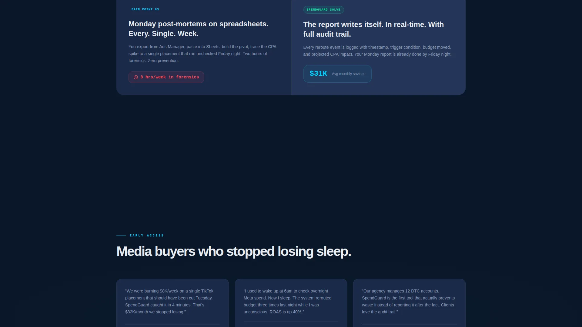
Problem→Solution Arc Layout
Below the header, the left column scrolls through escalating pain points, budget bleeding overnight, manual rules firing too late, Monday morning spreadsheet post-mortems. The right column answers each with a specific product screen showing the resolution. Tension builds row by row until both columns collapse into a single full-width panel showing the complete dashboard in a clean, all-green resting state.
Qualified Waitlist Form
The signup form is intentionally minimal. It asks for a work email and a monthly ad spend range chosen from four options: under $50,000, $50,000 to $150,000, $150,000 to $500,000, and $500,000 and above. Spend tier determines queue priority, which is displayed instantly as a live counter after submission.
Live Queue Position Counter
After form submission, visitors see their exact position in the waitlist, for example, "You're #214 of 1,400." This mechanic creates social proof and urgency simultaneously without requesting payment or personal data beyond a work email.
Pinned Early Access Call to Action
A slim top bar pins the primary call to action, "Reserve Early Access", at the top of the page throughout the scroll. The same call to action repeats at the arc's resolution point, bookending the conversion flow so no visitor reaches the end without a clear next step.
Page sections overview
| Section | Purpose |
|---|---|
| Pinned top bar | Anchors "Reserve Early Access" call to action throughout scroll |
| Feature Tab Switcher | Introduces Detect, Reroute, Report via animated split view |
| Problem row one | Surfaces overnight budget bleed pain point |
| Solution row one | Shows real-time detection screen as the answer |
| Problem row two | Highlights manual rules firing too late |
| Solution row two | Demonstrates automated rerouting product screen |
| Problem row three | Calls out Monday post-mortem spreadsheet waste |
| Solution row three | Presents reporting screen with full spend visibility |
| Full-width resolution panel | Collapses arc into one all-green dashboard state |
| Waitlist signup form | Captures email and spend tier, reveals queue position |
Design & branding system
The visual identity follows a Dashboard Pro theme built on a Midnight Blue color system. The palette is designed to feel like a professional data terminal, dark enough for extended screen time, precise enough to make critical numbers stand out at a glance.
- Background in deep terminal navy (#0A1628), card surfaces in desaturated slate (#1B2A4A), live-data accents and hover states in electric cyan (#00D4FF), and primary typography in cool white (#E8ECF1)
- Animated data elements, spend tickers, placement cards, and a ROAS gauge, reinforce the sense that the platform is actively working
- Typography and layout communicate control and precision, evoking a cockpit instrument panel where every element carries weight
Mobile & speed optimization
The template is structured for responsive display across screen sizes, maintaining the split-screen layout logic on larger viewports while adapting gracefully for mobile visitors.
- The 50/50 split-screen stacks vertically on smaller screens so problem statements and product panels remain readable
- Animated components are scoped to the header and arc sections, keeping the page structure lean for faster visual load
- The pinned call-to-action bar remains accessible at the top regardless of scroll depth or device size
How this template helps you convert
Every design and copy decision in this template is oriented toward one outcome: turning a skeptical media buyer into a waitlist signup with qualified spend data attached.
- The animated tab switcher opens with movement, so visitors immediately perceive an active, capable product rather than a concept deck, reducing the instinct to bounce before reading.
- The Problem→Solution Arc builds credibility row by row, matching each pain point to a visible product screen so buyers self-identify and feel understood before they reach the form.
- The live queue counter transforms a passive signup into a ranked position, giving buyers a concrete reason to act now and share their spend tier honestly to secure better queue placement.
Other information about this template
This template sits within the Startup and Launch category, specifically the AdTech Startup subcategory, and is optimized for the AdTech Waitlist Landing Page niche. It is a strong fit for teams using Framer, Webflow, or similar no-code tools to ship a polished pre-launch presence quickly.
- The Freemium/Trial landing page direction means the page is structured to generate leads for a free tier or early-access program, not to close a paid sale directly
- The intersection match score of 13 reflects a highly specific combination of design system, layout pattern, and conversion mechanic that suits adtech pre-launch campaigns
- The template can support a founder's pitch narrative or a growth team's internal stakeholder demo equally well, given its clear visual hierarchy and self-explanatory arc structure


Theme
Dashboard Pro
Creative direction
Problem→Solution Arc
Color system
Midnight Blue
Style
Split Screen (50/50)
Direction
Freemium/Trial
Page Sections
Animated Feature Tab Switcher
Problem→solution Arc Layout
Qualified Two-field Waitlist Form
Live Queue Position Counter
Pinned Early Access Call to Action Bar
Related questions
Can I customize the tab labels and dashboard visuals?
Do I need a developer to activate the live queue counter?
Is the signup form limited to two fields?
Who is this landing page template designed for?
Can this template be adapted for a non-adtech product?


