Book Reviews & Literary Criticism Content Advanced Booking Website Template
Spine is a literary criticism podcast landing page built for a weekly show that goes deep on one book per episode. The hub and spoke layout guides visitors through the host's full reading journey, from book selection to listener discussion, using a scrapbook editorial design that feels as personal and opinionated as a dog-eared paperback passed between friends.
by Rocket studio
Quick summary
Spine is a single-page template built for a weekly literary criticism podcast. It uses a hub and spoke anchor navigation structure to walk visitors through five storytelling stages: how a book gets chosen, how it gets heard, how it gets broken down, how listeners respond, and how to subscribe. The design feels like a well-loved reading desk, not a broadcast booth.
Who this template is for
This template is built for podcast creators who want their page to reflect the same depth and personality as their show. It works especially well for hosts whose content is driven by close reading, critical thinking, or editorial voice.
- Book review podcasters and literary criticism hosts looking for a page that earns listener trust before the first tap
- Book club organizers who want a hub where members can find discussion questions, episode notes, and subscribe links in one place
- Analytical readers and audio content creators who want a landing page that feels intimate, not promotional
What problem this template solves
Most podcast landing pages feel like placeholder pages. They list episodes and drop a few platform links, but they do nothing to pull a stranger into the world of the show. For a podcast built on critical warmth and close reading, that gap is especially damaging.
- Visitors arrive with no sense of the host's voice, the show's depth, or why this episode matters to them right now
- Generic podcast layouts lose readers who came for substance, not just a play button
- There is no natural path that moves a first-time visitor from curious to committed without forcing them to seek out more
What you get with this template
You get a fully structured, single-page hub and spoke layout that walks visitors through every stage of the Spine podcast experience. The page is built to convert literary-minded visitors into regular listeners using design details that mirror the show's intellectual warmth.
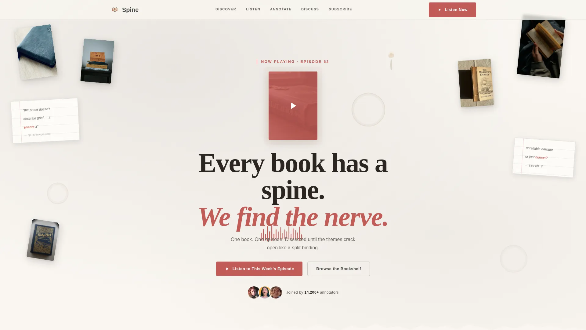
- A collage and scrapbook hero section with overlapping book covers, torn notebook pages, a waveform snippet, a pressed flower bookmark, and a serif headline layered over a reading desk composition
- Five named anchor navigation spokes, Discover, Listen, Annotate, Discuss, and Subscribe, each revealing a different stage of one episode's journey
- A fifteen-second audio clip that plays automatically on scroll, letting the host's voice do the convincing before any button is pressed
Feature list
This template ships with a set of components that are specific to how Spine tells its story. Each feature earns its place in the page layout.
Collage Scrapbook Hero
The header is built as a layered collage composition. Overlapping book covers sit at slight angles alongside torn notebook pages with handwritten episode quotes, coffee ring stains, a waveform snippet, and a pressed flower bookmark. A serif headline in pencil graphite reads "Every book has a spine. We find the nerve." A single red play button pulses gently over the latest episode's featured cover.
Hub and Spoke Anchor Navigation
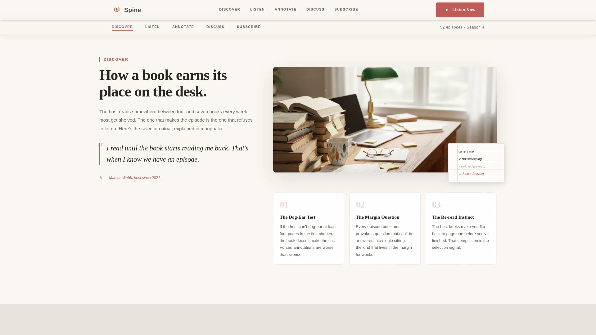
A sticky anchor navigation bar pins to the top of the page as the visitor scrolls. Five spoke labels, Discover, Listen, Annotate, Discuss, and Subscribe, each link to a named section below. Active states update as the visitor moves through the page, keeping orientation clear without interrupting the reading flow.
Scroll-Triggered Audio Autoplay
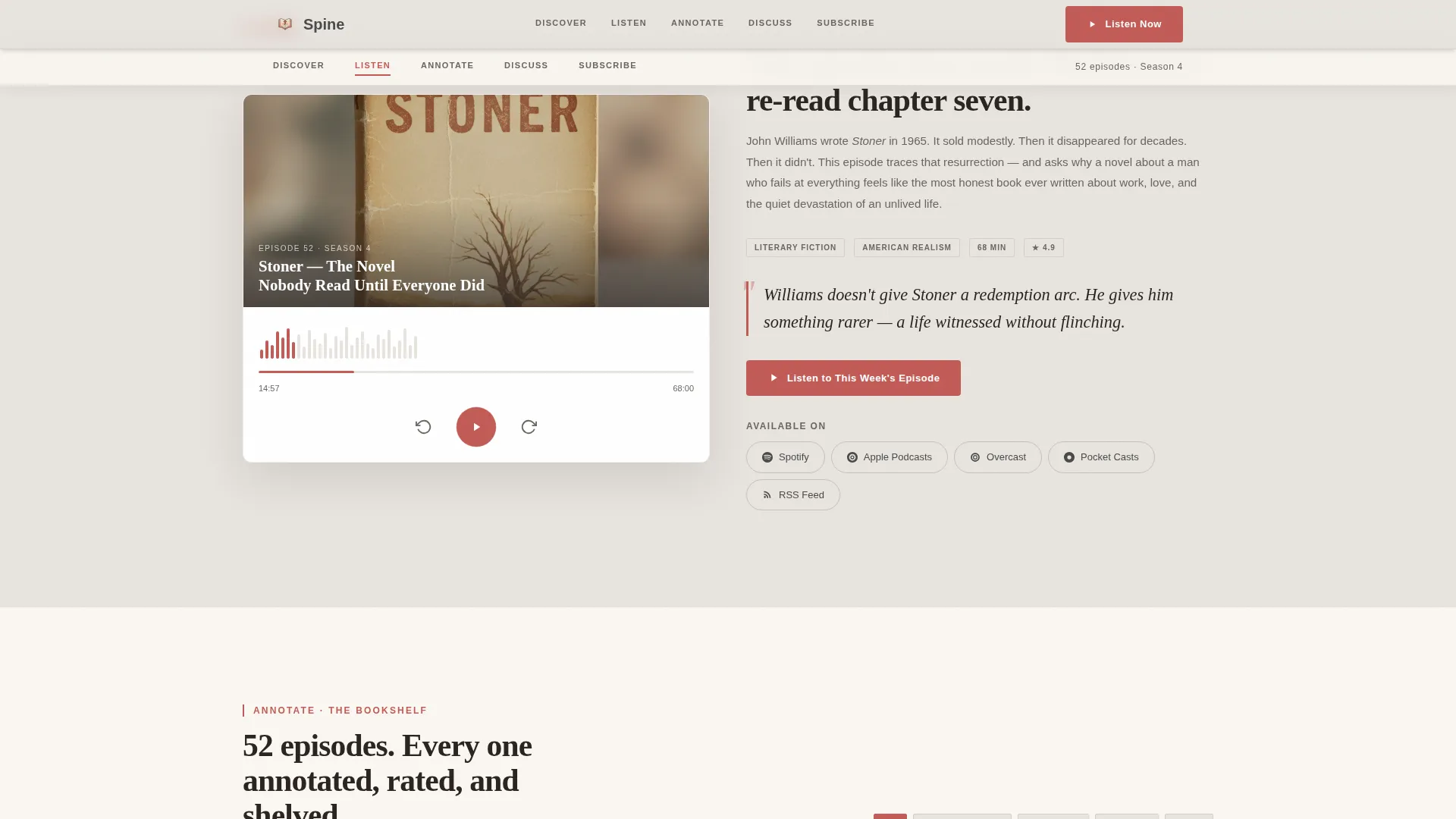
A fifteen-second audio clip is deferred until the visitor reaches the Listen section. It plays automatically on scroll, introducing the host's voice and critical tone before any manual interaction is required. This is the page's most direct conversion lever.
Episode Show Notes as Marginalia
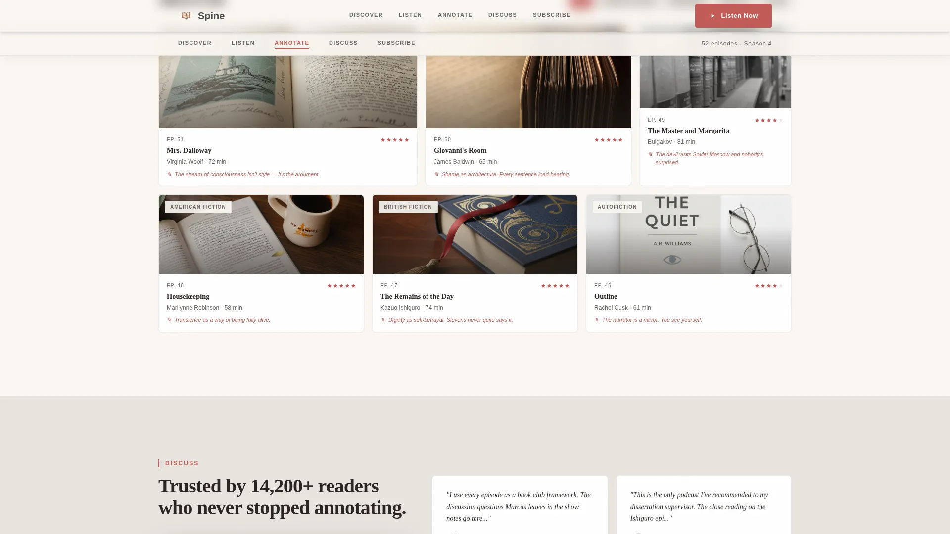
The Annotate section presents show notes in a marginalia format, styled like handwritten margin annotations alongside the episode breakdown. This keeps the template's editorial identity consistent from the hero section all the way through the content body.
Listener Discussion and Testimonials
The Discuss section surfaces listener pull quotes, star ratings, and community discussion snippets alongside curated discussion questions. This section turns social proof into reading material, which fits the audience's habit of annotating and engaging critically with text.
Platform Selector and Newsletter Subscribe
The Subscribe section presents platform links alongside a newsletter sign-up path. Visitors can choose their preferred listening platform directly from the page rather than navigating away to find it.
Page sections overview
| Section | Purpose |
|---|---|
| Hero Collage Header | Introduces the show with a scrapbook composition and a pulsing play button over the latest episode cover |
| Discover Spoke | Shows how the host selects the week's book, building personal connection before a single word of the episode is heard |
| Listen Spoke | Houses the episode player and triggers the fifteen-second audio autoplay on scroll |
| Annotate Spoke | Presents episode show notes styled as marginalia and a full episode breakdown |
| Discuss Spoke | Displays listener testimonials, discussion questions, and community response snippets |
| Subscribe Spoke | Lists platform links and the newsletter sign-up option with a clear call to action |
| Footer Pattern | Closes the page with a horizontal flow footer layout |
Design & branding system
The visual identity follows an Editorial Magazine theme built on a Soft Mist color palette. Every design choice reinforces the feeling of a quiet Sunday morning in a used bookstore, where the light comes through dusty windows and someone has already left penciled thoughts in the margins.
- Color palette: warm fog (#E8E4DF) for backgrounds, pencil graphite (#4A4A4A) for body text, aged page cream (#FAF7F2) for section surfaces, and marginalia red (#C25B56) reserved for the anchor navigation highlights, pull quotes, and play buttons
- Typography: Fraunces serif for display headlines, giving the page a literary print quality, and DM Sans for body text and interface elements, keeping readability clean at every size
- Animation and interactivity: rotated floating elements throughout the collage header, a gently pulsing play button, a waveform SVG in the Listen section, and an anchor navigation bar with active state tracking as the visitor scrolls
Mobile & speed optimization
The template is built mobile-first, reflecting the core commuter use case. Most Spine listeners reach for their earbuds on a train or bus, so the page is designed to perform and persuade on a small screen before anything else.
- Images in the collage header are lazy-loaded, so the page does not wait for every visual asset before becoming usable
- The scroll-triggered audio clip is deferred until the visitor reaches the appropriate section, preventing unnecessary load on first paint
- The sticky anchor navigation condenses cleanly for smaller viewports, keeping the five spokes accessible without overwhelming the reading area
How this template helps you convert
The page is structured around a single primary goal: get a first-time visitor to press play. Every design and copy decision builds toward that moment.
- The collage hero and the pulsing red play button create immediate visual focus on the latest episode, and the primary call to action, "Listen to This Week's Episode," appears inside the header before the visitor scrolls at all.
- The scroll-triggered audio autoplay in the Listen section lets the host's voice and critical warmth do the persuading, so the visitor is already listening before they consciously decide to.
- A secondary conversion path, the "Browse the Bookshelf" anchor link, guides visitors who want to explore past episodes by genre and rating before committing to a subscribe action.
Other information about this template
This template is categorized under Blog and Editorial, with a specific focus on Book Reviews and Literary Criticism podcast content. It is built as a hub and spoke, single-page layout with anchor navigation, not a multi-page site.
- The template style is Hub and Spoke with Anchor Navigation, following a Day-in-the-Life creative direction that threads one episode's full journey through every section
- The header concept is Collage and Scrapbook, a format that distinguishes this page from standard podcast templates that rely on clean grid layouts
- The landing page direction is Click-Through, meaning every design and copy element is oriented toward driving the visitor to the episode player or a platform subscribe link
- The target audience spans English literature graduates, book club hosts aged roughly 25 to 45, and commuters who treat audio content as a portable graduate seminar
- The footer uses a horizontal flow pattern consistent with a clean editorial close that does not interrupt the page's reading rhythm
Theme
Editorial Magazine
Creative direction
Day-in-the-Life
Color system
Soft Mist
Style
Hub & Spoke (Anchor Nav)
Direction
Click-Through
Page Sections
Collage Scrapbook Hero Section
Sticky Hub and Spoke Anchor Nav
Scroll-triggered Audio Autoplay
Marginalia-styled Show Notes
Listener Discussion Section
Platform Selector and Subscribe Path
Related questions
Who is this template designed for?
Can I use this template if I have a back catalog of episodes?
What does the scroll-triggered audio feature do?
How does the sticky anchor navigation work?
Is this template suitable for a podcast that covers multiple genres?



