Book Author & Publisher Booking Website Template
Spine is a book review landing page template built for serious readers who write long-form criticism. It uses an asymmetric 60/40 grid, an editorial magazine aesthetic rooted in Japanese Zen minimalism, and a lead generation flow that earns email signups by giving away two full reviews before asking for anything.
by Rocket studio
Quick summary
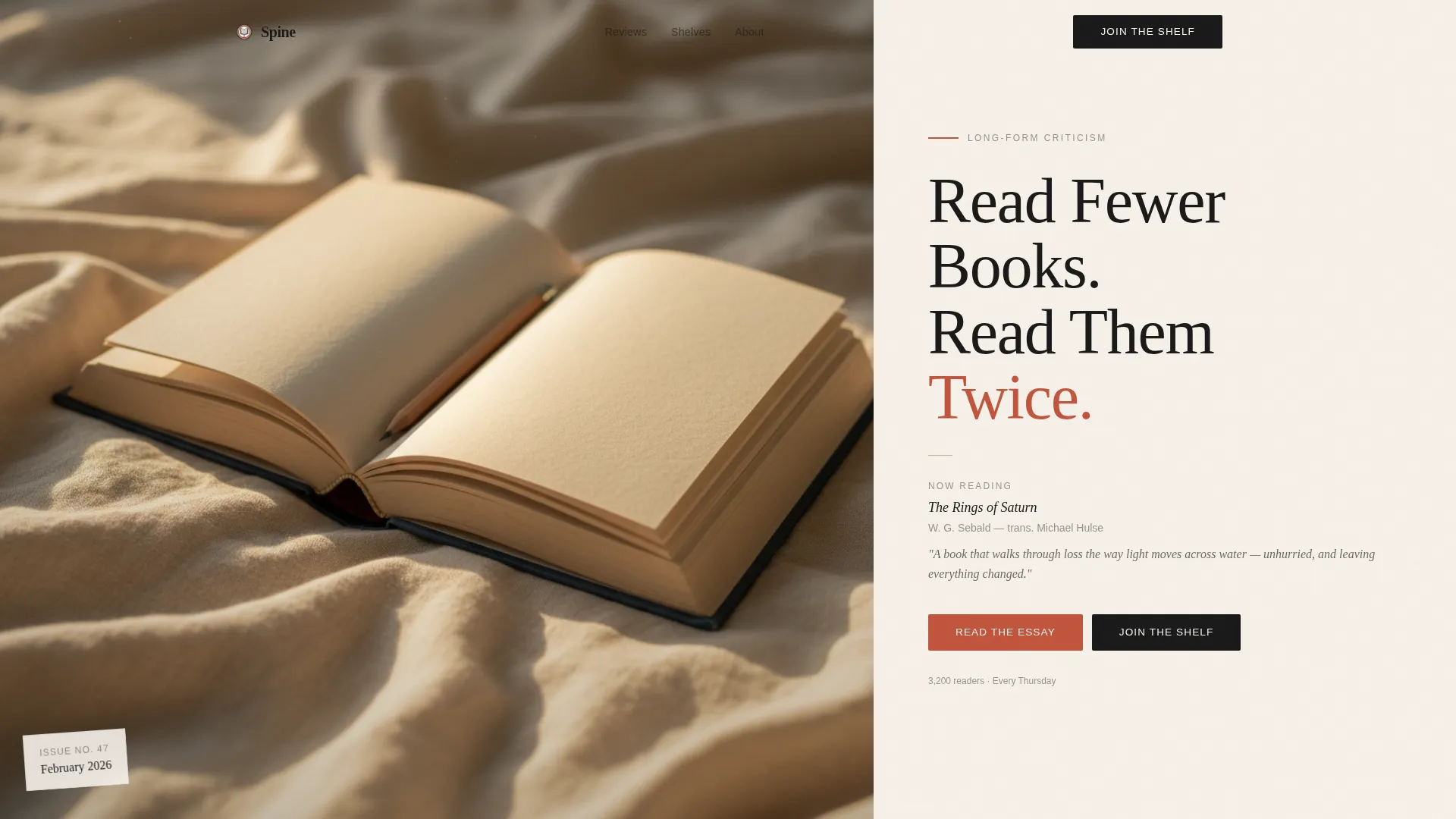
Spine is a single-page book review template designed for thoughtful literary critics and independent book bloggers. It pairs a moody half-page hero photograph with a curated mosaic of long-form reviews, three themed shelf sections, and a two-field newsletter signup. The layout is asymmetric, unhurried, and built to earn reader trust before it ever asks for an email address.
Who this template is for
This template is made for writers who take books seriously and want a home that reflects that. It suits solo reviewers, literary essayists, and small editorial projects that publish on a consistent weekly or monthly schedule.
- Independent book critics publishing long-form essays and wanting a clean, credible home base
- Literary bloggers or newsletter writers ready to grow an email list from an audience of dedicated readers
- Book club organizers or small editorial teams looking for a focused, distraction-free reading hub
What problem this template solves
Most blog templates treat every post the same. For a serious book reviewer, that sameness flattens the work. Readers who track their annual reading lists and distrust star ratings need a page that signals depth before they scroll past the fold.
- Generic blog layouts bury the writing beneath cluttered sidebars and noisy navigation
- Standard grid templates offer no rhythm variation, making long-form content feel as disposable as a listicle
- Off-the-shelf newsletter forms appear too early, before the reader has any reason to trust the writer
What you get with this template
You get a fully structured single-page layout that moves from a cinematic hero section through curated review shelves to a gentle, well-timed newsletter signup. Every component is already in place and ready for your content.
- A 60/40 asymmetric hero with a half-page photo slot and a large serif headline area
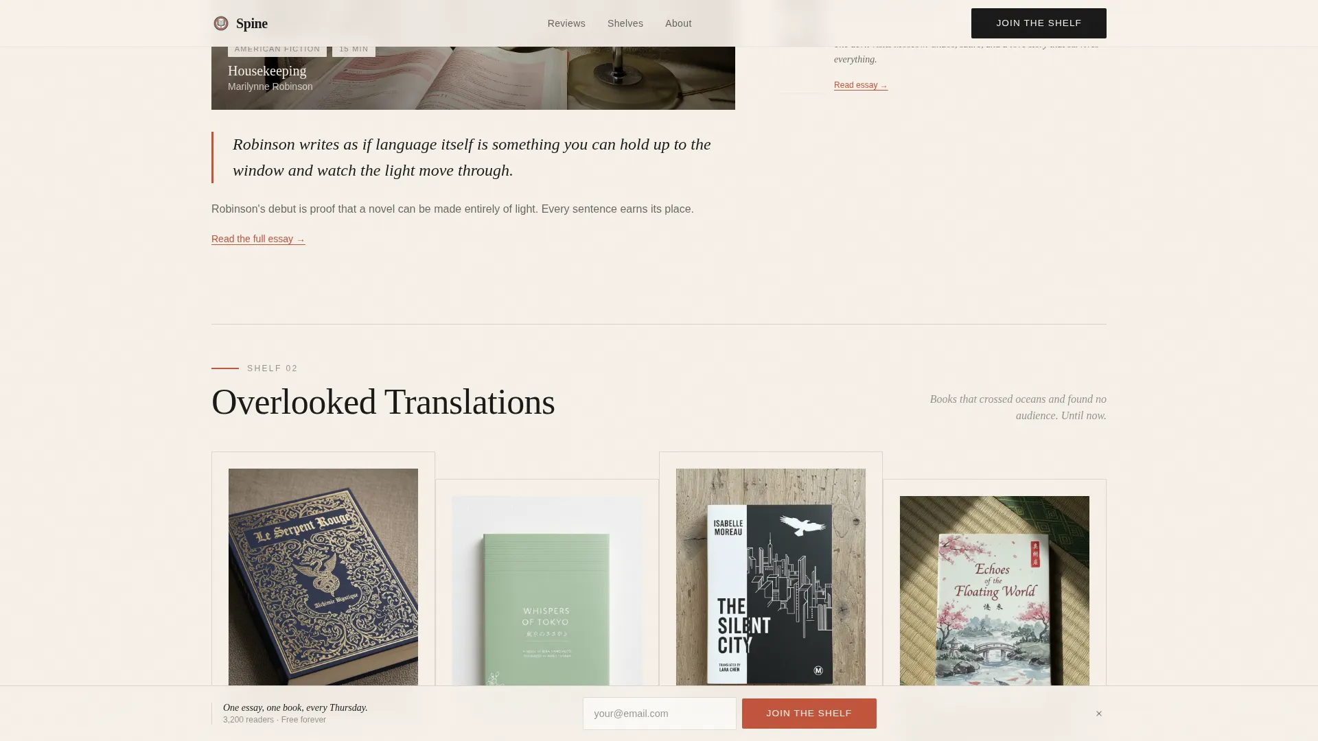
- Three named shelf sections ("Novels That Stayed," "Overlooked Translations," "Books Under 200 Pages") with alternating wide and narrow mosaic columns
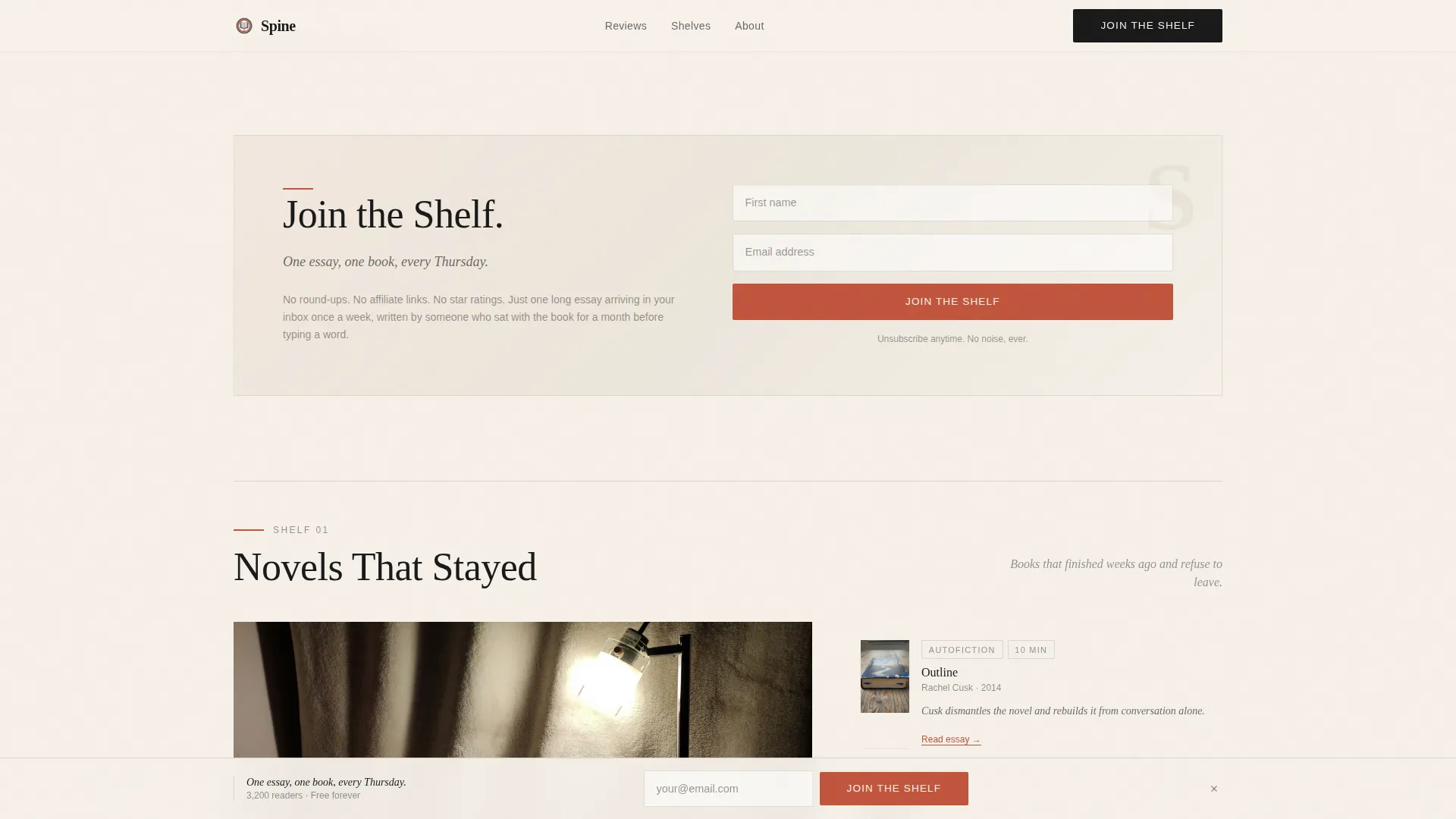
- Two lead generation touchpoints: an inline form after the second review and a fixed bottom bar that appears on scroll
Feature list
This template is built around a specific set of components described in the source brief. Each one serves the editorial tone and the lead generation goal.
Asymmetric 60/40 Grid Layout
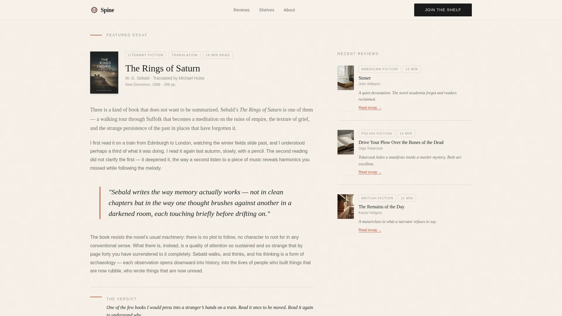
The page uses a deliberate 60/40 column split throughout. The wider column carries featured long-form reviews with generous pull quotes, while the narrow column stacks compact recent reviews with cover images, genre tags, and reading-time estimates.
Curated Shelf Sections
Three named shelves organize the review archive by theme rather than date. Each shelf section alternates between an expansive single-review spotlight and a tight mosaic cluster, so the visual rhythm never becomes predictable.
Inline and Fixed Lead Generation Forms
The primary call to action, "Join the Shelf," appears first as a gentle inline prompt after the second review. A fixed bottom bar reinforces the same form as the reader scrolls. Both forms ask only for a first name and email address.
Free PDF Gated Download
A secondary conversion path offers a downloadable PDF titled "The 12 Books That Changed How I Read." It sits behind the same two-field form, giving readers a concrete reason to sign up beyond the weekly essay promise.
Pull Quote Typography
Each featured review includes a pull quote that breaks the body text at a generous size. The persimmon accent color draws the eye and signals the emotional weight of the passage before the reader has read the full piece.
Scroll-Triggered Animations and Interactions
The hero uses a slideInBlur entrance. Subsequent sections reveal on scroll via IntersectionObserver. The header photograph supports a parallax effect. An accordion-style component handles frequently asked questions within the page.
Page sections overview
| Section | Purpose |
|---|---|
| Hero Header | Introduce the blog with a moody photo and large serif headline |
| Featured Review | Spotlight a single long-form essay with a pull quote |
| Curated Shelf One | Group reviews under "Novels That Stayed" |
| Curated Shelf Two | Group reviews under "Overlooked Translations" |
| Curated Shelf Three | Group reviews under "Books Under 200 Pages" |
| Inline Call to Action | Collect name and email after the second review |
| Free PDF Offer | Gate a downloadable PDF behind the same two-field form |
| Footer | Horizontal flow footer with essential navigation links |
Design & branding system
The visual identity draws from an Editorial Magazine theme filtered through Japanese Zen minimalism. Every color and type choice is meant to feel like a hand-bound journal resting beside a ceramic cup of matcha: unhurried, stripped down, and completely intentional.
- Four-color palette: washi paper cream (#F5F0E8) as the background, sumi ink black (#1A1A1A) for primary text, tatami warm beige (#C4B6A0) as a muted supporting tone, and persimmon (#C1553D) reserved for links, pull quotes, and call-to-action elements
- Typography pairing: Fraunces serif for all headlines, large and loose-tracked; DM Sans for body text and interface elements
- Whitespace is used structurally, widening between shelf sections like the white space between chapters, so each collection has room to land
Mobile & speed optimization
The template is designed desktop-first to match how serious readers tend to engage with long essays. Full mobile support is included so the layout holds up on any screen size.
- Server Components handle static content to minimize the JavaScript load on the page
- Animations are kept at a medium weight: slideInBlur on the hero, scroll reveals via IntersectionObserver, and a parallax photo effect on the header
- The fixed bottom call-to-action bar and the two-field forms are built to work cleanly across device sizes without layout shifts
How this template helps you convert
The lead generation strategy in this template is built on a principle of earning trust before asking for anything. The page proves the writing is worth a weekly inbox slot before the form appears.
- The template delivers two complete reviews above the inline signup form, so readers already have evidence of quality by the time they see the call to action.
- The "Join the Shelf" framing and the "One essay, one book, every Thursday" line set a specific, low-commitment expectation that makes signing up feel easy rather than risky.
- The free PDF download provides a second path to conversion for readers who want something immediate, using the same minimal two-field form so there is no extra friction.
Other information about this template
This template is a strong fit for book review blogs that publish on a regular cadence and want to grow a direct email relationship with their readers. A few additional details worth knowing:
- The page is localized for English-language content and uses the US date format
- The footer follows a horizontal flow layout (Pattern 3) with standard navigation links
- The template style is classified as an Asymmetric Grid (60/40) under the Editorial Magazine theme
- The color system is defined as Japanese Zen, with each palette choice tied to a specific function in the layout
- The creative direction follows a Curated Collection approach, designed to feel like browsing a bookshop table arranged by a trusted owner
- The header concept is a Half-Page Photo and Text composition, with the photo occupying the left 60% and the headline space on the right 40%
Theme
Editorial Magazine
Creative direction
Curated Collection
Color system
Japanese Zen
Style
Asymmetric Grid (60/40)
Direction
Lead Generation
Page Sections
Asymmetric 60/40 Grid Layout
Curated Shelf Sections
Inline and Fixed Lead Generation Forms
Free PDF Gated Download
Editorial Pull Quote Typography
Scroll-triggered Animations
Related questions
Can I change the review shelf names to match my own categories?
Does the template include a working newsletter signup form?
Can I remove the free PDF download section if I do not need it?
Is this template a good fit for reviewers who publish less than weekly?
What page type is this template, and how many pages does it include?



