Craft & Hobby Blog Specialist Pre-Launch Website Template
Spread is an editorial-style waitlist landing page built for a bullet journaling and planning online community. It pairs a massive serif headline, a curated gallery walk of journal spread photography, and a minimal waitlist form to turn analog planners into early members. The design feels like a fresh, unhurried notebook page waiting for the first mark.
by Rocket studio
Quick summary
Spread is a single-page waitlist landing page for an analog planning community. It opens with a giant centered serif headline, moves through a full-bleed gallery of journal spreads with editorial captions, and closes signups with a floating call-to-action form. The tone is quiet, deliberate, and magazine-precise, designed to make creative planners feel at home before the community even launches.
Who this template is for
This template is built for community founders, creative entrepreneurs, and niche content builders who are launching a product or community in the analog planning space. It works especially well for anyone who needs to gather waitlist signups before going live.
- Founders launching a bullet journaling or planning community who want to collect early interest
- Independent creators running editorial blogs or niche membership sites in the creative lifestyle space
- Anyone building a curated planning community who needs a polished pre-launch presence
What problem this template solves
Most waitlist pages feel generic and transactional. They ask for an email, show a countdown, and offer nothing in return. That approach fails creative audiences who invest emotional energy in their planning practice and need to feel something before they commit.
- Generic waitlist pages fail to communicate craft, identity, or community atmosphere
- Analog planning audiences respond to tactile, editorial aesthetics, not startup-style holding pages
- A flat form with no story gives potential members no reason to stay, share, or return
What you get with this template
This template delivers a complete, ready-to-customize pre-launch landing page. Every section is purposefully sequenced to build quiet anticipation and earn signups before a single piece of content goes live.
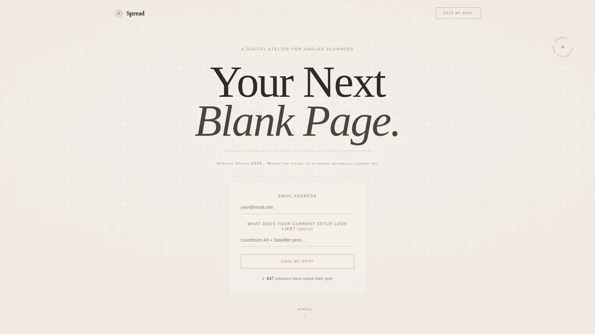
- A hero section with a giant centered serif headline, a dot grid atmosphere, and an inline waitlist form
- A Gallery Walk of full-bleed journal spread photography with magazine-style editorial captions between images
- A floating call-to-action form that reappears after the gallery, a community manifesto section, social proof with a member counter and member vignette quotes, and an extreme-minimal footer
Feature list
This template's features are grounded in the editorial and waitlist brief described above. Each one serves a specific part of the visitor journey.
Giant Centered Serif Headline
The hero opens with "Your Next Blank Page" set at extreme scale in an elegant serif typeface. A thin graphite rule sits beneath the text, mirroring the feel of a hand-ruled notebook line. Small caps beneath the headline carry the launch date and a one-line community manifesto.
Gallery Walk with Editorial Captions
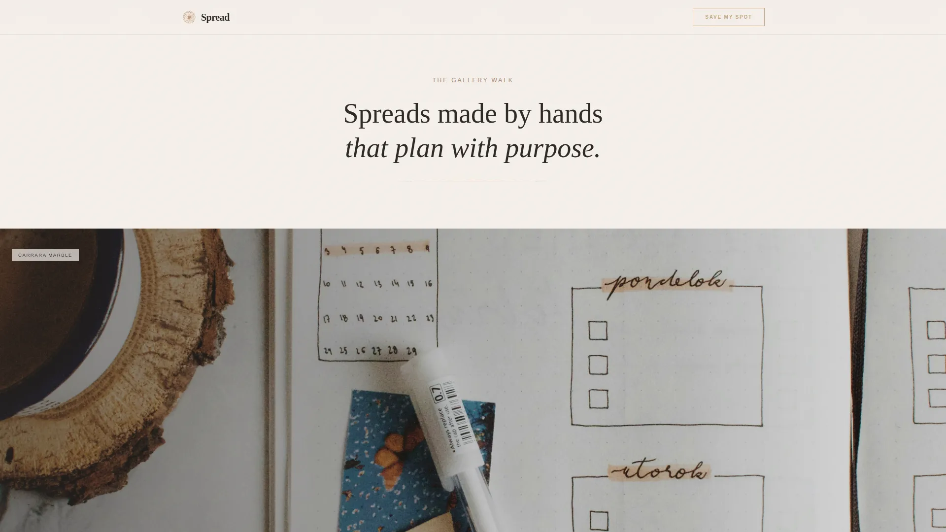
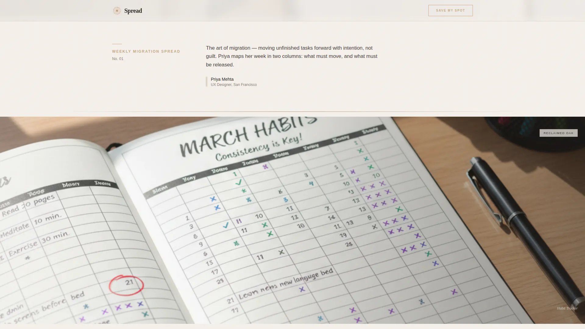
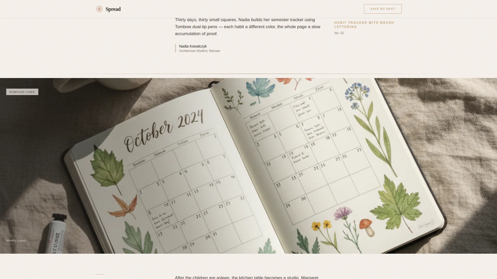
As visitors scroll, they move through full-bleed overhead photographs of open journals shot on natural surfaces. Short editorial captions in magazine-style columns appear between each image. The rhythm alternates between immersive photography and intimate text to build a quiet sense of belonging.
Dual Waitlist Forms with Soft Social Proof
The primary waitlist form sits directly beneath the hero headline. A second instance floats gently into view after the third gallery image. Both forms ask only for an email address and include one optional question inviting identity investment. A member counter below the form shows how many planners have already joined.
Community Manifesto Section
A dedicated section articulates what the community believes about intentional planning. This gives potential members a shared value anchor and helps convert curious visitors into committed early members.
Staggered Reveal Animations
Sections enter the viewport through staggered reveals. A marquee ticker, a draw-on line animation beneath the headline, and a subtle dot grid background add motion and texture without competing with the editorial content.
Extreme-Minimal Footer
The footer follows a superhuman minimal pattern, keeping the close of the page as quiet and deliberate as the opening. No visual clutter distracts from the final impression.
Page sections overview
| Section | Purpose |
|---|---|
| Hero Headline | Introduce the community and capture first waitlist signups |
| Gallery Walk | Showcase real journal spread photography with editorial captions |
| Floating Call to Action | Recapture interest with a second waitlist form mid-scroll |
| Community Manifesto | Share the community's beliefs about intentional planning |
| Social Proof | Display member counter and three member vignette quotes |
| Minimal Footer | Close the page quietly with essential links |
Design & branding system
The visual identity is built on a Luxe Minimal editorial aesthetic. Every color and type choice reinforces the feeling of a linen-covered desk with an uncapped pen resting on dotted grid paper.
- Color palette: limestone cream (#F5F0EB) for backgrounds, charcoal graphite (#2D2926) for body text, wet clay (#A68B79) for secondary text, and muted rose gold (#C4A882) reserved for the call-to-action button, hover states, and accent lines
- Typography: Fraunces serif for display headlines and section titles, DM Sans for body copy and interface elements
- Layout style: editorial magazine structure with wide-viewport photography, sparse whitespace, and hand-ruled graphite line details
Mobile & speed optimization
The template is designed desktop-first to honor the editorial grid, but mobile visitors are a core audience. The brief calls for kitchen-table and lunch-break usage, so the mobile experience is carefully considered.
- All gallery images are optimized for static delivery, with CSS-only animations to keep load behavior light across devices
- The editorial column layout adapts gracefully to narrower viewports without breaking the magazine rhythm
- The floating call-to-action form and member counter remain clearly visible and usable on smaller screens
How this template helps you convert
This template converts by earning trust before asking for anything. The design creates emotional investment through atmosphere and story, then offers a low-friction path to join.
- The hero headline and dot grid atmosphere establish the community's identity immediately, giving visitors a reason to keep scrolling before they see a single form field
- The Gallery Walk builds quiet longing by showing the craft and community that already exists, making the optional identity question in the waitlist form feel like an invitation rather than a data request
- The member counter and vignette quotes provide soft social proof that reduces hesitation, while the floating second form catches visitors who were moved by the gallery but scrolled past the first signup opportunity
Other information about this template
This template was built specifically for the bullet journaling and planning niche, where aesthetic integrity matters as much as function. A few additional details worth knowing before you customize it.
- The template uses Fraunces and DM Sans, both available as free web fonts, making customization straightforward
- The social proof counter is pre-set to display a planner count and can be updated to reflect real signup numbers as your waitlist grows
- The optional form field ("What does your current setup look like?") is designed to invite identity investment and can be edited or removed without breaking the layout
- This is a single-page, static-first template with no backend dependencies built in; connecting a form service is a separate step during your own setup
Theme
Luxe Minimal
Creative direction
Gallery Walk
Color system
Warm Stone
Style
Editorial/Magazine
Direction
Waitlist/Coming Soon
Page Sections
Giant Centered Serif Headline Hero
Gallery Walk with Editorial Captions
Dual Waitlist Forms
Member Counter and Vignette Quotes
Staggered Reveal and Draw-on Animations
Community Manifesto Section
Related questions
Can I change the headline and manifesto text?
Does this template include the journal spread photography?
How does the waitlist form collect signups?
Is this template suitable for a community that is already live?
Can I adjust the color palette to match a different brand?



