Artisan Embroidery Course Landing Page Template
Stitch is an editorial landing page template built for pre-launch embroidery and cross-stitch online courses. It pairs a magazine-style layout with a warm Ink and Paper color palette, anchor navigation, and a minimal waitlist form. The design feels like a beautifully typeset craft journal, built to attract millennial crafters, meditative hobbyists, and intermediate stitchers ready to commit.
by Rocket studio
Quick summary
Stitch is a hub and spoke landing page template designed for a premium embroidery and cross-stitch online course. It uses an editorial magazine aesthetic, a parchment and letterpress color system, and a scarcity-driven waitlist flow to turn curious crafters into founding members before the course opens.
Who this template is for
This template is built for course creators, craft educators, and independent instructors launching a needlework or textile arts program. It speaks directly to the audiences that make handcraft courses thrive.
- Instructors pre-launching a counted cross-stitch or crewelwork course who need a polished, editorial-quality waitlist page
- Millennial crafters, burned-out professionals, and intermediate stitchers who have outgrown free content and want a structured, slow-paced learning experience
- Craft educators or gift-buyers looking for a reference-quality course page that communicates depth and intention
What problem this template solves
Most course landing pages look like every other sales funnel. They rely on stock photos, generic testimonials, and pressure-heavy countdown timers. For an artisan embroidery course, that feel is a mismatch. Buyers who stitch for meditative calm need a page that reflects that calm.
- There is no editorial template built specifically for handcraft and textile course pre-launches, leaving instructors retrofitting generic builder themes that undermine their brand
- Intermediate stitchers and analog-first audiences distrust high-pressure tactics and respond better to curated storytelling, generous whitespace, and earned scarcity
- Course creators need a structured anchor navigation layout that previews modules clearly without revealing full lesson content before enrollment
What you get with this template
You get a fully structured, single-page editorial layout built around four course module clusters. Every section is designed to move a reader from curiosity to commitment without feeling rushed.
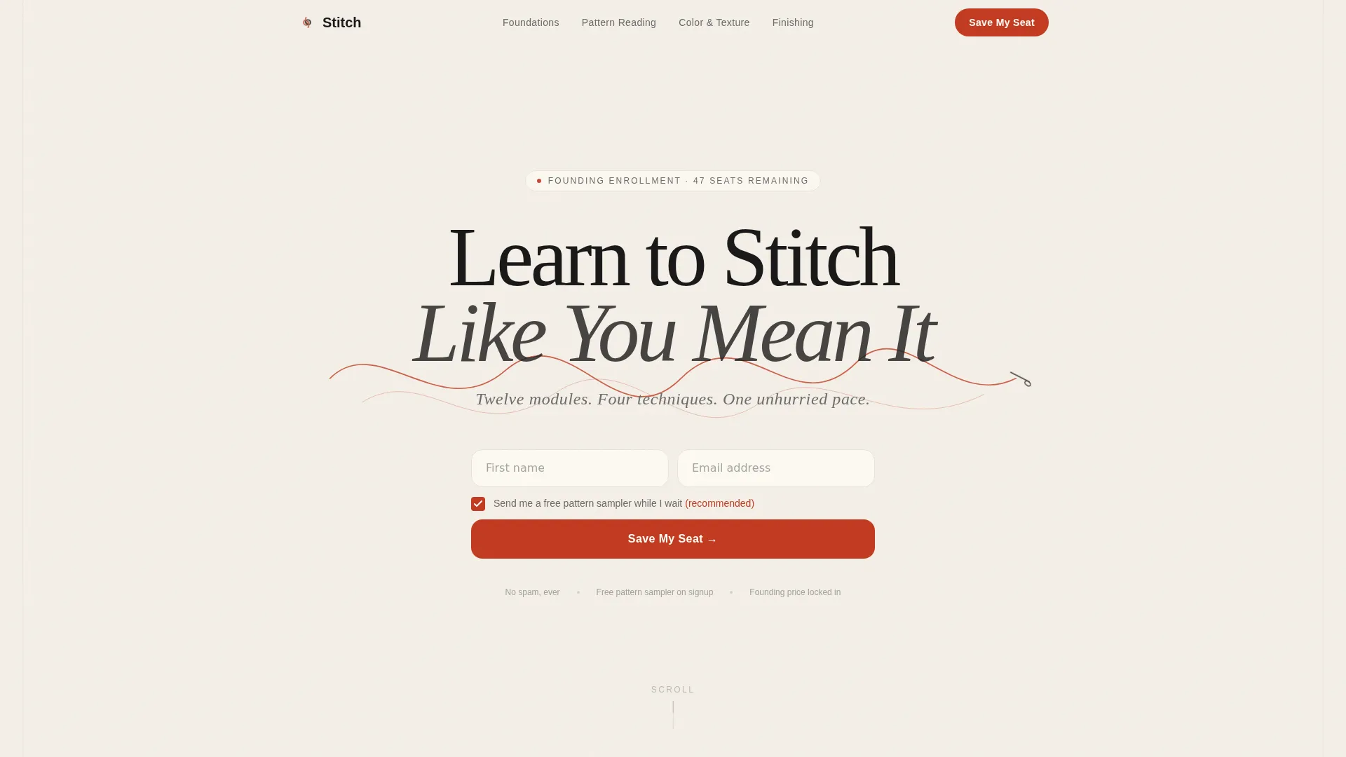
- A hero section with a giant centered serif headline, a vermillion thread SVG illustration, and a minimal first-name and email waitlist form with an optional free pattern sampler checkbox
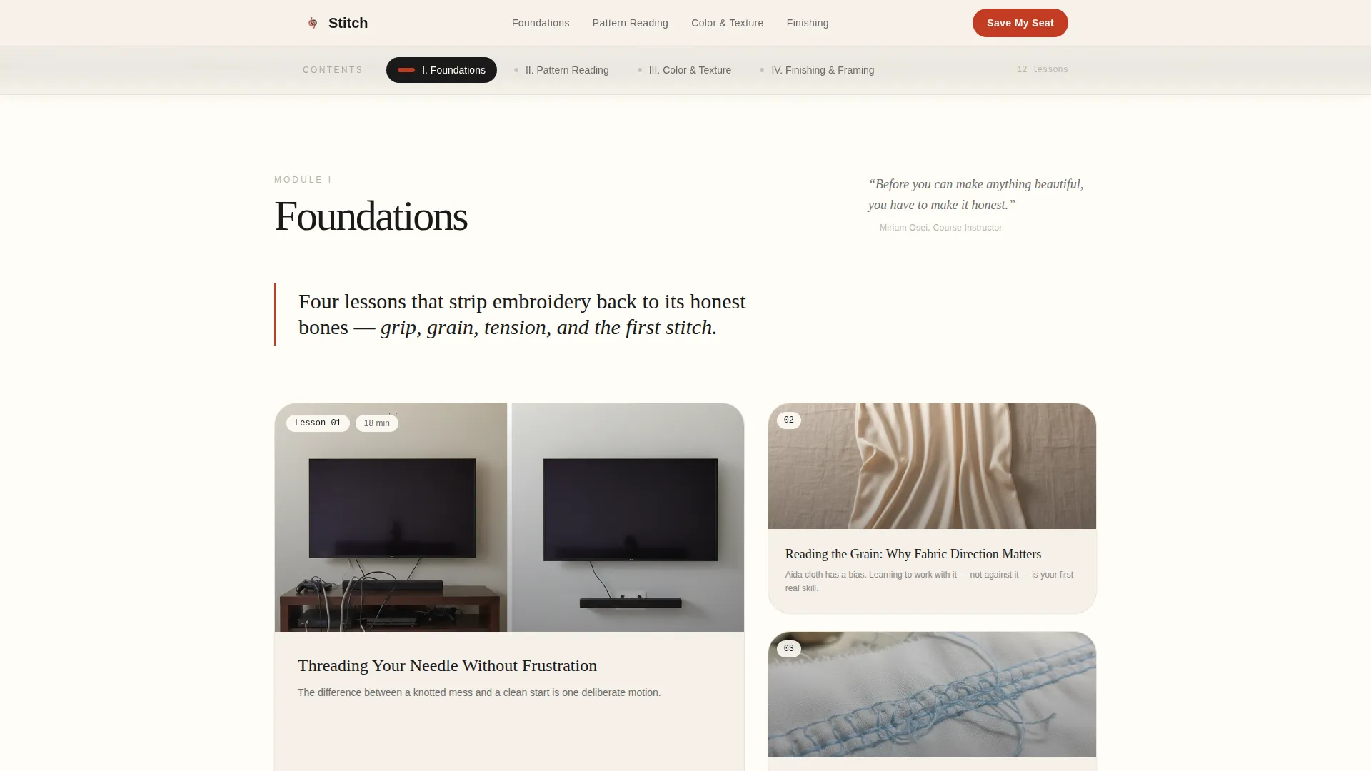
- A sticky anchor navigation bar styled as a magazine table of contents, linking to four editorial spoke sections: Foundations, Pattern Reading, Color and Texture, and Finishing and Framing
- A closing section featuring a handwritten-style instructor note, a founding-member spot counter, and a repeated waitlist call to action
Feature list
This template delivers a curated set of purpose-built components. Each one is grounded in the editorial magazine creative direction and the waitlist conversion goal.
Giant Centered Editorial Headline
The hero opens with oversized Fraunces serif display type reading "Learn to Stitch Like You Mean It." A vermillion thread SVG weaves through the letter descenders, making the typography itself the visual centerpiece. No competing imagery is needed.
Sticky Anchor Navigation Bar
A magazine-style table of contents pins to the top of the page as the reader scrolls. Each of the four anchor links corresponds to a self-contained editorial spoke section, with active states that update as the reader moves through the page.
Hub and Spoke Module Layout
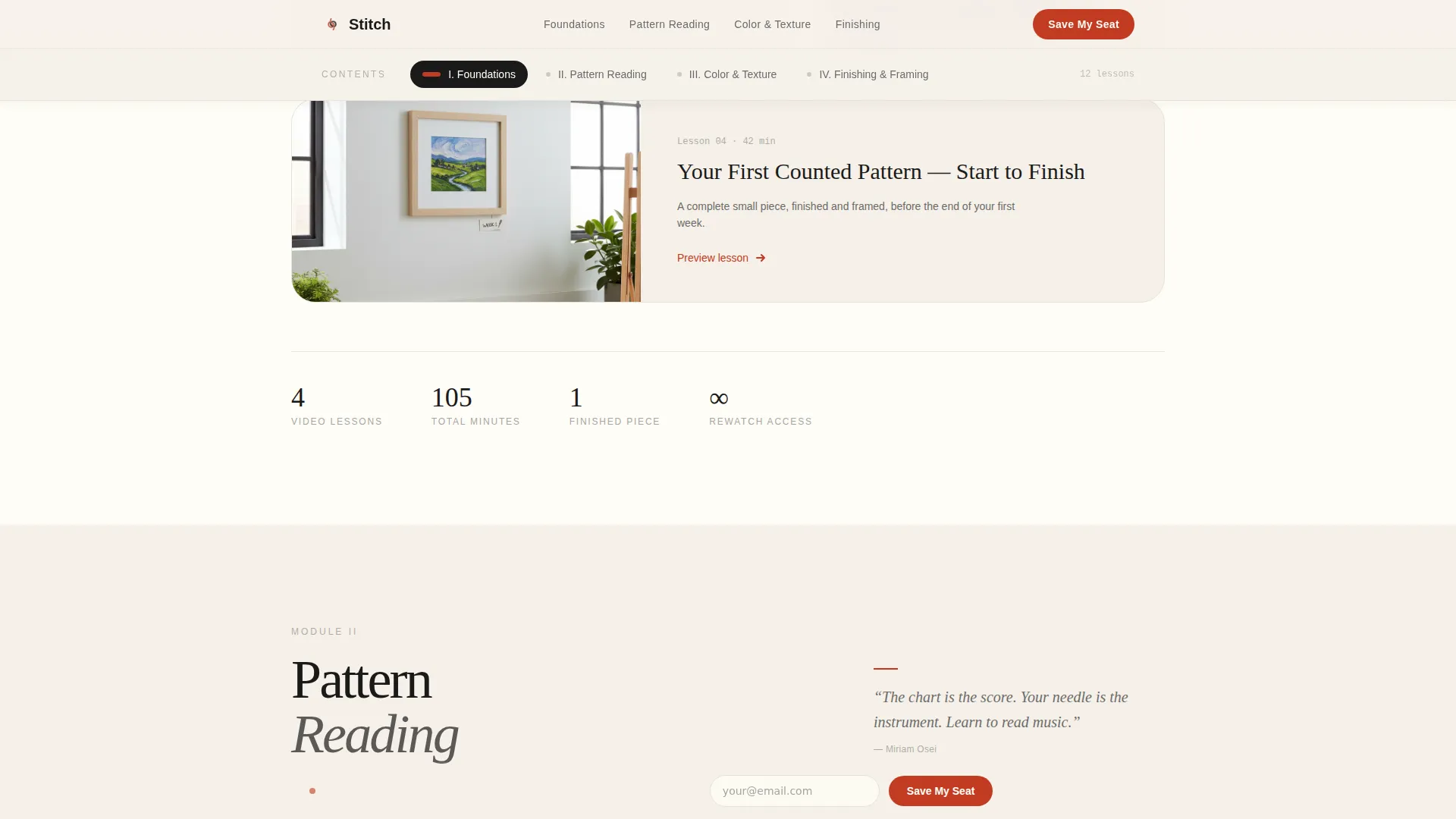
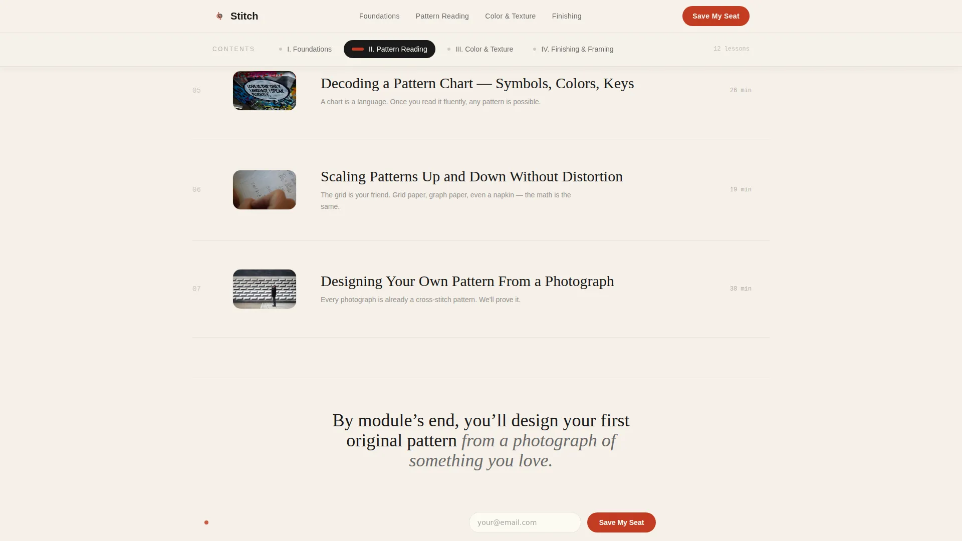
Each spoke section opens with an oversized pull quote from the instructor, followed by a grid of lesson thumbnails styled as editorial photo essays with generous captions. The rhythm alternates between dense visual grids and breathing-room typographic pages.
Waitlist Form with Optional Sampler
The waitlist form appears beneath the hero and repeats as a sticky bar after the second spoke. It asks only for a first name and email. A single optional checkbox invites readers to receive a free pattern sampler while they wait.
Scarcity Counter and Instructor Note
A small typeset counter displays the number of founding-member spots remaining. The closing section includes a handwritten-style note from the instructor explaining why enrollment is capped to keep feedback personal and the learning pace unhurried.
Scroll Reveals and Parallax Hero
The page uses medium-weight scroll reveal animations and a parallax hero effect to create a sense of depth and deliberate pacing. The sticky navigation and marquee elements are handled as interactive client components while static sections load as server components.
Page sections overview
| Section | Purpose |
|---|---|
| Hero Headline | Introduce course identity and capture waitlist signups |
| Sticky Anchor Nav | Link to four module spokes, persist on scroll |
| Foundations Spoke | Preview basic techniques with editorial lesson grid |
| Pattern Reading Spoke | Showcase pattern literacy lessons with pull quotes |
| Color and Texture | Dense bento grid with instructor pull quote |
| Finishing and Framing | Closing module preview and scarcity messaging |
| Instructor Note | Build trust with handwritten-style personal message |
| Waitlist Repeat | Reinforce signup with founding-member counter |
| Minimal Footer | Horizontal minimal footer with essential links |
Design & branding system
The visual identity follows an Editorial Magazine theme built on an Ink and Paper color system. Every design decision references the tactile feeling of a hand-bound sketchbook filled with thread swatches and margin notes.
- Colors: warm parchment (#F5F0E8) and soft ivory (#FFFDF7) alternate as backgrounds, letterpress black (#1A1A1A) handles all headline type, pencil-sketch graphite (#6B6B6B) carries body text and subheads, and embroidery-floss vermillion (#C23B22) is reserved for navigation dots, pull quotes, and the primary call to action
- Typography: Fraunces is the serif display face for headlines and pull quotes; DM Sans carries all body copy and form labels, keeping the page readable at smaller sizes
- Whitespace is treated as a structural element, acting like the linen border around a finished embroidery piece, and backgrounds never compete with the typographic hierarchy
Mobile & speed optimization
The template is designed desktop-first to honor the editorial magazine feel, but every section reflows cleanly for tablet and mobile viewports. Interactive behaviors are scoped to keep the experience smooth across devices.
- Scroll reveal animations, the parallax hero, and the sticky navigation are handled as client-side components, while all static editorial sections are built as server components for faster initial load
- The anchor navigation collapses gracefully on smaller screens so the table-of-contents feel is preserved without overwhelming a mobile viewport
- The waitlist sticky bar activates after the second spoke on all screen sizes, keeping the call to action visible without interrupting the editorial reading rhythm
How this template helps you convert
Every layout decision in this template serves the goal of moving a reader from curious visitor to waitlist signup. The editorial restraint is intentional: it earns trust before asking for commitment.
- The hero places the waitlist form immediately below the headline, so a reader who is already sold can sign up without scrolling, while the pull quotes and lesson grids below reward those who need more context before committing
- The founding-member spot counter and the instructor's handwritten note introduce earned scarcity without relying on generic countdown timers, making the limited enrollment feel credible and personal
- The sticky waitlist bar appears after the second spoke and stays visible through the rest of the page, reducing the distance between a reader's decision moment and the actual form
Other information about this template
This template is part of the Blog and Editorial category and sits within the Cross-Stitch and Embroidery Content subcategory, targeting the Cross-Stitch and Embroidery Online Course niche. It is built for English-language audiences in the United States and is priced and positioned for USD markets.
- The template style is Hub and Spoke with Anchor Navigation, the header concept is Giant Headline Centered, the creative direction is Curated Collection, and the landing page direction is Waitlist and Coming Soon
- The color system is Ink and Paper and the theme is Editorial Magazine, making it a strong fit for any artisan craft, slow-living, or textile arts course that values restraint and depth over visual noise
- The template is designed as a single-page layout with no multi-page routing required, keeping setup straightforward for solo instructors and small course teams
Theme
Editorial Magazine
Creative direction
Curated Collection
Color system
Ink & Paper
Style
Hub & Spoke (Anchor Nav)
Direction
Waitlist/Coming Soon
Page Sections
Giant Centered Editorial Headline
Sticky Anchor Navigation Bar
Hub and Spoke Module Layout
Minimal Waitlist Form
Scarcity Counter and Instructor Note
Scroll Reveals and Parallax Hero
Related questions
Can I use this template for a craft course that is not embroidery-specific?
Does the waitlist form connect to an email platform automatically?
How many module spokes does the anchor navigation support?
Is this template designed for a pre-launch only, or can I use it for a live course?
What typefaces does this template use?



