Prepper & Survival Content Reviews Website Template
Stockpile is a rugged prepper newsletter landing page built in an Ink and Paper editorial style. It captures subscriber trust through a letterpress-inspired masthead, a first-person editor's note, three curated issue previews, and a frictionless single-field email signup. The layout is built to earn the click by showing the writing first.
by Rocket studio
Quick summary
Stockpile is a single-page newsletter landing page for a weekly survival and preparedness dispatch. It leads with a heavyweight newspaper masthead, reveals the editorial voice through a handwritten-style editor's note, and demonstrates content range across three issue preview columns. Every section builds toward one goal: a clean, low-friction email signup.
Who this template is for
This template is built for independent newsletter creators publishing in the prepper, survival, and self-reliance space. It suits anyone who wants their writing to do the selling, with no heavy marketing copy required.
- Survival and preparedness writers launching or growing a weekly email dispatch
- Homesteading and off-grid creators who want an editorial identity, not a generic signup form
- IT professionals and independent analysts building a readership around practical grid-down knowledge
What problem this template solves
Most newsletter landing pages ask visitors to trust a headline and a form. That is not enough for a niche built on skepticism. Stockpile solves the credibility gap by putting real content in front of visitors before asking for their email address.
- Readers arrive with no context and leave without subscribing when there is nothing to read on the page
- Generic templates feel too polished and undermine the analog, field-notebook authenticity this audience values
- Three-step calls to action with name fields, preferences, and consent checkboxes create friction that kills conversions
What you get with this template
This template delivers a fully structured editorial landing page with every section designed and copy-ready for a survival newsletter. The layout guides visitors from first impression to email submission in one deliberate scroll.
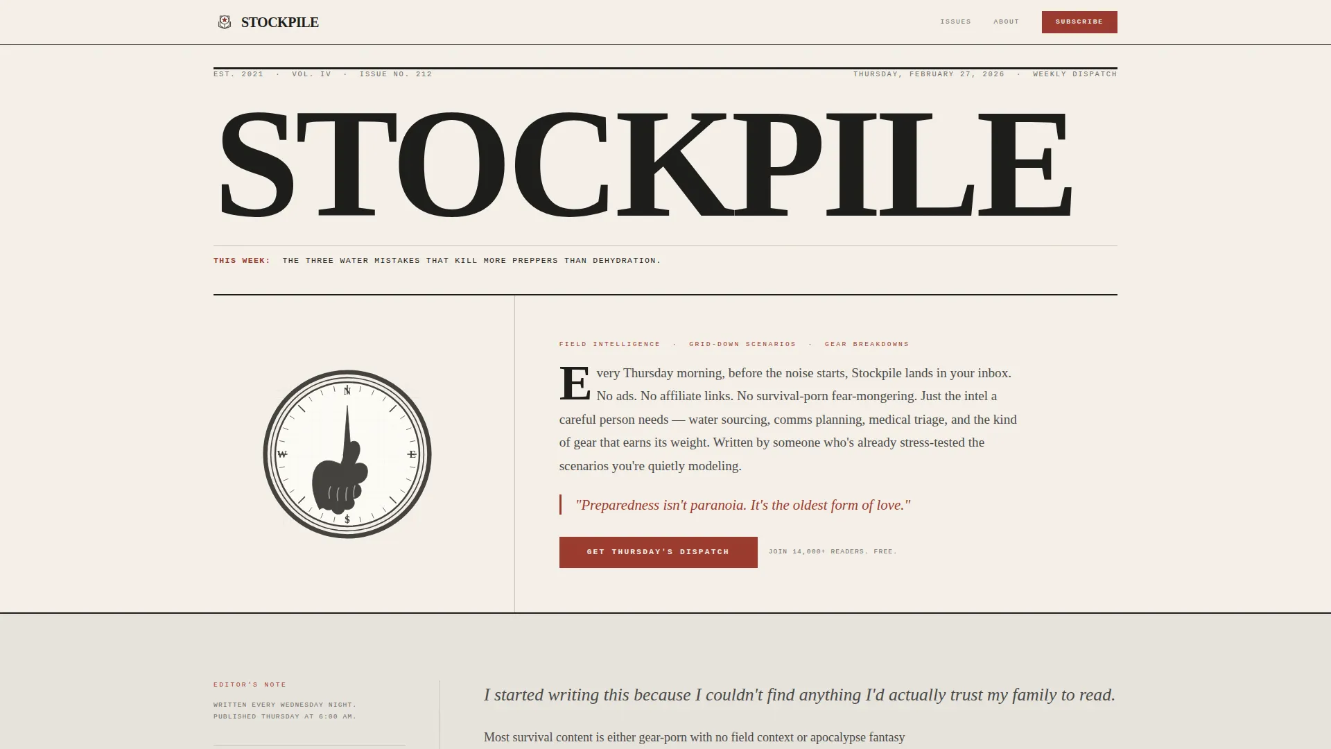
- A newspaper-style hero masthead with a woodcut compass illustration, dateline, and primary call to action
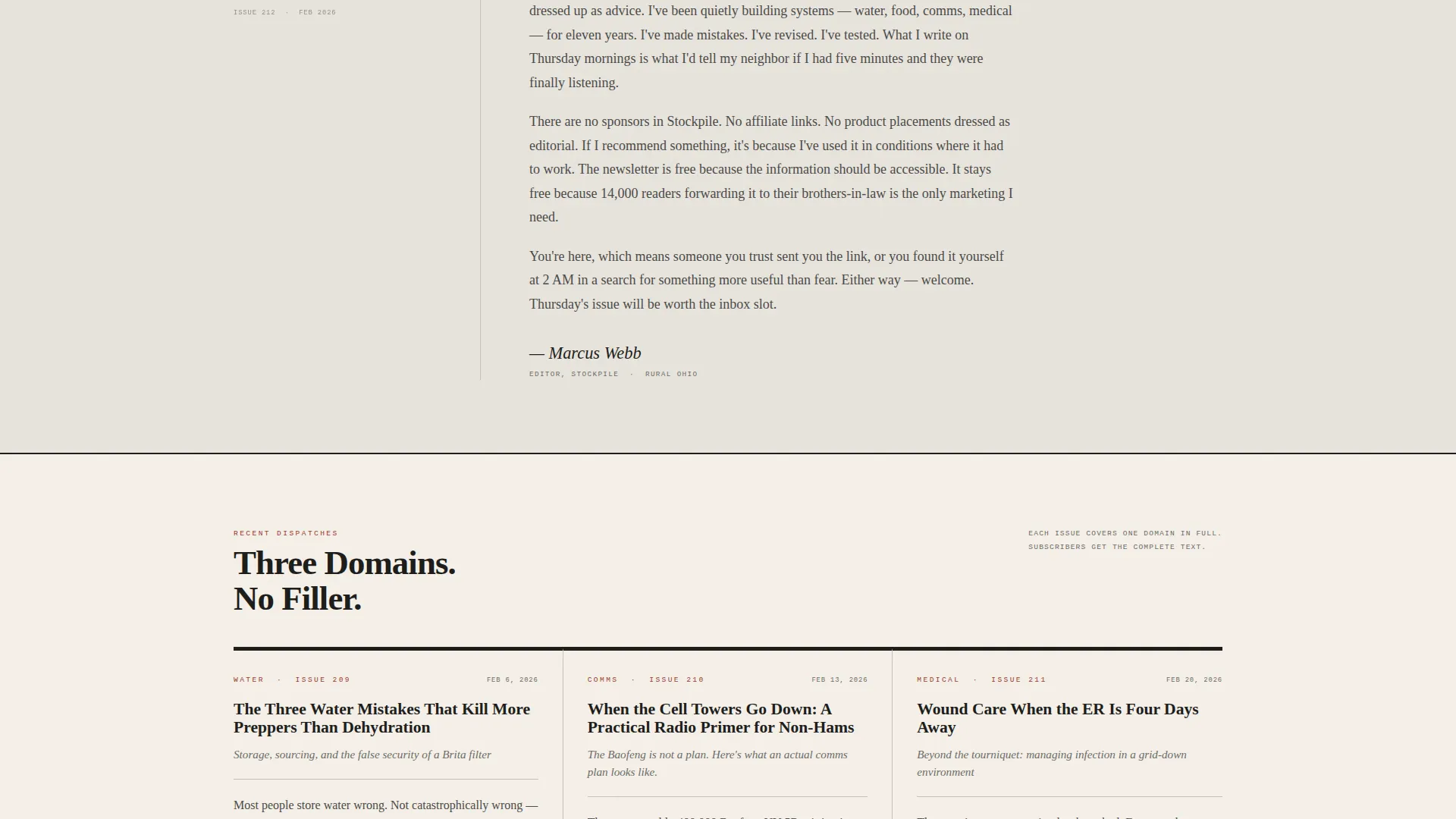
- A first-person editor's note section, three newspaper-column issue preview cards, a social proof marquee, and a subscribe section with single-field email input
- A footer in a single linear row pattern that closes the page cleanly
Feature list
This template is built around six core capabilities that work together to move a curious visitor toward becoming a loyal weekly reader.
Letterpress Masthead Hero
The hero section presents "STOCKPILE" in heavy condensed serif type across the full page width. A woodcut-style compass illustration sits below the fold line. A dateline and issue teaser sit beneath the title, and the primary call to action button appears immediately below with no distracting elements nearby.
First-Person Editor's Note
A dedicated section renders the newsletter creator's voice in handwritten-style italic type. This section creates direct, personal contact between the editor and the visitor. It builds the sense of receiving a private briefing rather than landing on a marketing page.
Three-Column Issue Preview Cards
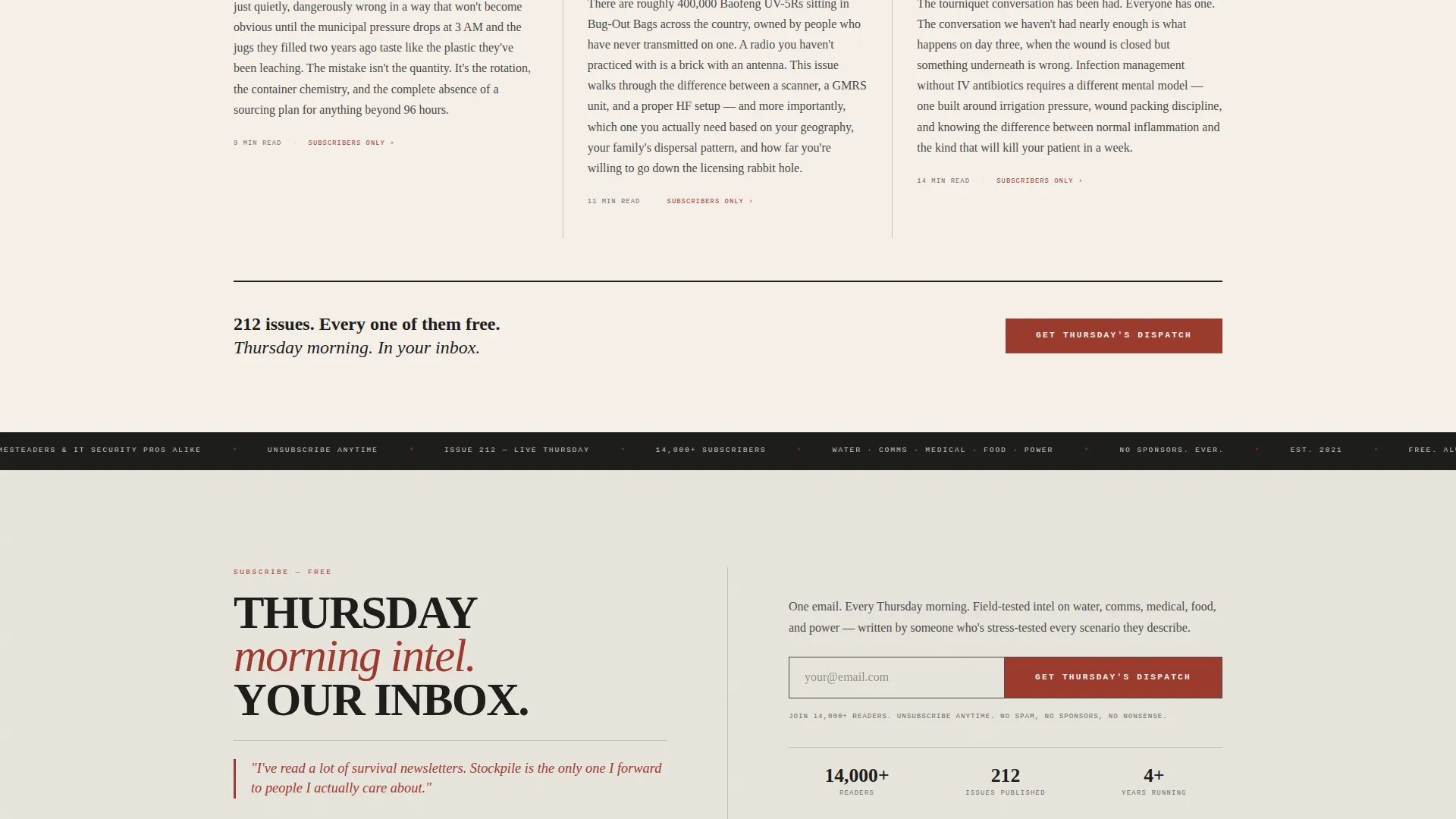
Three newspaper-column cards preview recent dispatches across different survival domains, including water, communications, and medical preparedness. Each card includes a headline, subhead, and one-paragraph excerpt. The cards prove editorial range without giving away the full content.
Social Proof Marquee
A rolling marquee section displays the subscriber count, issue cadence, and trust signals. This element communicates that 14,000 or more readers already receive the dispatch every Thursday, which reduces hesitation at the signup step.
Frictionless Subscribe Section
The subscribe call to action section uses a single-field email input. There is no name field, no preference selector, and no extra steps. A secondary trust line beneath the button reads that readers can unsubscribe at any time with no sponsors and no spam.
Repeating Call to Action Placement
The primary call to action, "Get Thursday's Dispatch," appears three times across the page: directly beneath the masthead, after the issue preview cards, and again at the footer alongside the email input. This placement means visitors are never more than one scroll away from the signup moment.
Page sections overview
| Section | Purpose |
|---|---|
| Hero Masthead | Sets editorial identity and delivers the primary call to action |
| Editor's Note | Establishes the creator's voice and builds personal connection |
| Issue Preview Cards | Demonstrates content range across three survival topics |
| Social Proof Marquee | Displays subscriber count and publication trust signals |
| Subscribe Call to Action | Converts interest into an email submission with one field |
| Footer | Closes the page with a clean linear single-row layout |
Design & branding system
The template uses a Soft Mist color system built to feel like a field notebook open beside a kerosene lamp. Every visual decision reinforces an analog, lo-fi editorial identity that matches the newsletter's voice.
- Color palette: unbleached newsprint (#F5F0E8) for the background, pencil-lead gray (#4A4A48) for body text, fog-bank white (#E8E4DD) for cards, and muted red-oxide (#9B3A2E) reserved for pull quotes, issue numbers, and the subscribe button
- Typography: Fraunces for display headings, Crimson Text for body serif columns, and IBM Plex Mono for datelines and labels
- No photography anywhere on the page; illustration work is woodcut-style in ink weight only, with generous margins and white space throughout
Mobile & speed optimization
The template is built desktop-first to deliver a broadsheet reading experience on larger screens. A responsive mobile fallback ensures the layout adapts without losing its editorial character.
- Desktop layout prioritizes the multi-column newspaper grid and wide masthead type treatment
- Mobile fallback stacks columns vertically and preserves the serif typography hierarchy for comfortable reading on smaller screens
- GSAP ScrollTrigger powers staggered column reveals, a rolling marquee animation, and a magnetic-feel call to action button; static content uses server components to keep initial load light
How this template helps you convert
The conversion strategy is built into the content itself. Visitors are shown the writing before they are asked to subscribe, so the decision feels natural rather than pressured.
- Three issue preview cards put real dispatch excerpts in front of visitors early in the scroll, letting the voice and credibility speak before any call to action appears
- The social proof marquee confirms an active readership of 14,000 or more subscribers, which removes uncertainty and validates the decision to join
- The single-field email input at the footer removes every form barrier, so a visitor who reaches the bottom can subscribe in seconds with no extra steps
Other information about this template
This template is part of a broader editorial and magazine landing page category designed for independent content creators. A few additional details are worth knowing before you build.
- The Ink and Paper theme and Soft Mist color system are consistent across all template elements, so customizing the palette requires changing only a small set of defined color variables
- The template is structured for English-language use in the United States market, with issue numbering used in place of calendar date formatting
- Animation behavior is set to medium intensity using GSAP ScrollTrigger; individual reveal effects can be adjusted or removed to suit different performance preferences
- The footer follows a Pattern 1 Linear Single-Row layout, keeping the closing section minimal and uncluttered
Theme
Ink & Paper
Creative direction
Creator Spotlight
Color system
Soft Mist
Style
Editorial/Magazine
Direction
Click-Through
Page Sections
Letterpress Newspaper Masthead
First-person Editor's Note Section
Three-column Issue Preview Cards
Rolling Social Proof Marquee
Single-field Subscribe Section
Repeating Call to Action Placement
Related questions
Can I change the newsletter topic from survival to another subject?
Does the template include a working email signup form?
How many times does the call to action appear on the page?
Can I replace the woodcut compass illustration with my own artwork?
Is the social proof subscriber count editable?



