Retail Blog & Media Education Website Template
Stockroom is a hub and spoke landing page template built for independent retail education blogs. It opens with a viewport-filling editorial headline, flows through a manifesto scroll, then reveals a sticky anchor nav linking five content clusters. A five-question diagnostic quiz drives sign-ups by delivering a personalized reading path and weekly curriculum opt-in.
by Rocket studio
Quick summary
Stockroom is a single-page editorial template for retail how-to blogs targeting boutique owners, gift shop managers, and first-time shopkeepers. It pairs a bold manifesto-style hero with a hub and spoke content architecture, five themed article clusters, and a diagnostic quiz that turns casual visitors into subscribed readers on a personalized curriculum path.
Who this template is for
This template is built for independent retail educators, niche blog publishers, and content-led brands serving hands-on shop operators. If you run a retail knowledge publication and need a page that both inspires and organizes, this structure delivers both.
- Boutique owners and gift shop managers looking for practical retail craft resources
- First-time shopkeepers who need fast access to pricing, merchandising, and inventory fundamentals
- Editorial blog publishers who want a structured, curriculum-style content hub with a clear conversion path
What problem this template solves
Independent retailers learn by doing, often under pressure, without a clear guide. A standard blog homepage buries the most useful content under reverse-chronological posts. Readers leave before they find what they actually need.
- No clear entry point for readers at different experience levels
- Content scattered without category logic or priority signaling
- No mechanism to turn a single visit into an ongoing learning relationship
What you get with this template
You get a complete single-page layout that functions as both an editorial statement and a structured content directory. Every section serves a purpose, from the opening declaration to the quiz that closes the loop.
- A viewport-filling hero section with a centered editorial headline and manifesto scroll
- A sticky anchor navigation bar linking five content category clusters, each with article cards, reading time labels, and difficulty badges
- A five-question quiz modal with progress dots, personalized reading path results, and a weekly email curriculum opt-in
Feature list
This template ships with a set of purposefully designed components. Each one reflects the editorial restraint and practical utility that independent retail readers expect.
Giant Headline Hero Section
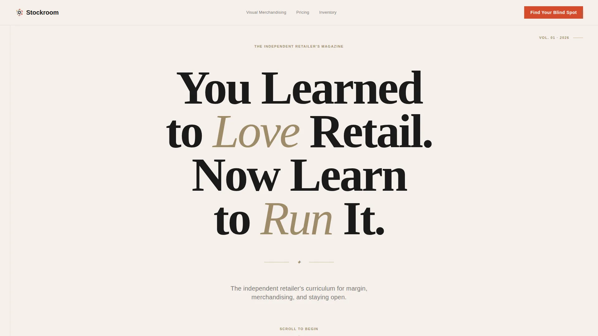
The hero fills the viewport with a single centered editorial headline set in a high-contrast serif typeface. No imagery competes with the words. The emptiness around the type is the visual statement.
Manifesto Scroll Sequence
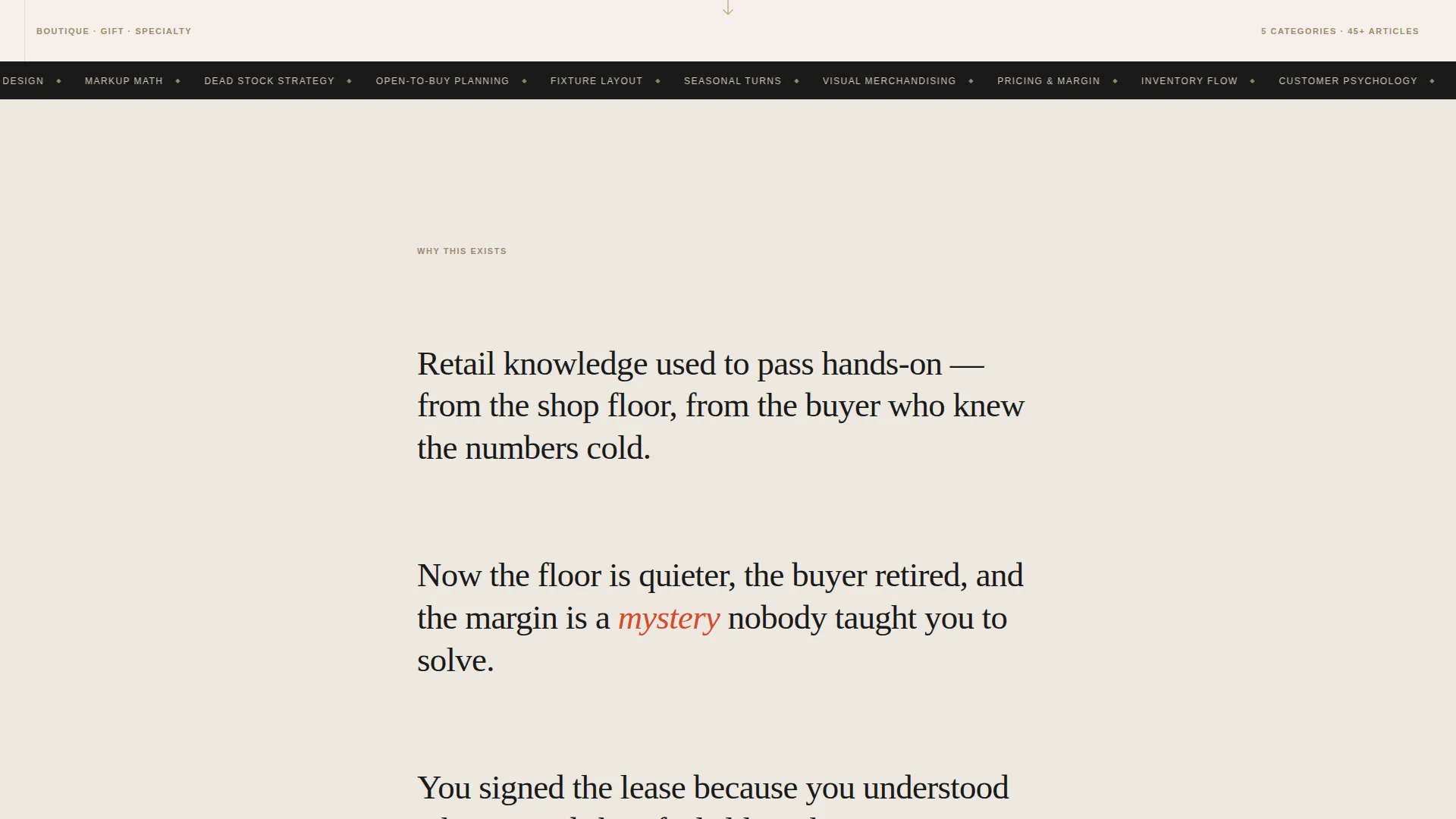
Four to five single-sentence paragraphs appear one at a time as the reader scrolls. Each sentence occupies its own vertical space with generous breathing room. The staggered reveal builds conviction before the content architecture appears.
Sticky Hub and Spoke Navigation
A sticky anchor navigation bar locks to the top of the page after the manifesto resolves. Five category spokes link directly to their content clusters: Visual Merchandising, Pricing and Margin, Inventory Flow, Customer Psychology, and Store Design.
Article Card Clusters with Social Proof Signals
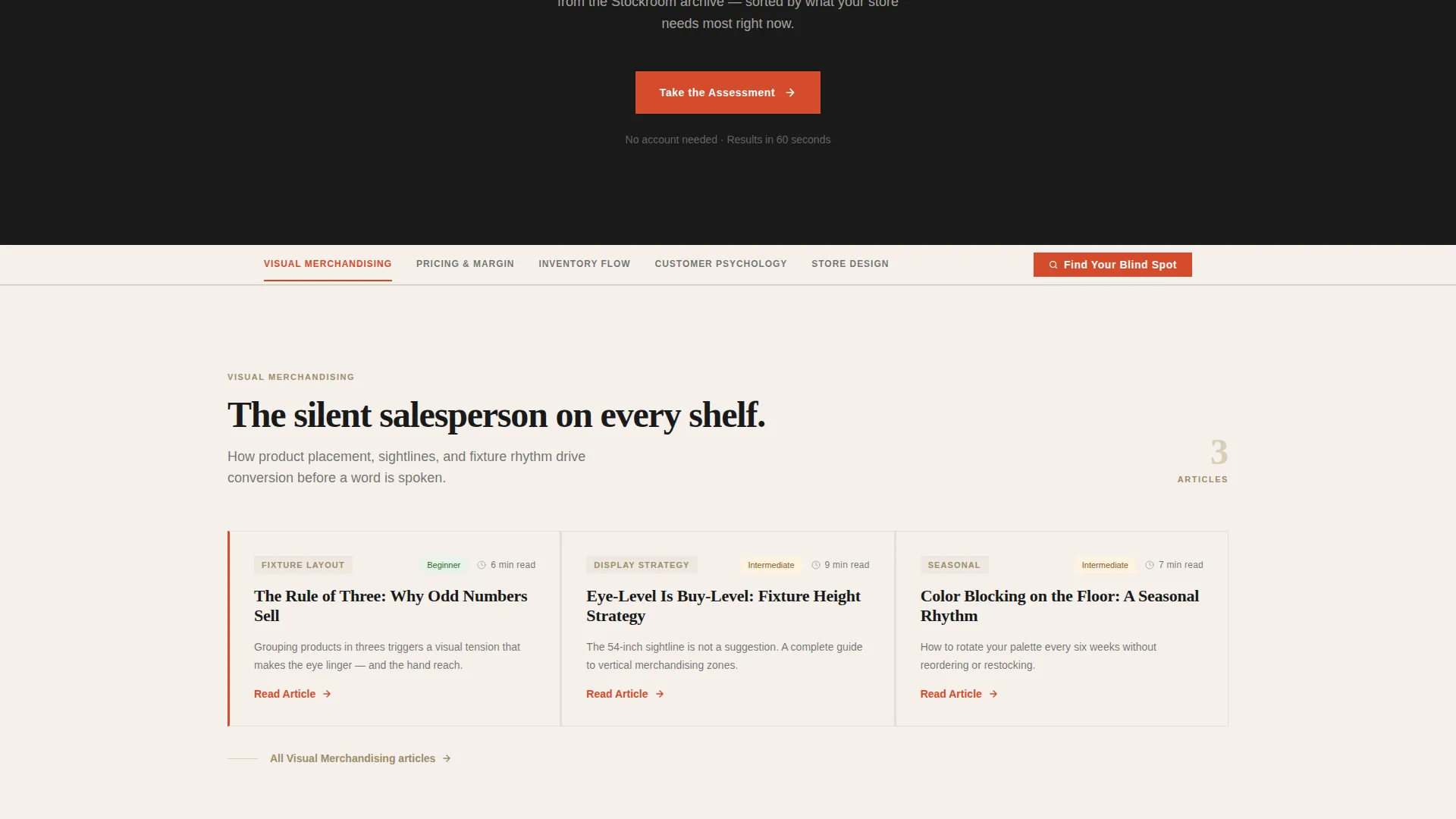
Each content cluster displays article cards tagged with reading time estimates and difficulty badges. These signals help readers self-select the right entry point without guessing.
Five-Question Diagnostic Quiz Modal
The quiz appears as a modal with one question per screen and large tap targets for easy mobile use. Progress dots track position. Questions cover store type, years open, biggest frustration, average transaction value, and inventory turn estimate.
Personalized Reading Path and Email Opt-In
Quiz results deliver a prioritized reading path drawn from the blog archive. An email opt-in is framed as receiving a weekly curriculum, earning the subscription by promising diagnosis rather than generic newsletter content.
Page sections overview
| Section | Purpose |
|---|---|
| Hero Headline | Fills viewport with centered editorial headline and manifesto subhead |
| Manifesto Scroll | Builds belief through staggered single-sentence declarations |
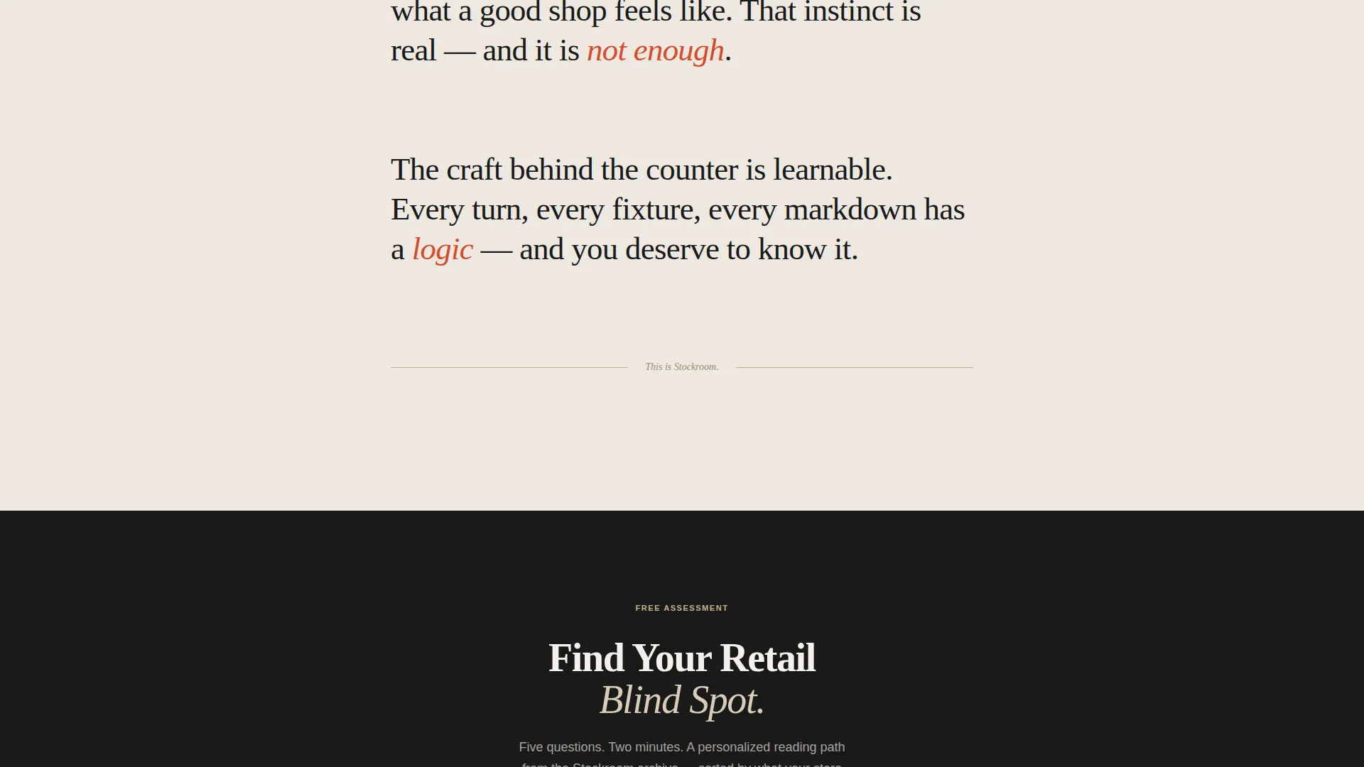
| Quiz call to action Bridge | Introduces the diagnostic quiz with a floating call-to-action card |
| Anchor Nav Bar | Sticky navigation linking five themed content category spokes |
| Visual Merchandising | Article cluster for display and floor layout content |
| Pricing and Margin | Article cluster for markup math and margin strategy content |
| Inventory Flow | Article cluster for stock turn and cash flow management content |
| Customer Psychology | Article cluster for shopper behavior and retail experience content |
| Store Design | Article cluster for physical environment and layout content |
| Quiz Modal | Five-screen assessment with progress dots and personalized results |
| Footer | Linear single-row footer with essential links |
Design & branding system
The visual identity follows an editorial magazine aesthetic grounded in Japanese Zen restraint. Every design decision favors considered whitespace over decoration, letting the typography and content carry the full weight of the page.
- Color palette: washi warm white (#F5F0EB) for backgrounds, sumi ink black (#1A1A1A) for body text, tatami wheat (#C4B08B) for tonal accent zones, and torii vermillion (#D44B2C) reserved for active navigation states and primary action elements
- Typography pairing: Fraunces editorial serif for all headlines and manifesto text, DM Sans for body copy and interface elements, with generous line height throughout
- Background alternation between warm white and a faint wheat tint distinguishes content zones without using hard borders or heavy graphic elements
Mobile & speed optimization
This template is built with a mobile-first layout approach, reflecting how independent retailers actually consume content: on a phone, between tasks, with limited uninterrupted time.
- Large tap targets in the quiz modal make it easy to respond accurately on small screens without pinching or mis-tapping
- The sticky anchor navigation is designed to remain accessible and readable at mobile viewport widths
- Static content sections use server-side rendering while interactive elements such as the quiz modal and sticky nav are handled on the client side for responsive performance
How this template helps you convert
Stockroom converts through earned trust rather than aggressive prompting. The manifesto scroll creates agreement before asking anything of the reader. The quiz then turns that agreement into a personal commitment.
- The diagnostic quiz replaces a generic call to action with a promise of self-knowledge. Readers click because they want to find out what they do not know, not because they were pushed.
- The personalized reading path from quiz results gives each subscriber a reason to stay. The email opt-in is framed as curriculum delivery, not a newsletter, which raises the perceived value of signing up.
Other information about this template
Stockroom is a purpose-built editorial template for the retail education niche. A few additional details worth knowing before you use it:
- The footer follows a linear single-row pattern, keeping the page exit clean and consistent with the overall design restraint
- Animation behavior includes IntersectionObserver-based reveals, manifesto sentence stagger on scroll, and smooth slide transitions between quiz screens
- The quiz call to action labeled "Find Your Retail Blind Spot" appears in two locations: below the manifesto and as a persistent item inside the anchor nav bar
- The template is localized for English-language audiences using United States dollar formatting and United States date conventions
- Content difficulty badges and reading time estimates on article cards serve as lightweight social proof signals that reduce friction for new readers choosing where to start
Theme
Editorial Magazine
Creative direction
Manifesto
Color system
Japanese Zen
Style
Hub & Spoke (Anchor Nav)
Direction
Quiz/Assessment
Page Sections
Viewport-filling Editorial Hero
Staggered Manifesto Scroll
Sticky Hub and Spoke Navigation
Article Cards with Difficulty Badges
Five-question Diagnostic Quiz Modal
Personalized Curriculum and Email Opt-in
Related questions
What type of blog works best with this template?
How does the diagnostic quiz work on the page?
Can I update the five content category spokes?
Is this template designed for mobile readers?
What makes the email opt-in different from a standard newsletter sign-up?



