Editorial eCommerce Blog Landing Page Template
Storefront is an editorial-style landing page template built for e-commerce how-to blogs and digital magazines. It pairs a still-life book-cover hero, a masonry article grid, and a sticky call-to-action bar into one cohesive, scroll-friendly page. Designed for first-time sellers and maker communities, it turns a content library into a welcoming, trust-building reading experience.
by Rocket studio
Quick summary
Storefront is a single-page editorial template that presents an e-commerce education blog as a curated print magazine. A flat-lay book-cover hero, a vision manifesto, nine masonry article cards, a featured chapter spotlight, and a chapter archive combine into one confident, click-through-focused layout built for makers who are just starting to sell.
Who this template is for
This template speaks directly to content creators and educators in the e-commerce space. It is built for people who have real knowledge to share and want a page that feels as considered as the writing inside it.
- Side-hustlers and kitchen-table sellers who are building a beginner-focused content brand around topics like product photography or pricing
- Etsy migrants and small-batch makers who want to publish practical, jargon-free selling guides for their growing audience
- Independent content publishers running an e-commerce how-to blog who need a landing page that earns reader trust before asking for a click
What problem this template solves
Most blog landing pages look like dashboard exports: a grid of thumbnails, a date stamp, and a generic headline. For an audience of first-time sellers who are already intimidated by the word "conversion," that kind of cold, clinical layout kills trust before the first scroll.
- Readers have no reason to stay when a page looks identical to every other content aggregator they have already dismissed
- Makers and side-hustlers need to feel that the publication understands them before they invest time reading an article
- A generic grid layout cannot communicate editorial voice, warmth, or the sense that someone thoughtfully curated each piece for them
What you get with this template
You get a fully structured, single-page landing page that works as the front door to an e-commerce education magazine. Every section is designed to move a first-time visitor from curiosity to a confident click on the primary call to action.
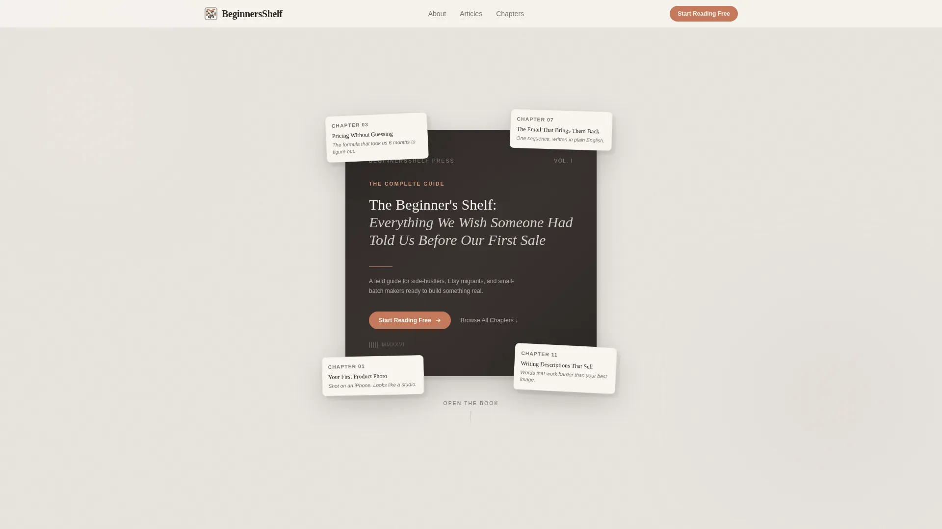
- A book-cover hero section with scattered angled chapter cards, a primary "Start Reading Free" button, and a secondary "Browse All Chapters" anchor link
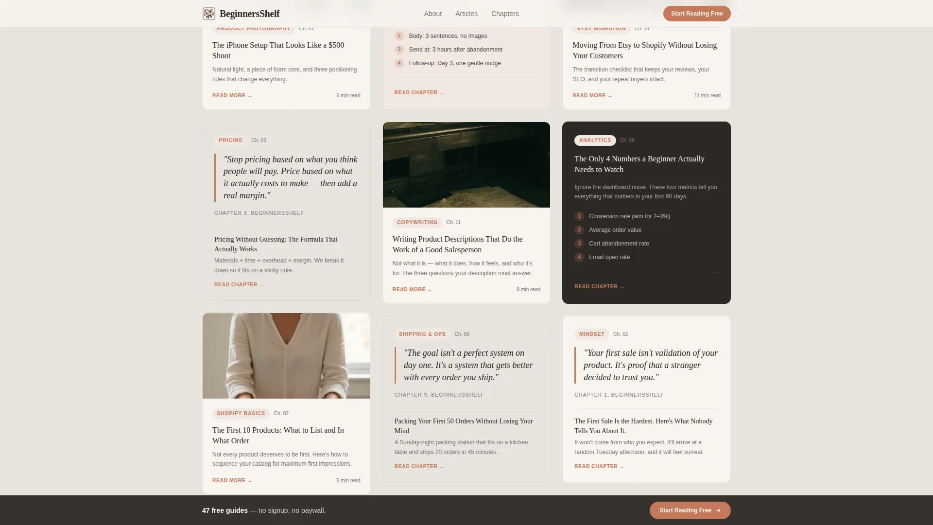
- A masonry article grid with nine varied-height preview cards, each carrying a category tag, headline, one-line hook, and optional pull-quote or mini infographic thumbnail
- A sticky bottom call-to-action bar that appears after the first scroll, a full-width featured chapter spotlight, a chapter archive index, and a horizontal-flow footer
Feature list
This template is built around a clear set of purposeful components. Each one serves the reader experience and the click-through goal.
Book Cover Hero with Chapter Cards
The hero opens on a large-format book cover laid flat, set in elegant serif type. Surrounding it are scattered chapter cards tilted at slight angles, creating an overhead still-life composition. No animation runs in the hero, texture and typography carry the entire visual weight.
Vision Manifesto with Trust Bar
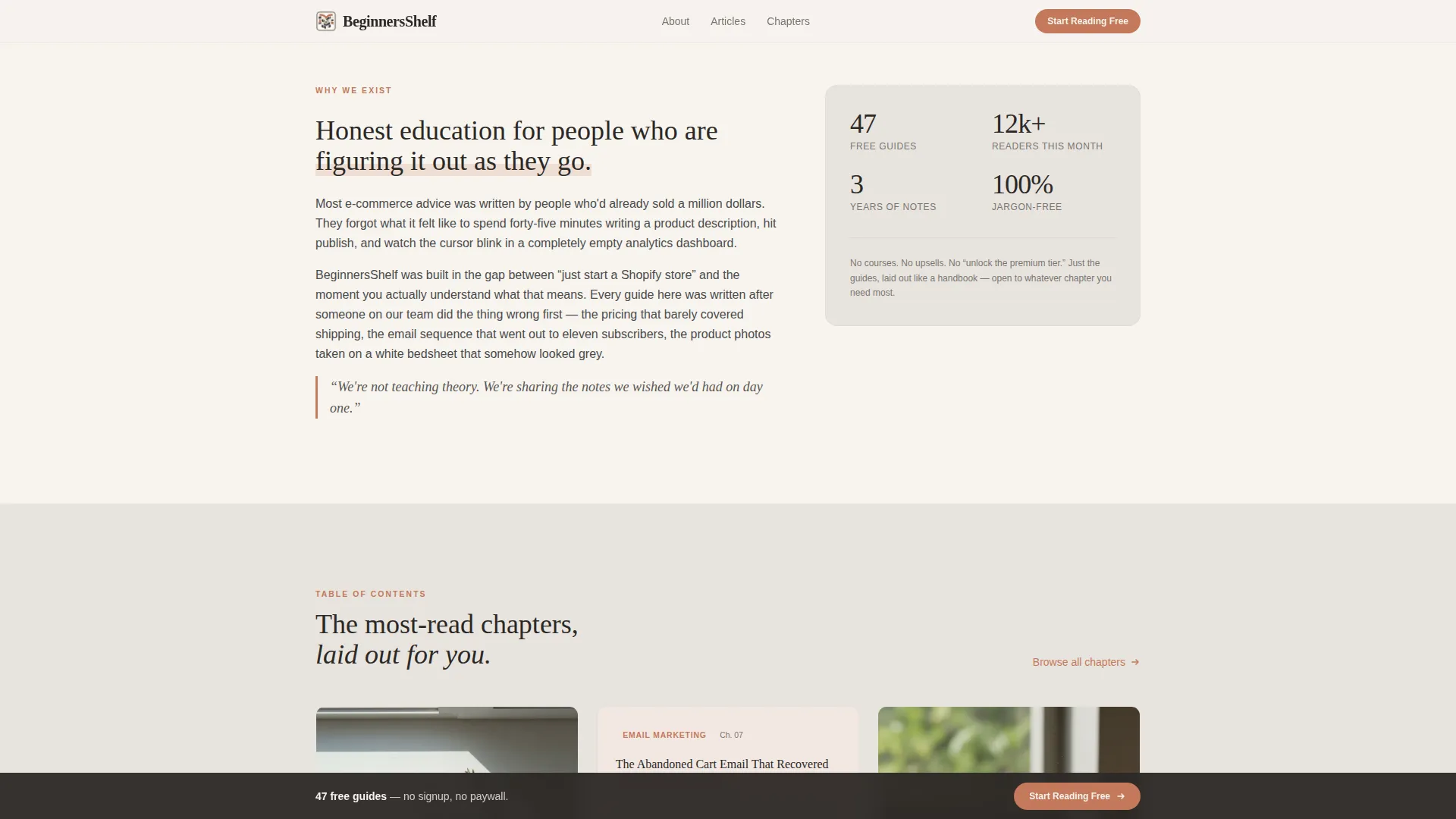
Directly below the hero, a full-width manifesto paragraph states why honest, jargon-free e-commerce education matters. A four-stat trust bar sits beneath it, showing social proof figures such as reader count, article count, and years of publishing.
Masonry Article Grid
Nine article preview cards fill the grid in a Pinterest-style masonry layout. Cards vary in height and visual emphasis. Some feature pull-quotes; others display mini infographics or product photography tips as visual thumbnails. Each card carries a terracotta category tag, a headline, and a one-line hook.
Featured Chapter Spotlight
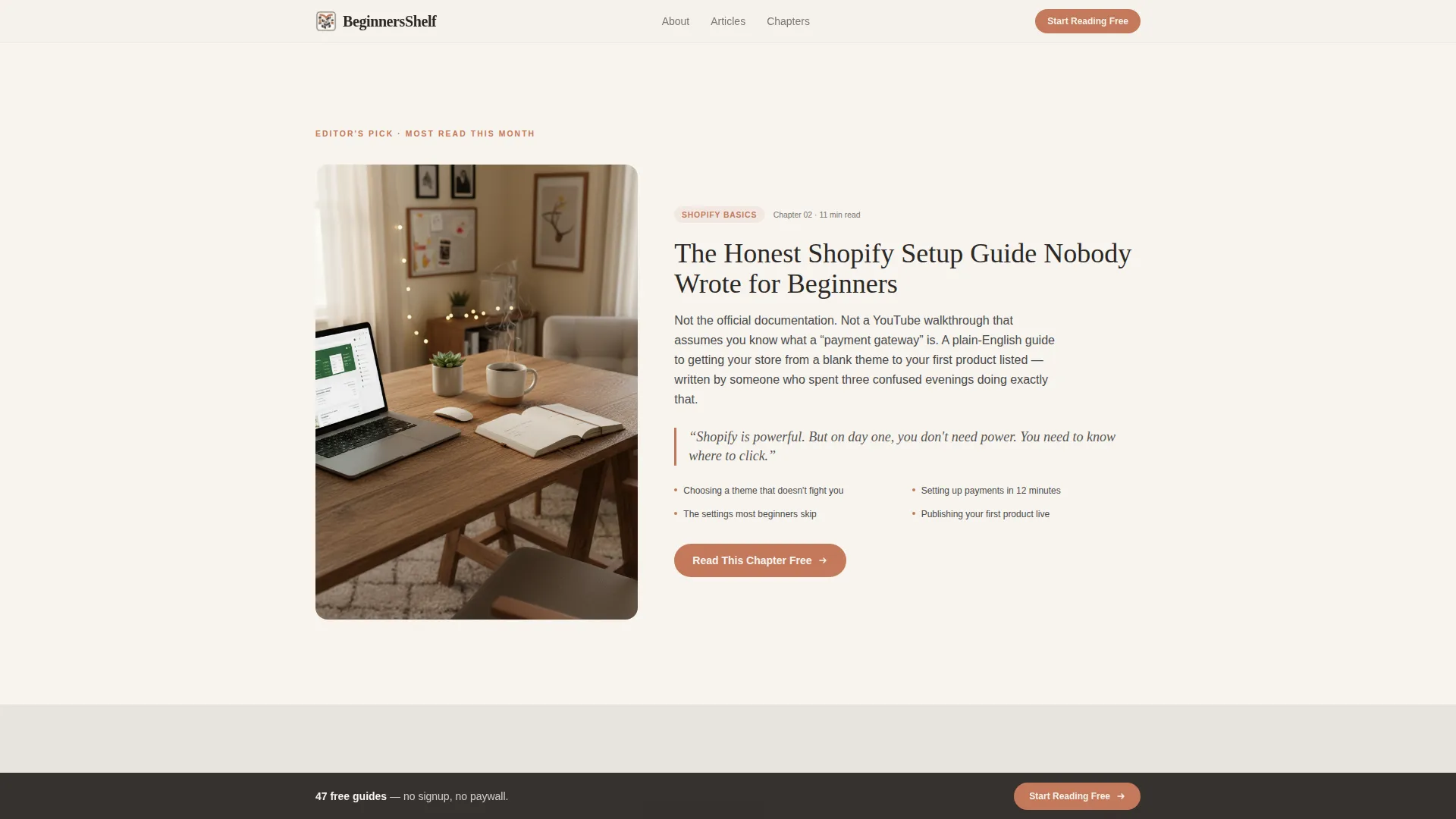
A full-width section highlights a single standout guide with a large pull-quote and a clear call to action. This section gives editorial weight to the most important piece of content and reinforces the magazine's voice before the reader reaches the archive.
Sticky Bottom Call-to-Action Bar
After the first scroll, a fixed bar appears at the bottom of the viewport with the "Start Reading Free" prompt. It stays visible as the reader browses, providing a consistent, low-pressure path to the primary article without interrupting the reading flow.
Page sections overview
| Section | Purpose |
|---|---|
| Book Cover Hero | Opens with flat-lay editorial still-life and primary call to action |
| Manifesto Block | States editorial vision and displays four-stat social proof bar |
| Masonry Article Grid | Previews nine varied-height article cards with tags and hooks |
| Featured Chapter Spotlight | Full-width highlight of one standout guide with pull-quote |
| Chapter Archive Index | Scrollable list of all chapters with secondary navigation anchor |
| Sticky Bottom Bar | Persistent call-to-action visible throughout the scroll journey |
| Footer | Horizontal-flow footer with publication links and context |
Design & branding system
The visual identity follows an Editorial Magazine theme built on a Soft Mist color palette. Every design decision reinforces the feeling of a linen-bound journal left open on a writing desk, unhurried, literate, and warm without being fussy.
- Colors alternate between warm fog (#E8E4DF) and unbleached paper (#F7F4EF) for section backgrounds, with graphite (#4A4A4A) for all body text and muted terracotta (#C4795B) used sparingly for links, category tags, hover states, and pull-quote borders
- Typography pairs Fraunces, an expressive serif, for display headings and chapter titles with DM Sans for body copy, creating a clear hierarchy that feels editorial rather than digital
Mobile & speed optimization
This template is built mobile-first, matching the reality that most of its target readers are browsing on a phone after putting the kids to bed. The layout adapts thoughtfully from the masonry desktop grid down to a single-column card stack on smaller screens.
- Scroll-reveal animations are kept minimal: cards reveal on scroll, the sticky bar appears after the first scroll, and the hero remains completely static for fast perceived load
- The page uses static content and server components, keeping the layout light and responsive without relying on heavy client-side rendering
How this template helps you convert
This template is built around one conversion goal: earning a single, confident click to the most popular beginner guide. It achieves that by showing value before asking for anything.
- The hero places the "Start Reading Free" button inside the book cover itself, making the action feel like opening a book rather than clicking an ad, while the sticky bar keeps that same path available throughout the entire scroll
- The masonry grid delivers visible headlines and readable one-line hooks so the reader absorbs real, useful insight from the page itself, by the time they reach a call to action, trust is already built
- The pull-quotes and category tags inside each card act as proof of editorial depth, signaling that the content library is organized, thoughtful, and worth the reader's time
Other information about this template
This template is part of the Blog & Editorial category with a specific focus on the E-Commerce Blog and Media subcategory. It is a strong fit for anyone building a content-first brand in the e-commerce how-to space.
- The template style is Masonry/Pinterest, making it well suited for content-heavy publications that want visual variety without a chaotic layout
- The header concept follows a Chapter/Book structure, which sets it apart from standard hero-banner blog templates and gives the publication an immediate identity
- The creative direction is Vision & Mission, meaning the page leads with editorial purpose before presenting the content archive, a deliberate choice for audiences who respond to "why this exists" before "here is what we have"
- The landing page direction is Click-Through, with no forms, no gates, and no required sign-up before the reader accesses the primary guide
Theme
Editorial Magazine
Creative direction
Vision & Mission
Color system
Soft Mist
Style
Masonry/Pinterest
Direction
Click-Through
Page Sections
Book Cover Hero with Chapter Cards
Vision Manifesto with Trust Bar
Masonry Article Grid
Featured Chapter Spotlight
Sticky Bottom Call-to-action Bar
Chapter Archive Index with Footer
Related questions
Can I change the article card content and category tags?
Does this template include a contact form or email sign-up?
Is the sticky bottom call-to-action bar easy to customize?
What typography does this template use?
Can I add more article cards to the masonry grid?



