Innovative Tech Publication Landing Page Template
Chronicle is an editorial landing page template built for startup and tech business blogs. It pairs an analog broadsheet design with a Warm Stone color system, collage-style header, and a content-first layout that earns reader trust before asking for a subscription. The Monday Briefing call to action, featured article previews, and founder interview excerpts give visitors a reason to subscribe and return.
by Rocket studio
Quick summary
Chronicle is a digital broadsheet landing page template for startup and tech business blogs. It merges the nostalgic feel of traditional print journalism with a modern, content-driven design. Three flagship article previews, a full-viewport editorial mission statement, and a single-field email subscription form work together to convert curious visitors into loyal weekly readers.
Who this template is for
This template is built for editors, writers, and founders who want a publication that feels authoritative and handcrafted. The design serves content creators who value depth over clicks, and who want their website to communicate seriousness from the first scroll.
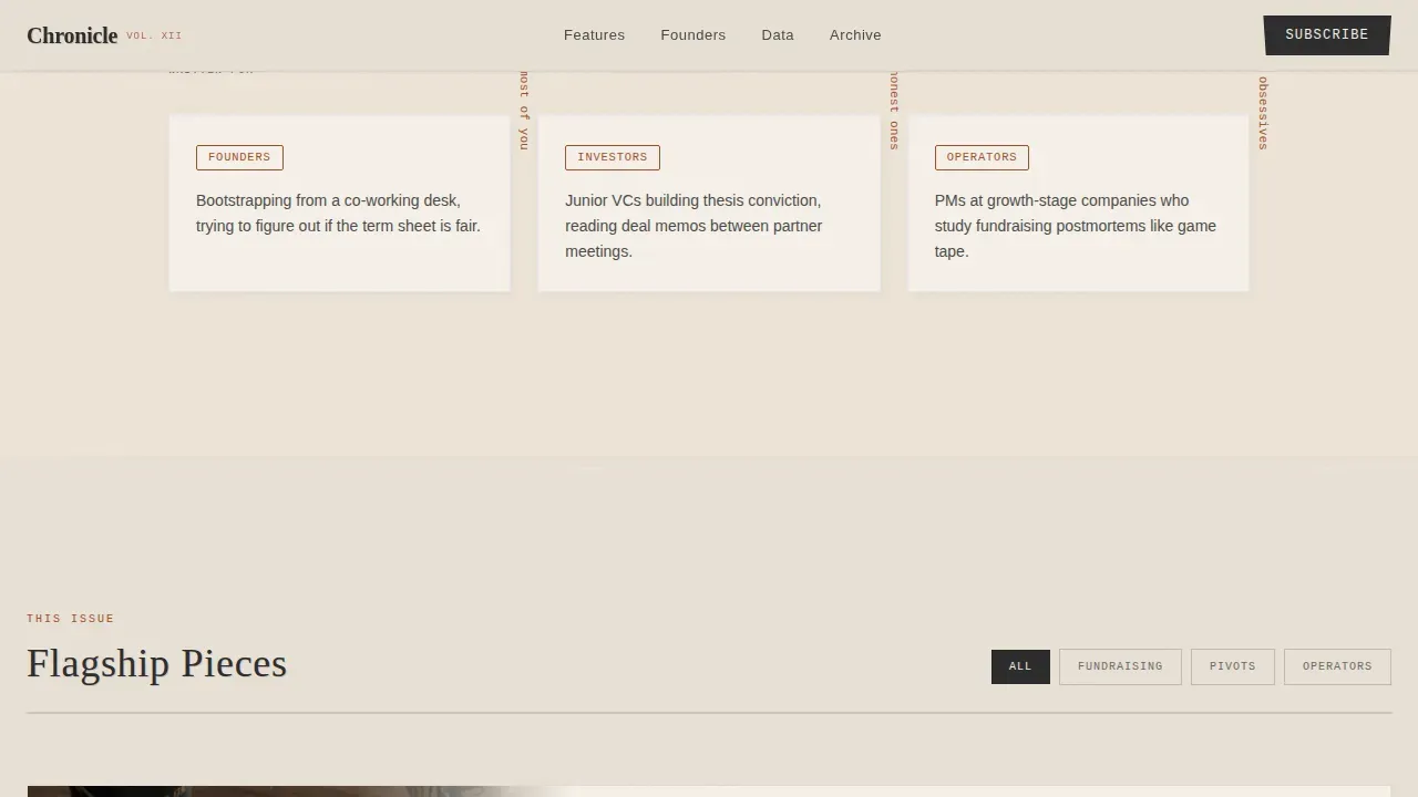
- First-time founders bootstrapping a startup blog from a co-working desk
- Junior venture capitalists building thesis conviction through longform reading
- Product managers and startup operators who study fundraising postmortems like game tape
What problem this template solves
Most blog landing pages look like every other content website. They push generic card grids, oversized hero images, and calls to action that visitors learn to ignore. Chronicle solves the credibility gap that new startup publications face when they compete for inbox space against established editorial brands.
- Visitors leave before reading because the design does not communicate editorial quality
- Founders and operators distrust publications that look like template-default blogs
- A weak above-the-fold experience fails to prove the writing is worth a subscription
What you get with this template
Chronicle gives you a complete, ready-to-customize editorial landing page. Every section is designed to carry the weight of longform startup content without sacrificing clarity or visual warmth. A polished, professional landing page built on this structure can measurably improve your conversion rates compared to generic alternatives.
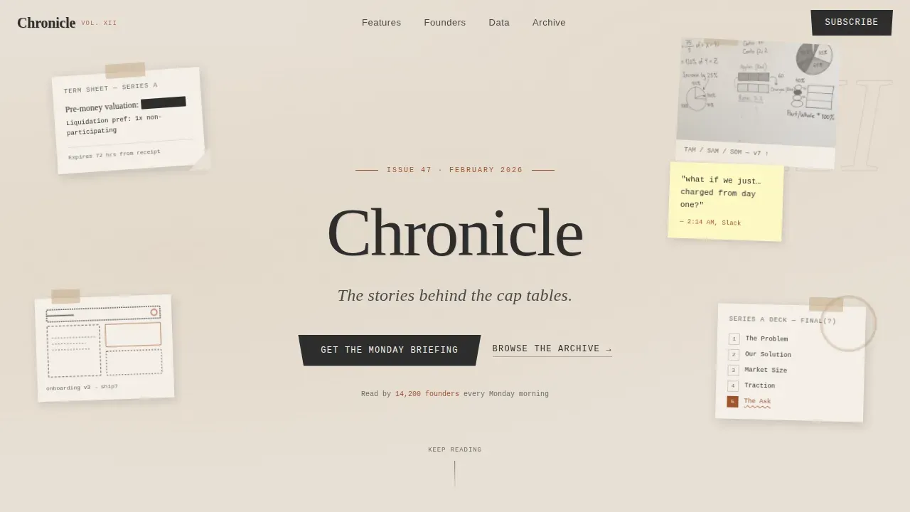
- A scrapbook-style collage hero with torn paper fragments, rotated elements, and a stamped serif tagline
- Three flagship article preview blocks with opening paragraphs, large pull quotes, and handwritten-style margin annotations
- A Monday Briefing subscription module with a single torn-paper-styled email input field
Feature list
This template was built to serve one purpose: turn first-time visitors into loyal readers. Every feature below exists because it directly supports that goal. The landing page focuses on typography, grid-based layouts, and a content-first aesthetic that keeps the reading experience at the center of every design decision.
Collage Scrapbook Hero Section
The header opens with a layered collage composition styled like a founder's desk mid-chaos. Torn term sheet corners, hand-drawn wireframe fragments, a sticky note, and a coffee-stained pitch deck printout are arranged with slight rotations and torn-edge shadows. The blog tagline is set in a serif typeface that looks stamped rather than rendered. This first impression immediately signals that Chronicle is not a typical content website.
Full-Viewport Editorial Mission Block
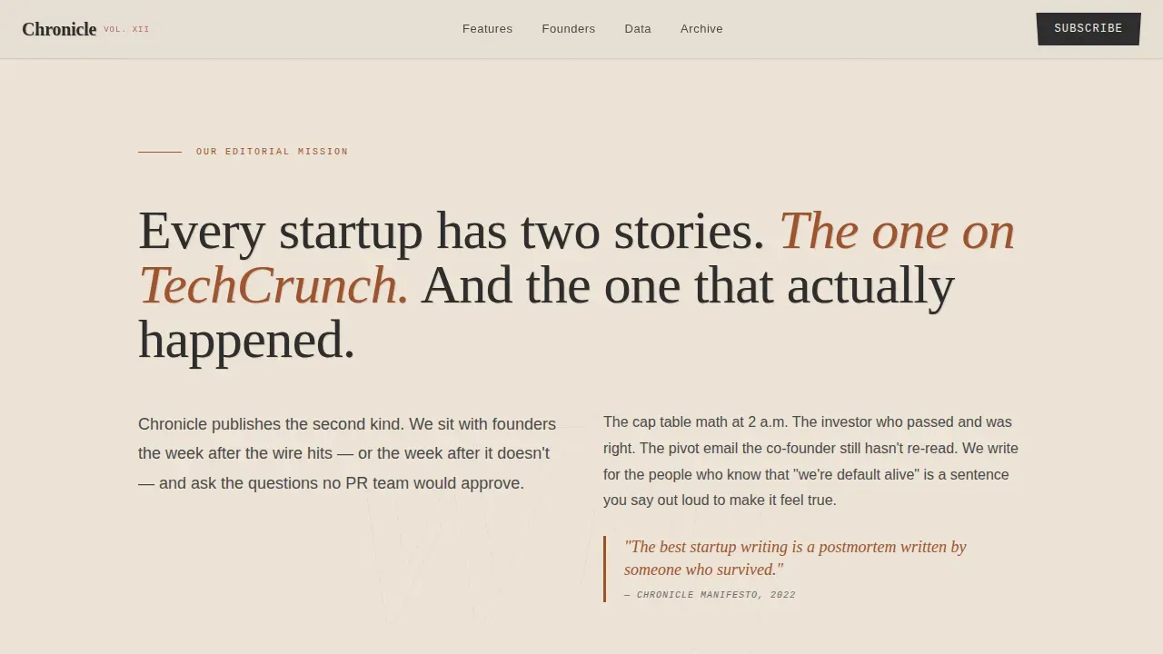
After the hero, the page reveals a typographic manifesto statement that fills the entire viewport. This block communicates why Chronicle exists and who it serves. Placing a clear value statement above the fold ensures visitors immediately understand the page's purpose, reducing bounce and building trust before the first article preview loads.
Flagship Article Preview Blocks
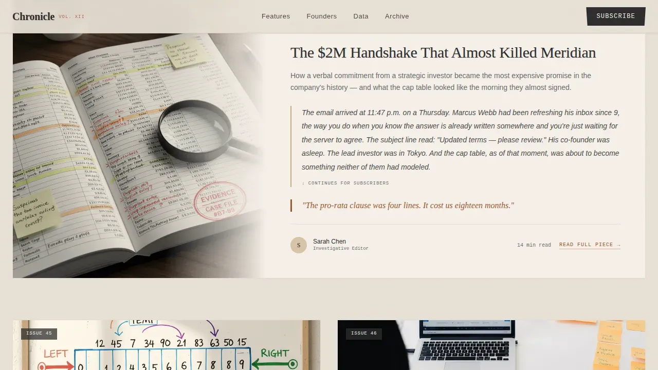
Three longform piece previews are included, each showing an opening paragraph styled as the lede. The lede functions as the unique selling proposition of each piece, proving editorial quality before asking for a subscription. Each preview includes a large pull quote set in sienna red and margin annotations styled in handwritten type. Article cards use smaller thumbnails with bold, headline-driven text rather than modern large images, keeping the focus on writing quality.
Monday Briefing Subscription Module
The primary call to action is a single email field styled like a torn paper input, placed directly after the first featured article preview. The form is intentionally minimal. Long and intimidating forms are a common mistake on landing pages that convert poorly. This design avoids that problem entirely by asking only for an email address, making the subscribe action feel natural and low-commitment.
Founder Interview and Data Essay Section
Below the subscription module, the page continues with founder interview excerpts and data essays. Margin annotations appear in a handwritten-style monospace font. Charts are styled like hand-drawn infographics, reinforcing the analog editorial identity. This section extends the reading journey deeper into the notebook, from manifesto to evidence.
Scroll-Triggered Reveal Animations
The template uses scroll-triggered animations throughout. Ink-bleed entrance effects, subtle paper texture parallax, and hover states on article cards create an interactive reading experience without relying on heavy scripts. These animations reinforce the print-inspired identity and reward readers who keep scrolling.
Page sections overview
| Section | Purpose |
|---|---|
| Collage Hero | Establish editorial identity and tagline |
| Mission Manifesto | Communicate why Chronicle exists |
| Article Preview One | Prove writing quality with the first lede |
| Article Preview Two | Deepen trust with a second flagship piece |
| Article Preview Three | Complete the above-fold editorial sample |
| Monday Briefing call to action | Capture email subscriptions with a minimal form |
| Interview Excerpts | Feature founder voices with margin annotations |
| Data Essay Block | Present hand-drawn-style charts and analysis |
| Footer Pattern | Provide navigation links and contact details |
Design & branding system
The visual identity follows an Ink and Paper theme. The background sticks to an off-white parchment tone with deep charcoal text, keeping the feel close to a grayscale newsprint style while adding warmth. The color palette is primarily anchored in neutral tones with muted vintage accent colors to emulate newsprint, exactly as print-inspired web design principles recommend.
- Aged parchment background (#E8E0D5), fountain pen charcoal body text (#2C2C2C), sandstone section dividers (#C4A882), and marginal-note red pull quote accents (#A0522D)
- Fraunces for serif display headlines, DM Sans for body and interface text, and IBM Plex Mono for data annotations and margin notes
- A bold serif-heavy font for headlines contrasting with a clean body typeface to grab attention, with thin horizontal rules separating editorial sections like chapter dividers
Mobile & speed optimization
Chronicle is designed desktop-first to deliver a premium editorial reading experience on large screens. The layout adapts gracefully to smaller screens, ensuring that visitors on any device can still read and subscribe without friction. Common landing page mistakes like unclear value propositions and distracting elements on mobile are avoided by keeping the mobile adaptation clean and focused.
- Desktop-first layout with graceful mobile adaptation for every section including the hero collage and article previews
- CSS-only animations keep the page light on any device, avoiding heavy scripts that slow rendering
- The subscription form stays minimal on every screen size, with a single input field that is easy to complete on a phone
How this template helps you convert
Landing pages built on Chronicle are designed to earn the subscription before asking for it. The structure follows a proven editorial funnel: give first, then ask. Understanding why visitors arrive at your landing page is the foundation of good conversion strategy, and this template is built for readers who are already curious about startup content.
- Three article opening paragraphs are revealed before the fold, giving visitors enough proof of writing quality to trust the publication and willingly subscribe or sign up for the Monday Briefing.
- The single-field email form, placed immediately after the first article preview, matches the call to action to the moment of highest reader intent, providing a seamless transition from content to conversion.
- Social proof elements including issue numbers, reader counts, and featured founder names with company context are woven into the layout to reassure new visitors that the publication is established and worth following.
Other information about this template
Chronicle is ideal for anyone who wants to build a startup and tech business blog that stands apart from generic content websites. The template is fast, simple, and easy to use for various projects, from personal founder journals to professionally run editorial operations. It is suited for personal or commercial use with certain image restrictions, so check the license terms before you purchase.
- The template was built without writing code, using a visual interface that lets you customize pages easily without technical knowledge
- No-code and low-code development tools allow users to create and edit applications without extensive programming knowledge, and this template follows that philosophy, using a visual interface that simplifies the entire setup process
- You can download the template and begin editing right away, making it a practical choice for marketers, agency teams, and independent editors who need to launch quickly
- Landing pages built on this structure are standalone web pages created specifically for a marketing or campaign goal, and Chronicle keeps that focus sharp by removing distracting elements that dilute the subscription funnel
- The page template supports social proof display through issue numbering, reader count callouts, and founder testimonials, all of which help convert visitors who arrive with skepticism
- Videos and other rich media can be added to the data essay and interview sections when the content strategy calls for it, since landing pages with video can increase conversions by 86 percent
- The template works well as a content destination for publications that promote original longform writing, want to build a community around startup stories, or plan to grow an email list as the primary business asset
- For publications referencing pop culture moments or media coverage, such as a feature on Jimmy Kimmel Live or a story that reached 1.7m views or 238k views across platforms, the article card design gives those moments the visual weight they deserve
- The New York startup ecosystem and similar dense founder communities are a natural fit for the Chronicle editorial voice and the business stories this template is built to tell
- Readers posted responses to Chronicle-style pieces 10 hours ago, 2 months ago, and years ago, and the template's comment-ready layout supports that kind of ongoing reader engagement over time
- The along using the transcript annotation style built into the data essay section makes it easy to reference interview recordings or panel discussions with a format that feels native to the analog editorial design
Theme
Ink & Paper
Creative direction
Vision & Mission
Color system
Warm Stone
Direction
Content/Resource
Page Sections
Collage Scrapbook Hero with Stamped Tagline
Full-viewport Editorial Mission Statement
Three Flagship Article Preview Blocks
Minimal Monday Briefing Subscription Form
Scroll-triggered Ink and Paper Animations
Founder Interview and Data Essay Blocks
Related questions
Can I customize the colors and fonts without writing code?
Is this template suitable for a commercial startup publication?
How does the subscription funnel work in this template?
Does the template include article content or just the layout?
Can I add videos or other media to the template pages?



