Intelligent Logistics Command Landing Page Template
The Ingest Data Command Supply Chain Landing Page Template is a scroll-reveal, single-page build for enterprise foodtech startups. It puts a live dashboard fragment front and center, fires animated data counters on every scroll trigger, and leads VP-level operators through a progressive comparison table and a three-field Waste Gap Calculator that returns projected savings before asking for contact details.
by Rocket studio
Quick summary
This is a high-impact, scroll-reveal landing page template built for an enterprise supply chain intelligence platform. It opens on an interactive dashboard preview, escalates through stats-first sections, and closes with a diagnostic calculator. Every section is designed to give operators a clear view of their losses before the call to action appears.
Who this template is for
This template is built for foodtech founders and product teams launching a supply chain management platform. It speaks directly to VP-level buyers who evaluate vendor proposals at their desks and need hard numbers before they engage.
- VP Operations and CFO stakeholders at multi-unit restaurant groups with 23 or more locations
- Ghost kitchen network operators and institutional food service directors managing logistics across siloed data sources
- Enterprise SaaS teams who need a landing page that earns trust through data, not copy
What problem this template solves
Multi-unit food operators lose six figures monthly to spoilage and logistics waste they can see but cannot quantify. Existing supply chain management tools either fragment visibility or bury insights behind slow implementation cycles. This template gives the platform a landing page that makes the cost of inaction impossible to ignore.
- Fragmented supply chain data across vendors, shipments, and walk-in IoT sensors makes it hard to monitor waste in real time
- Legacy systems and spreadsheets provide no automated tracking of food costs, supplier performance, or spoilage trends
- Generic landing page templates fail to communicate the business value of a data-first supply chain solution to skeptical VP buyers
What you get with this template
You get a fully structured, scroll-reveal landing page with six purpose-built sections. Every section follows a stats-first layout, so data leads and narrative follows. The template is desktop-first but supports responsive scaling for field-side access.
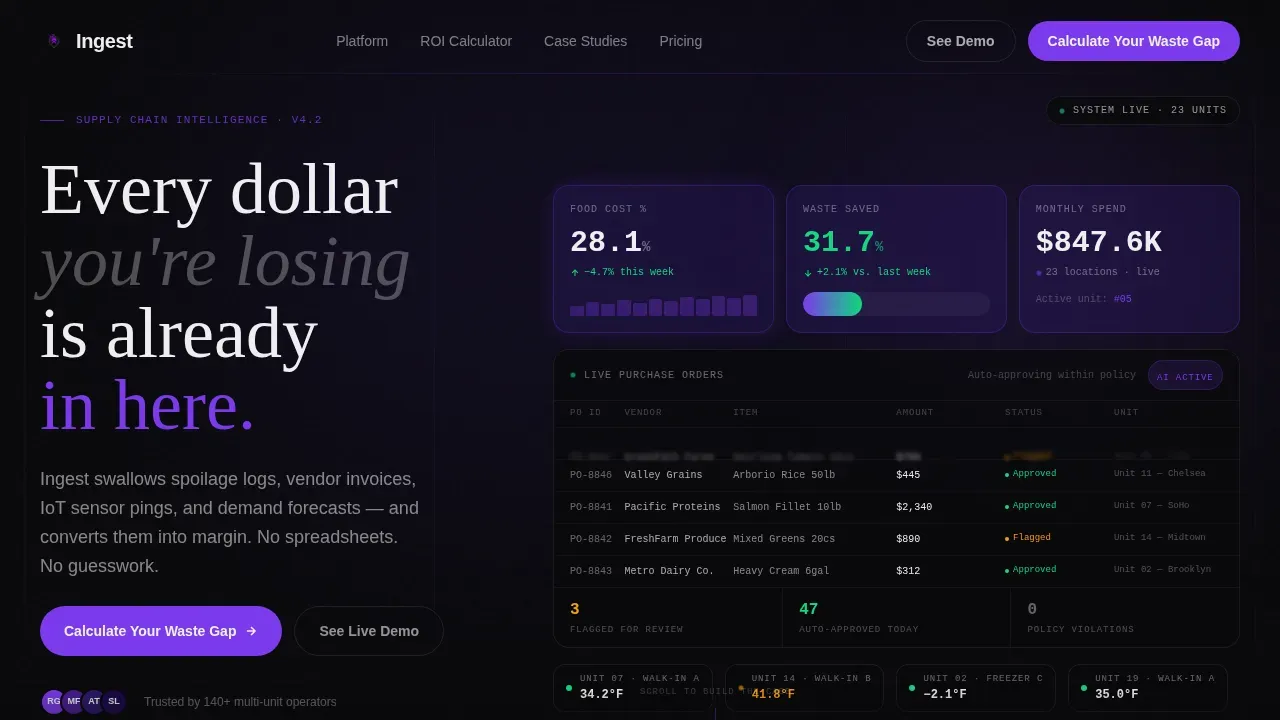
- An interactive hero section with an animated dashboard fragment showing live food cost percentage, waste reduction metrics, and a scrolling purchase order feed
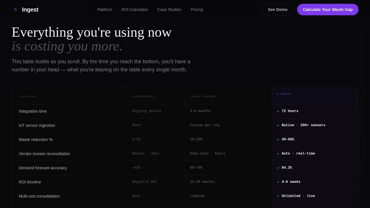
- A progressive comparison table that populates as the visitor scrolls, stacking the platform against spreadsheets and legacy supply chain systems across dimensions like logistics integration time and ROI timeline
- A three-field Waste Gap Calculator that returns a projected savings figure instantly, and a secondary path gating a competitive teardown PDF behind a work email
Feature list
This landing page template provides the following built-in sections and interaction patterns. Each one is grounded in the source brief and ships as a ready-to-customize container.
Live Dashboard Hero Fragment
The hero drops visitors into a functioning dashboard preview before they scroll. Animated counters display food cost percentage ticking downward, spoilage dropping from 11.2% to 3.4%, and a live purchase order feed scrolling in the sidebar. The product is the hero and it is already running on arrival.
Stats-First Scroll Reveal
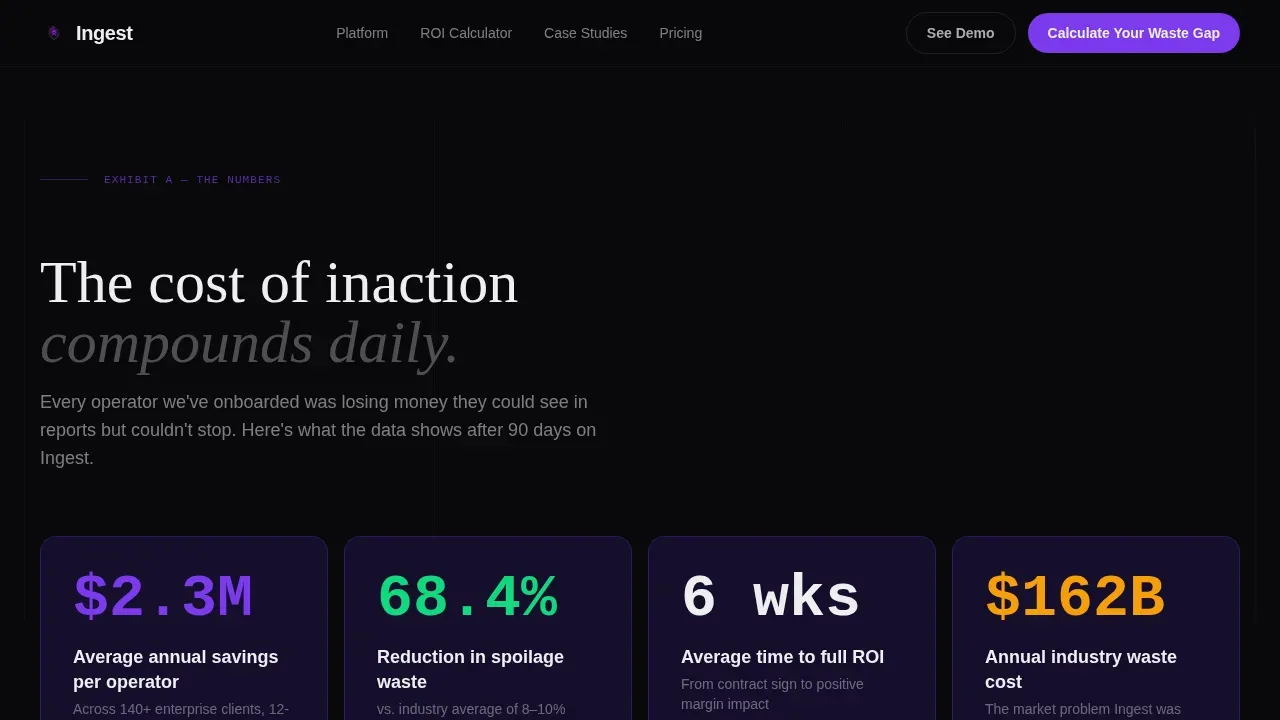
Every scroll trigger fires a counter animation before narrative text appears. Visitors hit a section and see "$2.3M average annual savings" animate upward, then the supporting explanation materializes beneath it. This progressive reveal builds a prosecution case with each exhibit, helping users calculate their own losses as they scroll.
Progressive Comparison Table
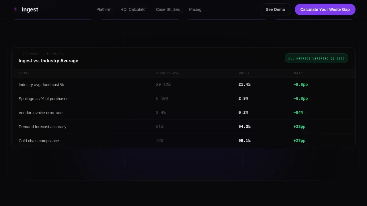
A persistent versus table populates across scroll. It stacks the platform against spreadsheets and legacy systems across fields like logistics integration time, waste reduction percentage, and ROI timeline. Dashboards help teams identify inefficiencies, and this table makes those differences visible at a glance.
Waste Gap Calculator
A three-field diagnostic form lets visitors input their number of locations, estimated monthly food spend, and current waste percentage. The platform returns a projected savings figure instantly, before requesting contact details. Pre-populating fields with sensible defaults and auto-fill options reduces input errors and speeds up submission.
VP-Level Testimonials Block
Named operator testimonials include specific dollar figures and location counts. This section provides the social proof that supply chain companies need to replace skepticism with confidence. Visual trust signals reinforce that the data shared in the form is handled with care.
Linear Single-Row Footer
A clean, single-row footer section provides end-of-page alignment for legal text, secondary links, and a final call to action. It keeps the landing page focused without adding visual clutter.
Page sections overview
| Section | Purpose |
|---|---|
| Hero Dashboard Fragment | Show live supply chain data before any scroll |
| Stats Impact Block | Fire animated counters on scroll entry |
| Comparison Table | Progressive versus table across scroll depth |
| Testimonials Row | VP-level social proof with savings figures |
| Waste Gap Calculator | Three-field diagnostic returning projected savings |
| Linear Footer | End-of-page links and secondary call to action |
Design & branding system
The template follows a Data Command visual identity built on the Void and Violet color system. The aesthetic feels like a mission control room at 2 AM, with every screen alive and every number carrying signal.
- Void Black (#09090B) dominates backgrounds at 70%, Electric Violet (#7C3AED) pulses through data visualizations and interactive states, Deep Ultraviolet (#2D1B69) anchors card surfaces and section dividers, and Ghost White (#EEEEF0) delivers typography with surgical contrast
- DM Sans handles body and user interface text, JetBrains Mono renders all data and numbers for a precise, terminal-grade feel, and Fraunces appears in editorial headline moments for tonal contrast
- No stock photography and no illustration; the product user interface is the only visual element, ensuring every image on the page carries signal rather than decoration
Mobile & speed optimization
This template is desktop-first, matching the behavior of VP operators reviewing vendor proposals at their desks. Responsive scaling is built in to ensure access on other devices when needed.
- Scroll-reveal animations use Intersection Observer for efficient trigger management, and live data simulation runs via setInterval without heavy external dependencies
- The hero dashboard fragment and counter animations are driven by static data simulation, keeping the landing page fast without requiring a live backend connection
- Mobile-friendly layout ensures field teams and secondary users can monitor and explore the page from any device, following best practices for supply chain logistics tools that serve workers across multiple environments
How this template helps you convert
This landing page is structured to move a skeptical VP buyer from curiosity to calculation. Each section adds a new layer of evidence, so by the time the call to action appears, the visitor has already done the math.
- The hero dashboard shows the product working immediately, so users understand the platform's value before reading a single line of copy. Supply chain dashboards that provide real-time insights build faster trust than static screenshots.
- The progressive comparison table and stats blocks create a data-led case for switching. End-to-end supply chain visibility across shipments, suppliers, and logistics costs is shown as a default outcome rather than a promised feature.
- The Waste Gap Calculator converts intent into action. A visitor who inputs three fields and sees a savings figure is already engaged enough to provide a work email for the gated teardown PDF, completing a multi-step conversion path without friction.
Other information about this template
This template can support a range of supply chain management use cases beyond its default configuration. Teams can replace placeholder figures with real dataset values, connect their own data sources, and add optional fields to the calculator form. The following points cover additional context that matters for operators evaluating this template.
- The comparison table fields are variable and can be updated to reflect custom logistics benchmarks, sourcing metrics, or EDI integration timelines relevant to your specific supply chain
- Data ingestion best practices are baked into the calculator form design: real-time validation can flag incomplete fields, idempotency logic can ensure duplicate submissions do not create false records, and confirmation states such as a thank-you page acknowledge successful data receipt
- Supply chain command centers combine AI, IoT, and advanced analytics with near-real-time data from disparate systems; this template's visual language and section architecture are designed to communicate that level of sophistication to buyers and stakeholders
- Command centers expand on traditional supply chain control towers by democratizing access to supply chain insights across functions; the comparison table section reflects this by showing how the platform provides visibility that legacy tools and spreadsheets cannot match
- Custom metadata fields, label structures, and upload workflows can be added to the calculator or gated form to support more advanced data collection; files in CSV or JSON format are the recommended default for ingestion payloads in enterprise supply chain systems
- The ingest data command supply chain landing page template is structured to serve as a conversion-focused article page and a product demo vehicle at the same time, providing value to both marketing teams and sales-assist workflows
- Organizations in regulated food service markets, for example those operating under California SB 1383 compliance requirements, can use this template to communicate their platform's monitoring and tracking capabilities to buyers who need assurance on that dimension
Theme
Data Command
Creative direction
Stats-First Impact
Color system
Void & Violet
Style
Scroll Reveal (Progressive)
Direction
Comparison/Versus
Page Sections
Live Dashboard Hero Fragment
Stats-first Scroll Reveal Sections
Progressive Comparison Table
Three-field Waste Gap Calculator
Vp-level Testimonials with Dollar Figures
Gated Competitive Teardown PDF Path
Related questions
Can I customize the comparison table fields for my supply chain platform?
Does the Waste Gap Calculator require a live backend to function?
What file formats does the template support for data ingestion forms?
Is this template suitable for a desktop-first audience?
Can I add more sections or adjust the scroll reveal order?



