String — Bespoke Accessory Design Landing Page Template
A warm, masonry-style landing page built for a bead and wire jewelry-making online course. The template combines a half-page hero, a staggered gallery of student project cards with flip-reveal technique details, full-width studio moment breaks, a scrolling five-star review ticker, and a persistent enrollment call-to-action bar, all styled in a parchment-and-rust atelier palette.
by Rocket studio
Quick summary
This is a single-page, masonry-layout landing page template designed for an artisan bead and wire jewelry-making online course. It guides visitors from a cinematic hero section through a progressively complex gallery of student work, building desire and trust before directing them to an enrollment checkout. Every section earns the click before asking for it.
Who this template is for
This template suits course creators and educators who teach hands-on craft skills online. It works especially well when the product is visual and the audience needs to see a transformation before they commit.
- Hobbyist crafters who teach structured jewelry-making progressions and want to show the full arc of student skill growth
- Etsy sellers or independent makers launching a course to help others build a signature product line
- Gift-oriented craft educators whose students want to produce something handmade and boutique-quality
What problem this template solves
Selling an online craft course is hard when visitors cannot feel the experience. A plain course description page rarely earns trust. This template replaces generic layouts with a curated gallery experience that shows, not just tells, what students will achieve.
- Visitors leave enrollment pages too soon because they cannot picture the outcome; the masonry gallery closes that gap with real project progression
- Trust is missing before the pricing ask; the scrolling review ticker and visible student work volume address that directly
- The jump from "curious visitor" to "enrolled student" feels too large; the Module 1 preview and low-stakes entry point shrink that distance
What you get with this template
You get a fully structured, single-page layout ready to be customized for your bead and wire jewelry-making course. Every section has a defined purpose in the conversion journey.
- A half-page hero section with a split photo-and-text layout, masonry student gallery with card flip interactions, full-width studio moment breaks, a scrolling micro-review ticker, a Module 1 preview block, and a persistent bottom call-to-action bar
- Warm atelier visual identity using Fraunces serif headlines, DM Sans body type, and a four-color palette of parchment, rust, tarnished brass, and deep walnut
- Desktop-first responsive layout with a mobile fallback, GPU-accelerated card flip animations, scroll-linked parallax on studio moments, and lazy-loaded images
Feature list
This template ships with purposeful interactive and visual features drawn directly from the course's gallery-walk creative direction.
Half-Page Hero Split Layout
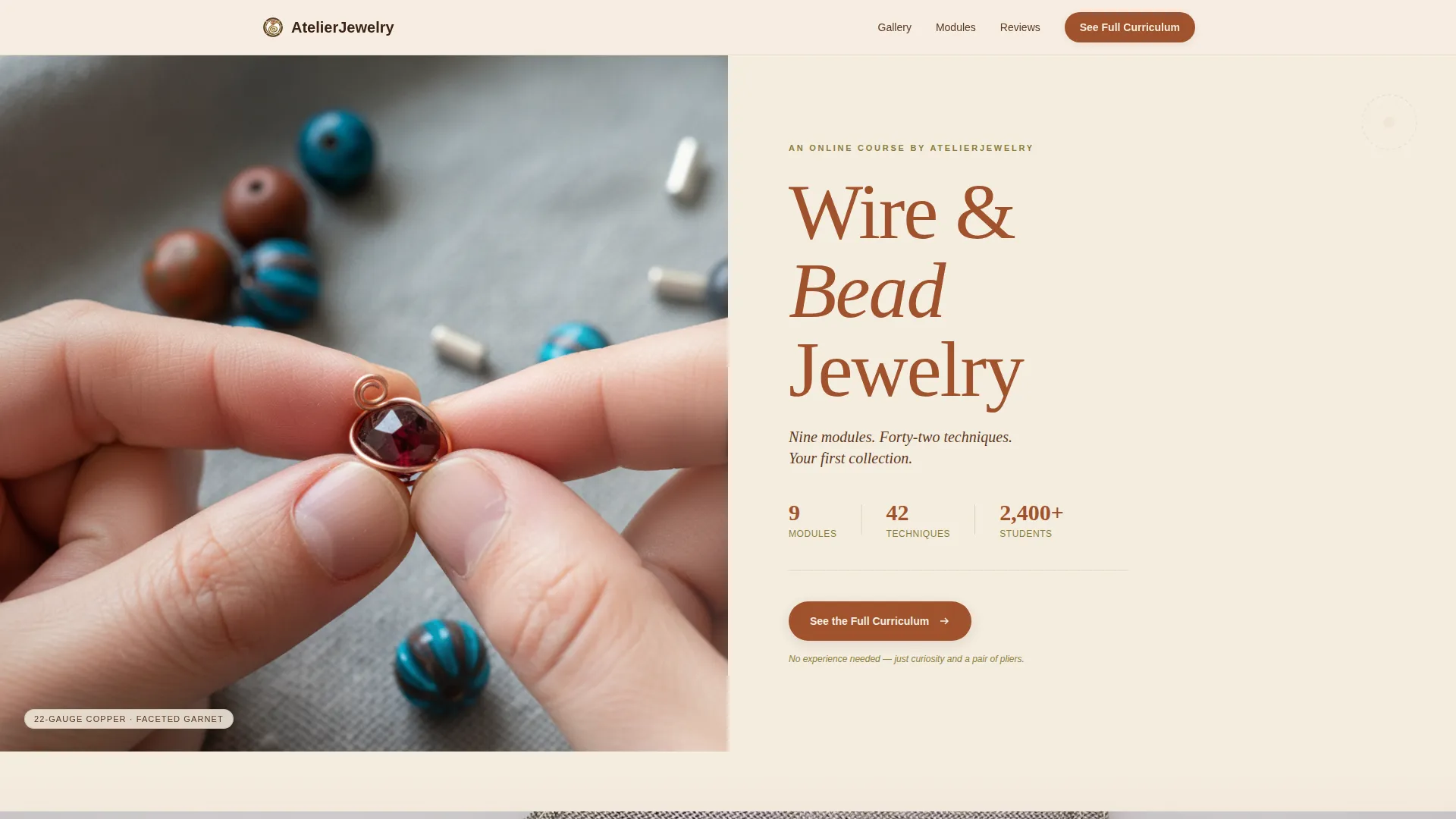
The hero divides the viewport into two halves. The left side holds a tightly cropped overhead photograph of hands mid-wire-wrap. The right side presents the course title in a tall Fraunces serif set in rust, with the subline "Nine modules. Forty-two techniques. Your first collection." The stillness of the image does the selling before a single word is read.
Masonry Gallery with Card Flip Reveal
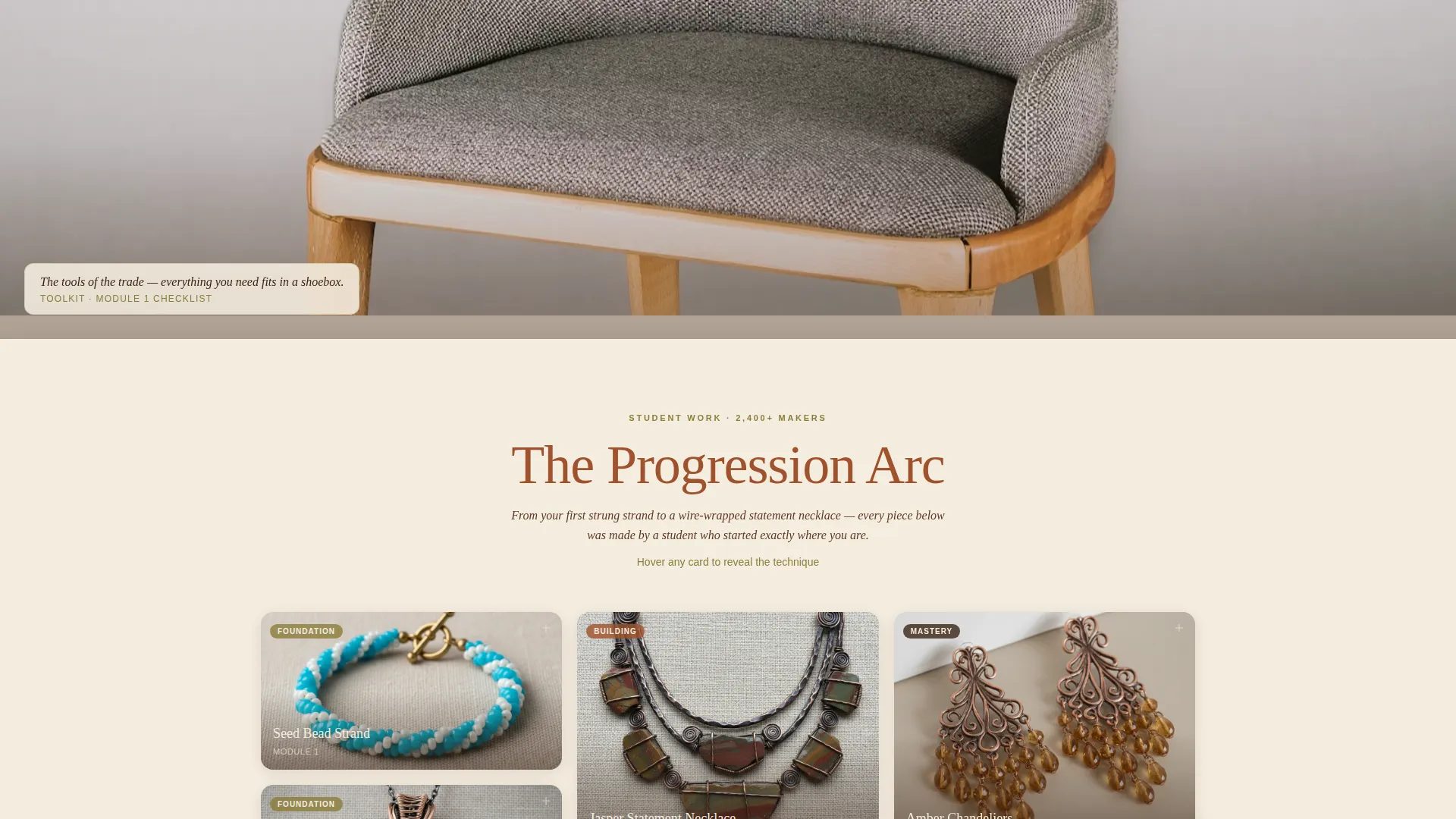
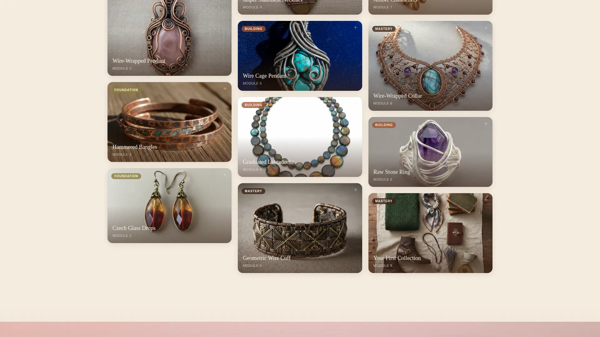
Student project cards are arranged in a staggered Pinterest-style masonry grid. Cards progress from simple strung pieces at the top to intricate wire-wrapped statement necklaces lower in the scroll, making the skill progression visible without explanation. Hovering any card triggers a CSS three-dimensional flip that reveals the technique name, module number, and a five-second looping video of the key hand movement.
Full-Width Studio Moment Breaks
Between masonry card clusters, the grid pauses for full-width atmospheric images. These include a flat-lay of tools, a close-up of a clasp being closed, and a finished piece worn at the collarbone. They give the eye a natural rest point and keep the emotional tone of a sun-filled atelier alive throughout the scroll.
Scrolling Five-Star Review Ticker
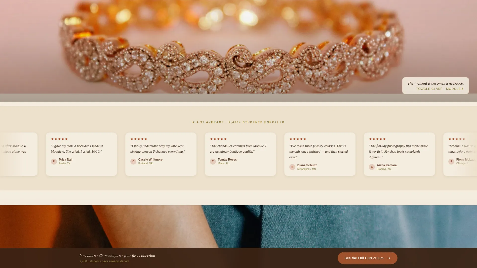
A horizontally scrolling ticker carries short five-star micro-reviews from students alongside a visible student count badge. This social proof layer appears before any pricing information, building trust through volume rather than a single testimonial block.
Module 1 Preview Block
A dedicated "Your First Project" section shows the visitor exactly what they will make in the first module. This preview deliberately lowers the perceived stakes of enrolling, making the primary call-to-action feel like a natural next step rather than a commitment leap.
Persistent Bottom Call-to-Action Bar
After the visitor scrolls past the third masonry row, a fixed bottom bar appears with the primary call-to-action: "See the Full Curriculum." It stays visible through the rest of the page, removing the need to scroll back up to act.
Page sections overview
| Section | Purpose |
|---|---|
| Hero Split Layout | Introduce course with image and headline |
| Masonry Gallery Grid | Show student project progression visually |
| Studio Moment Breaks | Provide atmospheric rest between clusters |
| Trust Review Ticker | Deliver social proof before pricing |
| Module 1 Preview | Lower stakes with a first-project teaser |
| Persistent call to action Bar | Keep enrollment action always visible |
| Minimal Footer | Close page with lightweight navigation |
Design & branding system
The visual identity follows an Atelier Studio theme. Every color and type choice references the sensory world of a working jewelry studio, aged metals, warm cloth, worn surfaces.
- Four-color palette: parchment cream (#F5EDE0) as the dominant background, kiln-fired rust (#A0522D) on headlines and primary accents, tarnished brass (#8B7D3C) for secondary type and icon strokes, and deep walnut (#3B2314) for body text
- Typography pairing: Fraunces tall serif for all display headlines and the course title, DM Sans for body copy and interface elements throughout
- Visual texture references oxidized wire, aged silk, and linen work cloth, warm metals against soft surfaces, nothing synthetic or overly polished
Mobile & speed optimization
The template is designed desktop-first to support the masonry grid's full visual complexity. A responsive mobile fallback ensures the experience remains coherent on smaller screens.
- Masonry grid collapses gracefully on mobile with a single-column stacked layout, preserving the card flip interaction and progression order
- Images across all sections are lazy-loaded to reduce initial page weight, and CSS animations are GPU-accelerated for smooth card flips and parallax effects
How this template helps you convert
This template is built as a click-through page. Its only job is to move an interested visitor toward the enrollment checkout with genuine desire, not pressure.
- Trust is built visually first. The masonry gallery fills the page with student outcomes before any pricing or commitment language appears. Visitors see the transformation, then hear about it.
- The Module 1 preview removes hesitation. Showing exactly what a new student will make in the first project answers the unspoken question: "Can I actually do this?" That answer makes the call-to-action click feel obvious rather than risky.
Other information about this template
This template sits within the Blog and Editorial category, specifically matched to the bead and wire jewelry-making content niche. It is built for course creators in the artisan craft and maker education market.
- The page direction is click-through, meaning it carries no embedded forms or checkout flow; the primary call-to-action links out to a separate curriculum and pricing page
- Animation complexity is set to high, including masonry stagger reveal on scroll entry, card flip on hover, scroll-linked parallax on studio moments, and a ticker scroll for reviews
- Localization defaults are set for English (United States), USD currency, and MM/DD/YYYY date formatting
- The footer uses a minimal horizontal flow pattern, keeping the close of the page lightweight and uncluttered
Theme
Atelier Studio
Creative direction
Gallery Walk
Color system
Parchment & Rust
Style
Masonry/Pinterest
Direction
Click-Through
Page Sections
Half-page Hero Split Layout
Masonry Gallery with Card Flip
Full-width Studio Moment Breaks
Scrolling Review Ticker
Module 1 Preview Block
Persistent Bottom Call-to-action Bar
Related questions
Does this template include a checkout or payment form?
Can I replace the placeholder images with my own course photography?
Is the card flip animation removable for a simpler layout?
Does the persistent call-to-action bar appear on mobile devices?
Can this template work for a craft course on a different subject?



