Hobby & Passion Content Blog & Content Website Template
Strum is an editorial landing page template built for ukulele learning blogs and music communities. It combines a cinematic dark color system with an ink-and-paper visual identity to create an experience that feels like a well-loved music notebook. The template supports lead generation through a newsletter signup form, a free PDF offer, and a curated scroll of chord lessons and community content.
by Rocket studio
Quick summary
Strum is a single-page editorial template for ukulele blogs and music learning communities. It pairs a deep charcoal and warm parchment palette with magazine-style content sections to earn reader trust before asking for an email. The design feels analog and intimate, like a handwritten notebook, not a content feed.
Who this template is for
This template suits creators who teach music in an honest, personal voice and want a page that reflects that character. It works especially well for independent music educators who want to grow a newsletter audience without feeling corporate.
- Ukulele bloggers and music educators launching or refreshing a community site
- Intermediate content creators who want editorial polish without hiring a design team
- Hobbyist musicians building a loyal audience around a weekly newsletter or chord series
What problem this template solves
Most music blog templates look like generic news sites. They push content into a feed and never give visitors a reason to stay. Strum solves that by creating a deliberate scroll, one that shows useful content first and earns the email signup rather than demanding it up front.
- Visitors leave before converting because the page feels like every other content site
- Newsletter signups feel transactional rather than like a natural next step
- Chord and tutorial content gets buried instead of featured as a reason to return
What you get with this template
You get a fully structured editorial landing page with every section already planned and designed. The layout moves from a bold hero statement through curated article cards, a chord feature, a community spotlight, and two distinct email capture moments, all wrapped in a cohesive ink-and-paper visual system.
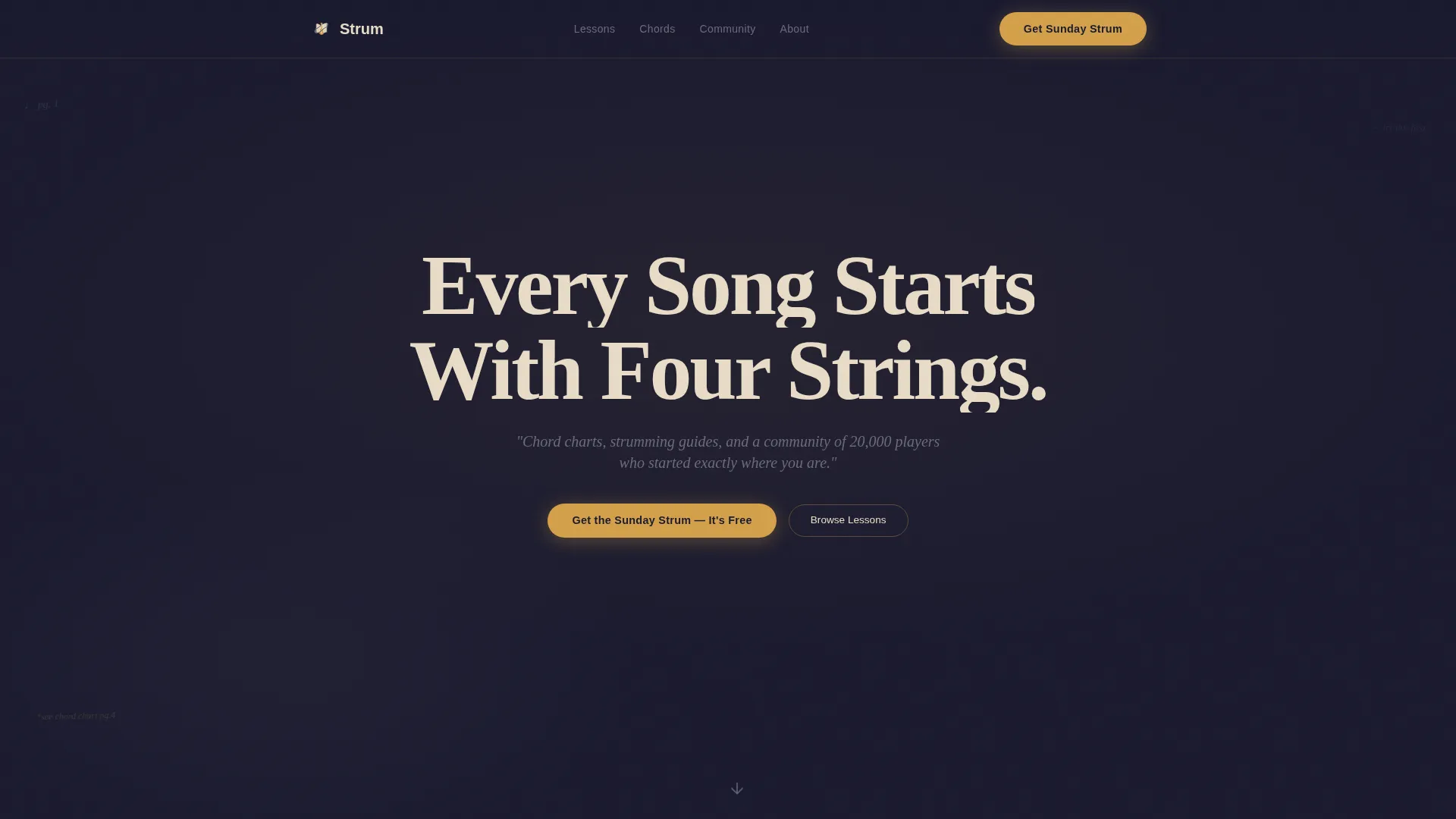
- A hero section with a giant centered headline, amber ink-bleed underline animation, and a floating call-to-action button
- Three editorial content sections including an Editor's Picks bento grid, a This Week's Chord feature card, and a Community Spotlight with inline email form
- A free PDF conversion section gated behind email capture, plus a minimal horizontal footer
Feature list
This template includes six distinct built-in capabilities drawn directly from the design brief.
Giant Headline Hero with Ink-Bleed Animation
The hero opens with enormous Fraunces serif type set in parchment cream against a deep charcoal background. A thin amber underline extends slowly beneath the headline, mimicking ink bleeding across wet paper. A single graphite italic subline and a floating amber call-to-action button complete the opening moment.
Editor's Picks Bento Grid
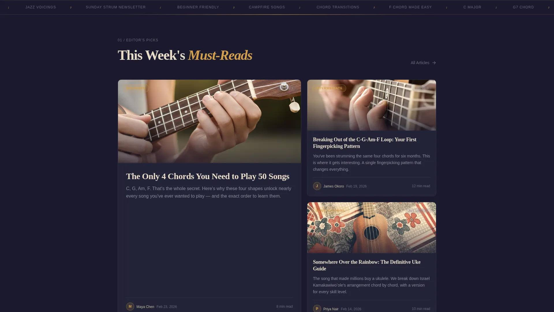
Three featured articles are laid out in an asymmetric bento grid with oversized ink-sketch style thumbnail illustrations. A marquee ticker runs below the grid to add editorial energy and keep the scroll moving. Each card is designed to feel hand-picked, not algorithmically generated.
This Week's Chord Feature Card
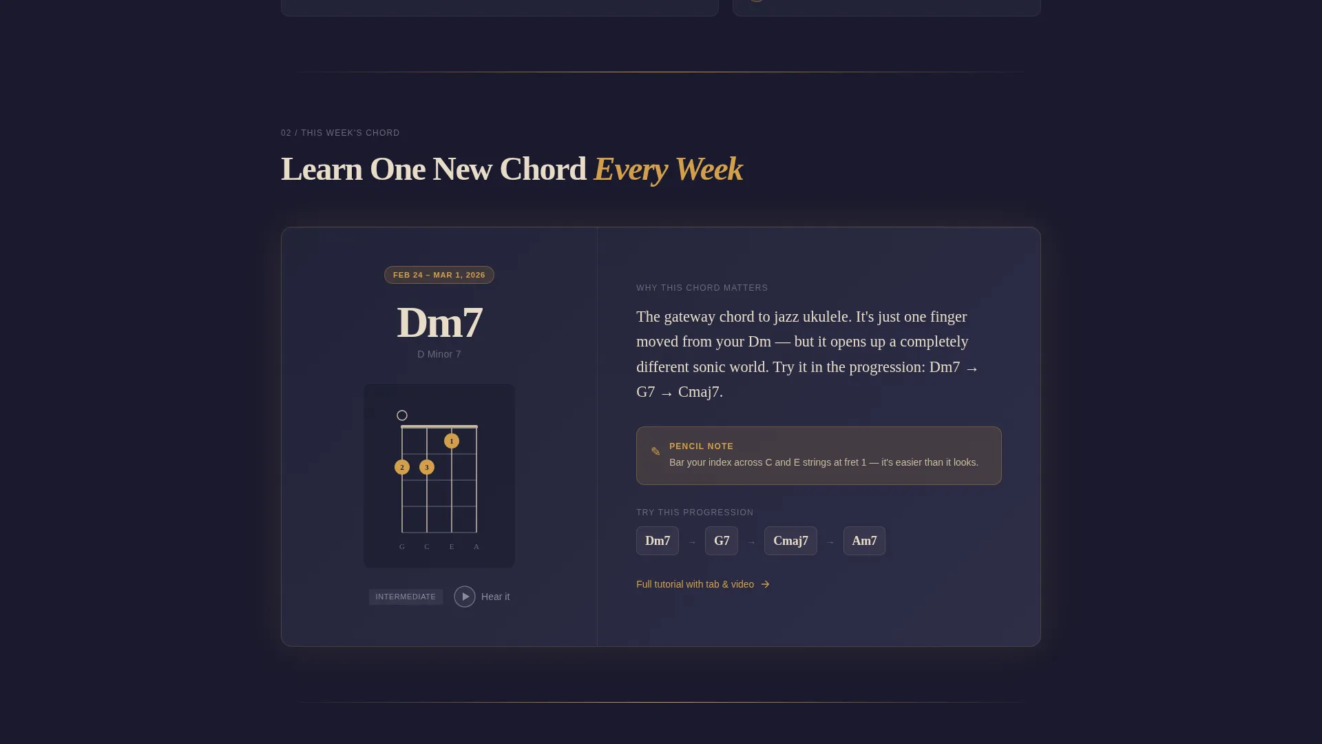
A full-width feature card displays a large chord diagram alongside an audio snippet and tab reference. This section gives visitors immediate, tangible value before any signup is requested. It anchors the page as a genuine learning resource.
Dual-Path Email Capture
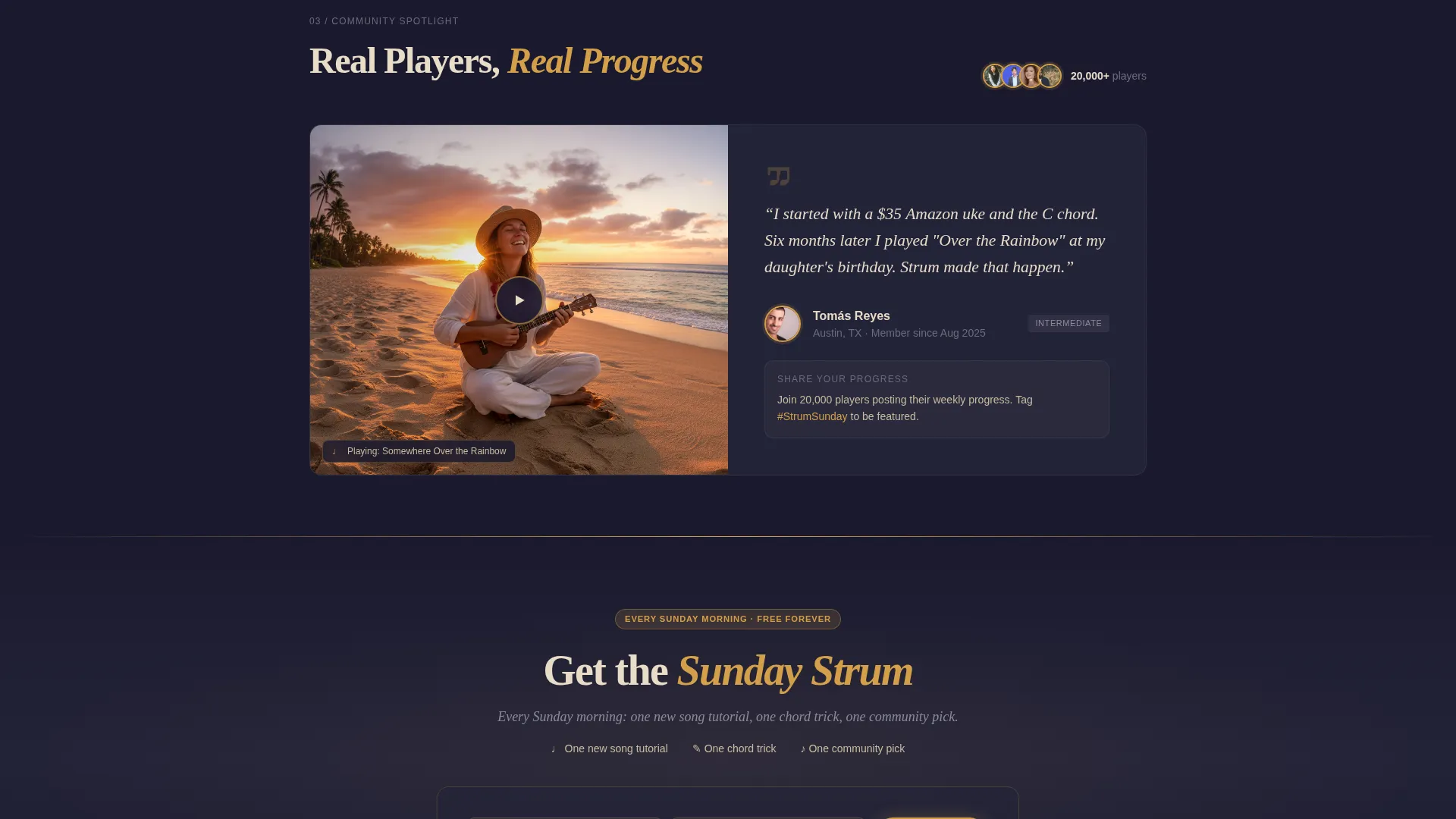
The primary call to action, "Get the Sunday Strum," appears twice: first as a floating amber button after the hero, then as a full-width inline form after the third editorial section. The form asks only for a first name and email address. Both capture moments frame the newsletter as a weekly gift, not a list subscription.
Free PDF Gated Offer
A dedicated section promotes a downloadable PDF called "The First 20 Chords Every Beginner Needs." The download is gated behind the same email capture form, creating a second conversion path for visitors who scroll past the newsletter prompt without signing up.
High-Motion Scroll Animations
The template includes text-reveal masked slide-up animations, scroll-fade with blur transitions, a parallax effect, and a marquee ticker. Interactive elements include FAQ accordion behavior, hover states on article cards, and chord diagram interaction. These details create the feeling of flipping through a physical magazine rather than scrolling a website.
Page sections overview
| Section | Purpose |
|---|---|
| Hero Headline | Opens with bold centered serif type, amber underline animation, graphite subline, and floating signup button |
| Editor's Picks Grid | Shows three curated article cards in an asymmetric bento layout with a marquee ticker below |
| This Week's Chord | Features a large chord diagram, audio snippet, and tab in a single focused card |
| Community Spotlight | Highlights a member cover video alongside the primary inline email capture form |
| Free PDF Offer | Promotes the beginner chord PDF download gated behind the same email form |
| Minimal Footer | Closes the page with a clean horizontal footer layout |
Design & branding system
The visual identity follows an Ink and Paper theme rendered through a Cinematic Dark color system. Every color choice is deliberate: charcoal dominates like heavy cardstock, parchment carries the reading experience, and amber marks what matters most.
- Deep charcoal (#1A1A2E) as the dominant background, warm parchment cream (#E8DCC8) for all body text and pull quotes, and faded pencil graphite (#6B6B7B) for secondary labels
- Nib-ink amber (#D4A04A) used for links, highlights, interactive accents, and the signature ink-bleed underline
- Fraunces serif for display headings and DM Sans for body text and interface elements, creating a contrast between editorial warmth and clean readability
Mobile & speed optimization
The template is built desktop-first with a fully responsive mobile stack. The editorial grid collapses gracefully so the curated feel holds on smaller screens without losing the analog character of the design.
- Desktop editorial grid transitions to a clean vertical stack on mobile, preserving section hierarchy and content pacing
- Server Components handle static content while Client Components manage animations and interactive elements, keeping the page load sensible
- High-motion animations including text reveals, scroll-fades, and marquee are scoped to Client Components to avoid blocking the initial render
How this template helps you convert
Strum is built around a specific conversion philosophy: show so much genuine, useful content above the fold that subscribing feels like bookmarking a favorite page rather than handing over personal data.
- The hero, chord feature, and article grid deliver real value before any capture form appears, so visitors arrive at the signup with trust already built.
- Two separate email capture paths, the floating Sunday Strum button and the full-width inline form, meet readers at different points in their scroll without repeating the same pitch twice.
- The free PDF offer provides a second reason to sign up for readers who want a tangible takeaway, reducing the friction of committing to a recurring newsletter.
Other information about this template
This template is categorized under Blog and Editorial with a Hobby and Passion Content subcategory. It was designed with a high intersection match for the ukulele playing blog and community niche. A few additional details worth knowing before you customize:
- The social proof element built into the page references a community of 20,000 players, which you can update to reflect your actual audience size
- The template style is Editorial and Magazine, and the creative direction follows a Curated Collection approach where sections alternate between dense grids and single-focus feature moments
- Animation and interactivity levels are both set to high in the build spec, so the template is intentionally motion-forward and best suited for creators comfortable with that energy
- The page uses English (United States) locale with an informal tone, making it a natural fit for independent creators rather than institutional music schools
Theme
Ink & Paper
Creative direction
Curated Collection
Color system
Cinematic Dark
Style
Editorial/Magazine
Direction
Lead Generation
Page Sections
Giant Hero with Ink-bleed Animation
Editor's Picks Bento Grid
This Week's Chord Feature Card
Dual-path Email Capture
Free PDF Gated Offer
High-motion Scroll Animations
Related questions
Who is this template designed for?
What email capture features are included?
Can I replace the 20,000-member social proof figure with my own numbers?
Does the template include real chord diagrams and audio files?
What skill level is needed to customize this template?



