Art & Design Blog Blog Website Template
Masthead is a single-column editorial landing page template built for a weekly graphic design blog. It blends a heavy-paper-stock visual identity with a Day-in-the-Life scroll structure, moving visitors from a full-viewport hero through mood boards, article excerpts, reader submissions, and a resource shelf. The template is designed to capture leads through editorial writing quality, not aggressive pop-ups.
by Rocket studio
Quick summary
Masthead is a single-column flow landing page template for a weekly graphic design blog and newsletter. It follows a Day-in-the-Life scroll rhythm, opening with a full-viewport Type Over Image hero and flowing through five editorial sections. The Soft Mist color system and Cormorant Garamond display type give every page the unhurried feel of a perfectly bound print magazine.
Who this template is for
This landing page template was designed for graphic design practitioners who take the craft seriously. It suits publishers, educators, and independent writers launching a design-focused newsletter or blog with a strong editorial voice. The template speaks to an audience that treats typography as a discipline and expects the pages they read to reflect that standard.
- Junior designers who refresh their feeds between client revisions and need trustworthy craft references
- Creative directors who collect visual references and want a site that delivers editorial-grade content on a reliable schedule
- Self-taught freelancers and design educators launching a professional blog or newsletter destination online
What problem this template solves
Most blog landing page design templates default to generic content layouts that feel indistinguishable from a product marketing page. A graphic design blog needs a landing page that demonstrates craft before it says a single word about craft. Visitors should feel the editorial quality the moment the page loads, so the writing earns the subscription rather than a pop-up demanding it.
- Generic templates fail to communicate editorial credibility, causing visitors to scroll past the email capture without converting
- Design-focused audiences evaluate a site's visual standard instantly; a weak layout undermines the message before the first sentence lands
- Most landing page design templates lack a scroll narrative, leaving readers without a reason to stay through to the call to action
What you get with this template
You get a complete, single-column landing page template built around five distinct editorial sections and a carefully considered Soft Mist visual identity. Every section serves a clear goal, and the overall structure guides visitors from first impression through to email subscription in a way that feels natural, not forced. The template is ready to customize and launch without requiring advanced design skills.
- A full-viewport Type Over Image hero, a curated mood board grid, an annotated article excerpt with email capture, reader submission cards, and a resource shelf section
- A matched typographic system using Cormorant Garamond for display headings and DM Sans for body text, tuned for editorial readability
- Scroll-triggered word reveals, parallax effects, a marquee ticker, and hover states that add depth without distracting from the content
Feature list
This landing page template includes purpose-built features that help you showcase serious design writing and capture leads from the right audience. Each feature was specified in the template brief and is described here as delivered.
Full-Viewport Type Over Image Hero
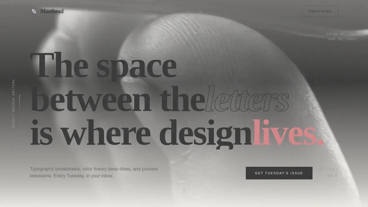
The hero section fills the entire browser viewport with a desaturated, softly overexposed photo of a designer's hands adjusting letterforms on a lightbox. A massive serif headline set at 12 viewport-width units is laid directly over the photo in pencil graphite, creating a depth illusion where the type and the hands physically overlap. This immersive hero gives visitors an immediate, high-quality visual impression of the editorial brand and sets the tone for every section that follows. A large, immersive image that emotionally connects to the main feature is a proven way to engage readers from the first scroll.
Day-in-the-Life Scroll Structure
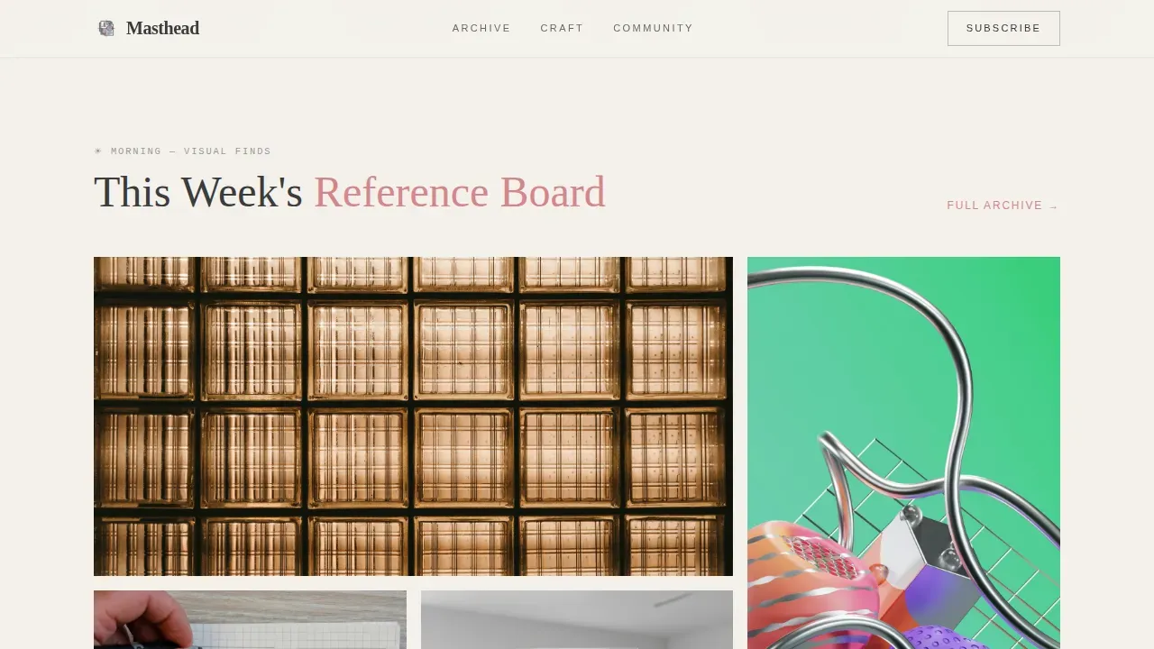
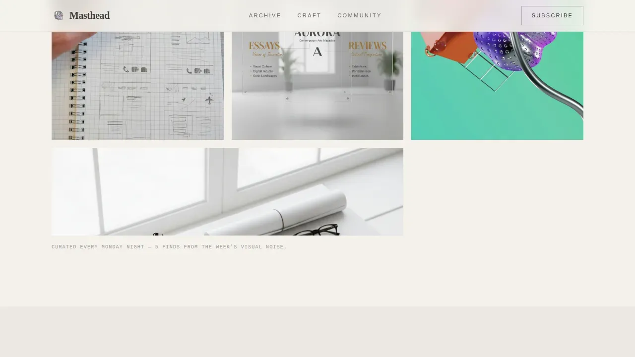
The page is organized around a designer's actual day. Morning delivers a curated mood board grid of weekly visual finds. Midday shifts to an in-progress article excerpt with inline annotations and margin notes. Afternoon surfaces reader-submitted work with editorial critique snippets. Evening closes with a resource shelf of typefaces, plugins, and templates arranged like desk objects being packed away. Each section transitions through subtle time-of-day tonal shifts in background warmth, making the scroll feel like moving through a full creative day rather than clicking through a generic content feed.
Annotated Article Excerpt with Email Capture
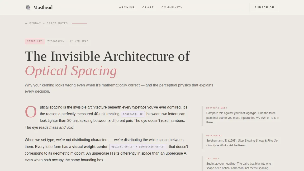
The midday section presents an article excerpt styled like a manuscript, complete with visible inline annotations and pull-quote highlights. This gives visitors a real taste of the editorial voice before they are asked to subscribe. The primary call to action, "Get Tuesday's Issue," sits beside a single email field directly after the excerpt. A secondary path offers a free downloadable resource, "Grab the Spacing Cheatsheet (PDF)," gated behind the same email capture. No pop-ups and no countdown timers are used; the writing does the persuading.
Reader Submission Cards
The afternoon section showcases reader-submitted work displayed as editorial critique cards. Each card pairs a community piece with a short editorial critique snippet. This section builds trust by showing that the blog has an active, engaged readership. Showcasing real community work also gives prospective subscribers social proof without resorting to manufactured testimonials. Using a modular grid to display this collection of work lets the section stay scannable even when the card count grows.
Resource Shelf Section
The evening section presents a curated collection of typefaces, plugins, and templates arranged like physical objects on a desk being packed up for the night. The layout uses an object-on-desk visual metaphor that reinforces the handcraft aesthetic. This section adds practical value for visitors who came for tools as much as for reading, giving them a concrete reason to return every week and explore new additions.
Soft Mist Color System and Editorial Typography
The visual identity uses warm fog white (#F4F1EC) across the full background, pencil graphite (#3B3B3B) for body text, faded lilac (#C4B8CB) for section dividers and pull-quote accents, and editorial rose (#D4868A) exclusively for links and hover states. Cormorant Garamond handles all display headings; DM Sans handles body copy. Color schemes in masthead design evoke specific emotions, and this restrained palette keeps the focus entirely on the featured design work. A contrasting accent color for interactive elements makes calls to action stand out and encourages clicks.
Page sections overview
| Section | Purpose |
|---|---|
| Hero: Type Over Image | Establish editorial identity with a full-viewport typographic photo overlay |
| Morning: Mood Board Grid | Display weekly visual finds in an asymmetric bento-style grid |
| Midday: Article Excerpt | Present manuscript-style content with annotations and the primary email capture |
| Afternoon: Reader Submissions | Showcase community work with editorial critique cards to build social proof |
| Evening: Resource Shelf | Highlight curated typefaces, plugins, and templates as a practical weekly reference |
| Footer: Minimal Horizontal | Close the page with a clean, minimal footer pattern |
Design & branding system
The template follows an Editorial Magazine theme that feels like tracing paper layered over a watercolor sketch. Every design decision is deliberately restrained so the featured design work stands out by contrast. The logo placement, navigation links, and tagline all sit within a system that prioritizes editorial hierarchy over decoration. Incorporating unique typography in a magazine masthead helps convey the brand's personality immediately, and that principle guides every typographic choice here. A concise tagline in the hero serves as the mission statement that explains the blog's niche to visitors within seconds.
- Soft Mist palette: warm fog white background, pencil graphite text, faded lilac accents, editorial rose links and hover states
- Cormorant Garamond at display scale paired with DM Sans for body, creating a clear hierarchy between headline drama and readable body text
- Section-level tonal background shifts that mirror a time-of-day rhythm, giving each part of the page its own quiet visual identity
Mobile & speed optimization
The template is built desktop-first for creative professionals working on large screens, and it includes a responsive layout that adapts to mobile viewports. Mobile-first responsiveness ensures the layout adapts to smaller screens with a focus on vertical scrolling, which is how most mobile users navigate long-form content pages. Fast loading speeds matter on editorial blogs where a slow page can cause visitors to leave before the content makes its case. The template favors CSS animations and server components for static sections to keep the page lean.
- Scroll-triggered word reveals and parallax effects are implemented with CSS animations preferred over heavy JavaScript, keeping sessions smooth across devices
- The email capture field, mood board grid hover reveals, and annotation tooltips are all built to remain functional and accessible on smaller screens
- The single-column flow naturally collapses to mobile without requiring a separate layout overhaul, saving development time during launch
How this template helps you convert
A landing page is a standalone web page created specifically for a marketing or advertising campaign, and this template treats that definition seriously. The design of a landing page is crucial in enticing visitors to take action, so every section here has a clear goal. Using a single primary call to action reduces distractions and helps increase conversions by keeping readers focused on one decision: subscribing.
- The annotated article excerpt gives visitors a genuine sample of the editorial voice before they see the email field, so the subscription request feels earned rather than premature. Understanding why visitors arrive at your landing page helps tailor your messaging to their motivations, and this structure does exactly that.
- The secondary free resource path, the Spacing Cheatsheet PDF, gives hesitant visitors a low-commitment reason to share their email. Effective landing pages focus on a single, clear goal, and both capture paths here funnel to the same list without confusion.
- A/B testing is an essential tool for discovering what resonates best with your audience on landing pages. Because the template keeps sections modular and clearly bounded, you can test headlines, excerpt lengths, or call to action copy in focused sessions without rebuilding the whole page.
Other information about this template
This template is one of several editorial landing page design templates available on the platform. It is especially well suited for creative professionals who are launching a recurring publication and want their site to reflect the same craft standards as their writing. The template can support a range of publishing formats beyond weekly newsletters.
- The template works as a homepage or as a dedicated subscription landing page linked from social profiles, email campaigns, or app stores
- Real estate in the mood board grid and resource shelf sections is flexible; you can store additional curated finds or link out to partner collections as your content library grows
- The page is ready to demo immediately after setup, making it practical for creators who want to test audience interest before committing to a full publishing schedule
- Creative professionals in fields adjacent to graphic design, such as illustration, photography, and web design, can adapt the template to their own publishing needs by swapping section content and adjusting the logo and brand color details
- Job seekers building a professional online presence in the design industry can also use this template format to showcase their creative point of view and services
- Friendly design decisions, like the ghost-text email placeholder and the no-pop-up subscription flow, keep the user experience calm and focused
- The Cormorant Garamond and DM Sans pairing is a modern typographic choice that reads well in both large display and small body sizes across all pages
- Interactive micro-interactions like hover reveals on the mood board and annotation tooltips enhance user engagement without adding visual noise
- Intentional white space throughout the layout improves readability and draws attention to featured content, consistent with editorial best practices
- This template was built with the same clear goal that drives high-converting landing page examples: earn the visitor's trust with the content first, then make the ask
Theme
Editorial Magazine
Creative direction
Day-in-the-Life
Color system
Soft Mist
Style
Single Column Flow
Direction
Content/Resource
Page Sections
Full-viewport Type Over Image Hero
Day-in-the-life Scroll Narrative
Annotated Article Excerpt and Email Capture
Reader Submission Editorial Cards
Resource Shelf Section
Soft Mist Color and Typography System
Related questions
Who is the Masthead landing page template designed for?
How does the template capture leads without using pop-ups?
Can I customize the colors and typography in this template?
Is this template suitable for mobile visitors?
Can I use this template for a different type of editorial site?



